A black logo? A white logo? A blue logo? Many business owners ask themselves this question when designing or redesigning their brand. Although there are truly no hard and fast rules, as a general rule black is usually better for a more formal business, while a white logo is usually better for a more casual business. However, there are other considerations aside from the color, such as the shape and the font of the logo.
Businesses around the globe look for ways to stand out from their competition. One way to do this is to use a black logo. The thing is, not all businesses should use a black logo for their brand. This blog will look at the different ways that a black logo can be used for a business.
Table of Contents
Black logos meaning

Typically, a new dominant color contrasts closely with its own values and personality. Shade can carry a great deal of weight in business usage, therefore it’s important to comprehend both the negative and positive characteristics of the color black and the traits related when designing logos in black.
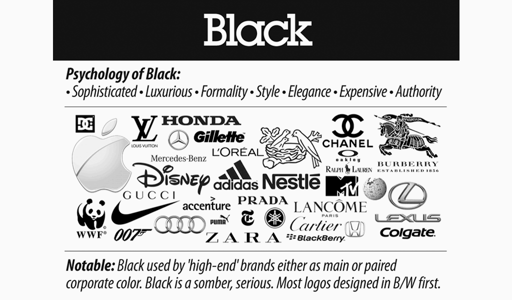
Black can be unbelievably mysterious. Even though you might often hear people refer to the term “plain black” the color black can be very tricky and carry with it hidden meanings or messages. It can indicate aggressiveness, power, and subject. It can also be related to sophistication, temptation, affluence, luxury brands, and success.
By using black in a company logo, you are able to convey authority, strength, formality, and electricity. When used in packaging, black may create a powerful and impressive effect, even making products look more stylish or lavish.
Brands using logos in black are often secure and deep-rooted. They don’t feel a need to call a great deal of attention to themselves. They may think that their reputation speaks for them and they don’t need colors to convey their power, stability, and worth.
Color and your brand personality
Google the words the psychology of color and you’ll receive about 190,000,000 outcomes. Numerous psychologists have studied colors and the emotions and responses associated with them over several years.
It should come as no real surprise to anybody why branding and marketing professionals spend a substantial quantity of money and time examining color and design alternatives, understanding that it’s the potential for a significant effect on customer perception, buying decisions, and future achievement of the overall brand.
Studies have shown that color has the ability to increase brand awareness by up to 80%, and of course, evoke certain emotions and also impact mood and physical wellness. A company’s color palette is an important element of its general visual brand.
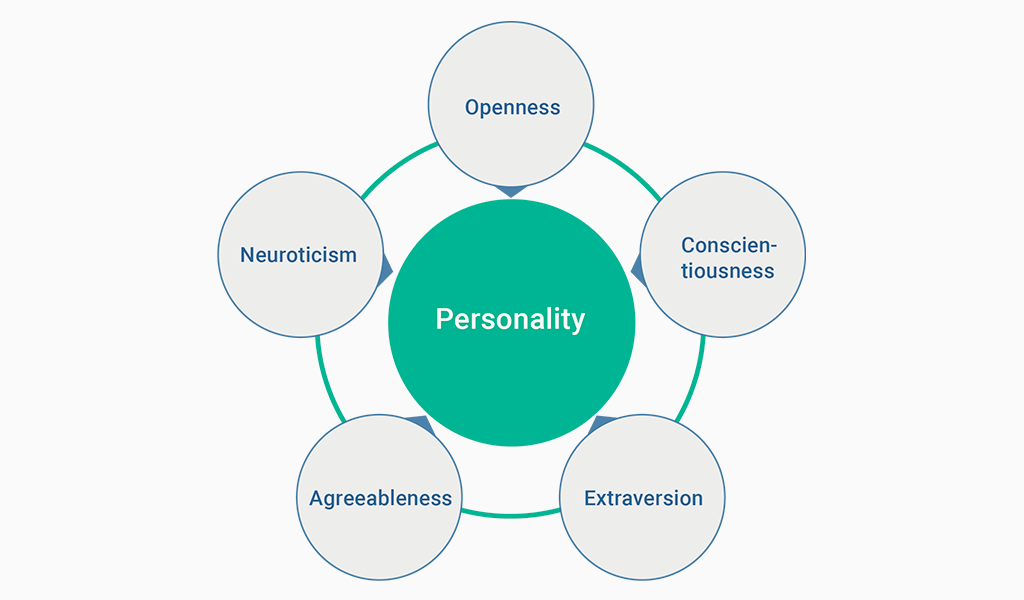
Based on Jennifer Aaker, a psychologist, and professor at Stanford, a new character has five measurements. Identified as “The Big Five,” the measurements are sincerity, excitement, competence, sophistication, and ruggedness.
According to this research, brands might have some element of several of these human characteristics and one of these is generally the dominant dimension. Each dimension has facets and traits associated with them. Whether it is determined what character traits you want your brand to convey, your color choice should align with these traits.
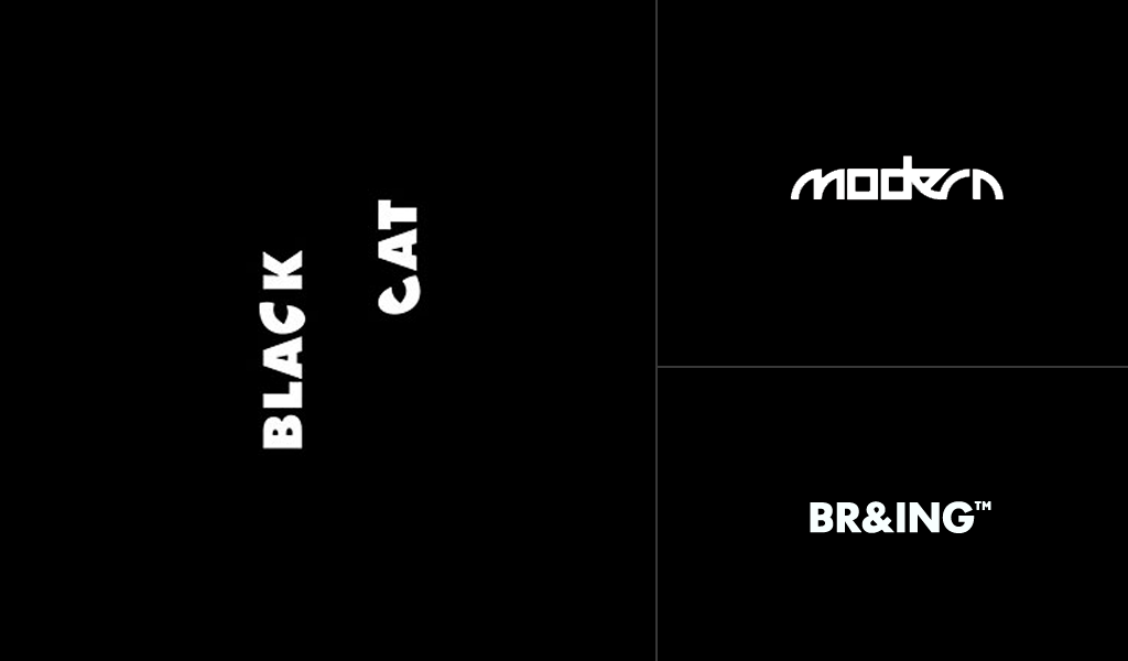
Knowing your brand’s character and picking out the perfect color palette to complement and support these personality traits is one of the most crucial choices entrepreneurs and branding professionals can create.
Decisions about color and visual branding need to be on your business values and the kinds of connections you need your audience to produce with your own brand. They should not be based on what appeals to you personally. Additionally, it goes without saying that a good deal of consumer and target audience study should go into building your brand and making decisions about the visual manufacturer.
Famous logos using black color
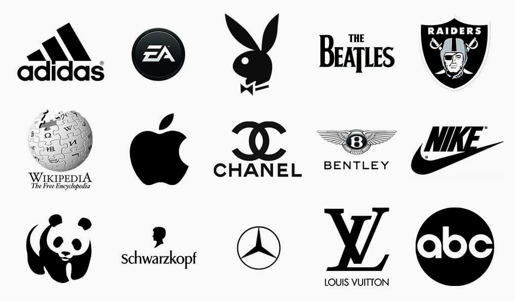
All this reference to color and emotion is intriguing because black is actually not a color, but the absorption of all colors. Black is the lack of visible light. All of that aside, black makes for a stunning and powerful emblem.
High-end luxury brands
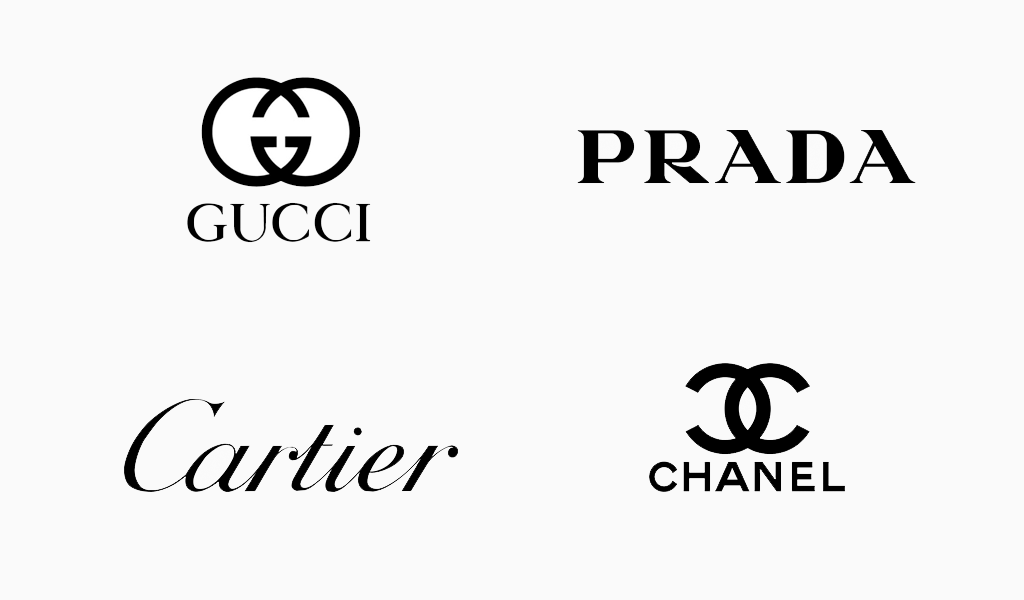
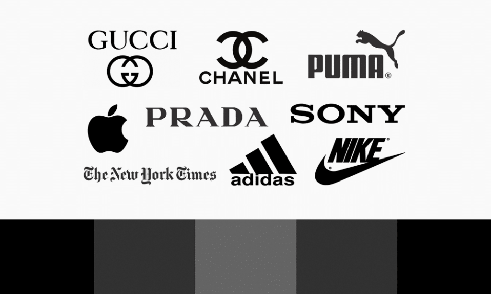
Antique black is a popular alternative for many high-end luxury brands. For example, Gucci, Prada, Chanel, Cartier and others.
IT and tech manufacturers
Black indicates power, ability, seriousness and presents itself as very modern and glistening. It is frequently the option for well-established technology and data giants. Strong brands like Apple, Sony, Motorola, the New York Times, ABC, BBC, and others have consistently used black logos through the years.
Black logo design inspiration
Here are some black logo ideas to browse.








Well-established athletic brands
Since black is often connected with strength, discipline, seriousness, security, and confidence, it’s likewise a popular selection for athletic companies like Nike, Under Armour, Adidas, and Puma.
Client decisions are often motivated by brands, logos, and colors. Ensure that your logo and your color palette are in accord with your brand’s values so as to communicate the ideal message to your target audience.
To amplify impact and brand awareness your logo should look clearly and consistently in everything that you do. From signage to invoicing, business cards, advertising, packaging and across all electronic channels. Consistent branding is the basis of a solid brand.
Every experience a customer has with your brand is an important part of their general perception and relationship with your brand-new. Consistency through the brand experience builds loyalty and trust with your audience!
Learn more about color in logo design
Browse these logo colors and get inspiration for each.
I’m a product and graphic designer with 10-years background. Writing about branding, logo creation and business.

