Colors serve as non-verbal communication that positions your brand in your audience’s minds. Understanding the meanings behind different colors enhances brand perception, creating a memorable brand that stands out. The right palette evokes specific emotions, making your brand more relatable and trustworthy.
A color palette distinct from your competitors is crucial for trademark recognition. This helps create a unique brand identity and ensures easy recognition.
This guide delves into the meanings of different colors and how to use them strategically to build a strong, impactful brand’s colors.
Create your own logo with Turbologo logo maker. It takes less than 5 minutes and no design skills needed.
Go to Logo MakerTable of Contents
Meaning logo colors
This psychology of colors is an important factor when you build a new identity. The ideal logo colors may communicate the deep significance of your worth and elicit certain behaviors. By extension, the incorrect logo colors choices can be bad for your new image.
By knowing how each color affects the thoughts and the feelings it warms up, you may produce a more successful brand. It is important to not forget this is a nuanced and complex area that needs careful consideration. Think about how logo color meanings influence psychology and emotions.
Understanding Red in Logos
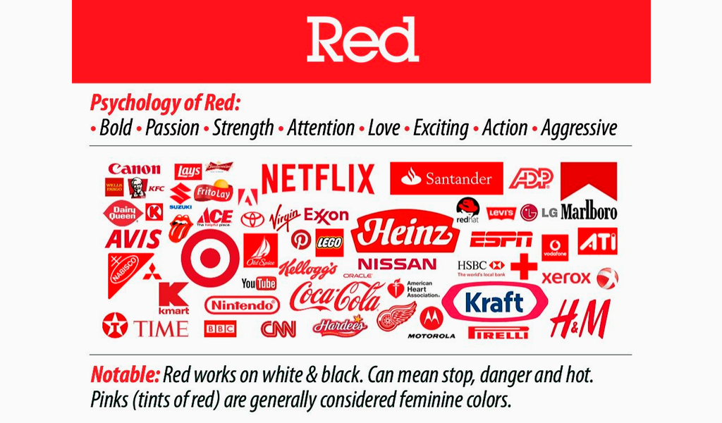
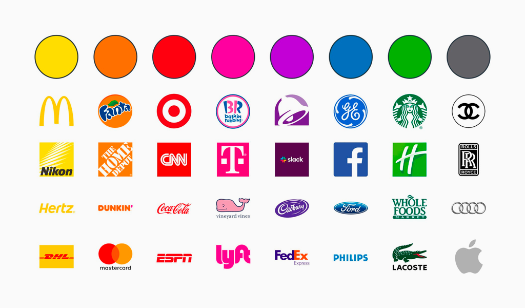
Red commands attention and represents action and strength. It embodies energy and passion in business. Red logos convey enthusiasm and excitement, ideal for brands aiming to stimulate passion and action. Brands like Coca-Cola use red to evoke joy and energy.
However, consider cultural contexts when choosing red, as perceptions can vary. Ensure the color resonates with your audience and aligns with your brand’s identity.
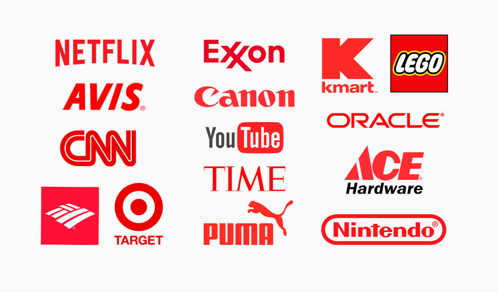
Red’s attention-grabbing ability makes it powerful in logo design but use it thoughtfully to avoid unintentionally creating a sense of urgency or danger.
One of the most famous brands that chose red as the basis of their logo is Coca Cola.

The Significance of Orange in Logos
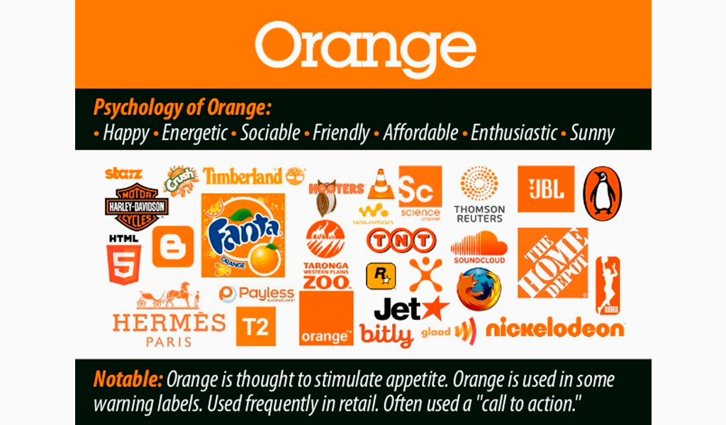
Orange radiates energy, creativity, and change. This vibrant hue stimulates the senses, encouraging greater customer engagement and interaction. Brands like Nickelodeon and Fanta use orange to communicate fun and enthusiasm, appealing with a lively and cheerful image.
Orange logos convey adventure and risk-taking, ideal for attracting extroverted customers. The vibrancy of orange makes your brand’s personality feel more approachable and spontaneous, helping it stand out in a crowded market.
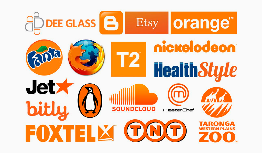
To convey youthful enthusiasm or creativity, orange is a compelling choice for your logo.
One of the most recognizable examples is the Nickelodeon channel logo.


Yellow: The Color of Optimism
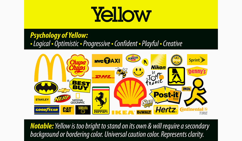
Yellow represents optimism and is often chosen to evoke joy and capture attention. Yellow logos radiate affordable, youthful energy, making brands feel approachable and friendly. Brands like McDonald’s and Snapchat use yellow to target younger customers, creating warmth and friendliness.
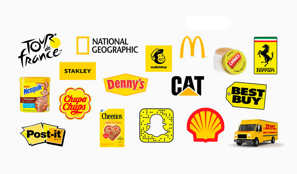
Snapchat’s playful yellow ghost logo signifies fun and spontaneity, resonating with younger audiences. Yellow’s ability to evoke happiness and positivity makes it excellent for brands aiming to create a cheerful, inviting image. Using yellow can make your brand feel more accessible and engaging.
Сolor yellow is used in many logos. The most recognizable yellow logos in the world are the logos of Nikon, McDonald’s and DHL.


Green Logos: Growth and Harmony
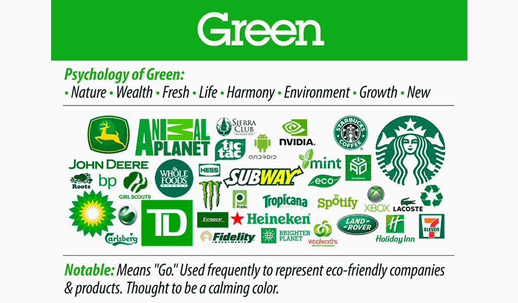
Green symbolizes life, renewal, and energy. In branding, it represents:
- harmony
- safety
- growth
- health
- prosperity
- abundance

Green logos are associated with growth and versatility, popular in industries like food, finance, and tourism. Brands like Starbucks, Tropicana, and Heineken use green to convey their connection to nature and trust.


Blue Logos Convey Trust
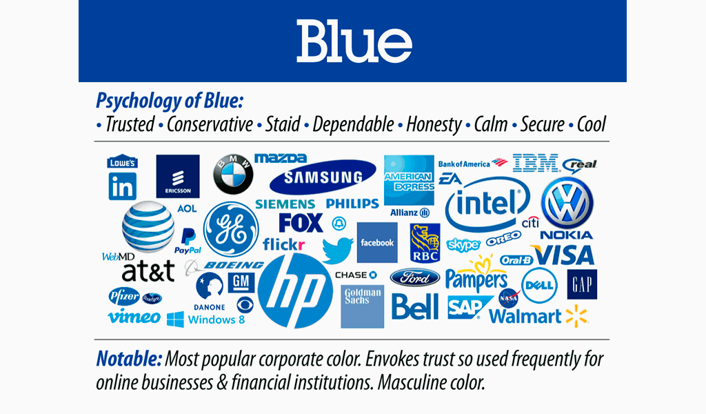
Blue conveys trust and reliability, making it a popular branding choice. Brands often choose blue logos to project professionalism and dependability, as seen with companies like IBM and Ford. In technology, blue symbolizes reliability and connectivity, with brands like Intel and Facebook using it to communicate stability and trustworthiness.
Light blue is often associated with approachability and simplicity, suitable for brands seeking a softer image. Blue’s ability to evoke trust and security makes it ideal for brands wanting to build strong, long-lasting customer relationships.
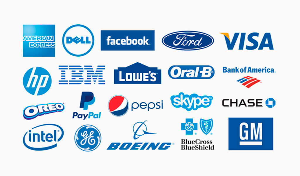
Incorporating a blue logo into your logo enhances your brand’s credibility and reliability.


Purple in Branding: Luxury and Creativity
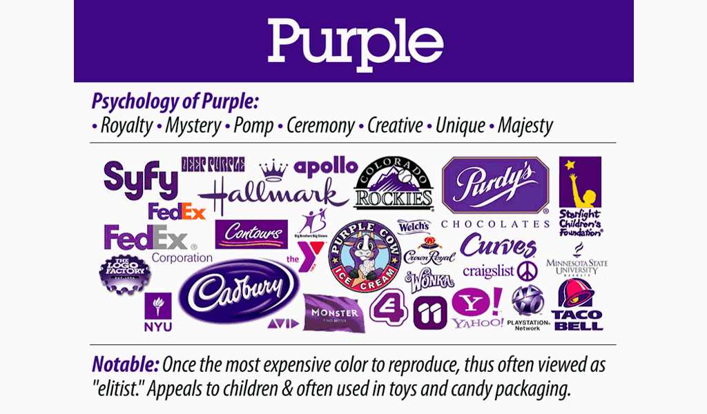
Purple represents luxury, sophistication, and creativity in branding. Historically linked to royalty and wealth due to expensive dye production methods, purple logos are associated with luxury, sophistication, and femininity, ideal for brands conveying exclusivity and elegance.
Purple is often used as a secondary color for emphasis, suitable for playful and upscale projects. Luxury brands frequently use purple to express confidence and creativity, appealing to their target demographics.
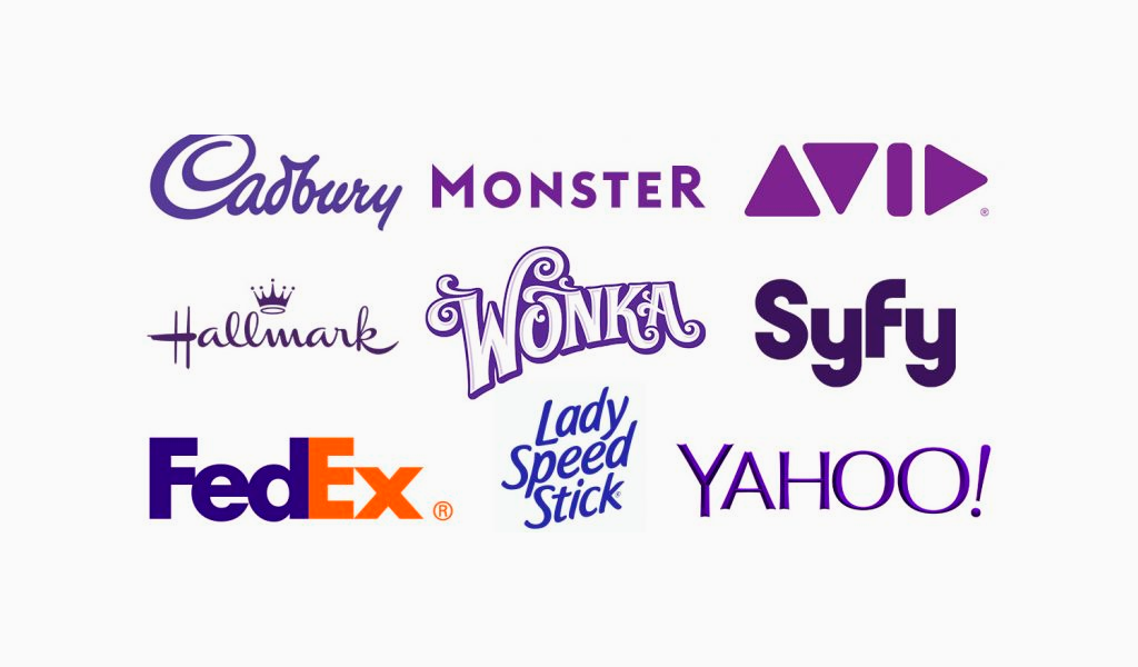
Using purple in your logo creates an image of high quality and innovation, attracting customers who value sophistication and uniqueness.
Large brands rarely choose the purple color of the logo as the main color. More often it is used as a secondary color to emphasize corporate identity and brand recognition.


Pink Logos: Femininity and Modernity
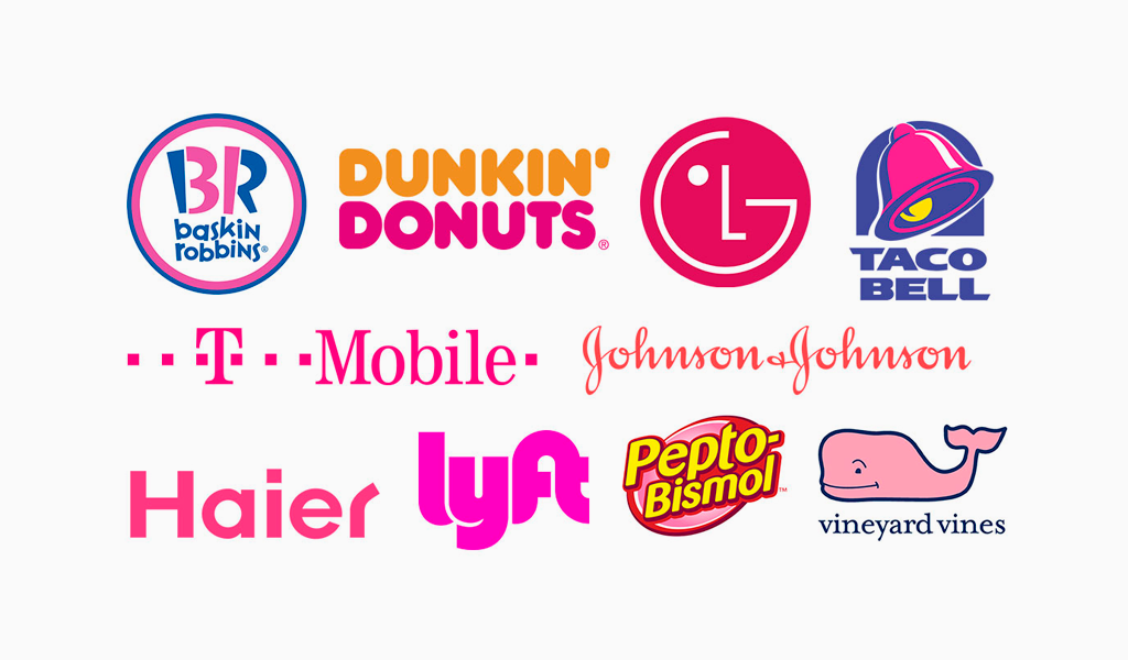
Pink signifies femininity, youthfulness, and luxury in modern branding. More versatile than primary or secondary colors, it allows for unique branding opportunities. Historically, pink represented luxury in the 17th century, but its perception evolved to be associated primarily with femininity after the 1940s.
Brands like Barbie and Victoria’s Secret use pink logos to target female audiences, evoking emotions from compassion to modernity. Pink’s alignment with themes of femininity and luxury makes it a strategic choice for brands aimed at women.
Incorporating pink into your logo creates a modern, feminine, and luxurious brand image.

Brown Logos: Ruggedness and Earthiness
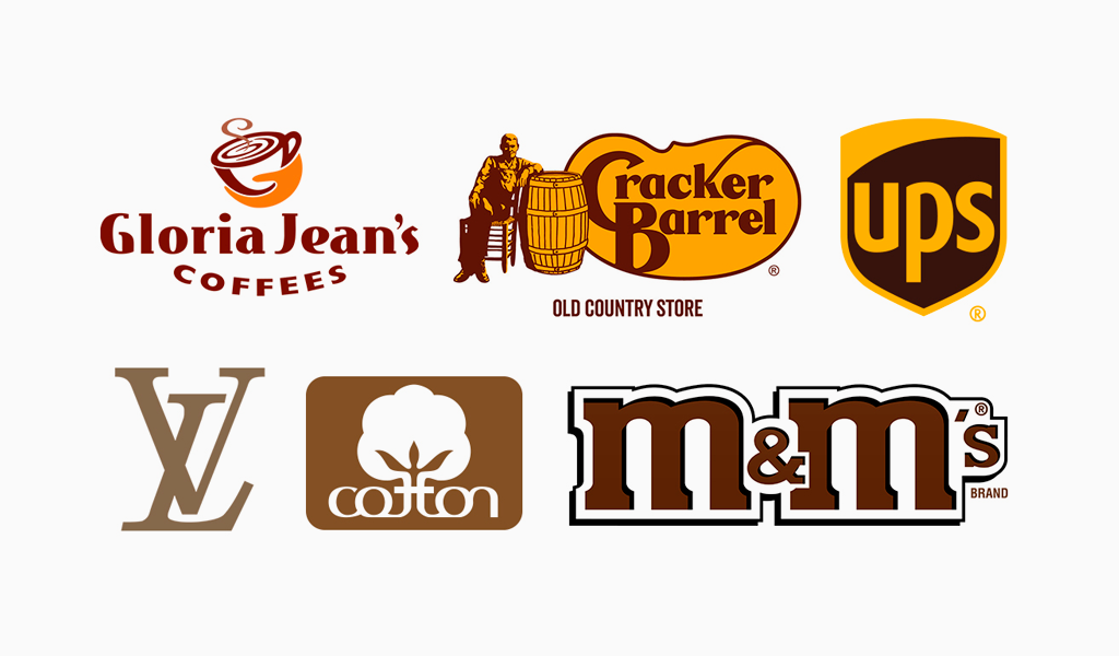
Brown symbolizes ruggedness, nature, and reliability. Brown logos convey a rugged, masculine, and severe image, ideal for brands projecting strength and durability. Despite being the least-utilized logo color, brown can make a brand stand out.
Brands like M&M’s, Lamborghini, and Dove use brown to convey a warm color, warmth, and reliability. Pairing brown with green creates an organic feel, suitable for brands focusing on natural or eco-friendly products that utilize warm colors.
Using brown in your logo creates a strong, earthy brand personality that resonates with consumers seeking authenticity and reliability.

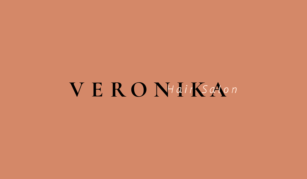

Black Logos: Sleekness and Mystery
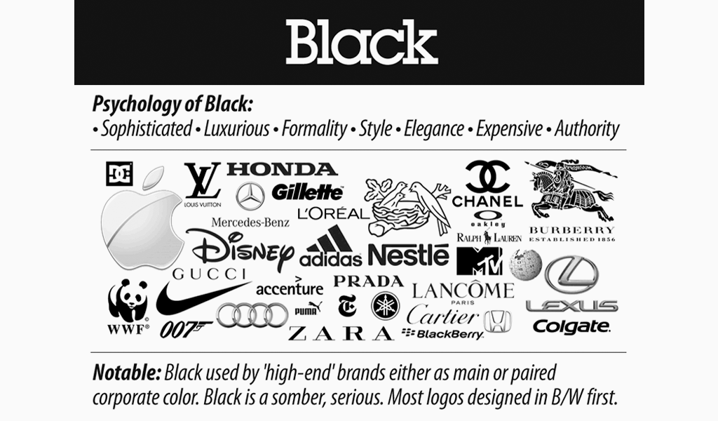
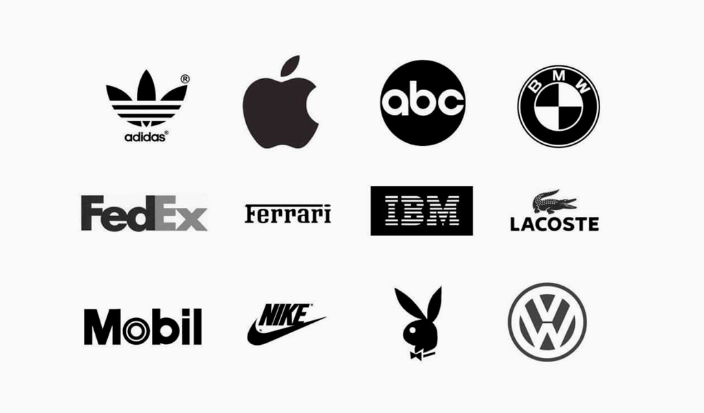
Black symbolizes power and elegance, popular in luxury branding. High-end brands like Aesop use black to emphasize a timeless, minimalist aesthetic. However, overuse may lead to perceptions of low cost or cheapness, which brands should avoid.
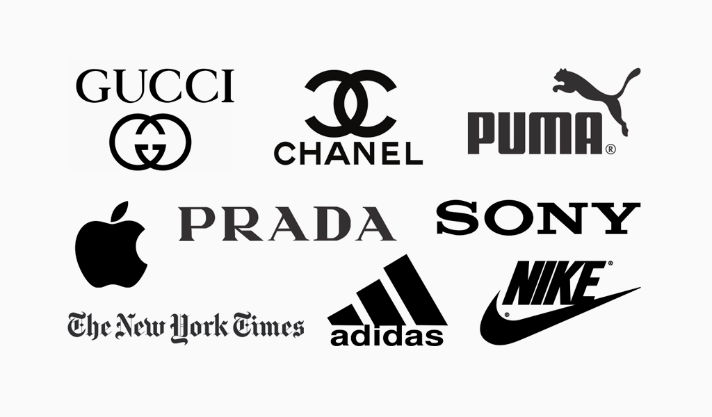
Black logos create a sleek, mysterious image, suitable for brands projecting sophistication and exclusivity. Incorporating black into your logo creates a powerful and elegant brand identity that stands out in the luxury market.




Gray Logos: Seriousness and Timelessness
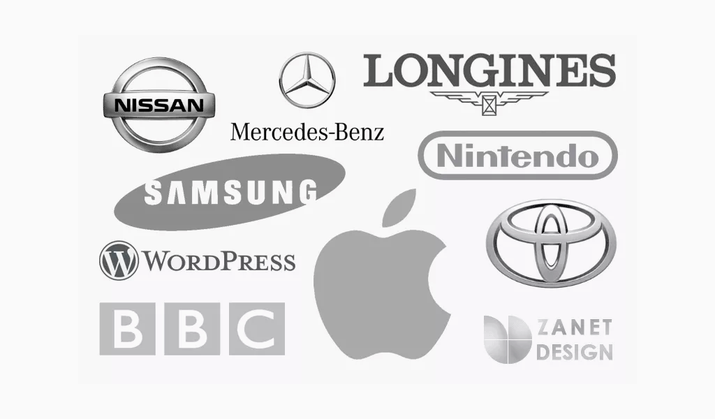
Gray signifies maturity, seriousness, and a classic feel. Gray logos convey authority, sophistication, and strength, ideal for brands projecting a refined image. Brands like Forbes and Lexus use gray logos to signify luxury and refinement.
Darker shades of gray add mystery, while lighter shades are more accessible. Gray is popular for technology and automotive brands aiming for a sleek appearance. Using gray in your logo creates a timeless brand image that exudes professionalism and sophistication.


White Logos: Purity and Cleanliness
White symbolizes neutrality, cleanliness, and purity, making it versatile for various branding applications. White logos are seen as elegant and timeless, providing a clean and weightless impression that adapts easily to different contexts. When incorporated into designs, white enhances visibility and supports effective communication through negative space.
Using white in logos can evoke feelings of calmness and creativity, making other colors appear more approachable and economical. Incorporating white in your logo creates a pure and clean brand image that stands out for its simplicity and elegance.



The Psychology Of Color In Logo Design
Color plays a crucial role in establishing a brand’s identity and effectively influences consumer perception. Consistent use of brand colors creates a memorable and recognizable appearance, enhancing brand recognition. Consumers often make decisions based on emotions rather than logic, highlighting the need for strategic color selection.
Understanding the significance of brand colors helps create a deeper connection with the target audience. Leveraging color psychology aligns your brand’s goals with the emotions and values of your audience, creating a lasting impact.
Cultural Associations of Colors
Colors have different meanings across cultures, affecting global brand perception. Cultural meanings attached to colors can vary significantly, impacting logo design in different regions. For example, in Western cultures, orange is commonly associated with lower-cost products, enhancing its appeal in budget-focused branding strategies.
When choosing colors for your brand, consider cultural connotations. Analyzing brand color options and gathering focus group feedback on emotional responses helps ensure your accent color choices resonate with your target audience and complement your accent colors.
Combining Logo Colors Effectively
An analogous color scheme consists of colors close to the primary color, creating a harmonious look. A contrasting color scheme uses complementary colors or vibrant hues to create visual interest and attract attention. Using gray in logo design is associated with a neutral color, complementing other colors.
Sources for color inspiration in branding can include competitors’ palettes, online color palette generators, and focus group feedback. Select two to three secondary colors that harmonize with the primary color to maintain brand identity, while considering the primary colors.
Combining colors effectively enhances brand visibility and creates a cohesive visual identity through a thoughtful color combination and various color combinations.
Testing Your Logo Colors
Testing your brand colors is crucial as they influence consumer behavior, helping them categorize products and make purchasing decisions. After selecting your brand colors, test them in different combinations to determine their effectiveness. Utilize tools like Contrast Checker and Colour Contrast Analyser to ensure your logo colors meet accessibility standards across platforms such as websites, social media, and marketing materials.
For example, Alpro experienced a boost in sales with small color adjustments in their branding, illustrating the effectiveness of thorough testing. By rigorously testing your logo colors, you can ensure they resonate well with your audience and effectively communicate your brand’s identity.
How to decide on a logo color
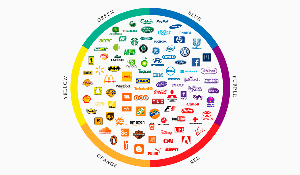
Before choosing your logo color strategy, take into consideration the message you wish your company to communicate. What exactly do you would like to emphasize? Speed, daring innovation, compassion, efficiency, intuitiveness? Knowing the values of the logo color, you can emphasize various aspects of the brand, which will allow a really good logo.
The first thing to do when choosing a color palette for a logo is to define your target group. You have probably already heard that piece of advice, but it really is important to do so.
Brand character traits that draw your target client are an essential consideration when picking logo colors. Consumers knowingly or subconsciously select products which align with their identities.
As soon as you understand exactly what you need your new identity to signify, proceed through the listing of colors above and determine that which may help you communicate the ideal message.
Choosing the logo color
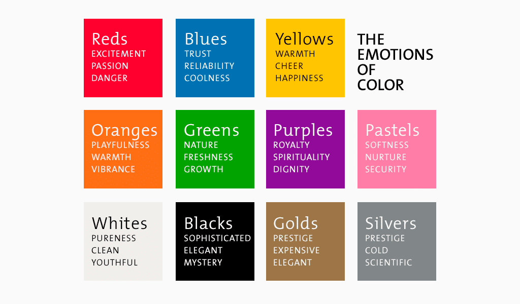
Color choices additionally give your logo thickness by minding a visual link to your organization’s values and personality. The perfect mix can visually convey the feeling your organization is casting to customers. It is recommended to choose in advance the colors of the logo design that will match the image of the company.
Everyone knows that colors affect our feelings and behavior. Yellow is upbeat and green is calming (e.g. laying down grass and looking up at lots of leaves is calm). However, do these emblem color”principles” actually imply anything in company and branding?
Researchers Lauren Labrecque and George Milne looked to that issue and discovered that several colors have a quantifiable effect on customers and others do not. So yes, yellowish will make you are new-look young and approachable, however, a green emblem does not inherently make clients believe your brand is calm.
Shine bright on the market
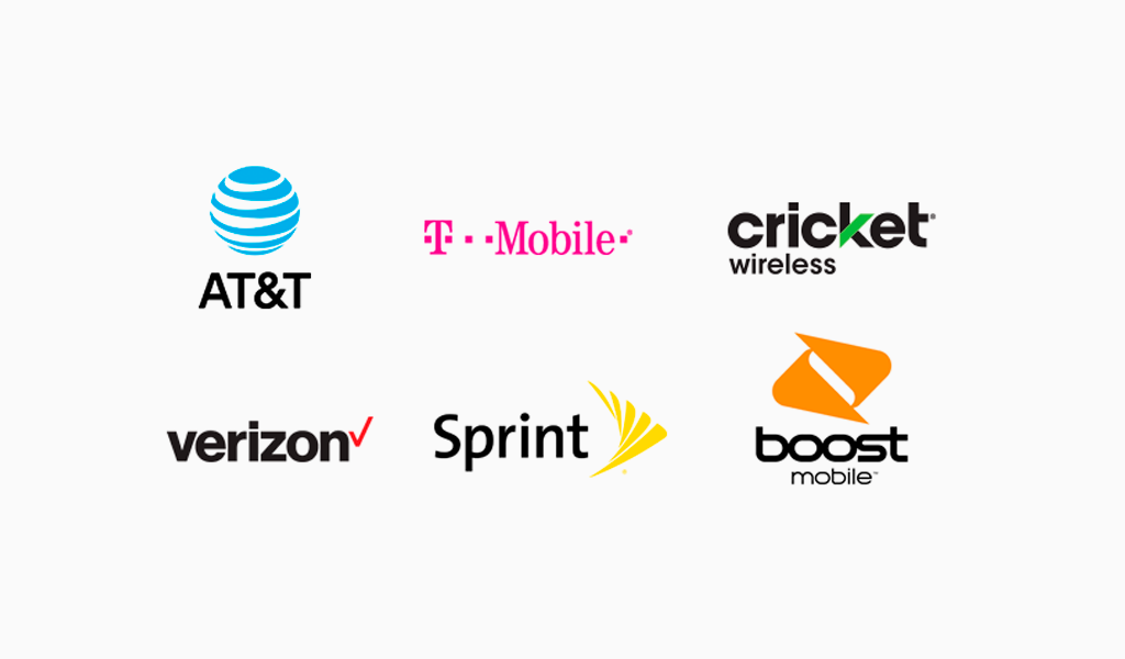
The trick to a successful emblem is trademark recognition. Therefore, if you would like to be noticed in the event, it is a fantastic idea to opt for a color palette that differs radically from those of the biggest competitors. Cell phone providers from the USA are a superb illustration of this; everyone has selected a different color for their new brand that many customers can immediately identify.
Summary
Choosing the right logo color is a strategic decision that goes beyond mere aesthetics. Each color carries specific meanings and emotions, influencing how your brand is perceived by your audience. From the passion of red to the trustworthiness of blue, understanding the psychological impact of colors can help you create a logo that resonates deeply with your target market.
In summary, a well-thought-out color choice can enhance your brand’s identity, create a lasting impression, and differentiate you from competitors. By leveraging color psychology, considering cultural connotations, and testing your logo colors thoroughly, you can craft a powerful and effective brand image. Let the colors of your logo tell your brand’s story and connect with your audience on a profound level.

SEO specialist, link builder, and blog editor at Turbologo. Writing insightful content about marketing, design, and branding. Sharing practical tips on building and promoting brands online.

