
Coca-Cola is the most popular beverage in the world. Provided the Company never was stingy of adverts, remaining in people’s minds round the clock. That is why most people would agree with the statement. It’s funny that many consider Pepsi-Cola to be a rival, though it’s not true. Both companies belong to the same investors. However, it was rather rational not to put all the eggs in one basket, promoting all the beverages under the same brand. This so-called opposition of the world’s recognizable brands has brought about even more fame!
Table of Contents
Coca-Cola logo history
So, how did it all start and how did Coca-Cola logo appear? The thing is, that all fizzy drinks are related to Jacob Schweppes. Remember Schweppes drink? Nevertheless, we are talking about Coca-Cola logo history, not him though. Regardless of the fact, that humanity has long-before-invented sweet drinks, Cola was invented much later in 1866, in a small basin in Pemberton’s backyard, who was a pharmacologist back then. His friend, Frank Robinson, who was an accountant, sampled it and proposed the name – “Coca-Cola”. The initial logo was nothing special, just a simple machine-typed inscription, but soon Frank gave it a try and came up with a unique, stylized type for the brand. And so, an ordinary accountant became the one who designed the Coca-Cola logo, a brand that will outlast its creator and become part of 21-century culture.
Success of the sweet carbonated drink broke out a bit later, at the end of the 19th century. Though the meaning of Coca-Cola logo was quite simple, it soon became popular thanks to Aza Kendler, who bought the recipe from Pemberton’s widow and set up an odd marketing campaign. Aza spammed free cola coupons, as well as nice souvenirs depicting Coca-Cola brand. The advert was a success and people were longing for more of this «Delicious and Refreshing» drink.
The first Coca-Cola script logo was created by Frank M Robinson in 1893.
Coca-Cola Logo Meaning
The Coca-cola logotype consist of the name and two colors’ mix against the background. Color schema include white and red colors, which have a particular meaning. Red color means strength, passion, love and energy. White color – purity, youth, nobility.
Ever noticeable logo
Despite the lack of dramatic changes in the last few years the brand was still changing and accumulated new details. As we know, logo isn’t just a colorful symbol on a package. The package itself can be a famous symbol. There was an important thing in the history of Coca-Cola logo – a special, shaped bottle that became part of registered trademark. Coca-Cola created it in 1915 and the shaped bottle became well known worldwide. Up until now, the rightholders watch it carefully, so that no one would use the same shape, as the 5-pointed bottle bottom has become a quality mark.
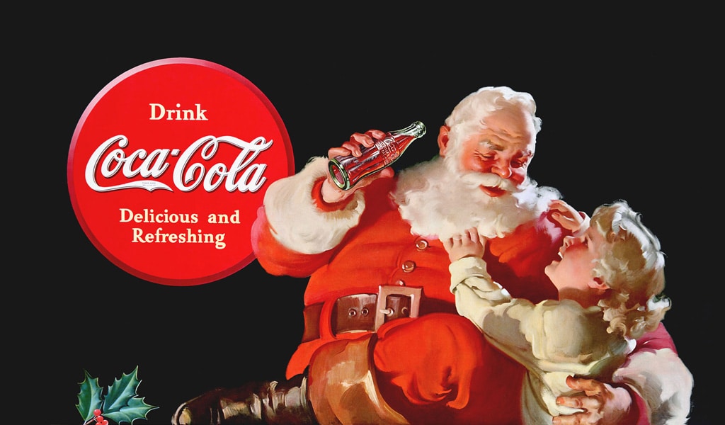
The most successful and effective move was perhaps not only using Coca-Cola logo on sport competitions and championships. Coca-Cola managed to cooperate with modern kid’s major magician – Santa Claus. You can instantly remember the bell ringing, short melody and a kindhearted, red-cheeked old man, gulping fairy, sweet drink, can’t you? All the kids know, what Santa drinks.
One of Coca-Cola’s logo secretes is that they never grudge adverts. Numerous fridges, decorated with a bright logo, beach café umbrellas, all of it reminds us of buying some «Delicious and Refreshing» drink. And quite often, the company provides such fridges for free, as long as there is Coca-Cola inside.
Coca-Cola logo font
Coca-cola logo use Gotham font family in its lettering.
Coca-Cola logo evolution – marketing experiments
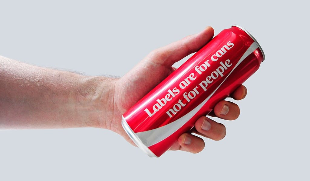
Coca-Cola is bold with experiments. They feel certain of their logo so they can make it disappear! The company attentively follows everything that happens in the world. For example, there are many various nations in the Near East and neighbors often treat each other in disrespectful to their origins ways. Cola-Cola decided to remind everyone that a world without various origins is a world without a difference at all, that all people differ but a bit. It is especially for those countries Coca-Cola removed its labels during celebrations, instead of which there were only a white stripe and an inscription «labels are for cans, not for people».
Coca-Cola and WWF
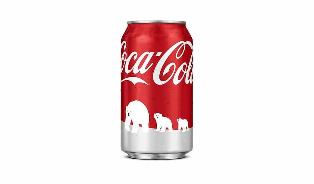
Here is another example. In countries where there are ecology and polar bear preserving problems, a limited edition of white collection Coca-Cola cans were manufactured. Coca-Cola has used the polar bear image in its adverts and souvenirs, and now the time has come to pay them some real attention. In the end, the company has attracted many funds to WWF.
Share a Coke
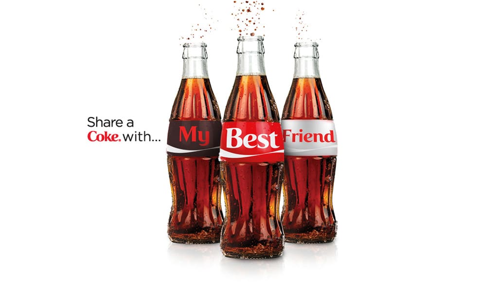
In case these marketing campaigns weren’t as famous, you are sure to know about “Share a Coke”. Logo on a can has been changed to a name. Just who is that man, worthy enough to be mentioned on a can of popular drink? Those are all of us. Numerous names have been printed on cans and that urged interest and a desire to get your own Coca-Cola. A huge activity, which has brought another success to the company.
Impressive, isn’t it? Not just every company can play with its logo like this, thus Coca-Cola brand is as powerful to afford it. There was numerous carbonated drinks on market since 19th century, but none of them can boast such popularity as Coca-Cola. Think of it, perhaps an interesting logo wasn’t the last thing to cater to such a success?
The name and the first Coca-Cola logo (this is the inscription in capital letters), was developed by Frank Robinson, who worked as an accountant in the company.
Haddon Sundblom – it was this artist who drew Santa Claus, who is still popular and associated with Coca-Cola nonsense.
Thanks to a competent approach to advertising, Coca Cola is associated with a holiday, happiness. Looking at a bottle or a jar with this drink, we immediately want to eat. The red color was not chosen for nothing, because they immediately arouse a person’s passion, desire. There are also quite a few slogans of this brand that cause a desire to buy a drink.
Initially, many people think that the red color was chosen precisely because the painted Santa Claus was wearing a red fur coat with white stripes and holding a bottle of Coca Cola. But the archivist of the company denied this and told another version. More than 130 years ago, Coca-Cola was supplied in barrels, and alcohol was also supplied. But in order to make a difference between them and there were no problems at customs, barrels of Coca-Cola began to turn red. The red color has already become a tradition and an association with Coca-Cola. Hence it came about that the logo is red.
In general, the creation of the logo belongs to Frank Robinson, it was he who thought that two capital letters “C” would look advantageous. For many years, the logo has changed, then the font, then the background, then with a bottle of soda, and much more. The last change was in 2015, in honor of the 100th anniversary of the glass bottle. It was this logo that was invented by the talented designer Earl R. Dean. As for the Christmas (New Year’s) logo, Santa Claus was depicted by the artist Haddon Sundblom.

SEO specialist, link builder, and blog editor at Turbologo. Writing insightful content about marketing, design, and branding. Sharing practical tips on building and promoting brands online.


