The friend’s sitcom is considered one of the best shows on American TV. You could call it an aging icon really, as it was one of the major elements of 90s culture. One might imply that the first episode has been shot but a few days ago. However, it was a long time since the first season was on the air.
Friends Logo History
The first series was shown on the NBC channel in 1994, in the same year the logotype was designed by Deborah Naysee and since this time it has never been changed. It was this year that people all around the world began to watch the story of six friends trying to get settled. The series ended about 10 years ago, but google still shows search results for “the friends” on top. We all love the series and that is why this article is about the friend’s logo and its peculiarities.
Create your own logo with Turbologo logo maker. It takes less than 5 minutes and no design skills needed.
Go to Logo MakerFriends Logo Font – A symbol of an age
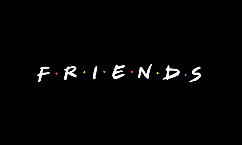
Deborah Nayee is the one who designed the logo. And nothing reminds me of the 90s better than that inscription in the friend’s logo. Modern companies choose clear types. And most series can boast expensive and cool looking logos nowadays. But the friends have soft and brief handwriting for a logo and the word itself is a more endearing one. It looks cozy or even homemade. And is just what the designers were aiming for.
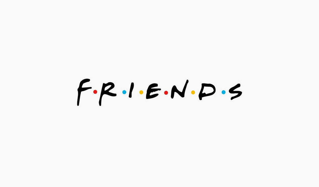
So, what is the type of TV show logo? It is actually a special font called “Gabriel Weiss’ Friends”. Many exclusive clothes manufacturers often use the font to design unique t-shirts with “The Friends” inscription. They sometimes change the inscription, but the font still remains. That is why the lettering is still popular.
Secret meaning of dots in the Friends tv show logo
Series fans kept asking themselves about the meaning of colorful dots between the letters of the series logo. Some were saying it was an acronym. However, any phrase didn’t quite do the trick. And nobody could tell that for sure until now. It is 25 years after the beginning of the sitcom that we finally reveal the truth.
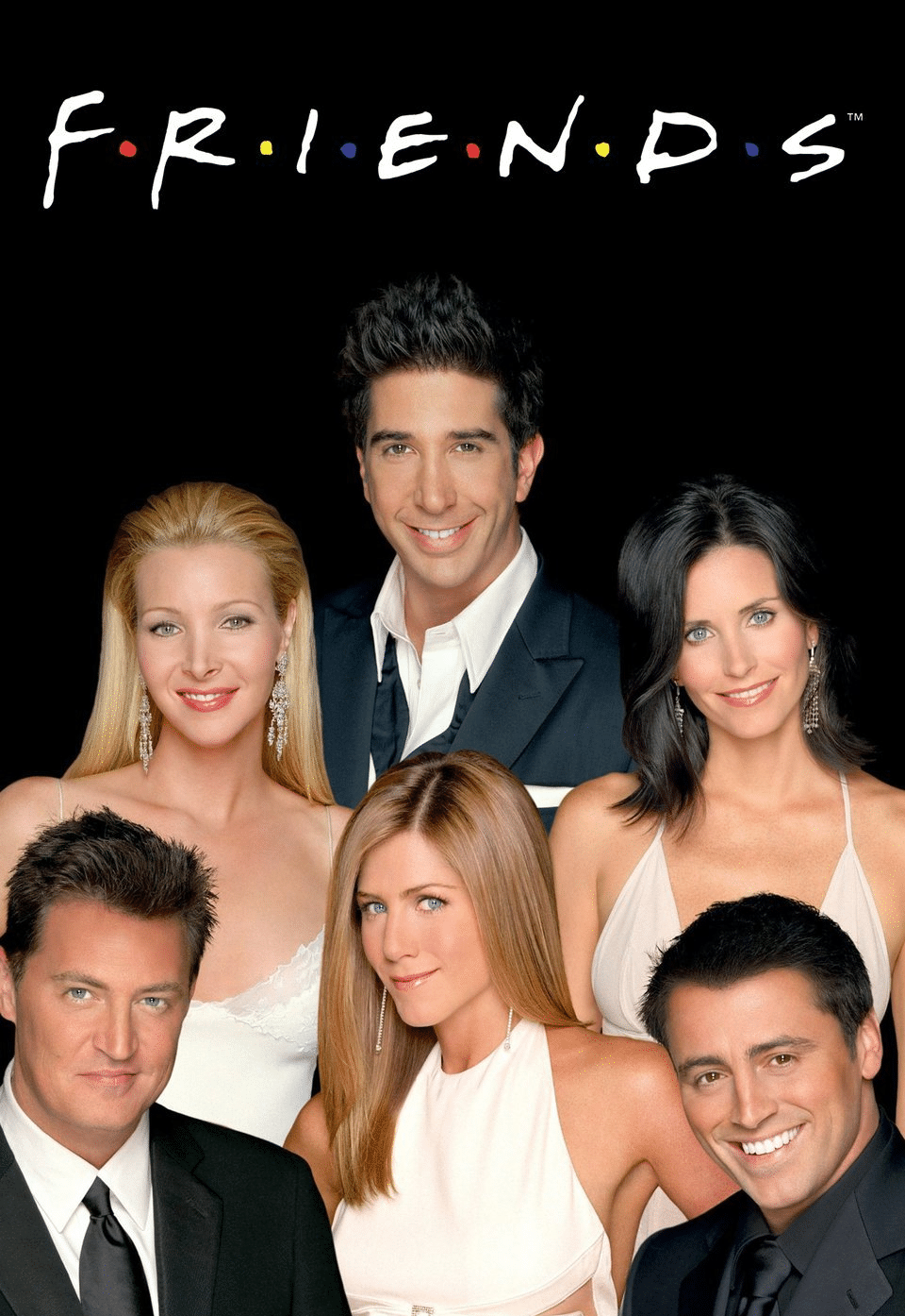
The series creators announced that it was but a stylistic solution.This dots’ composition symbolizes the number of the main characters – six friends.The colorful dots make the logo more friendly, pleasant and memorable. It is not just another word typed in black letters anymore. It is actually a bright and attractive logo. And there also is a tiny hint if you look closer. The colors of the dots correspond to the colors of umbrellas that characters put up in the series intro.
Friends font, with Regular font. Examples of this font can be found on AZFonts. The Friends font supports: English, Italian, German, Polish, French.
The logo was created by talented designer Deborah Nighy. On the one hand, a simple, but so elegant logo, brought great popularity to the show.
Of course the logo is copyrighted. Warner Brothers owns the copyright, anyone who wants to use the work will have to discuss all the nuances, otherwise litigation cannot be avoided.
The Friends logo looks elegant today as well. This is a black inscription on a white background, and there are bright dots between the letters.
Blog editor and content marketing specialist at Turbologo. Writing about Marketing and design. Victoria’s articles contain useful tips on how to build a brand and promote it online.

