
Do you remember what team is the oldest in football association? There is quite an amount of veterans, like Pittsburgh Steelers, who possess many unique features. And they have won most of titles too. The Steelers took part in Super Bowl cup for 8 times, and 6 times they were victorious. Only they are allowed to draw their starry logo on only one side of helmets. But why is the beloved logo such an exception? What is so special about it? How was it created? We’ll start with the most interesting parts of it and tell you everything in this article.
Table of Contents
Steelers logo History – Origin of Pittsburgh Steelers
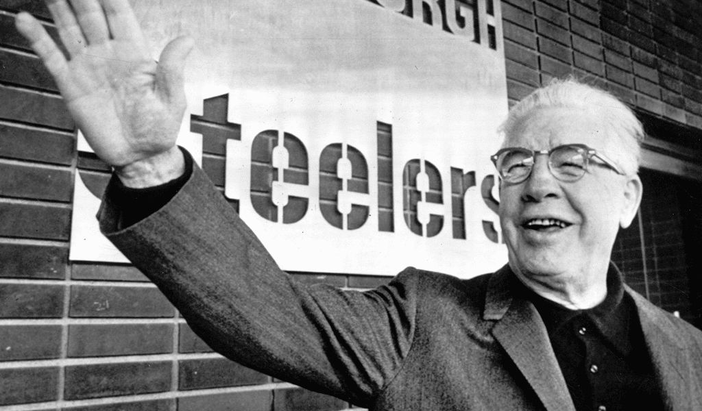
The team was founded in 1933 thanks to Arthur Rooney. It was he who brought together first members of the famous team as he valued sports more than his own life. The initial name, however, was Pittsburgh Pirates. The first design inspiration for creation of the team unique uniform was Pittsburgh flag and its colors. Main colors were black, yellow and some inclusions of blue and white. It is hard to tell whether it was the team’s name or 30s in America were unlucky in general, but after a sequence of failures the name was altered. It was in 1945 when some other names were also altered the final variation called “Pittsburgh Steelers” was approved.
One of the funniest moments in the team’s history is Rooney’s utterance which he issued after another image alteration. The team was training when reporters were shooting it and Rooney said ironically “They look like the Steelers to me – in green jerseys.” And the utterance quickly became a symbol of unsuccessful efforts. And then the phrase even turned into a cheer. When the team was losing fans used to shout “Same old Steelers”. As we can see, even the most attractive logo can’t change the core of what it represents.
Steelers logo meaning
The team image making begins with resorting to symbols of the city. Pittsburg is well known for its steel industry and that is why the team is named “Steelers”. And the team used to wear the city’s colors. And the colors weren’t picked just by chance. Black and yellow symbolize two essential elements for making steel which are iron ore and coal.
Pittsburgh Steelers initial logo was nothing but a depiction of fabrics and factories. However, American Iron and Steel Institute emblem was chosen to replace the previous one. The Institute emblem was altered a bit and it turned into a circle with three stars and “Steelers” word inside of it. Yellow color symbolizes coal, blue stands for steel and red means iron.
Steelers logo evolution
So, one thing begets another here. That’s why the Steeler’s charm is called Steely McBeam. It is clear that a factory worker is meant and “Mc” prefix symbolizes Arthur Rooney’s Irish origins. And “Beam” surname is related to Pittsburgh steel beams.
Privileges for Steelers’ logo
The funny twist is that the team draws its logo only on right side of their helmets. But why is it so? If we look back to past we’ll see that branding rules weren’t as strict as they are today. Dan Rooney, the team’s founder’s son, has simply drawn it there. And then he just didn’t allow to question his decision as it is this helmet design that brought a succession of victories to the team. Well, this is pretty much the story behind the placement of the logo on Pittsburg Steelers helmets!
Steelers logo font
Steelers logo is featured a Gunplay font from Typodermic Fonts family.

SEO specialist, link builder, and blog editor at Turbologo. Writing insightful content about marketing, design, and branding. Sharing practical tips on building and promoting brands online.


