
Have you ever used something awkward, cursing and damning it, and dreaming of inventing something truly sophisticated? In most cases, you just keep using that terrible item, but sometimes such dreams lead to fundamental inventions, which then change the world. So, once upon a time, some guy falls from a horse, hurting him badly and then made a decision to give the world more convenient and safe transport. It was Henry Ford and his dream came true. How did found his company and what role did it play in his story of success? Let’s find out!
Table of Contents
A story of success beginning
Initially, Henry simply kept failing, but he was trying hard. His first enterprise was founded in 1903; he was developing one model after the other, hoping to begin manufacturing them, which would mean he has finally entered a car market. However, a breakthrough took place only in 1911.
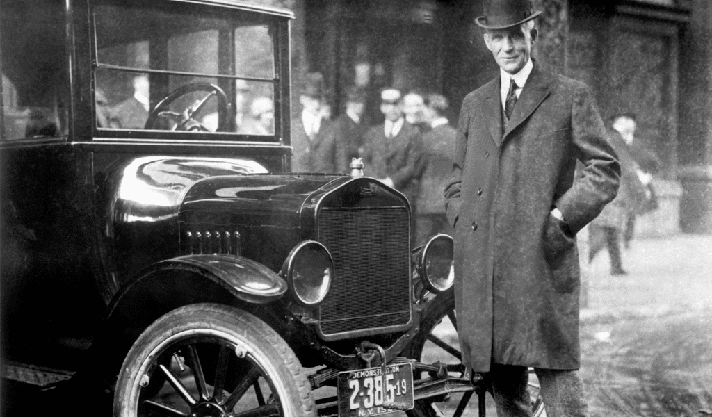
Little by little, Henry Ford’s oldest dream finally came to being. It was the first mass-market car, a model “T”, or as it was blandly called “Tin Lizzie”. It became the most famous car in the car industry. It cost only 260 dollars, which was quite affordable. It took but a year for the car to flood the mass market, as 11.000 of “Tin Lizzies” were sold. It was a turning point for the whole world back then. Horses finally became obsolete, and you could fall and break something no more. However, they will play their final role when the time will come to design a logo and draw emblems.
First Ford logo history
Ford logo history started with a rather common, art nouveau style logo in 1903. Black and white curlicues seemed to come out of silent pictures. There wasn’t anything special about it, so the old ford logo was removed soon.
The emblem evolution
The original version was changed by a “Ford” signature, and like any other signature, it struck speed and velocity into the hearts of customers, expressed by stressed “F” and “D” letters. But then, in 1912 the inscription was mixed with a bird figure, and so the logo turned into a bluebird.
The signature was devoid of changes, while the bird logo was altered once again; it became even faster and aggressively looking. Wings, drawn with clear and legible lines, were striving onwards no matter what. However, this ford logo was denied by Henry himself. He didn’t like it. The was accepted fast and removed fast. The time had come to search for a new idea.
Ford Logo Meaning
Ford emblem is an oval figure, which was designed with mix of two colors – blue and white. Blue color symbolizes strength, grace and excellence of the company and its products, while white color reflects company’s purity, elegance and nobility.
Ford Logo Font
The current Ford logotype was released in 2003 in honor of the 100 years birthday and is called “Centennial Blue Oval”. The word “Ford” use the font similar to FordScript.
How was the ford logo drawn
An oval it was, and the oval it is. Yes, that very one which is now popular, became that a long time ago; and it happened really quick we must say. Contemporary designers might deem it to be too trivial and ordinary, but given the time period, it was one of the best options possible. Actually, it hasn’t changed much since then. Ford logo history evolution reveals that a good logo has its uses for at least a century or so. It can be altered a bit, a few changes would never hurt, but the logo basis remains.
The blue oval and speedy, exquisite signature resemble the company’s success, they both never change. Ford Focus has become one of the major hit in the past decades and enabled the company leadership in the field of car export from the USA. The car is loved for its quality, comfort and accessibility. Henry Ford was always striving for it.
Ford Mustang emblem history
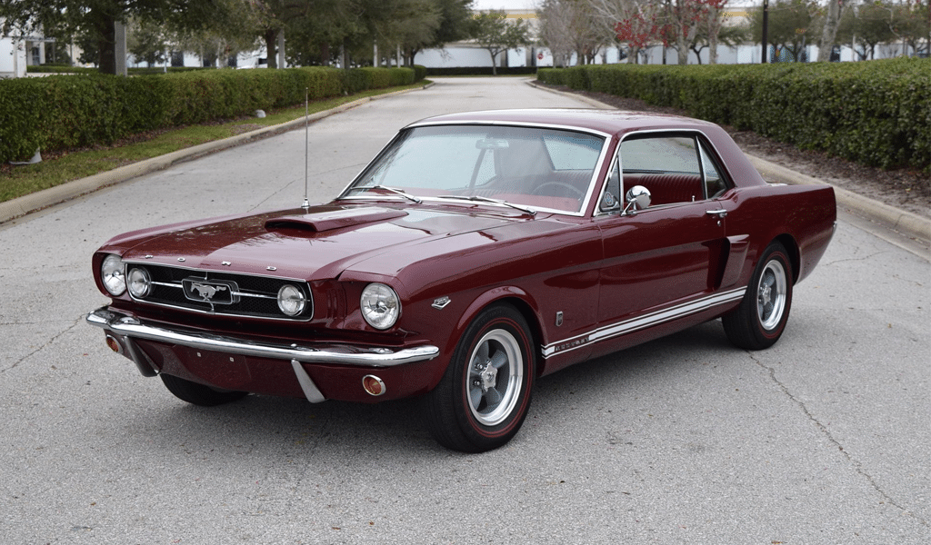
Only a selected few cars have the honor of having its own, unique logo. Ford Mustang is one of those. It is funny that initially, its nickname had nothing in common with that fast and powerful racer. The car was called cougar while being developed, and its final nickname comes from the interior of the car, which resembled one of a P-51 Mustang fighter.
Another curious detail is rooted in another mistake. As a rule, all the movement in logos is directed from left to right. We sign that way, we read that way, and from a psychological point of view, the future also comes from left to right. Consequently, the steed should have run from left to right. It is pleasant to the eye they say. However, molds were confused on a foundry and Ford Mustang drove left. What’s more, the company perceived no wrongdoing here. They stated that mustang is a wild horse and it races freely wherever it pleases. It is a perfect example of turning the odds!

SEO specialist, link builder, and blog editor at Turbologo. Writing insightful content about marketing, design, and branding. Sharing practical tips on building and promoting brands online.


