
The history of the McDonald’s logo started in 1940 as a restaurant opened in San Bernardino, CA. Initially, a barbecue drive-in, it was restyled into a hamburger stand which later grew into a franchise. The initially modest startup grew to become the world’s largest restaurant chain by revenue.
The McDonald brothers introduced the Golden Arches logo in 1953 at an outlet in Arizona. There is a fascinating history behind the trademark. Originally, a single yellow arch was used as an architectural element of McDonald’s outlets. Only much later, already in the 60s, a double-arched “M”, initially overlapped, was introduced, in obvious reference to the name of the business.
Ray Kroc had joined the company as a franchise manager, but eventually went so far as to purchase the chain from the brothers for some $2.5 million. At the helm of the company, Ray introduced some major innovations, starting from architectural redesign to branding improvements.
As the business grew, so did the logo. The golden arches were complemented with a slanting line across them symbolizing the roof of an outlet. Two colors dominated the emblem: red and golden.
When Kroc became the owner in 1961, he filed an application to register a new logo, described as “an overlapping, double-arched ‘M’ symbol”. It should be noted that the double-arched logo changed its form several times and in its current version has existed only since 1968.
Table of Contents
McDonald Logo Meaning – Globalization Symbol Or Part Of The Architecture?
No one will argue that McDonald’s and its logo are symbols of globalization and the American Way. The global footprint of the company is currently around 120 countries, with over 37000 outlets in operation. The chain operates mainly through franchisees dispersed around the globe. There is even a special “Big Mac Index”, used to compare the cost of a Big Mac (McDonald’s major menu item developed by a franchisee in around 1967) in various countries in the world, the highest being in Switzerland and the lowest in India. There is also a theory, proven wrong at least a few times though, that ‘no country with a McDonald’s has ever gone to war with another’.
Some people say that The McDonald’s emblem symbolizes the golden arches that were the base of the newly-crafted architecture of the first franchised restaurant in 1952. These two arches were unified by Ray Kroc in 1961 and the new McDonald’s logo was created, it looked like the letter “M”.
Logo Font
McDonald’s brand use the font similar to Helvetica Neue Black, this font belongs to premium font family.
In Mass Media
Being an integral part of the American lifestyle, McDonald’s brand could not but become household name. McDrive, McCafe, McExpress are all familiar names to every American. The global cultural presence has been achieved by such items as Big Mac, McCombo, Happy Meal, to name a few.
We see McDonald’s logo in TV commercials, and in action movies, it is truly ubiquitous. Many pop stars and celebrities have advertised McDonald’s brand.
You see McDonald’s everywhere in America. And it’s not just the innumerous outlets themselves. People pass highway billboards in their cars, the Golden Arches facilities are visible from far away, and its TV commercials are on everybody’s blue screen a t least a dozen times a day.
The “Happy Meal” commercials are characteristic in that by joining fast food and toys they attract children like nothing else, causing them to literally rush to the nearest joint in pursuit of instant gratification. The moral is this: they work. And it leads us to a simple formula for success: an easy-to-remember tune plus a highly visible and simplistic logo give an amazing brand.
To uphold its highly performing brand, McDonald’s pays for advertising through the nose. In US alone, its restaurants spend $5.8 billion. Somebody calculated that it is equivalent to every 6th dollar spent on advertising in the whole of the United States! One wonders if the brand would survive on the power of its logo alone.
When Service Gets Speed
If somebody has an acute toothache due to periodontitis (who experienced it knows what’s it like!) or other reason, who do you think he turns to the first thing? Correct, emergency dental care.
And where needs a person turn to if it’s been a while since his last square meal? A neat and comfortable place serving food real fast, of course!
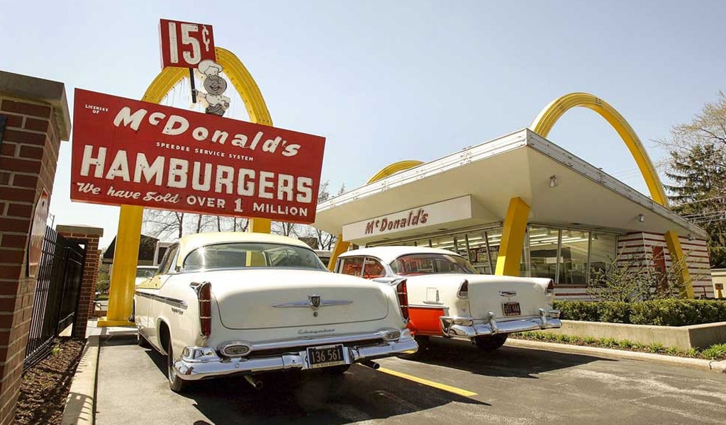
To emphasize their dedication to fast service, one of the first McDonald’s logos (before the Golden Arches era!) had the image of Speedee, a winking chef with a head shaped like a hamburger. The mascot symbolized the frivolously easy way of delivering service at the outlet it decorated.
To turn their restaurants into fast service powerhouses, the McDonald brothers had made a number of drastic changes to their original operations. The business had been revolutionized in many aspects, but the key one was to use the principles of production line manufacture for fast food. Originally, the brothers’ was a barbecue drive-in. They completely rethought their menu, deciding to focus on hamburgers and French fries. All the changes were aimed at filling the customer’s orders as quickly as possible.
McDonald’s Logo evolution – The Golden Arches & other versions
The McDonald’s did not always have the Golden Arches on its logo. The aforementioned Speedee gave way to the Golden Arches only in 1962. The arches were overlapping then, being reminiscent of the letter “M” only at a certain angle of vision. They were also complete arches, that is, going with all their legs all the way to the baseline, not like the 2006 version where semi-swooshes were introduced.
Prior to 1968, the logo combined the architecture of the building, as represented by a slanting crossbar, with the overlapping “M” as in McDonald’s. This logo was approved by Ray Kroc himself.
Between 1968 and 1968 though, a new redesign awaited the logo. The new logo had no crossbar any more and the arches were moved relative to each other, so that their two legs were slightly raised and joined to form an unequivocal letter “M”. This designer’s move went on to live till present days.
At any rate, starting from the initial architectural element, a single arch, the logo has evolved to one of the most recognized brands in the world. A fascinating story!
Today’s stylized ‘M’ look of the arches appears complete: Man at the top of an evolution ladder. One can argue about the nutritional value of the McDonald’s products, but no one ever doubted that in terms of business it was absolutely a whiz kid.
The Golden Arches now symbolize success in almost every household, not only in the US, but across the world.
I’m lovin’ It, You Should Too
As we saw above, the history of the McDonald’s logo saw quite a number of revisions, especially from the end of 1960s to the early 2000s.
A major one is without doubt the “I’m lovin’ it” campaign of the summer of 2003.
Many experts find the said initiative one of the most prominent in McDonald’s history. Indeed, the slogan “I’m lovin’ it” has gained unprecedented popularity worldwide. The campaign did not do without a redesigned logo. It was probably a tribute to the 3D animation times to have the Golden Arches embossed and throwing a shadow on the background.
What Can We Expect of McDonald’s Logo in the Future?
Let’s face it: the success story of McDonald’s logo is an inspiration for generations to come.
In view of new preferences and values of the past generations and the expanding and diversifying fast-food franchises, we have seen a new way people started to eat out.
A growing variety of catering facilities, on the one hand, and the rising prosperity in Western societies, on the other, resulted in the fact that people are trying to find the best dining place at the best price.
Will the current McDonald’s brand made widely known by its logo stand the test of time in the changing world?
That we shall see.
Arguably, one of the most successful popular icons in recent history, McDonald’s logo looks elegant and striking, be it on a neon sign, poster or a LCD screen. Once seen, it is imprinted in memory for the longest time. And, in an urban landscape, the vividly colored and inviting logo is not easy to miss.
With all that, the logo’s design is nothing too sophisticated.
The elusive secret of the logo lies probably in its perfect marriage of colors, shapes, and simplicity. One thing that we can be certain is, while the potential of the logo is still enormous, the challenges looming in the future are very likely to call for further alterations to its current design.
Jim Schindler designed McDonald’s logo in 1962, when he was hired to make it more corporate. He sketched 2 arches, and combined them together, they can also be read as “M”. Now this logo is recognizable in the whole world.
McDonald’s logo is yellow because this colour is associated with happiness. It can be easily seen during day and night. And according to psychologists combination of yellow and red causes an increased appetite.
The golden arches symbolize the idea that owning a McDonalds franchise is like having a gold mine. In addition, golden arches represent the gateway to a successful business.
McDonald’s logo is so successful because of these three factors: shape, color, and typeface. The shape “M”, the golden arches is known all over the world. Colors red and yellow are eye-catching to every age. Starting from children, who associate these colors with toys. And ending on commuters who are looking for something good and fast to eat. The typeface “M” is very easy to read. The simpler the logo, the more attractive it is.
“I’m loving it” – this is the slogan of McDonald’s right now. It is bean its slogan since 2003. And it makes it the longest slogan that hasn’t been changed.

SEO specialist, link builder, and blog editor at Turbologo. Writing insightful content about marketing, design, and branding. Sharing practical tips on building and promoting brands online.


