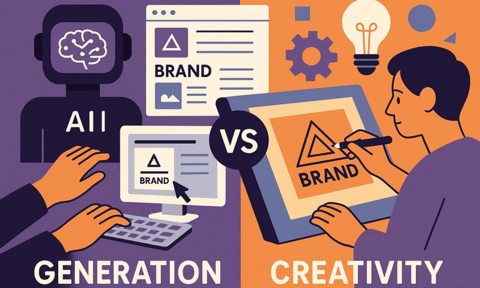
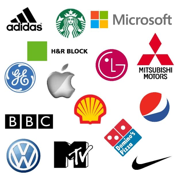
All the famous companies’ logos, such as McDonald’s, Apple or Adidas seem to be rather simple but that’s not actually true. Not just any person is able to draw a Nike swoosh or an apple like that. The thing is that color compatibility is nothing but a complicated feature. Despite the fact that people tend to cheapen professional designers’ labor, we still managed to write a whole new article on the best color combinations for logos.
Our brains are greatly affected by colors. They can convey emotions and feelings even better than words. While creating logo color combinations, you should be really careful since the colors (and feelings that people get from them) are going to be associated with your brand.
Keeping this in mind, you need to think about what colors work best together and what ideas you want to get through to the audience. The result should be simple and easy to keep in memory. Don’t use more than three colors. Stick to two colors if possible or choose black or white as the third one.
We’ve put together some of the nicest logo color combinations with a pinch of science. Use color combination psychology to find your inspiration. Let’s get started!
Table of Contents
Professional design approach history
If we look a few thousand years back, we’ll find out that there were significantly fewer color names in the past. For example, white and blue, green and blue or all three of them were considered to be the same color in ancient Greece. The lack of blue can be perceived in ancient religious books like New Testament or Torah. They still confuse blue and green in Japan as they tell young leaves to be bright blue.
Many people in Russia, especially those far from fashion, just asking themselves whether there is a difference between magenta, lilac and violet colors. So, what’s there difference one might ask. Indeed, a narrow-minded person is sure to say that it is but a worthless designers’ trick. And he would be no different from ancient Greek in that case. A narrow mind is going to have a tough time creating the best logo color combination. First of all, combining blue and green in the logo is rather debatable, to say the least. As you might already have understood, the colors make no contrast as they simply form a dull blur.
Best Logo Color Combinations
Yellow & purple
Think about what your brand is about. Do you want it to convey smartness and wisdom? A full of energy and optimism yellow and a deep purple will give your logo a bit of strictness and creativity. The complementary color combination is often used in the education and catering business. So if you’ve got a school or an elegant restaurant, that’s your color combination.
Blue & orange
Here is another complementary combination to give your brand power. This one is widely used in the technological field and banking as well. Orange and blue colors are the best color combination to excite people while building trust between your brand and your audience.
Black & orange
In case you want something stronger, try using black & orange. This color pairing features an optimistic orange combined with a grounded and professional black. If you’re a moviemaker or a musician, don’t pass by the trustworthy combination.
Green & yellow
If your brand is connected to nature, there’s nothing better than a green and yellow combination. The pairing brings energy and optimism to a logo while being very calming. So, if your industry is cleaning, agriculture or anything connected to the environment, it’s your choice.
Pink & blue
When you feel a creative urge, the blue and pink colors are your best companions. The two colors can help you build a professional look while remaining friendly and warm. The contract would perfectly fit the blogging or beauty industries.
Blue & white
Blue and white color combination can be suitable for any field. It conveys a feeling of trust and comfort. If you want your brand to be pleasing to the crowds, then the mix of the morning sky and the pure white color can easily help to communicate it to the audience.
Turquoise & blue
Here we are: one more combination showing confidence and trust. The colors are quite alike yet not the same which allows them to create quite a contrasting combination. If you want to add some accents, use the proven alliance with some white.
Red & yellow
This striking color blend attracts your eye to the logo center. The dynamic red makes the brand name stand out, the shade of yellow adds a feeling of vitality and energy.
Yellow & black
If you want something even more outstanding, draw your attention to the nearly black dark-gray shade in combination with yellow. This one is full of intriguing tones and widely used in the entertainment field, for example, in the clubbing industry.
Pink & purple
This pairing is for those who are in search of something crazy. Aspiration, ambition, and love. If your brand is a part of a creative field, feel free to use bright pink and a mature dark purple to create a design for a blog or a beauty brand logo.
Green & blue
The colors are often connected with serenity and calmness, however, depending on the tone, they can change into an energetic and full of vitality duet. The lime green and electric blue would make a perfect color combination for fashion or media.
Purple & orange
It can be like playing with fire when you choose to work with new color combinations. Orange and purple build a very rare combination in design yet they can play out well as a rich, warm and quite extraordinary pairing. Think about using this combination for a fashion or beauty logo design as well as home decoration or furnishing ones.
Black & red
This ambitious and bold logo color is for those who are not afraid to show off a bit. The powerful contrast makes a brand name stand out. The intensity of red is well accompanied by the soothing black background.
How to choose the right logo color combination
Contrasting
The best that there is in nature around us is contrasting. Things like bright and dark, still and relentless, gentle and savage truly catch the eye. The principle is also manifested in color combinations. Bright red matches green, while red and orange actually contradict turquoise. Such combinations are extremely popular and profitable provided you have selected the proper shades. It would be awful otherwise.
Close colors
You can use close, neighboring colors to create professional logo color combinations, for example, yellow and green or red and violet. But you still have to endow your logo with something more than just compatible colors.
Triads
You can create steady and reliable combinations of three colors which won’t fit if the two of them are used. A good example here is a combination of coral, purple and blue. However, matching three colors at the same time is not that easy as one might think it is.
Pay attention to color psychology while creating a logo style. We notice colors subconsciously and they can play with our mood. Be careful with color choices but also don’t forget to be daring. Colors can tell stories better than words. If you need more inspiration or insights check our these ( прикрепить статьи можно) articles or start creating your logo for free.
I’m a product and graphic designer with 10-years background. Writing about branding, logo creation and business.