
Logo is a graphic image used by commercial organizations to attract customers’ attention. Any company tries to create its unique sign, but, unfortunately, not all of them do it successfully. The famous half-eaten apple, logo of the world’s largest producer of computers, phones and software, is in the top 5 most recognizable emblems in the world. The history of Apple logo shows how many changes it has undergone.
Table of Contents
Apple Logo history
April 1, 1976, is the official date when Apple was established. There were three founders: Steve Jobs, Ronald Wayne and Steve Wozniak. These three friends who managed to build a PC with MOS Technology 6502 processor and sell several prototypes got funding and registered their firm.
The First Apple Logos: From Newton’s Sketch to a Simple Bite
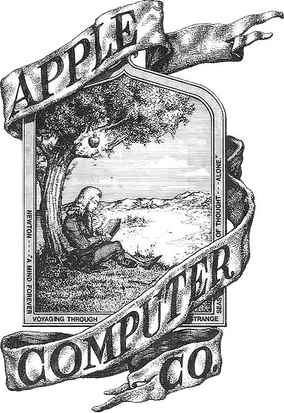
The story of Apple’s visual identity begins in 1976, with a logo that few would associate with the tech giant today. Designed by Ronald Wayne — the lesser-known third co-founder of Apple — the first logo depicted Isaac Newton sitting under an apple tree. It was a complex, hand-drawn illustration surrounded by a poetic frame, far removed from what we now associate with modern branding.
While historically charming, the design posed immediate challenges. It was nearly impossible to scale down, visually overwhelming, and had little connection to the futuristic vision Apple was beginning to shape. This is one of the earliest turning points in the apple computer logo history — when the brand recognized the need for clarity and simplicity in visual identity.
Steve Jobs, with his obsession for minimalism, pushed for a complete redesign. He commissioned Rob Janoff, a young designer at the time, to create something radically different. Janoff responded with the now-iconic silhouette of an apple — clean, bold, and instantly recognizable. The genius detail? A bite taken out of the apple, added not just for distinction, but also to prevent confusion with other round fruits like cherries or tomatoes.
This shift from a detailed sketch to a single, striking shape marked Apple’s first great branding decision. It wasn’t just about aesthetics — it was about creating a symbol that could grow with the company, and eventually, become timeless.
“Simple can be harder than complex.”
— Steve Jobs
“It was to make sure it looked like an apple, not a cherry tomato.”
Rob Janoff, designer of the Apple logo
In the beginning was Newton and apple

Ronald Wayne was the author of the new firm’s logo. He left the company after two weeks of its establishment selling his 10% stake for $800. Having decided that the friends’ venture was a failure he lost billions. If we assume that Apple stock price will triple, Wayne’s possible profit could reach $100 billion.
The logo designed by Ronald didn’t look like the world-famous Apple logo. The image that Wayne created was more of miniature artwork. It depicted Isaac Newton sitting under a giant tree with an apple falling down from it. As you zoom in, you can see a phrase on the edge “Newton… A Mind Forever Voyaging Through Strange Seas of Thought … Alone”. It’s a quote from The Prelude, a poem by William Wordsworth.
Apple Logo Evolution – How “half-eaten apple” logo was born
Apple logo has been altered twice over its history of the four decades and it was a significant design change – mostly in color.

Even though the emblem created by Ronald was unique and carried meaning, it wasn’t suitable for commercial purposes. The company used Wayne’s image as its logo for almost a year. Then Steve Jobs decided to use the services of a professional. The choice fell on Rob Janoff.
Jobs imposed the following requirements on the future company logo. It should be:
- Simple
- Modern
- Recognizable
In a week the designer presented the finished project to the client: a multi-colored apple with a bite. In the process of developing the logo, Janoff bought apples in a nearby store, put them on a plate at home, and made multiple sketches trying to get rid of unnecessary details. He decided to design the apple with a bite for a scale so that people got that it was an apple, not another fruit or berry.
Apple Logo Timeline: Every Design from 1976 to Today
- 1976 – Isaac Newton illustration (designed by Ronald Wayne)
- 1977 – Rainbow Apple (designed by Rob Janoff)
- 1998 – Aqua-style glass logo
- 2001 – Chrome metallic version
- 2007 – Glossy flat version
- 2013–Today – Minimalist black or white silhouette
Why the Bite? Symbolism and Meaning Behind the Apple Logo
At first glance, the bite in the Apple logo might seem like a purely stylistic choice — a way to make the apple recognizable. But there’s much more to this simple design tweak.
One popular interpretation plays on the wordplay between “bite” and “byte,” the building block of digital data. While designer Rob Janoff has stated that the pun wasn’t intentional, it quickly became part of the logo’s mythology — perfectly aligning with the company’s technological roots. In the context of apple computer logo symbolism, it created a subtle yet powerful connection to computing culture.
There’s also the deeper, more philosophical layer. The apple has long been a symbol of knowledge — from the story of Adam and Eve to Newton’s discovery of gravity. By presenting the apple as already bitten, Apple hints at the idea of accessing knowledge, pushing boundaries, and thinking differently — values that align with the brand’s ethos from the start.
Finally, the bite makes the silhouette visually clear and distinct. Without it, the shape might be mistaken for a cherry, a tomato, or any round fruit. The minimalism of the logo — just a single shape with one detail — reflects Apple’s design philosophy: simplicity, clarity, and elegance.
How Apple’s Logo Compares to Other Tech Giants
In the world of branding, logos are more than just symbols — they’re compressed ideas. A great tech logo captures not only aesthetics but also values and personality. Let’s take a closer look at how the Apple logo stacks up against other major technology brands:
| Brand | Logo | Color | Font | Meaning |
|---|---|---|---|---|
| Apple | Bitten Apple | Monochrome | SF Pro | Simplicity, Technology |
| Microsoft | Window Grid | Multicolor | Segoe UI | Openness, Universality |
| Wordmark | Bright Colors | Product Sans | Accessibility, Friendliness | |
| IBM | Striped Letters | Blue | City Medium | Engineering, Stability |
Apple’s logo stands out because it relies on pure form — no letters, no wordmarks, no colors. Just a shape. Its minimalist approach is both bold and timeless, creating an emotional impact without saying a single word.
Rumors and speculations
Apple’s colored logo gave rise to rumors and speculations that the company supported members of sexual minorities. Generally supporting the LGBT community the firm didn’t intend to demonstrate it with the logo. If homosexuals chose the rainbow as their sign, it had nothing to do with the multi-colored Apple logo. Rob had created the icon long before these events.
Those who like discerning hidden meanings in everything claimed that the rainbow-striped apple is a tribute to an Englishman Alan Turing, famous mathematician and cryptologist.
Alan tried to fight fascism using his knowledge and skills, breaking the codes of secret organizations. When World War II was over Turing became involved in the research of artificial intelligence. But his scientific work didn’t save Alan from a criminal conviction for homosexuality. The scientist had to make a tough choice: two years in prison or hormone therapy. In addition to that Alan was prevented from doing cryptography. In the end, Turing adopted a very reclusive way of life. At the age of 41, he committed suicide by biting a poisoned apple.
The logo has been altered twice over its history of the four decades and it was a significant design change.
Ready to create a logo that’s as clean and timeless as Apple’s? Try designing your own minimalist logo with the Turbologo logo maker.
Apple Logo Meaning
The Apple logo designer invites not to look for hidden meanings in the logo color scheme. Rob claims that the logo he developed reflected the sphere of the company’s activities. Apple produced PC with color monitors, that is why the apple was colored. A display of that time could generate six colors. The comparison of the apple logo and rainbow is irrelevant as the rainbow consists of seven colors, not six. Green was the main color for Janoff, he meant it to be in the first place. The arrangement of the other colors was random.
The apple symbol, the Apple company logo has a deep meaning – symbolizes knowledge. This symbol is one of the oldest and most important in Western mythology. In the Bible, Adam and Eve were tempted and took a bite of an apple it was their first taste of knowledge. After that they were ashamed. And as a result this first taste represents the fall of man.
From colored to monochrome
The colored apple attracted customers to Apple products for 22 years. The company underwent a series of changes during that time.
Problems began in the 1980s. First, the failure of the Apple III project, then the plane crash in which Wozniak was injured. Having hard times leading the company all by himself Jobs asked John Sculley to join. But there were more and more frictions between the two CEOs. Steve was extremely anxious about the problems with the firm. Although in 1985 Jobs and Wozniak got medals for the contribution to technological progress, Steve decided to leave the company. Which he did in the same 1985. He came back only 13 years later. At that time the company was in a miserable state. Financial problems were so serious that competitors repeatedly advised it to declare bankruptcy.
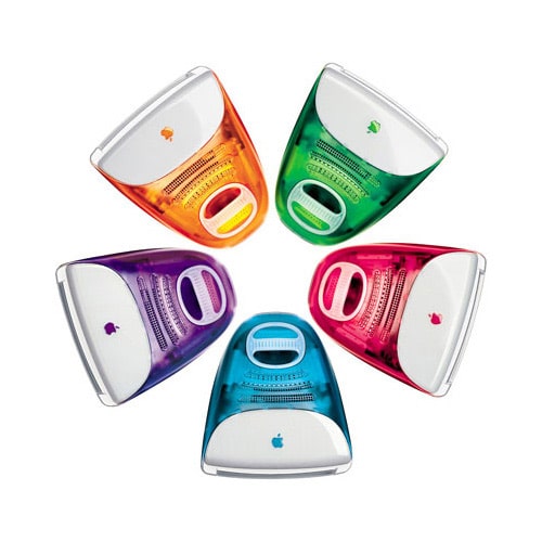
Only a miracle could save the company. The design of the iMac G3 was a miracle. Johnathan Ive was the author of this design. The computer case he created made personal computers look like lollipops. With this invention, the industrial designer saved the firm from financial ruin. A series of new all-in-one personal computers formed the basis for developing a consumer desktop line. This compact desktop computer had all the necessary specifications for uninterrupted work. The iMac featured a web-camera and the option of wireless networking. In order to use it one needed to connect the keyboard and mouse included in the basic package. The computer came with remote control for operating multimedia files.
The new computer was more and more popular among users. Unusually designed PCs became an integral attribute of characters in movies and TV shows. iMac 3 that combined a beautiful design and technical capacity became worldly known. The amount of attention the new product attracted made the company managers decide to replace the colored logo that looked odd on the colored computer. In 1998 the decision was made to use the monochrome version of the apple instead of the multi-colored one. This change adds originality to the Apple logo.
What does the monochrome apple tell us? The evolution of the Apple logo shows that the company has matured. It went through hard times and managed to move on. Apple continues to develop and make its fans happy by creating new products.
Appreciation for the logo’s success
It is worth mentioning that Apple didn’t really recognize Rob Janoff’s contribution. Thanks to his job Apple products are recognized all over the world. But Jobs forgot the person who created the ‘face’ of his baby. Having a huge annual income he could distinguish the designer in the same way as, for example, Phillip Knight, the founder of Nike, did. The firm thanked its logo designer by making her a shareholder and giving her a diamond ring.
Frequently Asked Questions About the Apple Logo
Who designed the first Apple logo?
The original Apple logo was designed in 1976 by Ronald Wayne, one of the company’s co-founders. It featured Isaac Newton sitting under an apple tree and was soon replaced for being too complex.
Why does the Apple logo have a bite?
The bite in the Apple logo was added by designer Rob Janoff to clearly identify the shape as an apple, not a cherry or tomato. It also creates a clever association with the word “byte,” referencing computing culture.
How has the Apple logo evolved over time?
Apple’s logo has evolved from a hand-drawn sketch (1976) to a rainbow-colored apple (1977), then through various glassy and chrome styles (1998–2007), finally settling on a flat, minimalist design by 2013.

SEO specialist, link builder, and blog editor at Turbologo. Writing insightful content about marketing, design, and branding. Sharing practical tips on building and promoting brands online.


