
Nowadays to be an entrepreneur and have a business, be it big or small, is quite a common thing. All the marketplaces of all possible industries are filled with those. Be it as might be, how many of them you will instantly recognize? Probably not as much.
The logo is a valuable instrument to fix the situation. In order to get inspired and generate new ideas, one may analyze the paths of well-known companies’ branding signs.
Nickelodeon logo design is a star of today’s article. The symbol of a popular American channel has not always been the way we see it now. It was through several changes, 4, to be precise. The text below covers its meaning, history, evolution, font, and colors. If the topic is interesting for you, keep on reading!
Table of Contents
Nickelodeon logo meaning

When talking about Nickelodeon name origin, it is necessary to state the definition of the nickelodeon machine itself. In simple language, it is a projector. And since the logo was intended for a cable television network, there is a touching point. Plus, its first variation (1979) illustrated a man looking inside of the ‘n’ letter, which resembles the action one was obliged to conduct to watch a short motion picture at the beginning of the twentieth century.
Nickelodeon logo history
Nickelodeon logo history started in 1979. Until the present day, it underwent multiple changes by which it was not only alternated in visual perception but in style applied as well. It came from conservative to futuristic and then to laconic, simple, and fresh. Each of the modifications the emblem either gave up the previous color palette, or the old Nickelodeon font was substituted with a new one or both simultaneously.
Nickelodeon logo evolution
1979 — 1980
The earliest design of the Nickelodeon symbol was presented in black and white tones and bold, bracketed slab serif typeface. Underneath the main word mark ‘the young people’s satellite network’ inscription in capital characters. On the right upper corner – ‘TM’ icon, on the left – a bent man’s silhouette dressed in a classic suit and an elegant bowler.
1980 – 1981
1980 brings a logo with no additional elements, yet with an interesting font decision. In general, it is a semi-bold, old-style serif. The capital ‘N’ has a cursive serif on the left top end, sans on the right lower corner, and an unbracketed slab on two other edges. The vowels are asymmetrical as well as the last ‘n’.
1981 – 1984
In 1981 the key Nickelodeon logo change consisted of replacing monochrome to a colorful gradient of yellow, orange, red, purple, blue, and green layered letters. In the background appears a bluish sphere. All the parts are executed with a glossy metallic effect.
1984 – 2009
The next symbol comes to life in 1984 and provides two options. Whether it is an orange inscription or white on the orange paint drop. The so-called Nickelodeon splat logo, despite not taking the place of a current one, happens to be the most memorable and used till recent times. This logotype has the longest life term among all: it served for two and a half decades.
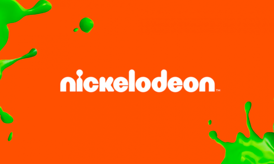
2009 – Present day
The latest transformation of the channel’s logo was made twelve years ago, in 2009. It is much more playful than its ancestors. None of the letters is capitalized, ‘i’ depicted as a keyhole – the dot and the body are combined.
Nickelodeon logo font
The Nickelodeon logo font resembles Harry Squeezed Obese and Bauhaus 93 typefaces. Yet, unlike those, its letters have partially rounded edges.
Nickelodeon logo colors
Nickelodeon colors have not been changed since 1984. Seems orange vs white perfectly suits the company’s purposes.
I’m a product and graphic designer with 10-years background. Writing about branding, logo creation and business.


