A font being an element of a company style has a strong association with offered brand products. Thanks to the writing style features, customers form their opinion about the whole company.
The results of a number of studies in psychology show that a font can make an influence the condition of a person, who sees it. Even the same words get different sentiments depending on the font style used for their writing.
It’s important to take into account the features of potential customers and select a font that will be perceived by your clients positively and effectively. Light playful letters on a promotional sign will attract a child, but this style won’t be appropriate for business partners.
Table of Contents
Special aspects of emotional perception of different font types
Scientists and psychologists identified a number of basic font categories based on the customers’ mood changes after they read it.
Upright elongated font

The font acts as a universal option for all types of business despite the type of products offered by a company to its customers. Please, note that this font isn’t suitable for the promotion of original products that should be emphasized among the competitive companies’ analogs. In this case, the final text will look poor. However, you can add colorful elements to make the logo more recognizable for your customers.
Formal square font

Mostly, this type of font is used in the promotional sign’s design of industrial products, as well as for various technological products and social posters. The formal square font will emphasize the importance of data and make people perceive promotional information seriously. This style is also suitable to attract the attention of businesspeople to your brand.
Rounded Font
The fonts for logos of this type can give your customers a sense of comfort. By contrast, angular fonts seem too formal. A writing style with rounded forms is perceived by potential customers as a guarantee of the company’s care and generosity.
Oblique font with vignettes
It’s usually used in the promotion of products for the female target group. This font style is recognizable due to its lightness and beauty and triggers pleasant associations in young girls and women. You can find this font style on advertising signboards of beauty salons, as well as stores of women’s clothing and cosmetic products. The italics use makes consumers perceive any information even easier as it seems not particularly important. That’s why they prefer to make footnotes and notes in italics.
Script font
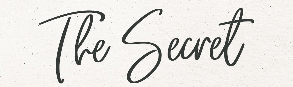
It’s unpractical to use this type of font in outdoor advertising as due to big size letters it becomes hardly readable for consumers. But the script font is effective in promotional materials of goods and services as it highlights their exclusivity and originality. This font can be found on the signboards of lawyers and specialists in consulting services. The use of this font style emphasizes information reliability and inspires customers’ confidence.
Stylized decorative font

This font type resembles inscriptions in Gothic style. We recommend using it only inappropriate situations. For example, it’s not suitable for the signboard of a child center or beauty salon. In contrast, a stylized inscription will have a gorgeous look on the signboard of a thematic bar.
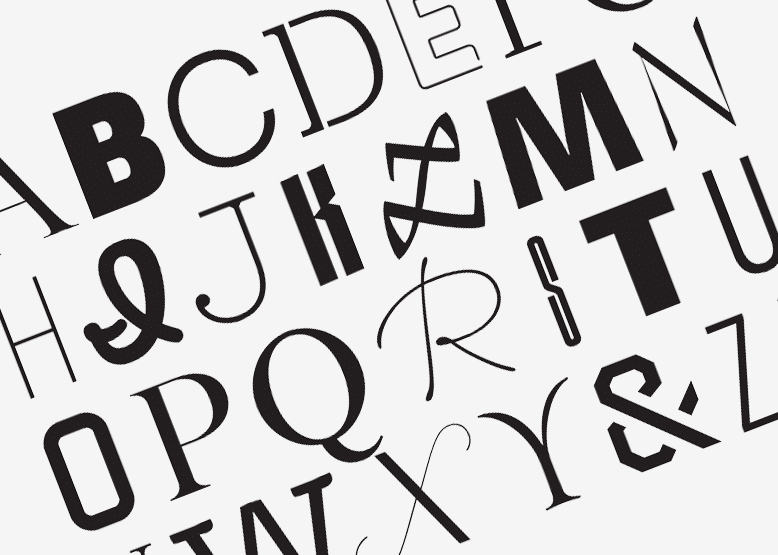
Examples of popular fonts
- Serifs fonts: Baskerville, Didot, Garamond, Georgia, Times. These fonts are perceived as traditional, practical and refined.
- Sans-serifs fonts: Avenir, Futura, Gill Sans, Helvetica, Verdana. They are characterized by their universality, modernity, purity, and geometrical forms.
- Script fonts: Buttermilk, Edwardian, Isabella, Snell Roundhand, Zapfino. These fonts are associated with elegance, sophistication, and style.
- Bar fonts: Clarendon, Copse, Josefin, Museo, Silverlake. They include modern, fancy and user-friendly fonts.
Serif and sans-serif fonts – what is the difference?
Serif fonts are perceived more efficiently in printed format texts. Serifs enable one to enhance the contrast between the letters making them different. Reading a text written with this font one faces some problems trying to identify single letters. That’s why the perception of information by a reader isn’t so effective.
Sans-serif fonts are optimal for texts published on the Internet. The letters of this style have an attractive look on the outdoor advertising elements maintaining their integrity even with an increased font size during printing. This font type attracts the customers’ attention and is the best option for small size texts. But we recommend selecting serif fonts as a basic writing style since they don’t make a reader feel tired too quickly.
According to statistics, the fonts of the first type are used in a text title in 40% of cases. But more than 60% of Web sites prefer sans-serif fonts for the main part of the text.
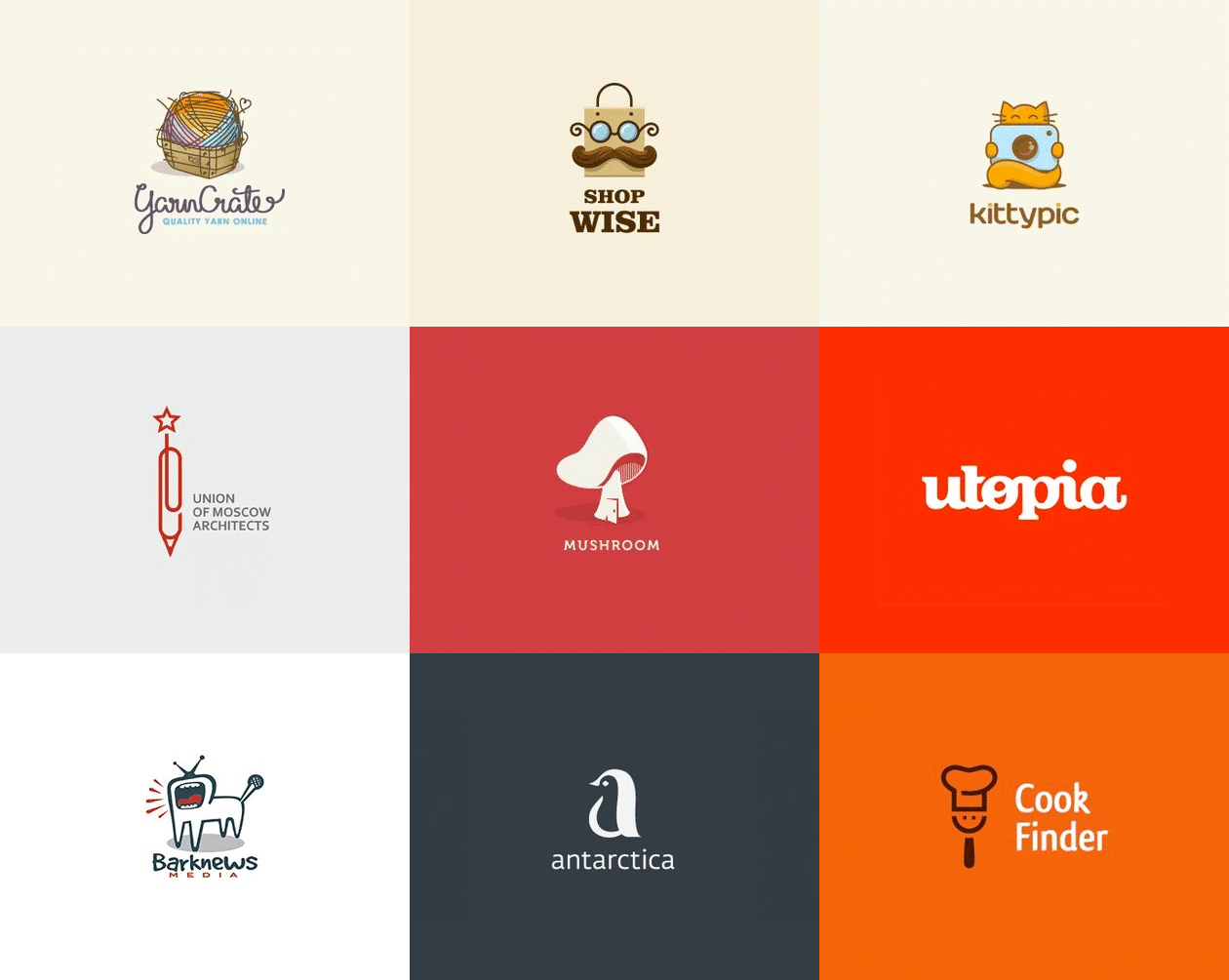
Some font perception aspects on a logo
Only 6% of international brand logos use an icon. 56% of logo creators apply a combination of text and images, and the remaining 37% prefer an inscription. It has been proven that companies are used to choose text as the main element of a brand sign. The selection of an appropriate font is crucial to ensure the future success of a company. It’s necessary to make customers feel the brand essence and characteristic features of the products that it offers.
Logos that place the text inside a circle or a square form a general impression of the company’s reliability and confidence in customers. If instead of these figures you select an ellipse the brand will be associated with creativity. A text inside an inverted triangle is perceived as a call to action. If the company name is located diagonally the logo makes people think that this organization has special advantages that include high speed and confident swiftness.
The font that is perceived by customers best of all
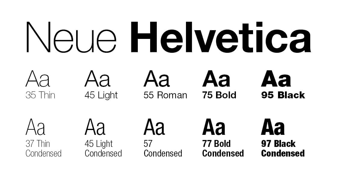
In more than 60% of cases, a sans-serif font is used in logo design. The most common and readable font is Helvetica. It’s found in 21% of logos. Famous companies including Saint Laurent, HBA, Comme des Garçons, and Colette used this writing style for their brand.
Font selection guidelines
- Bold and big size fonts are perfect for outdoor advertising, as they are readable on the background of any color and are recognizable quite easily. You should consider the distance when placing a logo. If it’s about 5 m you should choose text letters more than 5 cm high.
- If possible, don’t use more than 3 different font styles on one banner in order not to make the perception of information too difficult.
- The size should be about 11-12 points if your target group includes the general population. It’s better to use for a signboard a font starting from 18 points size for potential customers aged over 60 years. The title text should be done with 14-30 points size.
- Don’t make your text with only capital letters as it’s difficult to be read. If the background is bright you need to avoid ornate letterings.
- Serif fonts are suitable for printed promotional materials as in this case each letter will be perceived separately.
- Change of the line size enables you to control the speed of reading, so to improve the quality of information delivery we recommend taking into account spaces between letters and lines.
I’m a product and graphic designer with 10-years background. Writing about branding, logo creation and business.