Colors are an important part of design and everyday life. They attract attention, evoke certain emotions and are able to communicate something important without words. At the same time, not only the colors themselves are important, but also their combination. Even a whole color theory has been created, which is being improved every year. And it is used in many aspects of life – whether it’s an interior design choice or just a casual look.
With the help of color, you can irritate, relax, give energy, increase efficiency. It changes the perception of space, the geometry and the volume of the room. Color makes objects attractive and important, or otherwise boring and unimportant.
Create your own logo with Turbologo logo maker. It takes less than 5 minutes and no design skills needed.
Go to Logo MakerThe modern world of coloring adheres to its scale and variability. Every year, each sample presents new palettes with chic income. Each one is imaginative and has its own unique appeal.
The most authoritative trendsetter in the world of color is Pantone. But he is far from the only one. Paint companies unique in the world (Dulux, PPG, Sherwin-Williams and others) are constantly engaged in studying society and discussing the changes taking place in their lives and general moods. Then they express it all with color. And this, in turn, applies to color marketing.
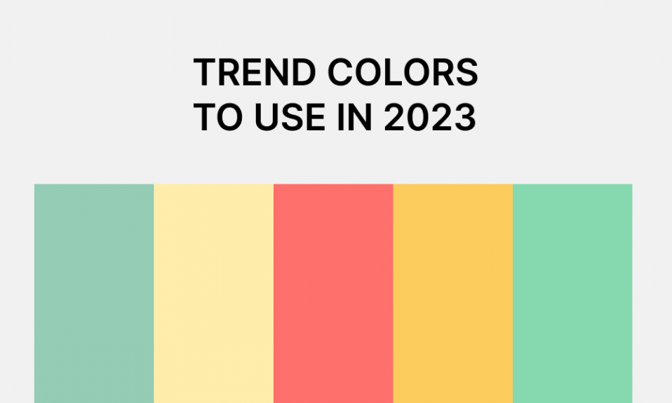
This article features the hottest color trends for 2025.
Table of Contents
The importance of colors in design
Color symbolism is deeply rooted in ancient culture, as people constantly strive for bright and harmonious color combinations. It is very important to combine colors and shades correctly, because each color has its own special meaning, although sometimes these meanings can differ in different cultures.
For example, in Western cultures, black is a symbol of mourning, while white is considered the color of youth, celebration, and new life. No wonder the bride wears white, right? However, in the East, the opposite is true – white is the color of sadness, and the bride usually dresses in bright, red and yellow colors. However, in modern pop culture, the combination of yellow and the red family has a positive meaning. Thus, it informs the buyer about discounts, because this is a very deep combination that immediately catches the eye. The trend of the year is defined for the entire planet. Well, we will tell you all about it, step by step.
What are the functions of color
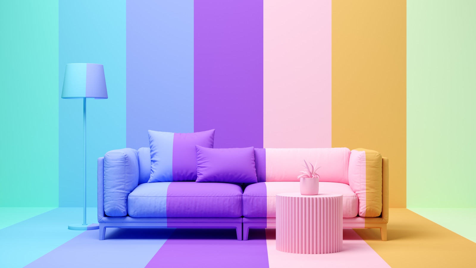
Our visual perception has a special device – we remember colors much faster than shapes, quantity and other characteristics that describe a particular object. All marketing experts have long known that color can increase brand awareness by up to 80%.
The degree of memorization increases if there are stable associations that a person associates with a particular shade. Color design performs two important functions at once – emotional and practical. If we talk about emotions, the feelings caused by this or that color are of great importance. And in a practical sense, the right color and combination of shades allow you to create a unique interior design.
Top Trending Colors 2025
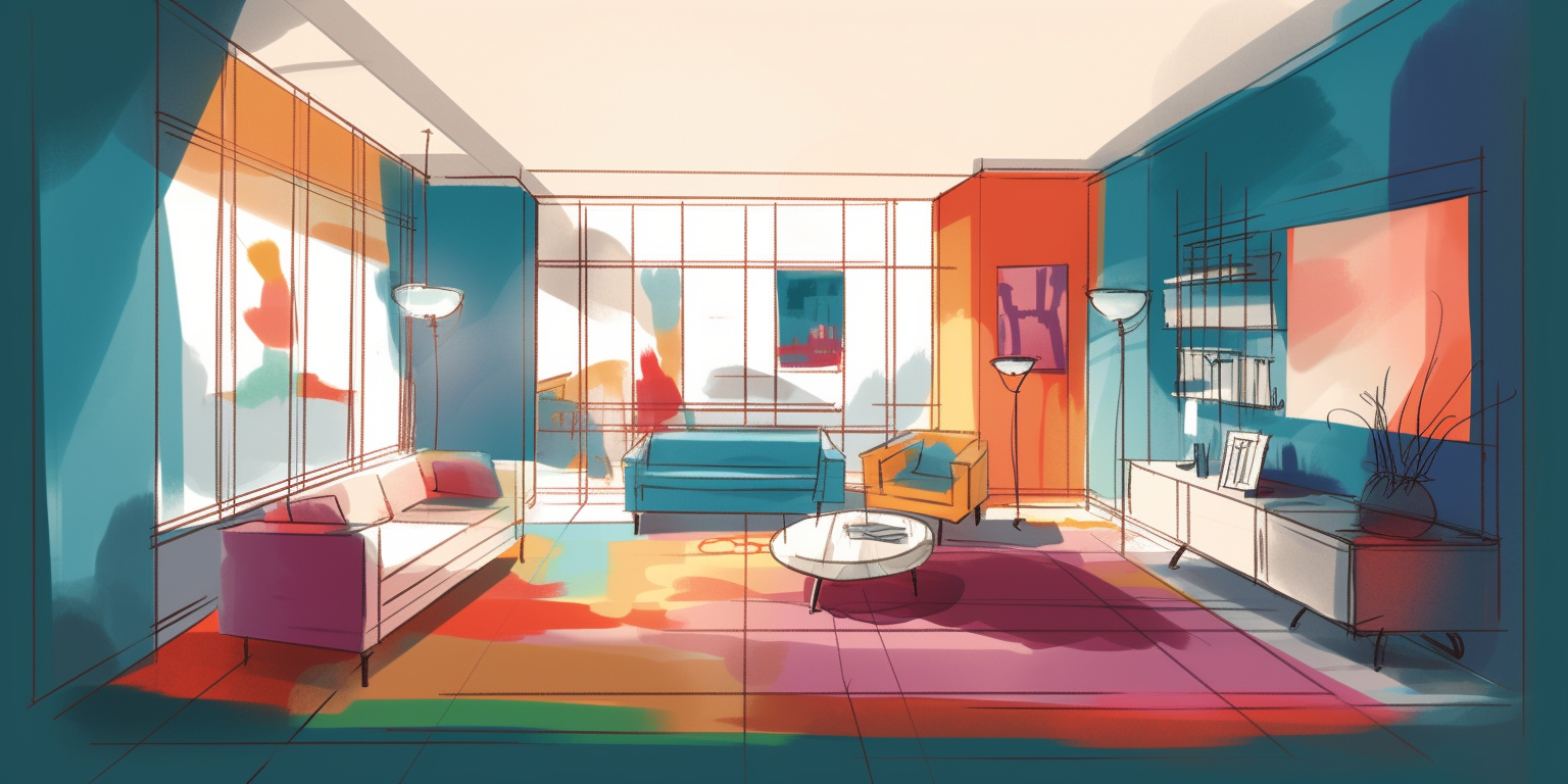
The Pantone Color Institute, as well as WGSN and Coloro, say that in 2025 society is most interested in natural tones, as well as bright and stimulating colors, as we are all now striving for positive. According to experts, the main one is red. And this applies to all color palettes – from bright and saturated (Luscious Red) to muted, “dusty” shades (Astro Dust).
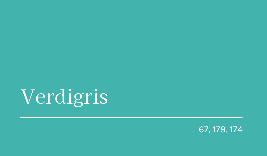
Verdigris
Green is always associated with nature and is a symbol of organic lifestyle. Life in a modern city is a constant bustle, rush and stress. Therefore, we are so eager to receive the power of the wild in order to restore our strength. Color trends help us with this.
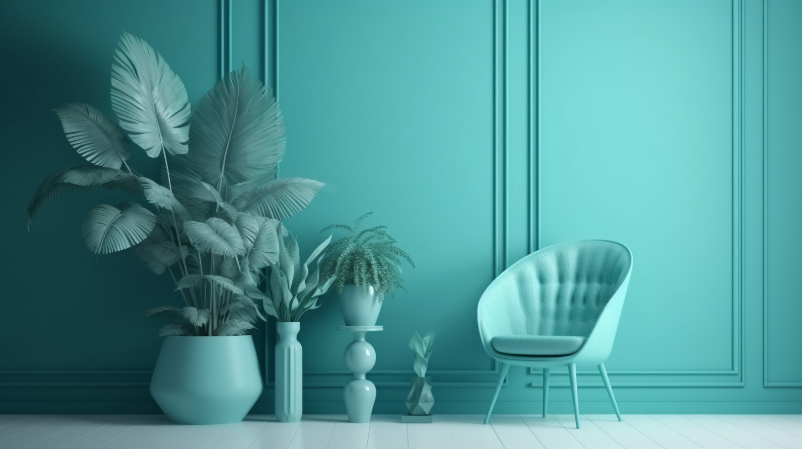
Verdigris was named after the greenish pigment on oxidized copper. This mesmerizing shade with a beautiful name is somewhere between deep green and blue. It can replace the already outdated turquoise.
Tranquil Blue
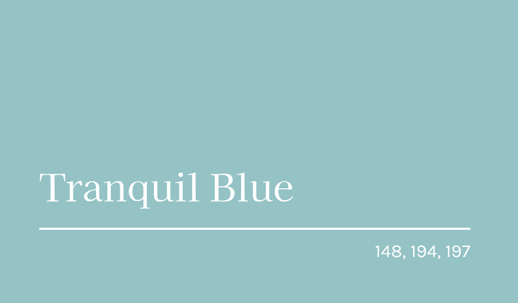
Another member of our color trends list is blue. Tranquil Blue is soothing and inspiring. It is associated with stability, lightness and clarity. All this is given to us by the elements of air and water. Tranquil Blue has already become a hit in the luxury womenswear market, as well as in interior design.
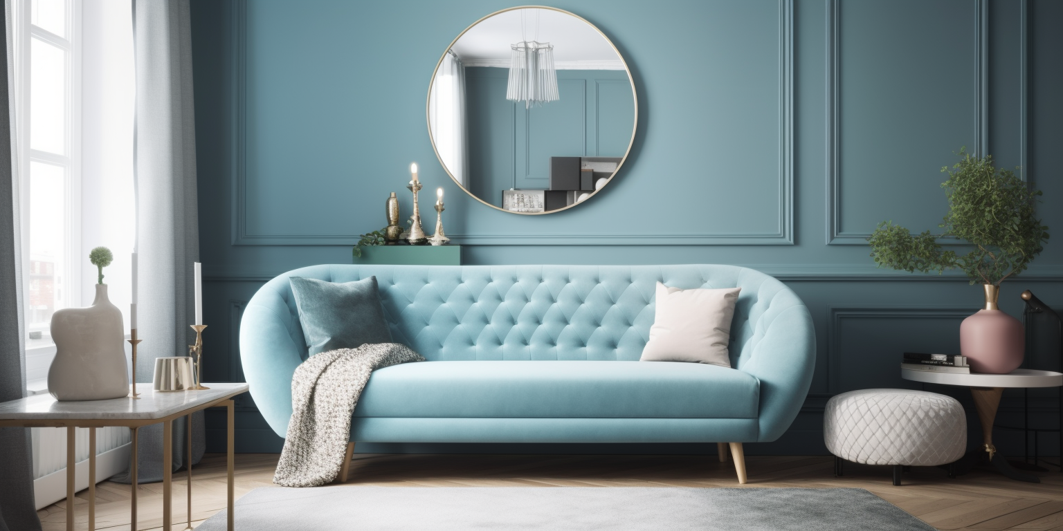
If desired, it can be softened with soothing shades or warm neutrals. In addition, Tranquil Blue pairs well with jewel tones.
Luscious Red
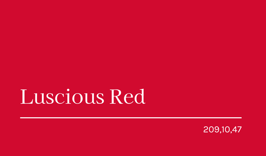
Luscious Red is a color that always attracts attention. It has a frenetic power, so it immediately affects our mood. Luscious Red speaks to our desires and passions, empowering.
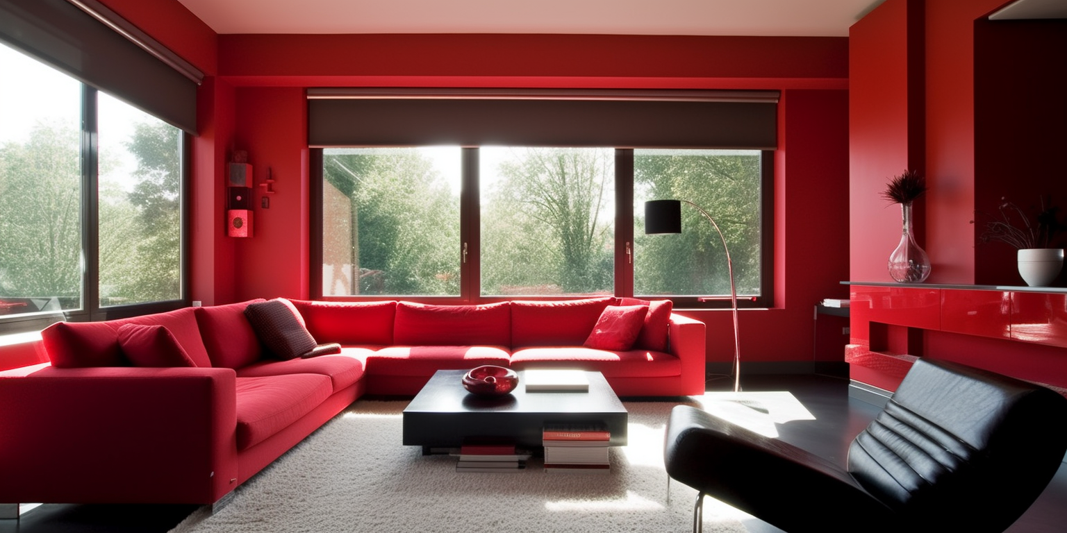
At the same time, the shade is quite light and transparent, which allows it to be used for both physical and digital products and practices.
Burnt orange
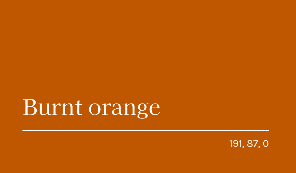
A shade for those who love bold colors. This color is especially interesting for its long history. With its help, television and fashion revived some of the signature images of the 70s of the last century. If you want to make your dining room, bedroom, or kitchen more “warm” and “energetic” – Burnt orange is the best choice.
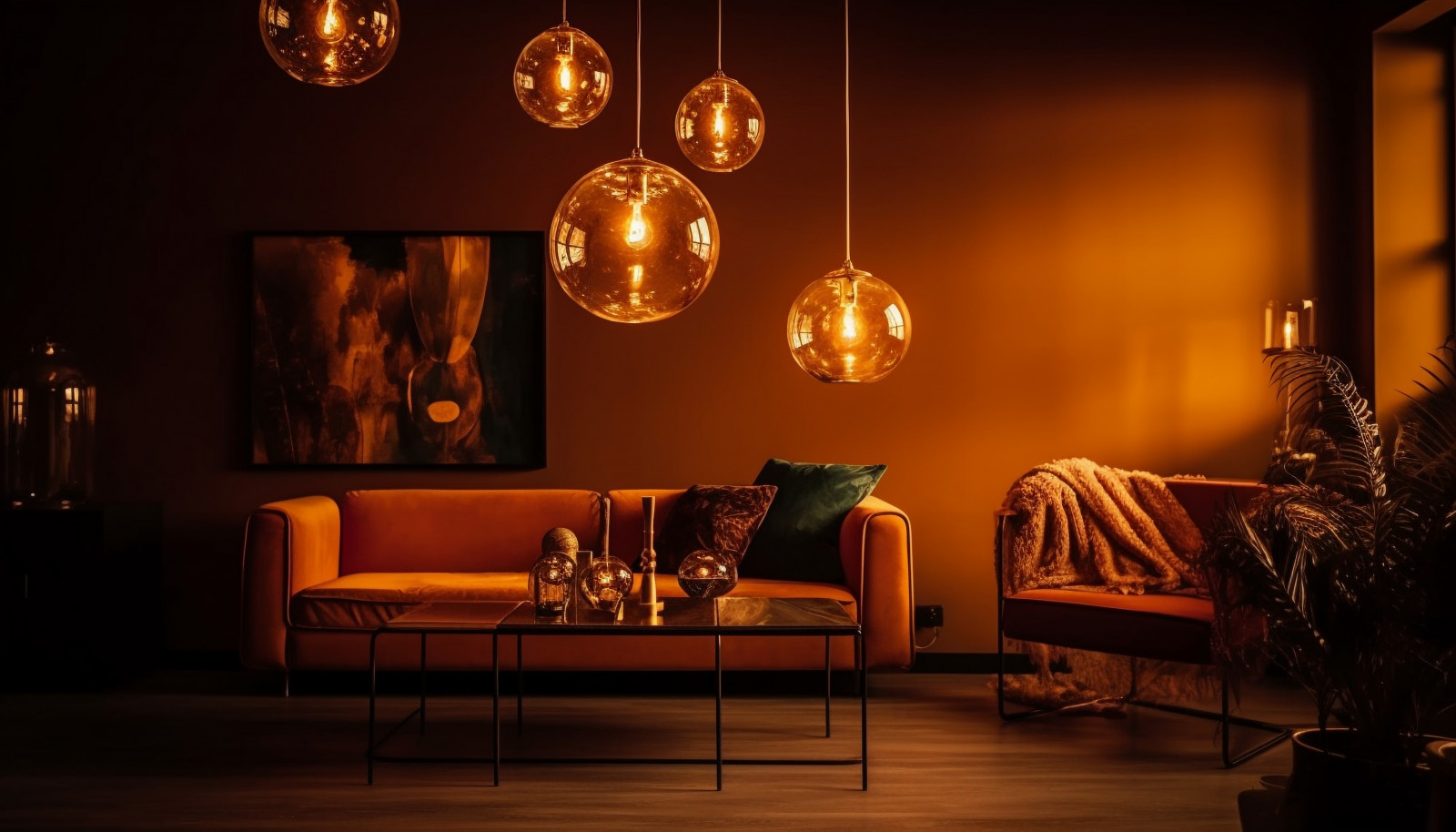
It brings warmth, and adds dynamics, but does not overwhelm. People feel comfortable around this color. If you want to look for something lively and retro when choosing a design, feel free to use this color.
Sundial
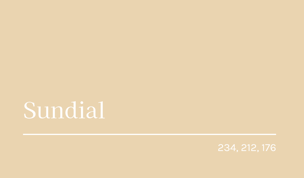
The desire for a balanced lifestyle and all things natural has led to the huge popularity of such a shade as Sundial. It can be called differently: warm neutral, warm yellow, earth tone.
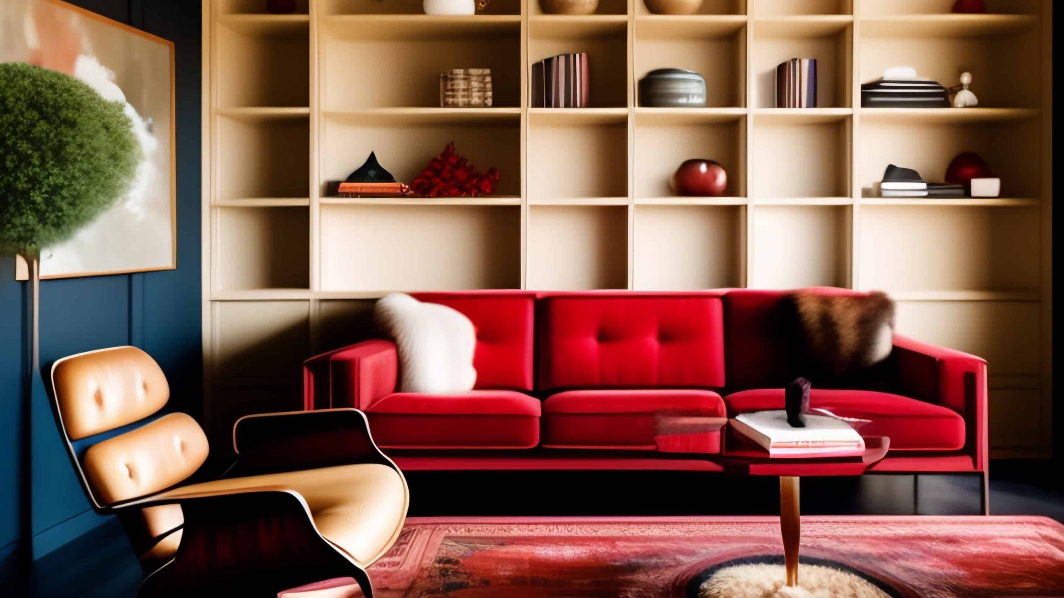
It calms and relaxes, just like warm brown reminds us of unity with all living things. In addition, this color trend is sustainable, as Sundial can be obtained naturally from food waste, plants and minerals.
Raspberry blush
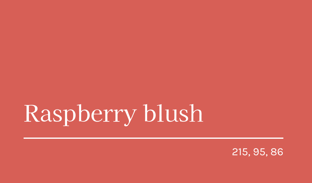
Raspberry blush – the color of the year by Benjamin Moore color experts. It combines pink, red and orange tones. It is noteworthy that after a few years of the popularity of more neutral families color, the company returned to a rich and intense coral without the admixture of purple.
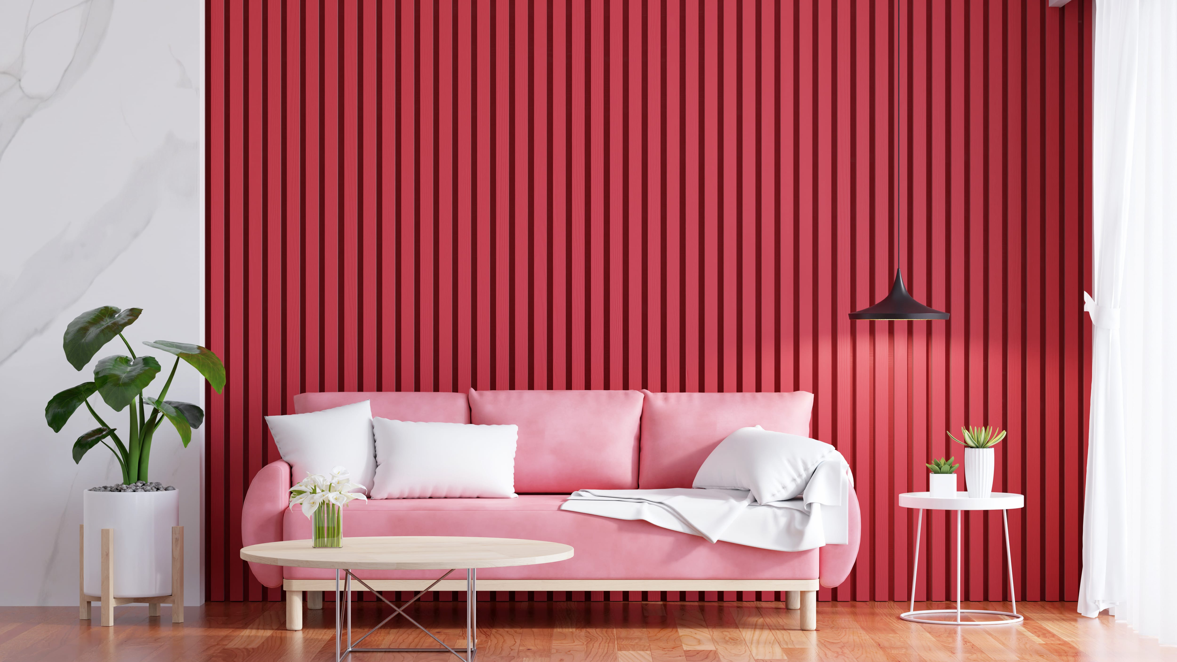
Andrea Magno notes that raspberry blush has a lot of charisma, but is calm enough to be a good backdrop for walls. The shade awakens our senses and gives us serenity. It is associated with sunset and is inspiring.
Raspberry Blush is a color trend that signifies a desire for warm colors and nature.
Viva magenta
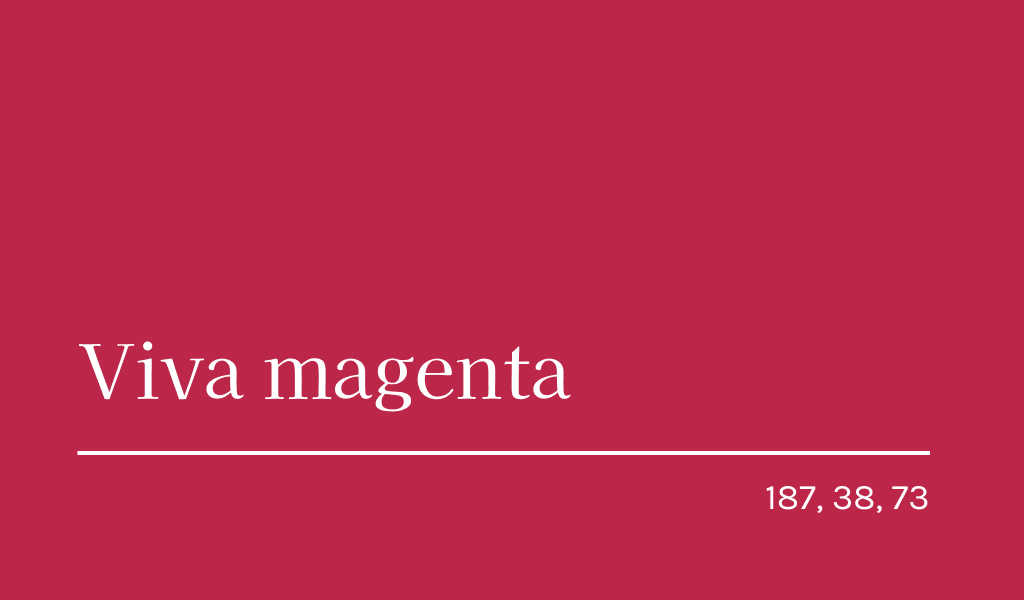
In December this year, representatives of the Pantone Institute presented the color of the year – Viva Magenta. This crimson-red tone symbolizes the balance of warm and cold. Viva Magenta is not as simple as it seems at first glance. This is a real breakthrough in the field of design.
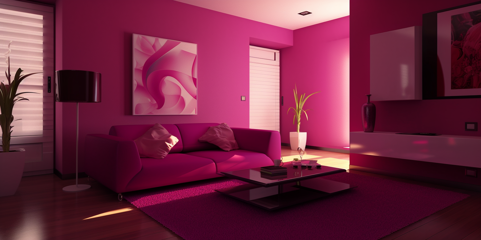
It is associated with both warmth and the spirit of experimentation. It connects human creativity and the pragmatism of the digital world. Viva Magenta awakens self-expression and brings joy.
Digital Lavender
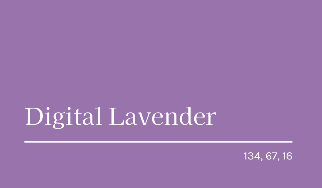
Digital Lavender – color of the year 2022, which has found its place this year as well. This complex and calm shade symbolizes health and well-being. He encourages us to take care of ourselves, achieve serenity and balance.
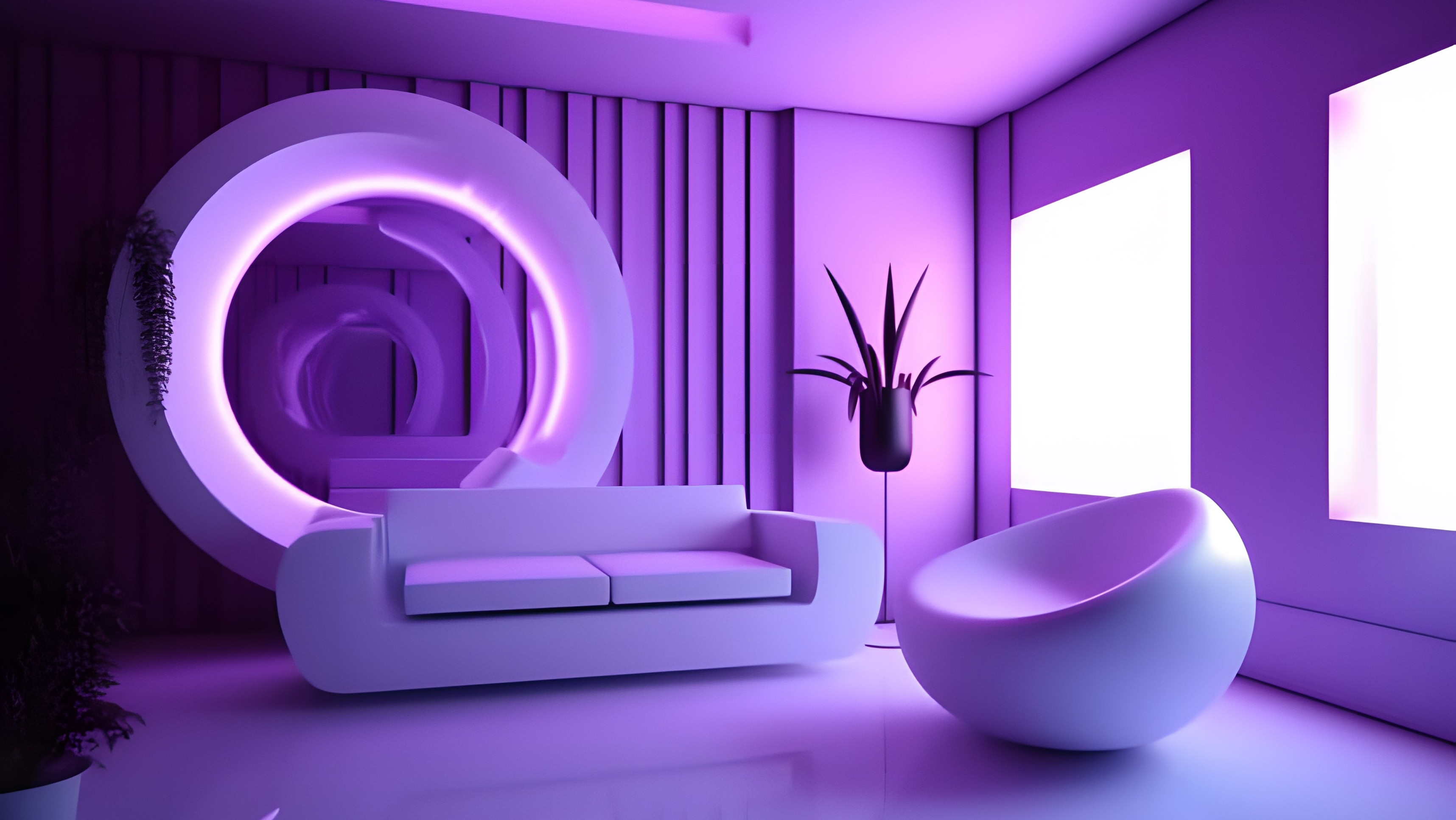
This color is a great choice for mental health and mental health projects, as well as gender-sensitive design.
Top color combinations 2025
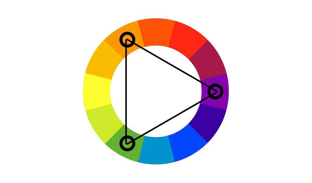
Some colors are great on their own, but can’t be combined together, as they will nullify each other, or worse, they can turn into the ugly stain, drawn with kids’ chalk. There are colors, that are hard to combine in terms of design, and you have to be a professional to play them right, so it is perhaps the best idea to keep away from them in order not to mar your logo.
Let’s look at successful color combinations in interior design and logos. Here are some of the best color combinations that complement each other to create a harmonious image.
Pink and yellow
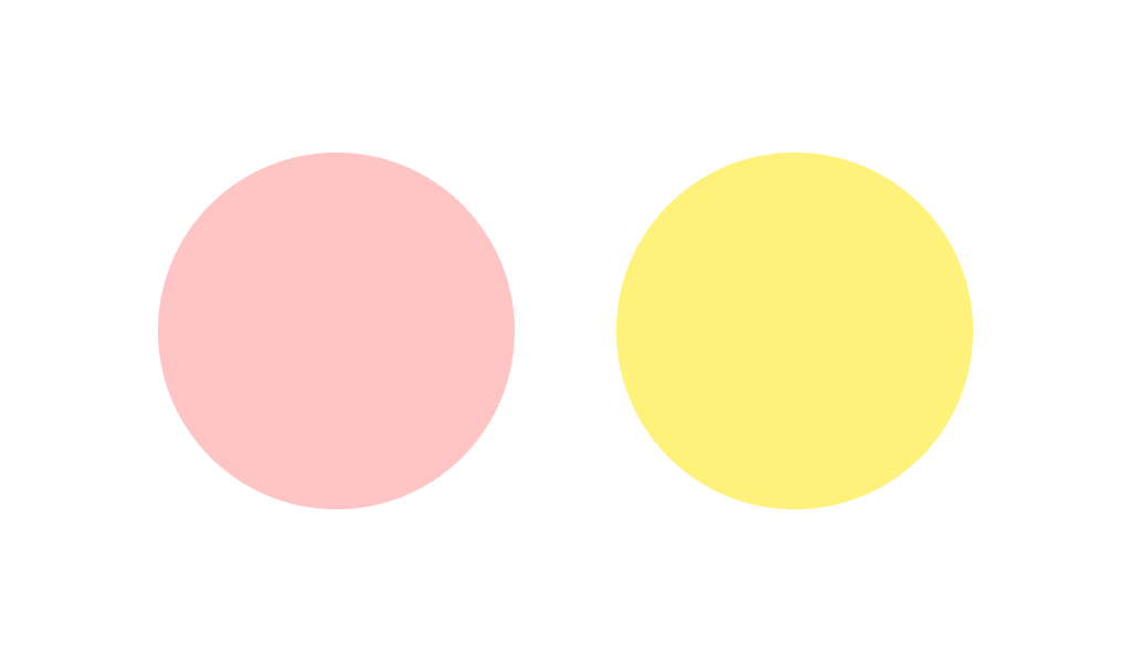
Pink and yellow are a combination associated with femininity, tenderness and playfulness. It can often be found in children’s or female images. Moreover, even if both colors are made as bright as possible, their combination will still retain its tenderness and lightness.
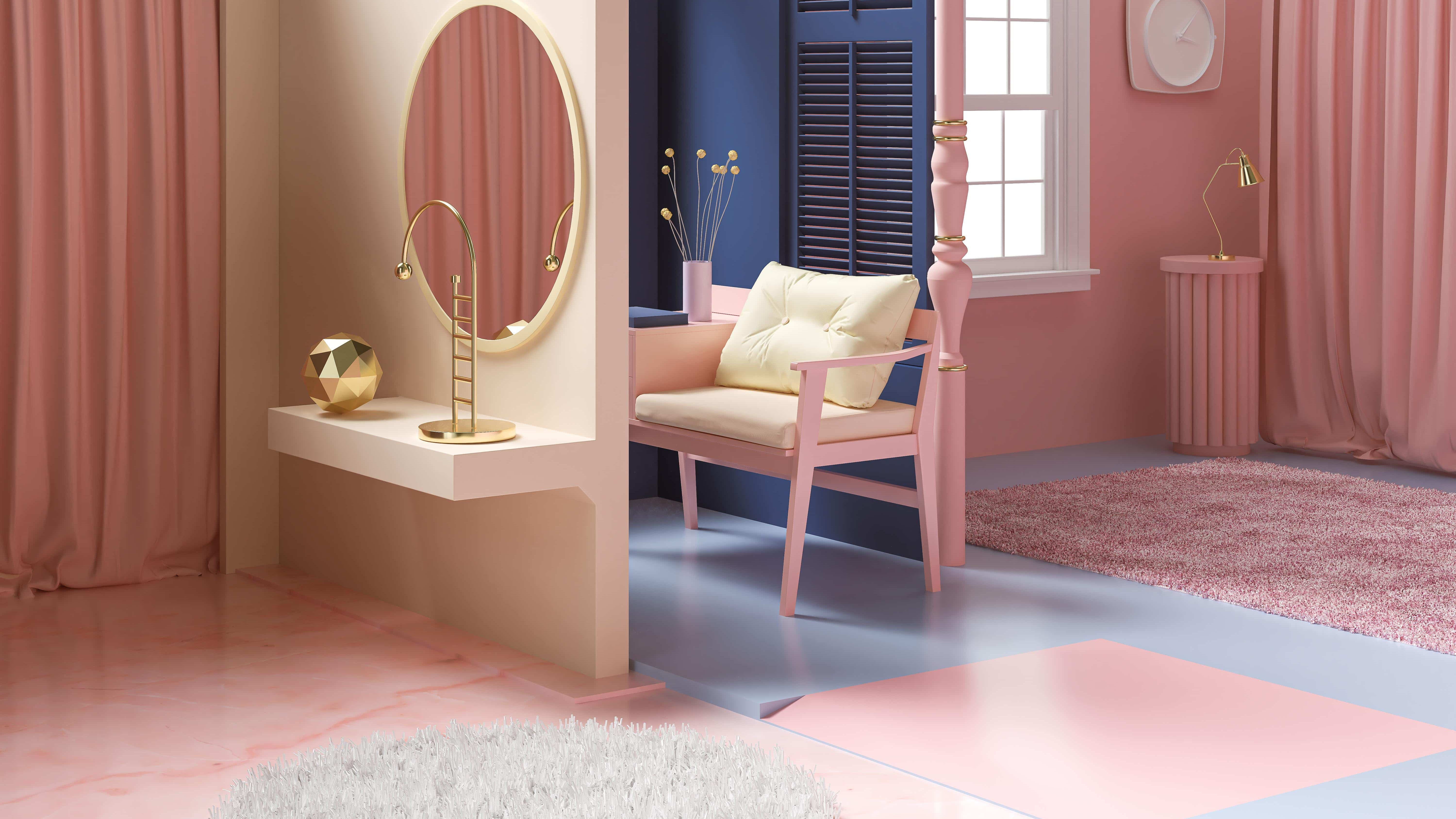
Pink and yellow is an ideal palette for the production and sale of cosmetics and fashion accessories, product lines for teenage girls, as well as for beauty studios, hairdressers or food delivery companies. This summer, the delicate and bright palette gives the buyer a pleasant and carefree shopping experience.
As for interior design, pink and yellow paint colors are suitable for a women’s or children’s bedroom.
Warm and cool tones
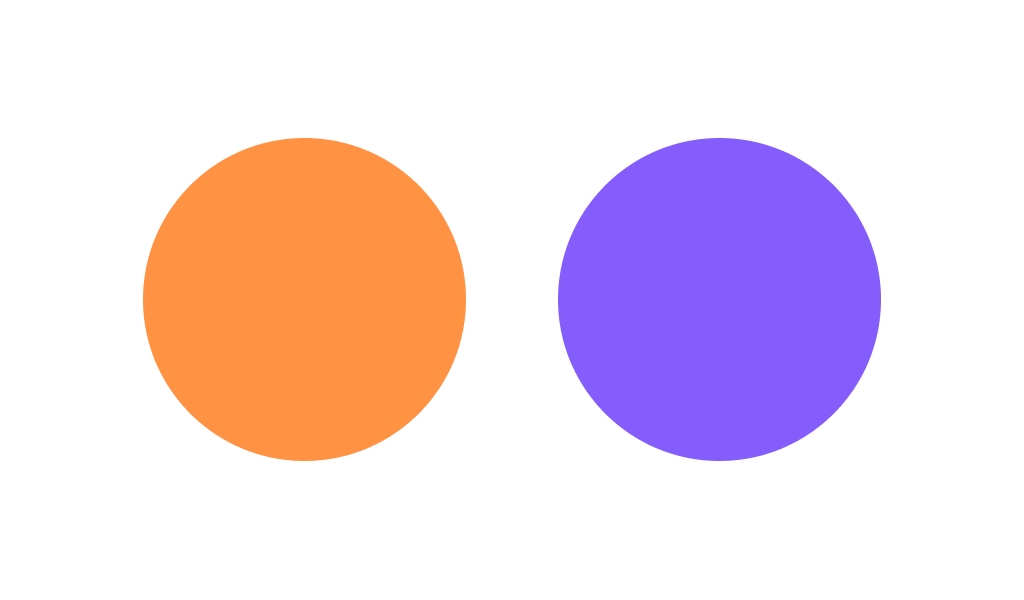
Cool tones in combination with warm tones in the interior are not only not prohibited, but welcomed. If you create a temperature contrast in a moderate ratio with the prevailing scale, the design will become more “multifaceted” and “voluminous”.
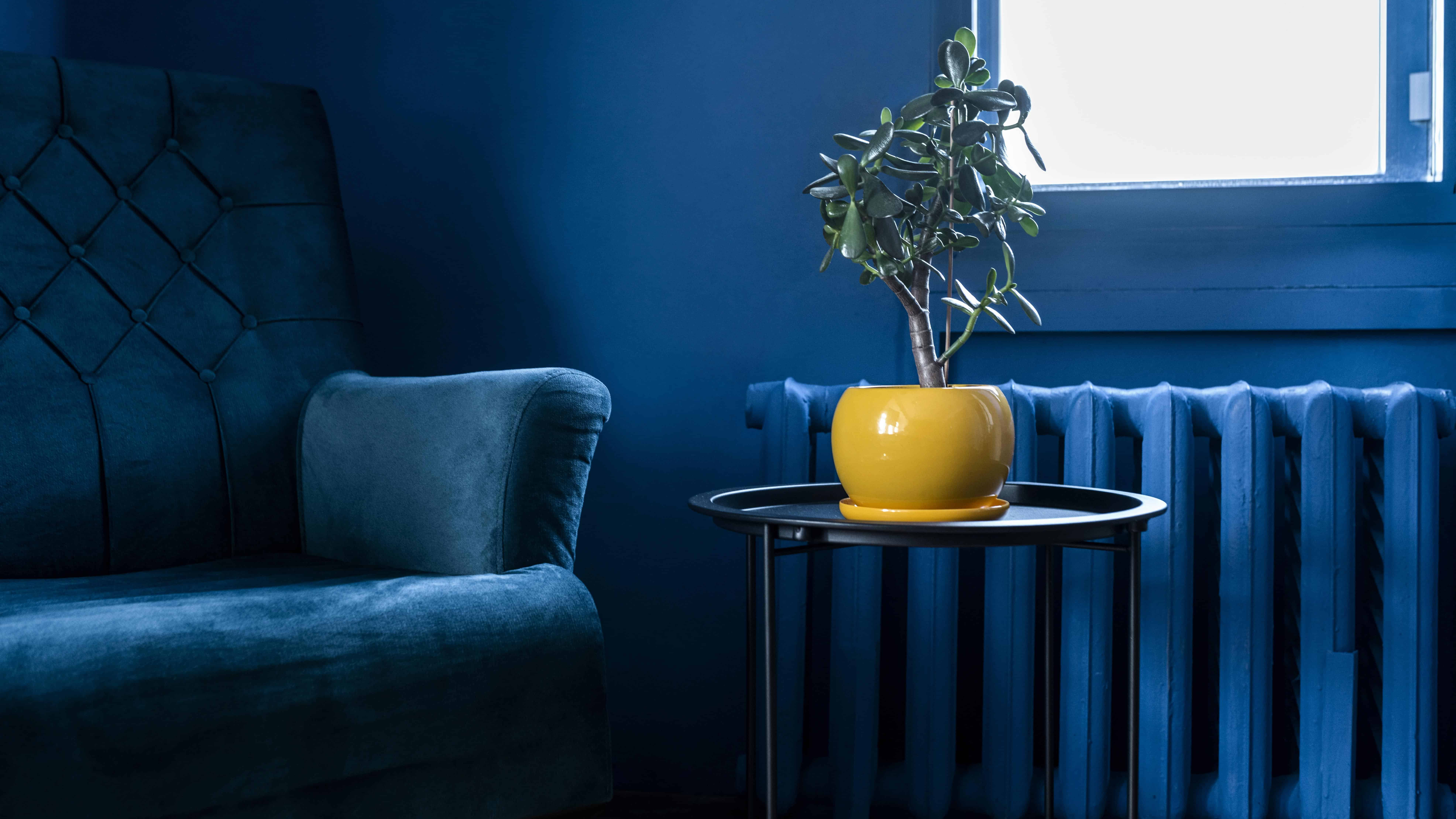
Mixing warm is quite suitable for everyday life. For example, you can “dilute” the white and blue environment with bright yellow pillows. And to add “freshness” to the “warm” interior of the dining room, add cold accents to it.
Pink and lime
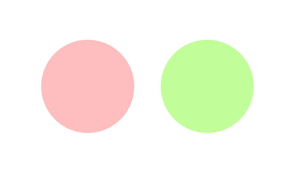
It’s something new, unique and fresh. Compared to pastel delicate combinations that are already familiar to many, periwinkle, pink, and lime are even a little shocking.
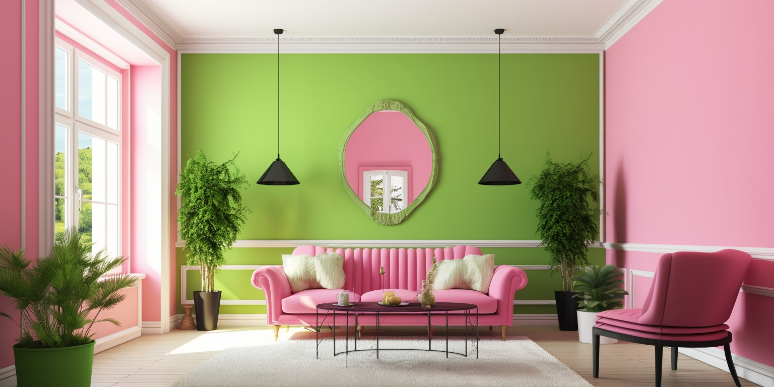
This combination looks rich and bold. It complements the image and creates a favorable impression. Such color trends are created for those who are not afraid of unexpected, revolutionary solutions or develop new ideas.
Light blue and cobalt
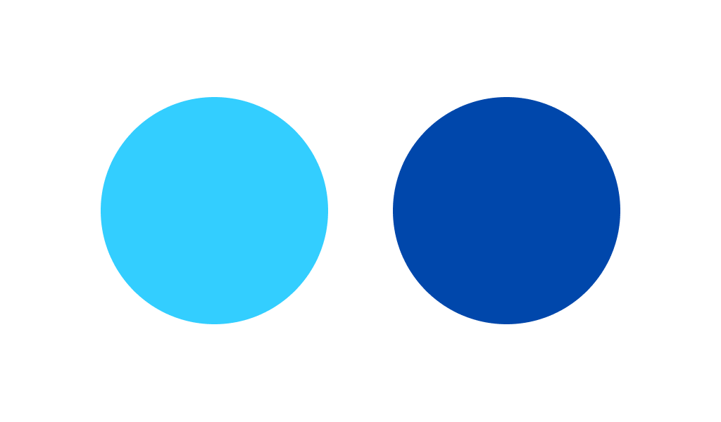
Blue is associated with lightness, air and flight. It visually expands the space, so it is used in interior design for small spaces.
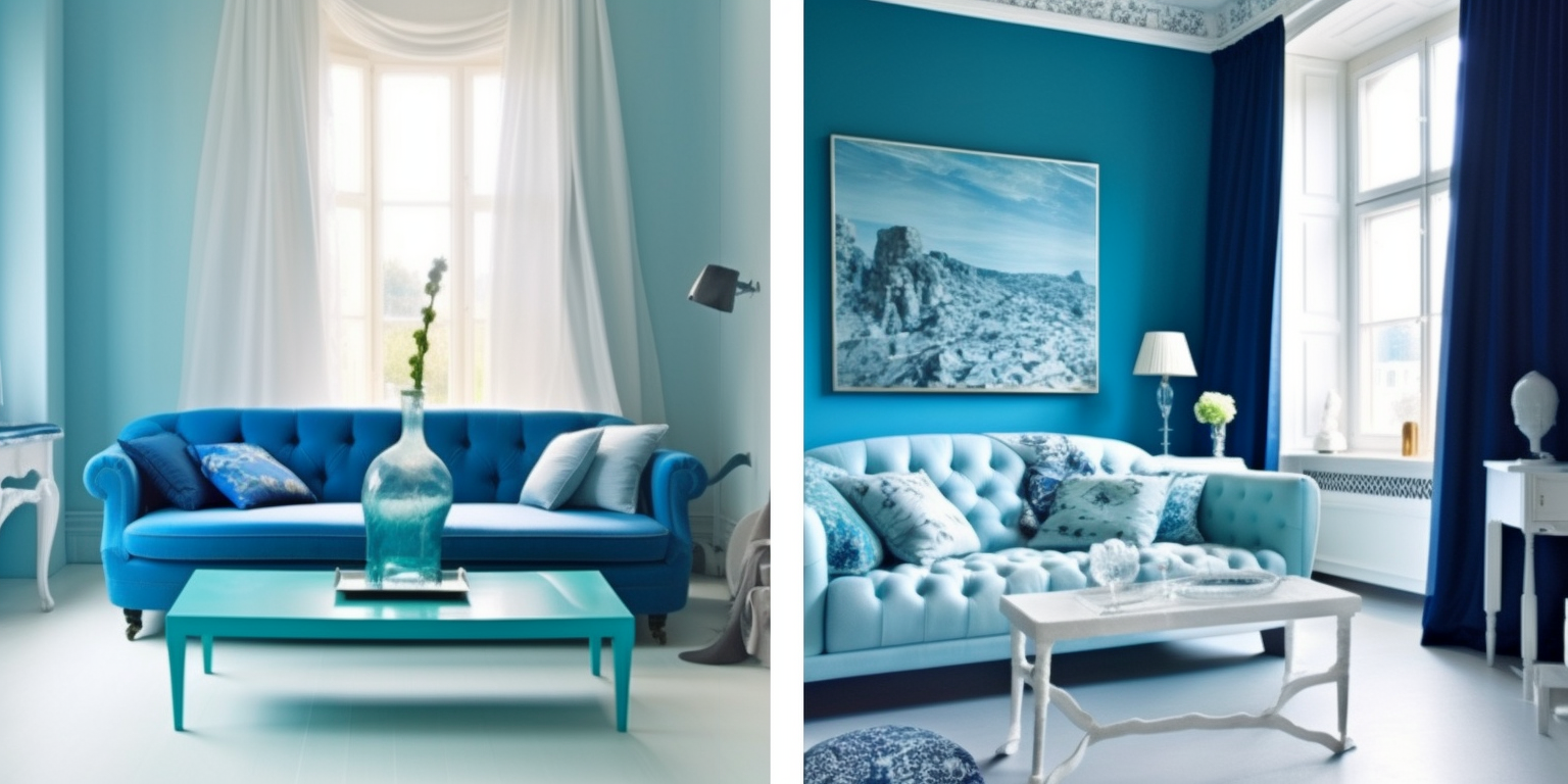
However, by itself, it is more suitable as a background. And if you want to create something really bright, try Light blue and cobalt.
Orange and Blue
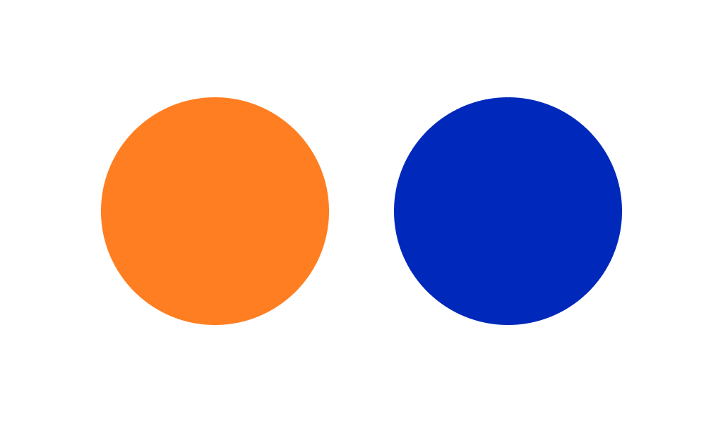
Orange and blue – a combination that is considered a classic. Bright paint colors of orange look harmonious with light blues, but soft orange tones are a good match for dark blues. If you’re designing for a library or study, it’s best to choose a combination of navy blue and mid-tone orange.
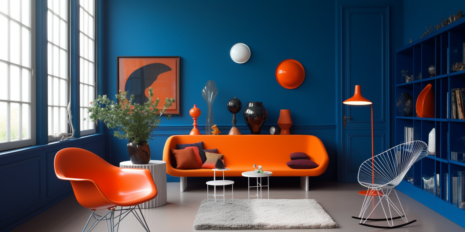
In the living room, small orange accents (like decorative pillows) against dark blue walls will look good.
Purple and black
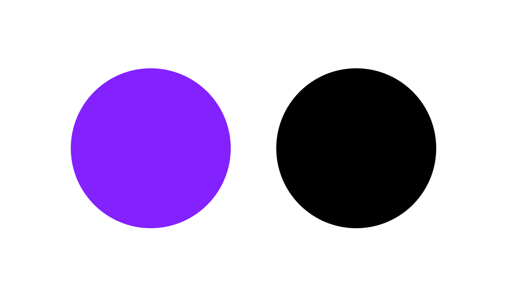
Purple is bright, rich and saturated. Once upon a time, purple dye was available only to representatives of the highest nobility. Purple is still associated with wealth and power.
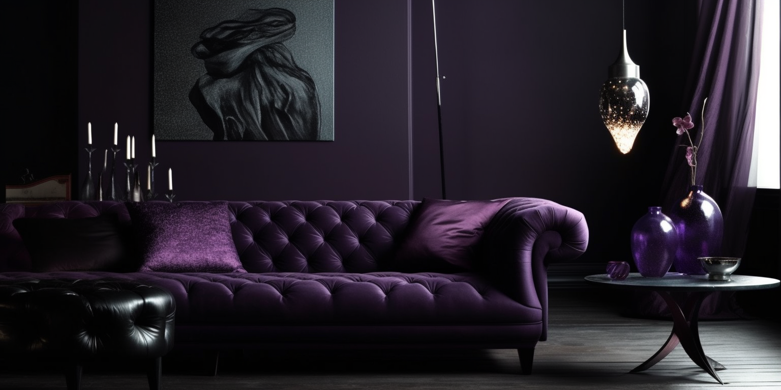
An excellent match for this magnificent shade is uncompromising black. This combination looks stylish and modern. Contrasting shades beautifully balance each other and add sophistication to any interior.
Lime Green and Gray
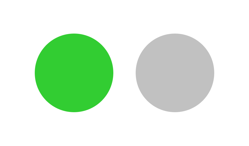
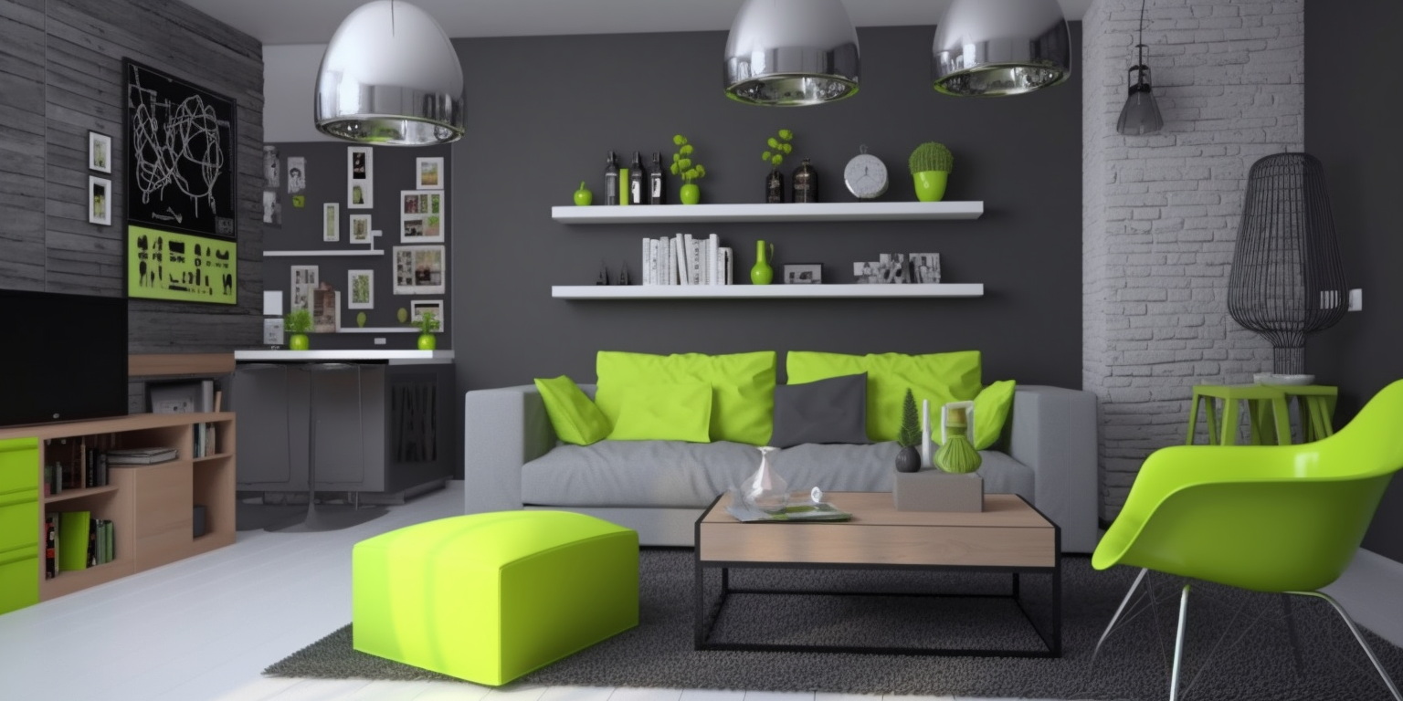
Lime color is invigorating and refreshing. Gray, on the other hand, is a fairly neutral shade. And together they create an extremely successful duet. The combination of Lime Green or Savannah green and Gray is a timeless classic. It works great in both small and spacious rooms.
How to make a 2025 color trends logo?
If all the options aren’t enough, or you intend to avoid being too fashionable and stick with the crowd, then you might want to choose a proper color solution all by yourself. First of all, we advise you to relate to the color circle and study color combinations, some contrasting and bright and some soft and pastel variations.
However, before making successful logo color decisions, it is crucial that you know some taboos, which will ruin your logo once and for all. Study the usage of the color palette carefully.
And the Turbologo logo generator will help you realize your ideas by creating a logo in 15 minutes on the Internet.
Conclusion
If color trends is not just words for you, you are probably already familiar with some (and maybe all) of the shades that were mentioned above. It is worth noting that color marketing has long moved away from acid shades, combinations of red and dark green and “pure” colors. Of course, you can use all of the above, however, then you will part with the stylish part of reality.
Color of the year is always different, and trends change rapidly. The palette of fashionable shades is updated every season. And if you want to always be in trend when creating interior design, websites, logos and other products, be sure to follow the fashion. But, it is worth remembering that there are also eternal things, such as good taste and knowledge of the color wheel. All together will help you create the perfect design for whatever it is.
We wish you success!
SEO specialist, link builder, and blog editor at Turbologo. Writing insightful content about marketing, design, and branding. Sharing practical tips on building and promoting brands online.

