Want to give your brand a sunny boost? This guide on yellow logos—how to add sunshine to your brand—will show you how to evoke joy, capture attention, and enhance your brand’s visibility. Dive in to discover how to integrate yellow effectively into your logo design.
Table of Contents
Yellow Logos: How to Add Sunshine to Your Brand Effortlessly

Yellow is often linked to feelings of cheerfulness, originality, and warmth, making it a perfect choice for brands aiming for a fun and accessible image. Think of brands like McDonald’s or National Geographic – their yellow logos are not just visually appealing but also evoke a sense of joy and enthusiasm. This is the magic of the color yellow; it naturally draws attention, enhancing visibility and memorability for brands.
Yellow in logo design profoundly impacts customer engagement by evoking warmth and energy, capturing consumer attention. It fosters positive emotions and strong connections. Brands aiming to spread delight and lightheartedness often choose yellow, as customers associate it with friendliness and approachability, significantly boosting brand identity.
Yellow also communicates low costs and a playful approach, beneficial for industries like food, entertainment, and retail, where excitement is crucial. Choosing yellow makes a statement about your brand’s personality and values. If you want to attract attention, consider how to effectively sell yellow products.
The Power of Yellow in Branding
Yellow is more than just a bright hue; it’s a powerhouse in branding. It evokes joy, warmth, and enthusiasm, leading to a positive emotional response. Incorporating yellow taps into these emotions, creating a connection beyond visual appeal. The warmth and energy of yellow attract customers and create excitement, enhancing engagement.
Yellow in branding communicates low costs and a playful approach. A yellow logo conveys friendliness and a welcoming image, aligning with brands wanting to spread delight and lightheartedness. This makes yellow ideal for brands aiming to appear fun, accessible, and creative.
The color’s attention-grabbing qualities also make it highly effective for improving brand visibility and standing out in a crowded market.
Choosing the Right Shade of Yellow

Selecting the right shade of yellow is crucial for creating the perfect logo. The psychological impact of yellow varies with its shade, so choose one that aligns with your brand’s message and identity. Mustard yellow suits brands with a classic or retro aesthetic, while lemon yellow conveys cleanliness.
Testing various shades of yellow with different icons and fonts helps find the best combination for your target audience. Bright yellow conveys energy and vibrancy, ideal for brands aiming to appear lively and dynamic.
Golden yellow is perfect for high-end brands seeking to evoke luxury and sophistication. Carefully considering the psychological impact and suitability of each shade helps create a yellow logo that truly embodies your brand’s identity.
Complementary Colors for Yellow Logos
Pairing yellow with complementary colors enhances logo visibility and impact. Contrasting colors make icons and text more noticeable and engaging, creating a logo that stands out. Additionally, when you pair yellow with other hues, it can significantly elevate the design.
Experimenting with various designs and color combinations helps find the perfect balance to complement your yellow logo. Here are some effective complementary colors for yellow logos.
Blue
Blue adds trust and reliability to yellow logos, creating a vibrant and dependable image. The yellow and blue combination evokes a trustworthy yet energetic vibe, excellent for brands wanting to appear reliable and lively.
This pairing is particularly effective in industries where building consumer trust is crucial, like finance and healthcare.
Green
Yellow and green evoke a refreshing and natural appeal, ideal for health and wellness brands. This combination reflects values like vitality and growth, resonating with health-conscious consumers who prefer natural and organic food.
Yellow alongside green creates an inviting and refreshing brand image that stands out in the health and wellness industry.
Orange
Yellow and orange together create a high-energy and enthusiastic vibe, perfect for creative fields. This combination captures attention and evokes enthusiasm and creativity. The bold and impactful look makes it excellent for brands in the entertainment and arts sectors.
Iconography and Typography in Yellow Logos
Icons and typography for your yellow logo are as important as the color itself. Icons should symbolize the brand’s essence and reinforce its message, ensuring the logo stands out and is easily recognizable. Whether using an abstract symbol or a literal representation, the icon should align with your brand’s identity and enhance the overall design.
Typography plays a crucial role in logo design. The font should complement the logo’s tone and style. Playful fonts may match brighter yellows, while elegant fonts suit muted shades.
The right typography can elevate your yellow logo, making it more visually appealing and impactful. Carefully selecting icons and typography that align with your brand’s identity helps create a yellow logo that truly stands out.
Background Choices for Yellow Logos
Selecting the right background ensures yellow logos stand out effectively. A solid, dark background boosts visibility, making logos more striking and memorable. Contrasting colors in the background help yellow logos pop, drawing attention and enhancing brand recognition.
Avoid backgrounds with busy patterns, as they distract from the yellow logo and diminish its impact. Opt for simple, clean backgrounds that allow the yellow logo to shine.
Yellow pairs well with gray for a combination that exudes warmth and professionalism, as well as with warm neutrals like beige and off-white. Choosing the right background ensures your yellow logo stands out and makes a lasting impression.
Designing a Yellow Logo: Step-by-Step Guide
Designing a yellow logo involves several steps, from sketching initial ideas to refining the final design. Testing and iterating on the designs is essential to ensure the logo resonates with the target audience.
The process breaks down into three key stages: sketching ideas, using logo makers, and testing and iteration.
Sketching Ideas
Sketching multiple concepts allows for creativity and exploration in designing a yellow logo. The first recommended action is to sketch your logo idea, incorporating yellow as the dominant or accent color. This initial stage helps visualize design possibilities and sets the foundation for the final logo.
Using Logo Makers
Logo makers are user-friendly tools that assist in creating and refining logo designs. Platforms like GraphicSprings offer services to help design a yellow logo effortlessly, providing common file formats like PNG, JPEG, SVG, and PDF.
Using a logo maker allows you to experiment with different typography, colors, and layouts, refining the design to create a visually appealing logo.
Testing and Iteration
Testing your logo on various platforms ensures it resonates with your audience. Conduct A/B testing to compare different yellow logo designs for effectiveness. Gathering feedback from target audiences identifies features that work and areas needing improvement, allowing for ongoing iteration and refinement.
Famous Brands with Yellow Logos
Famous brands like McDonald’s and National Geographic have successfully used yellow logos to create strong brand’s identity. These logos are visually appealing and evoke positive emotions and associations, making them memorable and effective.
Here’s how these brands have leveraged the power of yellow in their logos.
McDonald’s
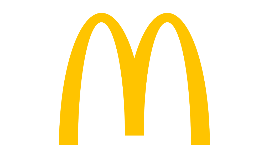
McDonald’s logo prominently features yellow, representing positivity and a vibrant image. The golden arches symbolize joy, contributing to positive associations. The M-shaped mark represents the chain’s old structure, creating familiarity with longstanding customers.
Overall, McDonald’s yellow logo effectively evokes joy and familiarity, appealing to customers worldwide.
National Geographic
National Geographic’s yellow logo is iconic, representing a commitment to exploration and adventure. Yellow evokes curiosity and adventure, encouraging exploration. It also symbolizes knowledge, reflecting National Geographic’s dedication to education and discovery.
Overall, the yellow logo enhances National Geographic’s brand identity by embodying its values of exploration and knowledge.
When to Choose Yellow for Your Brand
Choosing yellow can strategically differentiate your brand from competitors and resonate with your target audience. The psychological impact of yellow increases mental activity and promotes optimism, making it suitable for innovative brands. Yellow’s brightness is often associated with safety, making it ideal for brands emphasizing caution.
Industries like dating, entertainment, and food greatly benefit from yellow in branding. The yellow and green combination is favored in the health sector for its refreshing appeal. Choosing yellow helps brands attract consumers with warmth and vitality, effectively communicating their personality and message.
Additionally, considering the cultural context of yellow, such as its symbolism of royalty in Chinese culture, can influence branding decisions.
Maintaining Consistency in Yellow Logo Usage
Consistency in yellow logo usage is crucial for a cohesive presentation across all platforms. Ensure your yellow logo is consistently used throughout all marketing materials, from business cards and websites to social media posts and packaging. This consistency reinforces your brand identity and makes your logo easily recognizable.
Your new logo should look good on various sizes and mediums, maintaining simplicity for better recognition. Whether on a billboard or a mobile app icon, the yellow logo should retain its visual appeal and effectiveness.
Keeping your perfect yellow logo consistent and simple creates a strong and lasting impression on your audience.
Yellow Logos in Action: Case Studies
Examining case studies of brands that have successfully used yellow logos can provide valuable insights and inspiration for your own logo design. Yellow logos often create a sense of vitality and energy that can enhance brand identity.
Let’s explore how IKEA and DHL have leveraged the power of yellow to create strong and effective brand identities.
IKEA
IKEA’s yellow logo represents creativity and innovation. The standout colors in the IKEA logo are blue and yellow, which were prominently featured in a redesign in the 1980s to make it more visually impactful. This combination has helped IKEA create a brand identity that is both modern and approachable, aligning with their mission of providing stylish and affordable home furnishings.
DHL
DHL’s yellow logo effectively conveys speed and reliability. The yellow color, combined with specific design elements like line details, gives the illusion of movement, setting it apart from competitors who typically use red or black logos.
This distinctive logo helps DHL stand out in the logistics industry, reinforcing their brand message of fast and dependable delivery services.
Summary
Incorporating yellow into your logo design can bring a touch of sunshine to your brand, evoking feelings of joy, warmth, and positivity. From selecting the right shade to pairing it with complementary colors, every aspect of your yellow logo should be carefully considered to ensure it aligns with your brand’s identity and message. The psychological impact of yellow, combined with strategic design choices, can create a visually appealing logo that stands out and resonates with your audience.
Yellow logos have proven successful for many famous brands, enhancing their visibility and consumer engagement. By maintaining consistency in your yellow logo usage and continuously refining your design based on feedback, you can create a strong and lasting impression.
Whether you’re in the food industry, health sector, or any other field, choosing yellow for your brand can help you stand out and connect with your audience on a deeper level. Embrace the power of yellow and let it add sunshine to your brand effortlessly.
Be Different With Yellow logo
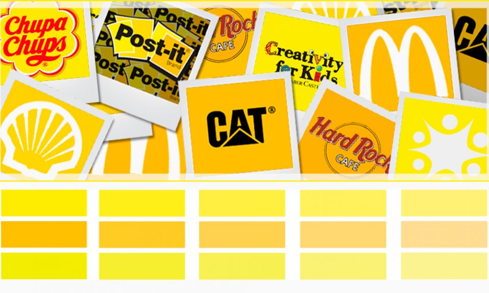
Statistically speaking, the most commonly used colors in logo design are blue, red, and black. If you want to show your customers the alternatives you offer, don’t be afraid to show them a bit of yellow. In the example above, yellow is used to provide another look for photography, communications, coffee, and tanning businesses. If you want to stand out from the crowd, use these examples for inspiration!
Learn more about color in logo design
Browse these logo colors and get inspiration for each.
Frequently Asked Questions
Using yellow in your logo design can effectively capture attention and evoke feelings of joy and warmth, making your brand resonate positively with consumers. Embrace the vibrancy of yellow to energize your brand identity!
Choosing the right shade of yellow for your logo is essential for conveying the right message. Opt for mustard yellow for a vintage feel, lemon yellow for a fresh and clean look, or golden yellow to exude luxury.
To ensure consistency in your yellow logo usage, use it uniformly across all marketing materials and maintain its simplicity for better recognition. This will enhance brand recognition and ensure it looks great across different sizes and mediums!
Brands like McDonald’s and National Geographic effectively use yellow in their logos to convey positivity and a spirit of exploration. Embrace the vibrant energy of these brands that inspire joy and discovery!

SEO specialist, link builder, and blog editor at Turbologo. Writing insightful content about marketing, design, and branding. Sharing practical tips on building and promoting brands online.