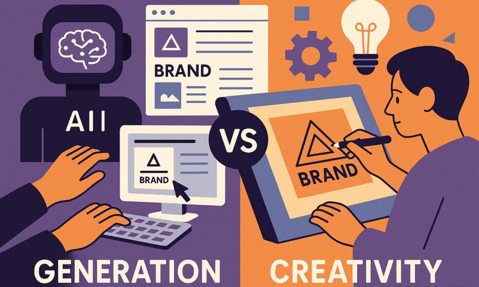
Typography has been around humanity for hundreds of years. Each of us comes into contact with this phenomenon on a daily basis, flipping through the feed on our favorite social network, reading the compositions on product labels in the store and looking at advertising posters.
Typography is the visual design of text, an important element of branding and a key component of composition.
It is known that people mastered the art of inscription more than a thousand years ago – long before the advent of special devices for printing. Each element was carefully thought out, drawn in draft form, and only then transferred to paper to the main text.
Typography includes many aspects: from the layout of newspapers and magazines to the development of fonts for logos. With the development of technological progress, it began to spread everywhere: now its methods and techniques are used not only in publishing houses.
Modern typography is "responsible" not only for the legibility of the text, but also for its graphic design.
The inscription should evoke certain associations and emotions in the reader, push to specific actions.
Before diving into the fascinating world of typography, let’s agree on some terminology. The terms “font” and “typeface” are often used as synonyms: this is not entirely true. A typeface is a set of fonts, while a font is one of the styles contained in a typeface.
Typeface Categories

All existing typefaces are divided into four main types – antiqua, grotesque, handwritten and display.
Antiqua (also referred to as “humanistic style”) is a typeface with serifs – small elements that go beyond the main components of the character. This is one of the oldest and most popular styles and is inspired by traditional calligraphy.
It is believed that the antiqua appeared more than 600 years ago. Serif typefaces are a strict, “formal” option for formal papers. They are often found in printed publications and documents. Such fonts have many ways of execution, they can be bold, written in italics, etc. The most famous serif style is Times New Roman.

Grotesque gained popularity relatively recently – in the middle of the twentieth century. From the humanistic style mentioned above, it is distinguished by a Gothic look. The typeface is considered more modern and clear, well suited for electronic texts: it is easy to read from screens. This typeface is a great choice for headings. Its most famous “representative” is the Arial font.

The handwritten typeface is unique due to its artistry and graceful curves. Like the Grotesque, the handwritten typeface appeared in the middle of the 20th century. The advantage of handwritten fonts is elegance and beauty, the disadvantage is that they are difficult to read: not everyone can be quickly and easily parsed. The choice of such styles should be approached as responsibly as possible: the font should attract, arouse interest, and not repel with its intricacy.

The display typeface is the most unusual and informal of all. Fonts are very original, memorable, create a unique style. Such options will be a wonderful choice for headlines and logos.

Typesetting fonts stand out in a separate group: they are used in books and online publications. Their key advantage is that they are understandable even at a small size.

Basic elements of typography
Knowing the basic components will help you better navigate the variety of styles, quickly select what you need.

Leading, line spacing, leading: all these are designations of the same concept – the distance between lines. Properly set leading makes the text more readable. If the line spacing is minimal, the text becomes illegible and is extremely difficult to read. Too much distance also complicates perception: it is necessary to stick to the “golden mean” and choose an average value (for example, the “default” option).
Letter spacing, or tracking, is the distance between adjacent characters. Too little letter spacing creates a shrinking effect, too much makes it difficult to separate one word from another. Parameters can be set manually: modern programs provide such an opportunity.
Kerning regulates the spacing between letters only within words: values do not apply to the entire text as a whole. Most often, this tool is used when drawing logos: it allows you to implement unusual stylistic ideas.
A grapheme is the smallest unit of text – a symbol (letter, number, punctuation mark).
A glyph is a graphic representation of a grapheme in a specific style.
Size – the size of the character vertically.
Separately, let’s say a few words about lettering – inscriptions with unique styles similar to calligraphic ones. Lettering is not the main type for forming fonts, but it is often used to create beautiful inscriptions on posters, posters, etc.
Text alignment allows you to give its elements the same distance, to make a single size of all its components. There are four alignment options: left, right, center, or justified. One of the most popular is text justification.
Hierarchy – selection of thematically significant elements of the text: headings of various levels, sidebars and other components. Can be done by writing H1-H5 subheadings, bold and italics, font size, shades, etc.
Rubrication is the internal division of the text into semantic blocks: chapters, parts, sections. Rubrication allows you to simplify the perception of the material: it must be used when laying out large texts – long reads, instructions, etc.
Stripe – all the space occupied by text and graphic elements.
What to Consider When Formatting Text for Visual Communication?

Any text is first of all created in order to be read, and only secondly – to complement the overall visual concept. Watch for readability: choose a shade that contrasts with the background, understandable font, adjust spacing and other parameters. Pay attention to each element: a small flaw can spoil the impression.
We do not recommend using many fonts within the same material: three or more styles run the risk of making the text too visually saturated, and therefore difficult to read.
A combination of harmoniously selected fonts (they can be elements of different typefaces) is called a font pair. A sign that unites styles into a single concept can be both similarity and contrast. Quite often, a font pair becomes a variation of the same font – bold and italic. You should be especially careful when combining Antiqua and Grotesque typefaces: they should not enter into a “conflict” and draw all attention exclusively to themselves.
Do not pile up all the empty space with text – leave air. Large paragraphs located nearby are repulsive: few people want to delve into the essence of such a text. Try to express your thoughts concisely and highlight the information that is really meaningful for perception.

Remember about style: choose the most appropriate typeface for the direction of your activity. Do not experiment too much if you need to design a visual concept for a company that is not engaged in a creative activity. And vice versa: you should not choose strict classic fonts for designing a creative project. Remember that the wrong typeface can spoil the whole impression of the project, while the right font can make the graphic concept harmonious, set its mood.
The typography is incredibly extensive and exciting! Dive into the world of typefaces and fonts: learn new styles and don’t forget to experiment with combinations, because this is the only way to find a corporate identity!
I’m a product and graphic designer with 10-years background. Writing about branding, logo creation and business.