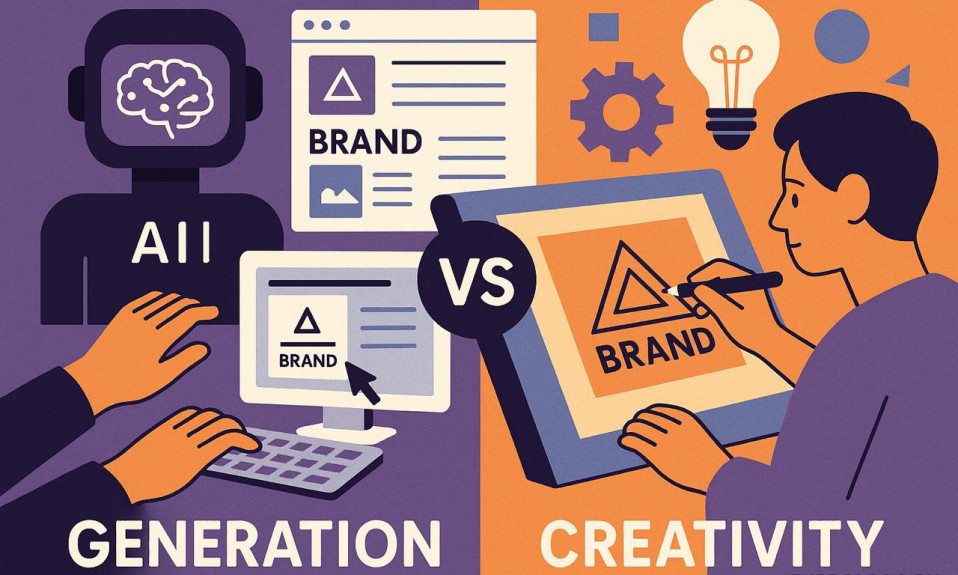
The font chosen for a modern logo has aesthetic and artistic values that help it stand out among a large number of competitors and be attractive to potential customers. Different text can be seen everywhere. It flashes in advertisements on TV, on banners, company signboards, on various types of products. It is the correctly chosen font that gives the opportunity to be remembered among the numerous texts present in the life of a modern person.
Table of Contents
The function of a font
The font should not only help the logo stand out, but also blend well with other elements of its design. It also affects people’s psychological perception. With the help of a font, a person can be left indifferent to the products and company to which the logo belongs. In our brain, at the sight of any picture or color there are certain associations. Therefore, all the elements of the logo should be harmoniously combined. This will cause only positive associations.
Some fonts are able to introduce a touch of elegance in the style of the logo, while others can make it weightless and romantic. The design depends on the activity of the company. The logo will be effective in promoting the company, if you choose the right font.
It is worth paying attention to the approach of the largest companies in the world. Many of them have a unique, unlike anyone else logo. At the same time they are always recognizable and have a high rating. For a successful and modern logo, you need to select a unique yet easy-to-read font that appeals to potential customers.
Why you need a unique font on your logo:
- Distinguish it from the competition;
- A way to attract customers;
- Providing brand recognition;
- Communicating the idea of the company.
By choosing a special font, the company is able to become popular from the first days of opening and stay on the market for a long time. Competently designed logo can attract a large number of new customers. The font allows making the brand memorable and recognizable.
When creating it, the features of the company, the concept, the basic principles are taken into account. The font should resonate with the idea of the organization, to be its addition and continuation. You should not give preference to variants, which are actively used by other companies. This is important when creating a unique brand.
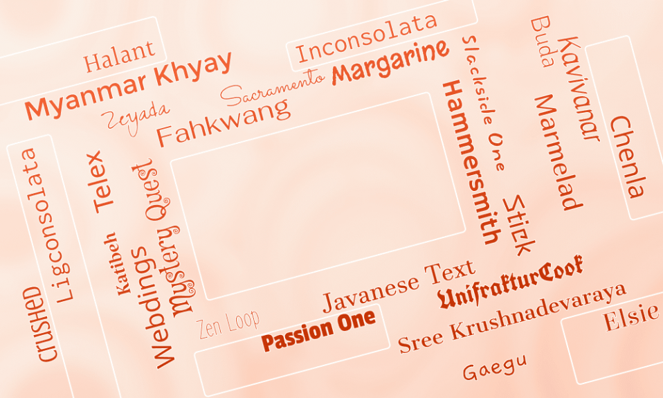
10 trendy fonts for your logo

The design of a logo text with different fonts allows to make it clear and visually appealing to the consumer. Styles differ in thickness, height of letters, distance between them, presence or absence of serifs.
Typography is rapidly developing every year. This is due to the high demand for new styles of text. Indeed, company owners understand the importance of font on the logo and constantly strive for individuality. Because of this, a large number of text styles are now offered. Below is a list with the most in-demand fonts in 2025.
The top 10 trending fonts for logos are:
- Butler;
- Bebas Neue;
- Choplin;
- Fenix;
- Ribeye;
- Nova Square;
- Pacifico;
- Gruppo;
- Life Savers;
- Oxygen.
Each of the presented fonts is unique and suitable for creating a modern logo. This year the trend is simple, but with a certain sophistication. Each of them is designed by professionals.
All these types of fonts have one thing in common – they make the text readable for potential customers, even at a great distance.
Butler

Combines the Dala Froda and Bodoni fonts. It is based on the classic style. This suggests the unlikelihood that this font will become irrelevant over time. The logo with its application will look great on advertising banners. It will speak to the sophistication of the brand. The font is simple and easy to read, it has no superfluous elements. This style of writing is widely used by many companies from around the world.
Bebas Neue

Has a moderate elegance and a high level of attractiveness. This is one of the variants of the popular, many remembered Bebas style. It should be taken into account that this typeface is not suitable for all types of activities, but for most. Bebas Neue combines several of the most important features – readability, elegance, the presence of clear lines. The font can be combined with any shade. It is capable of complementing any color on the logo.
Choplin

Refers to modern geometric fonts. It combines solidity and presence of serif letters. The main advantages of this font are its neutrality, simplicity and laconicism. Serifs on letters give the style a special character, temperament. It will be an excellent option for developing a unique and bright logo. Will look attractive on any promotional media.
Fenix

This is a modern style without excessive massiveness. This font is suitable for the logo of a creative company that seeks rapid development. The peculiarities of the style are serifs and jagged roundings. It has enough standard thickness of letters. The advantage of this style is high memorability. This allows the brand to become recognizable in a short period of time. The Fenix font looks brutal, elegant and easy to read at the same time.
Ribeye

This is one of the best of the handwritten fonts. It combines elegance and simplicity. When using it, you should consider the direction of the company. For example, this style of writing will not be appropriate for decorating the logo of a large legal company, as it is quite light for that. This font has a high degree of decorativeness and makes the text easy to read.
Nova Square

An original yet attractive typeface. Straight lines without serifs and curves prevail in it. This font creates the logo and conveys the seriousness of the company. Suitable for the modern organization, engaged in virtually any activity.
Pacifico

An interesting and unusual font, able to emphasize the uniqueness of a modern company. Rounded shapes of letters make the text soft and attractive. This font is sure to draw attention to itself among the large number of other promotional lettering and signage. It is handwritten, has a high decorative effect. This font is suitable for the logo of companies that create clothes and toys.
Gruppo

It is very popular and in demand due to its simplicity. The letters are rounded. This allows the text in this font to stand out from the many names of other companies. Despite the small thickness of the letters, the inscription on the logo is easy to read and notice among competitors’ advertising. There are no serifs in the font. The writing style belongs to the classic and will never cease to be relevant for use.
Life Savers

This font has sans serif letters and unusual artistic writing. This is a modern style that will allow the company’s logo to be remembered for its unconventionality. The non-standard forms of letters are the basis of this font, which is able to make any text original. The uniqueness is the guarantee of success for every company, especially at the initial stage of development.
Oxygen

A classic sans serif style with the original letterform. Perfect for creating a logo for any industry. This font lacks excessive artistry, which has the ability to distract from the essence of what the company stands for. The classic style is very often the key to success. It is worth looking at the logos of successful companies that are proof of this.
Tips for choosing a font

A person who has never created a logo, it is quite difficult to choose the right font and design for it. Before such an important process, it is worth studying the features of different types of writing styles. Some of them may have an intrinsic meaning.
A careful approach when choosing a font is the basis of the company’s success in the future and obtaining a decent, desirable profit. There are a few basic rules for selecting fonts that will help in creating a logo. To develop a successful variant it is worth considering each of them.
Basic rules for choosing a font for a logo:
- Take into account the age and needs of the target audience;
- Analyze fonts in competitors’ logos;
- Take into account the industry of the company for which the logo is intended;
- Choose classical styles;
- Give preference to simplicity.
When choosing a font for a logo, it is worth considering the age and possible preferences of potential consumers. If they are young people, the letters in the name or phrase can be creative, unconventional. For the older generation is suitable for a more restrained classic style.
The logo and font on it should reflect the activities in which the company is engaged. It is also worth analyzing data on competitors before choosing one. This will allow you to create a logo that does not look like someone else’s and choose a font that is not used by companies engaged in the same activity. This way you will be able to stand out from the crowd.
Many designers recommend giving preference to fonts that resonate with classic styles. These are the ones that are able to remain popular even after several years. Modern fonts are often made in a style that echoes the classic. This is done so that the logo does not lose its relevance after a couple of years.
It is also worth remembering that too tortuous letters with lots of extra lines or elements can not attract, but rather repel a potential client. It is logos with a simple font that most often become memorable and attractive.
Conclusion
The success of a company starts with a well-designed plan for the rapid development of the organization. Creating a winning logo and choosing a font for it is one of the fundamental parts of starting a new company. Rebranding can also lead a company to greater achievements.
The attractiveness of the logo speaks to the organization’s responsibility, its commitment to success. The style of the text should meet all the requirements and remain interesting for a long time for potential, and later regular customers.
For your successful logo, you should give preference to one of the trendy fonts of 2025 presented in the list above. It is also recommended to take into account all the features and rules for selecting a text style. If you follow them, it will be easier to make your company successful. It is not necessary to ponder over the choice for too long, the right decision often comes at once. You just need to choose one of the trendy fonts and match it with the background or additional elements, without overloading the logo with too much information.
I’m a product and graphic designer with 10-years background. Writing about branding, logo creation and business.