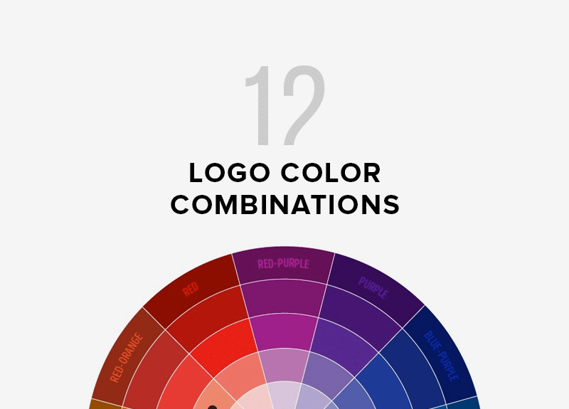
It doesn’t matter if you are creating a brand new or looking to refresh what you have, choosing the right logo is crucial. From carefully curated logo fonts to perfectly picked graphics, your logo tells current and future customers who you are and what you’re all about.
A logo can be bold and elegant or simple and elegant. The most important aspect of a logo’s design is its color. You should choose the right hues for your logo. They will enhance its overall appearance. The vibrant colors used by successful logos, such as Coca-Cola, McDonald’s, and Nickelodeon are a testament to their success. Some logos do not need to be bold colors in order to make a statement. Black and white is the best way to make your logo accessible, relatable and versatile.
Table of Contents
We love black and white logos
Sure, flashy logo colors are great when used thoughtfully, but sometimes the most effective, iconic logos are the ones that keep it super simple by employing just black and white. They are often the most memorable and successful logos. They are also cost-efficient and flexible.
It is much cheaper to print anything in black and white than it is to print in color. A black and white logo will be the best option for a brand just starting out, or looking to update its branding.
It’s important to think about all possible places your logo could end up. Your logo could be displayed on a wall, featured on a banner, or featured on the car’s window. It could be printed on a T-shirt, sticker, or Instagram profile. When you’re in need of a type of logo that will look good virtually anywhere, there really is no better option than black and white. It’s flattering and always looks good.






See more Black and White logos
What we have learned about famous black-and-white logos
It’s no surprise that logos that transcend the boundaries of color are what have made global brands some of their most successful. They are not only showing simplicity but also a logo that can be used anywhere.
The Nike swoosh is a favorite of many. It’s basically everywhere–clothing, footwear, gear and advertisements. The swoosh is not associated with a particular color. It’s about the shape and the association consumers make with the logo. The swoosh is so well-known that most logos don’t even need words.
Apple is another brand that has gained outstanding recognition without using words or color. Apple’s shape is easily recognized by consumers and they know what they are buying. It is rare for consumers to recognize the logos of Nike and Apple at this stage in consumer culture.
Logos in minimalist black and white
Let’s now look at some other ways to approach logo design. Let’s start with minimalism. It seems obvious, right? A simple black-and-white logo is clean and straightforward. While frills, glitter and holographic confetti are fun, your brand identity doesn’t need all those bells and whistles. It just needs a simple font, clean shapes, and perhaps a line or two that is visually pleasing. It is black and white (see what? It is.

Logos in geometric black or white
A black and white logo has the interesting advantage of being able to take on any shape you want and still look great doing so. Geometric designs are a popular choice. Think sharp angles, faceted effects, and strategic spacing. This option makes the logo more than just a shape and some letters. It’s art. Let the logo reflect your creativity and avant-garde side.

Luxe logos in black and white
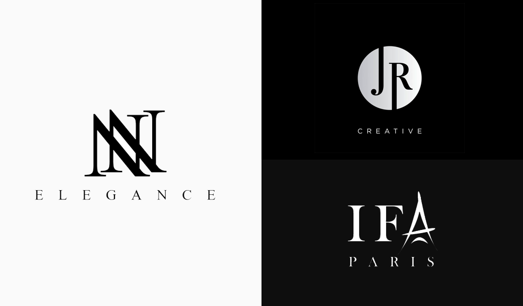
A monochromatic logo doesn’t have to be boring. It can actually be a great approach for brands that need to appear sophisticated at all times. You can think of luxury labels such as boutique hotels, high-end retail outlets and destination realtors. These brands thrive on bold, black and white logos with metallic trim. If your brand is fancy, show it. There’s no stopping you.
Playful logos in black and white
Brands that are professional and trustworthy will often use monochrome branding. Black and white logos do not have to be serious. You can give your black-and-white logo a playful, whimsical feel while keeping it classic and simple.

Benefits of a black-and-white logo
- Authority. A well-designed black and white logo is the best way to say “respect my authority”. Logos of athletic apparel companies like Nike, Adidas, or Puma have prominent, Bold black lettering in bold typefaceIt is accompanied by a simple, but powerful icon. Both the Nike swoosh logo and the black jumping panther trademarked by Puma exude authority.
- Classes. Gucci, Chanel and Coach are just a few of the many fashion designers who have black logos. Because nothing says sophistication like a black-and-white logo, this list is extensive. These designer brands don’t have to worry about colors, so they focus on font style and icons. Coach’s horse-drawn coach is a great example of this.
- Simplicity. A black and white logo has the advantage of not having to invest in color promotional materials, mailers, or other printed material. Customers will see that this logo design shows your company is able to compete with other industries-related brands, without having to use all the fancy colors (in this instance, bright reds, yellows, greens).
- Elegance. When you think elegant brands and products, Estee Lauder, Ralph Lauren and Lancome may be the first to come to your mind. A black and white logo will make your customers feel that you offer top-quality service and a more reliable product.
- It’s timeless. Apple, Disney, and SONY’s black and White logos have clean, modern lines that give them a sleek, modern look. These logos are timeless and simple, which is the best thing about them. These logos are easy to recognize, thanks to their use of clear fonts and well-sized icons.
- Minimalist. Some logos with black or white fonts can be complex, while others are more minimalist. Converse, Gillette and Louis Vuitton, for example, use a minimalistic font that is easy on the printer to print on their famous products. What to look for? Designing a black-and-white logo It’s important to keep your promotional products simple and conservative. Anything more complicated may not work well.
What if you only need some color?
Perhaps you are at the point in your life where you want to ditch color and go with black and white. This sounds great! One problem is that sometimes you might need some color. If you are a sponsor of an event and want your swag to stand out, this is a good example. You are in luck. Flexibility is one of the greatest qualities of a black-and-white logo.
The Nike swoosh logo is an excellent example of a neutral logo that crosses over into the world of colors. It’s black and white but it can be changed to any color you desire. You can easily change the color of a logo that is black or white to suit your needs. It’s the chameleon of logo design. Just makes sure to define what your logo can and can’t do in your brand style guide.
Are you ready to create the perfect logo in black and white?
A strategic decision to reduce the use of color can help your logo achieve a high level of recognition, versatility, and sophistication. You have the opportunity to make a black-and-white logo that will elevate your brand. Our global community of designers is your best resource.
I’m a product and graphic designer with 10-years background. Writing about branding, logo creation and business.

