
Walt Disney, as we know, isn’t only a talented guy with a remarkable smile, but also a founder of a megacorporation we all know since childhood. His contribution to modern world pop-culture cannot be underestimated, and even today the company makes trend vectors and fashion tendencies. But what did Walt Disney picture logo history begin with?
Table of Contents
Mickey the mouse – Logo Evolution
In order to know it, we need to remember that Walt Disney himself, wasn’t alien to art and had an extraordinary view of life. Walt, back in his younger years, worked in an advert agency as a designer. However he quickly became fed up with it and, as one of his peers, Walt rushed into Hollywood. He failed as an actor, but he didn’t give up and started to draw his first short-length cartoons.
At that time the very first Walt Disney logo was created. Initially, Walt drew Mickey-Mouse profile and it was an original and unique design. The logo rotated and changed color on the screen. Mickey-Mouse transformed from touching mouse into the most famous brand, thus it became the first cartoon character, who exceeded the bounds of the screen, becoming applied to various wares for kids and adults.
Walt’s castle – The Walt Disney Logo meaning
Nowadays, only true fans remember this Walt Disney logo, because we all know better another variation: a magnificent, fairy castle, a scattering of shining gems, and a short but mind catching melody. It has just flashed through your mind, really! By the way, logo isn’t always just a bright and attractive picture. Movement, such as the scattering of fairy, shimmering sparks – is a part of the logo too. And a melody as well, that’s something many people tend to forget about.
But there is another important detail of the Walt Disney’s company logo. It is the author’s signature, and regardless of frequent changes in Disney’s name variations, his initials remained the same. Sometimes Walt added Mickey-Mouse to his signature, artistically approaching the matter. It is hard to believe in 21 century, that the snow-white castle didn’t always beautify Disney’s cartoons. It is the multiplicator’s signature that possesses the longest-lasting trace in Walt Disney logo history. In old cartoons, we might notice the lack of a unified Walt Disney company logo. At the beginning of each cartoon, there is a signature, a new variation for each one.
The Walt Disney Logo symbolizes childhood fun, entertainment, joy and creativity of children and adults.
Walt Disney Logo font
The Walt Disney logo lettering is a Waltograph font.
The Walt Disney logo & company history
Maybe the creators wanted to specify thusly, that behind the huge company there is one talented person. And each new work appears thanks to him. And it was a well-taken step, as people trusted everything that was released under the brand and they still do. It is worth mentioning, that as a result, the author’s signature crowns not only every cartoon, but also TV shows, various wares and, finally, huge amusement parks – Disneylands, a place which every child dreams of visiting. This is all the same brand, of course, and nowadays all the production of Disney is well known.
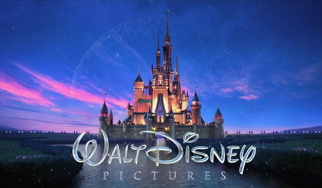
But how did this magnificent logo of Walt Disney company appear? The logo history begins in 1948. We all know that prototype was a majestic Bavarian Neuschwanstein castle. Multiplicators thought that Sleeping Beauty used to live in a castle-like this, so what could be better for a fairy cartoon world? Though the cartoons themselves were bright and colorful, the initial logo differed from them by being less colorful, that’s something that showed the good taste of Walt Disney logo designer back then. It was considered to be an advanced logo during those years. Logo lines are accurate and refined, and Tinker Bell fairy, scattering fairy dust, reminds of magic. However, the animation was added relatively late, in 1985. Since then, the logo was appearing in every cartoon and the logo has suffered but minor changes.
Contemporary Logo Design and Brand Synergy
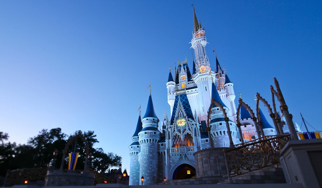
And what of now? The castle has remained in place, but it has become far more colorful, with more details. Though, now it Cinderella’s castle, who came escapes from daily routine and ends up on the ball. And animators offer the same thing to the audience. Colors are perfectly matched, and the latest technological advances allow to feature in the logo a new level of detailization. This is a good example of how a logo can show audience that something extremely interesting is waiting for them. The logo also depicts art reputation of the company. Just a few frames are enough to understand the core of the brand’s production, its brightness and colorfulness, happiness, and a fair amount of music in it. Even if you don’t like cartoons at all, it is still hard to deny that the logo is accomplished on a very high, professional level.
This is perhaps one of the most famous logos in the world, especially today, when the company owns many lesser art studios. Certainly, the company’s logo is a part of our modern culture. Disney’s logo is often parodied, let’s remember a vast array of drawings, depicting Mickey-Mouse wearing Darth Vader helmet, when the company purchased Star Wars. Like it or not, but the story of Disney corporation is worth learning from. Nobody knows what the future holds, but Disney’s logo is part of our history and will remain a symbol of captivating stories and animation magic for a long time.
Frequently Asked Questions
What is the meaning of the Walt Disney logo?
The Walt Disney logo symbolizes creativity, imagination, and childhood wonder. The castle represents a magical world full of dreams, while the stylized “Disney” lettering reflects the personal legacy of Walt Disney himself. Together, they evoke storytelling, animation, and timeless adventures.
Is the Disney logo Cinderella’s Castle?
Not exactly. The castle in the Disney logo is a fictional creation inspired by both Cinderella’s Castle and Sleeping Beauty’s Castle. It’s not a replica of either one, but rather a stylized emblem designed to capture the essence of Disney magic.
What was the old Disney logo?
The original Disney logo was simply Walt Disney’s signature. Over time, it evolved into more artistic versions, and in 1985 the iconic castle was introduced as part of the animated opening for Walt Disney Pictures. That marked the beginning of the modern Disney logo as we know it.
Is the Disney logo Walt Disney’s signature?
Yes — the word “Disney” in the logo is based on Walt Disney’s actual autograph. However, it’s been carefully stylized by designers to make it more visually balanced and iconic. It’s not an exact replica, but it captures the charm of his original handwriting.
Which letter in the Walt Disney logo is lowercase?
In the Disney logo, all letters are stylized, but the letter “i” is the only one that appears lowercase — it has a distinctive dot that stands out. The rest of the characters are custom-designed to resemble uppercase script, even though they don’t follow standard capitalization.
Who designed the Walt Disney logo?
While the name comes from Walt Disney himself, the castle version of the logo was created by the Walt Disney Pictures team in the mid-1980s. Later versions, including the 3D animations, were developed by professional animation studios in collaboration with Disney’s in-house branding teams.
How to draw the Walt Disney logo?
To draw the Walt Disney logo, start with the stylized word “Disney” using a font like Waltograph or by tracing the original logo. Then, add a fantasy-style castle above or behind the text, including tall towers, flags, and arches. Aim for a balanced and whimsical composition that captures the magical feel of Disney.

SEO specialist, link builder, and blog editor at Turbologo. Writing insightful content about marketing, design, and branding. Sharing practical tips on building and promoting brands online.


