
Red Bull logo history is a rebuttal of Kipling’s words regarding the twain and their meeting. Of course, many oriental manufacturers fail to try to enter the European market. In the case of Red Bull, however, the idea belongs to expert marketer and entrepreneur Dietrich Mateschitz. That might just be the reason for succeeding in taking its place on market with Coca-Cola and Pepsi rivaling the company.
It is unclear whether the world has benefitted from it. On the one hand, energy drinks are harmful and may cause some serious health problems. On the other hand, Red Bull logo can be seen near professional sports team logos and when attending festivals. The drinks seem to support youth sports. So, you can’t blame it being all wrong. And we are going to tell you about some excellent marketing moves and ideas.
Table of Contents
Red Bull logo history
The Twain final met when Dietrich Mateschitz found himself in Thailand. There he saw workers, drivers and just common folks drinking something strange. As it turned out, the was stimulating and quite tasty too. Dietrich quickly realized that people never sampled anything like this before. And he had some relations with drink manufacturers. That’s how the new fizzy drink was created.
The history of original Red Bull logo itself begins in 1987.
Red Bull Logo meaning
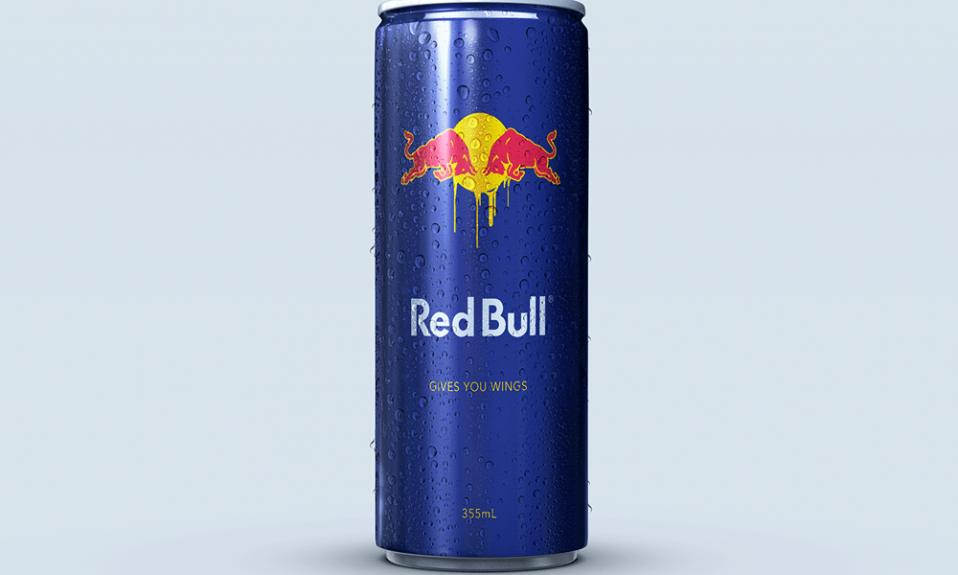
Logo meaning is really easy to get. Initially, the drink was for Muay Thai fighters. A logo where two red bulls were readying to fight is typical for Thailand. Therefore, bulls symbolize strength, red symbolizes perseverance and a bright yellow sun rises behind them. And Dietrich used his best judgment transferring all the unique cultural identity parts carefully in Red Bull logo.
Nowadays logo is a little bit complicated comparing with the first version. It has been added a mix of blue and silver against the background, this new color combination characterizes intellect.
Red Bull Logo Font
The logo was only complimented with a “Red Bull” inscription written in bold, English font. It was the name that the drink had in Thailand back then. They say that Red Bull is a unique merch font. But it looks like it simply was based on Futura as only a few letters were altered insignificantly.
Red Bull logo evolution
Throughout years the brand wasn’t altered for it remained profitable enough. An original design turned out to be resistant to major changes. Maybe it is all thanks to Mateschitz who is still owning the company. And let’s no one to interfere with his luck. This is for the best as Red Bull still looks exotic and trendy.
And here is a funny twist. In the beginning Mateshitz entrusted his friend Kastner with image making. The hardest part was to make a slogan. As the time went by, Kastner didn’t come up with anything of worth. Both friends were on the verge of despair no less. And so Mateschitz decided to ask some designing agency for help next morning. Kastner spent an entire night pondering the best variation possible and in the end he said “Red Bull gives you wings”.
And he designed the can too. The objective was challenging as the design was too bright. Kastner chose a blue and silver background to make Red Bull logo even more noticeable. However, a focus group considered the design being a failure. But Mateschitz knew that the idea was a success and just kept developing it. Thanks to a carefully planned marketing strategy he managed to make the drink extremely popular!
Legendary logo Red Bull means that when you drink this drink, the energy is added and the person becomes like a bull, hardy and hardworking. I tried this drink, I didn’t want to sleep. He is energizes well.
Red Bull uses the Spain Bull proprietary font in its logo with some similarities to the futura bold font.
Skydiver Felix Baumgartner jumped from a height of 39,000 meters. He has been preparing for this for 5 years. The Red Bull company paid 50 million euros.
Red is often associated with energy, which is why it’s prominently featured in the Red Bull logo. In bullfighting, for instance, red is used to provoke the bull, symbolizing vigor and vitality. The color red also represents life and blood, essential elements of existence. This choice was likely intentional, reflecting Red Bull’s brand identity as an energizing beverage. The drink is especially popular among long-distance taxi drivers who rely on it to stay alert and active. Red Bull’s widespread recognition is a testament to its effective branding and marketing strategies.

SEO specialist, link builder, and blog editor at Turbologo. Writing insightful content about marketing, design, and branding. Sharing practical tips on building and promoting brands online.


