
Pepsi-Cola is one of the contemporary world symbols that doesn’t need an introduction. All of us what does the blue-red yin yang means. In contrast to its red-white market rival, whose logo didn’t change over the years, Pepsi is always looking for fresh ideas. And so, we’ll tell you about the Pepsi logo evolution in this article, and provide you with a couple of little known facts, which you haven’t heard of before!
Table of Contents
Pepsi logo history – Sources of popular beverage and label
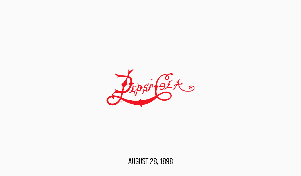
It is little known that initially Pepsi was called Brad’s drink. Everything has changed when it was named Pepsi-Cola in august 1898. It is still unknown, how did the name appear. Some say that it has something to do with pepsin ferment, as Pepsi was sold in drugstores and it was considered to be a digestion medicine. Pepsi is said to be a harmful sweet drink today, but it actually was something opposite. What a twist! Some say, however, that the name can be heard when you pour Pepsi in a glass and you hear beads pepping. The second version sounds more reliable, doesn’t it?
The old Pepsi logo looked really dull. It was but an inaccurate, messy lettering, full of useless details, which also was hard to read. And the cheap inscription looked like any other. Small wonder that this option was removed. Pepsi has entered a new millennium with still irrelevant details, but a more accurate and legible logo. It didn’t significantly change until World War II when the letters started to follow the square pattern and destabilization simplified even more. A true success of marketologists has been the Pepsi jingle (Nickel, Nickel). Its popularity made Life magazine include it in its list of timeless tunes.
Pepsi logo evolution
![]() Years passed and the world changed and in order to stay on the verge of success, the company had to redesign. The 60s became a true turning point for Pepsi. Firstly, the logo was fitted in a round, pointed bottle cap. Secondly, the famous, blue-red yin yang has appeared. Thirdly, the word “Cola” was removed from the name. Pepsi will never use it again.
Years passed and the world changed and in order to stay on the verge of success, the company had to redesign. The 60s became a true turning point for Pepsi. Firstly, the logo was fitted in a round, pointed bottle cap. Secondly, the famous, blue-red yin yang has appeared. Thirdly, the word “Cola” was removed from the name. Pepsi will never use it again.
70s design was even more minimalistic. In many cases logo simplification is the right move, this case included. The pointed cap has disappeared, leaving the Pepsi logo extremely simple and clear. It seems that it’s the best Pepsi logo ever, as the flat-design trend is popular in the modern world. The sign is unique, original and fresh, even nowadays it looks good. Consequently, this variation is being used today. There is, however, a special line of Pepsi in glass bottles with a vintage Pepsi logo. The design is aimed at a particular target group. And this fact tells of Pepsi being ready to face the needs of every single customer.
With minor changes, the logo existed for a long time. But in the 90s, volumetric images became popular, and the new Pepsi logo was affected as well. The sign became round, the background turned blue and the font switched to white color.
Current Pepsi logo meaning
While the major Pepsi rival keeps its logo, Pepsi is looking for something new. The current Pepsi logo shows that sometimes it’s better to stop. A search for the best can cause a loss of a good. 70s logo was beautiful and trendy. Should the company keep it, it would go down into history. Nevertheless, they decided to follow a different path. A well-balanced contrast of blue and red was altered to become more stylish and up-to-date. And they totally failed. The balance was lost, a white stripe in the center contorted, and many customers were asking why. It seemed that the new logo offended them somehow.
How exactly? Well, many implied that the white line resembles a fat belly that can be seen in an opening between a red t-shirt and blue jeans. Really offending, isn’t it? Moreover, it is well-known that sweet carbonated drinks are a shortcut to obesity. So, why reminding this to customers? Not all of them thought that way of course, but with help of the internet, the logo became part of countless memes. Even those how haven’t notice that variation before began to laugh at it. The lesson to learn here is that one must scrutinize a new label before issuing it. If a lame rebranding was spotted on the Internet – you won’t be able to remove it!\
Pepsi logo font
Pepsi logo is featured a basic, all-capital sans serif font.

SEO specialist, link builder, and blog editor at Turbologo. Writing insightful content about marketing, design, and branding. Sharing practical tips on building and promoting brands online.


