Any successful company requires successful branding. This notion is comprised of numerous elements, ranging from slogan, logo and name development to target group studying and proper advertising. Only a correct combination of the given items will turn your company into a legendary brand. So, now we are going to analyze various companies’ logos in order to find out what actually makes a company logo design so very unique and special.
Create your own logo with Turbologo logo maker. It takes less than 5 minutes and no design skills needed.
Go to Logo MakerTable of Contents
Consulting history
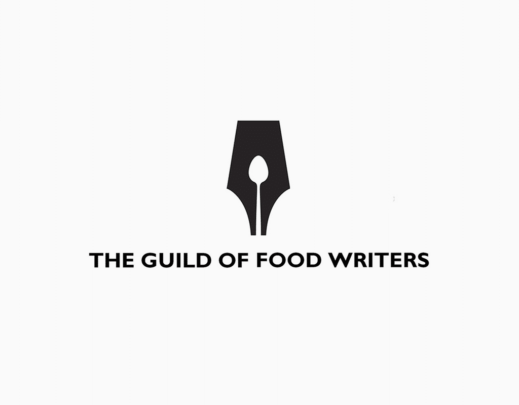
People like things with history; quite often stories behind a brand make it part of culture and everyday life, and the, in turn, makes it somewhat unusual and firmly desired. Without the history any vintage crockery turns into ordinary porcelain trash, and a vinyl plate becomes useless, annoying dust collector. Who uses a quill for writing nowadays? Nobody, and ballpoint pens are slowly being replaced by sensor keyboards. But we all know a quill as a symbol, and the Guild of Food Writers logo, people who are busy with polishing writing and culinary talents, are also of some importance to us. Their logo is a good example of negative space usage. You’ve noticed that spoon, haven’t you?
From history to geography
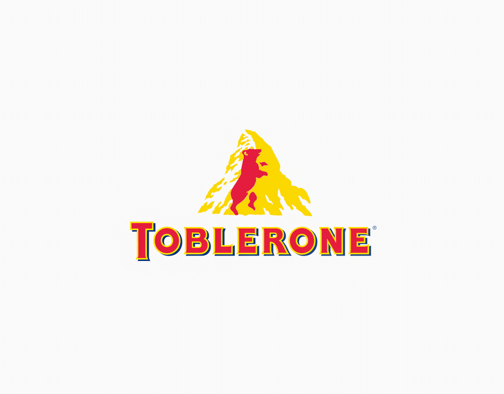
This history effect of a product can be created by getting to place where it was manufactured. A location is also part of history, and being presented in company logo would mean relation to its roots. One of the best examples of such business logo design is Toblerone chocolate. The logo depicts Matterhorn in Swiss Alps, and everybody knows that best chocolate is produced there. Customers don’t have to familiarize themselves with composition or producing country, as logo shows all the advantages. Even the chocolate itself is mountain shaped, which also a good move. And then again, rather professional usage of negative space, as bear is a symbol of company’s hometown.
Brand face
Quite often, companies offer actors and celebrities to become their faces, and it has its uses. However, many stars aren’t as faithful and take part in several adverts at the same, thus ruining a marketing effect. A made-up and drawn character, as opposed to them, will never betray you. M&M’s can’t find out their relation to Alps, and Marlboro Man will never smoke Lucky Star, and of course he will never use that nicotine patch. So, if you are having a drawn, fictitious guardian angel, making it your business logo is the best option here. Actually, Michelin has already done so. Certainly, we know many other quality tire producers, but what about their logos?
Encoded details
Company logo is mini-history of your brand told by a tiny picture. Consider well a usage of that space. We already analyzed some negative space examples, but how to design a business logo with an additional sense about it? You just look for an opportunity to endow your logo with details, which would encode some message in it. Follow the Baskin Robbins example. If you study their logo carefully, you will notice 131 number, which implies a wide range of tastes and flavors.
Don’t be afraid of bright color
Don’t forget about colors and their meanings. All those “how to make a business logo” guides state that bright colors, such as red or acid-green, ain’t your best choice, but in some cases it proves to be just fine. Bank of America red logo implies it to be the first, the strongest and the best, as it is a color of leadership and power.
Don’t forget about fashion trends
If your establishment is a reliable college of lawyers, then you might care less about fashion trends, but if your business is somehow related to fashion industry or contemporary pop-culture, following tendencies and label customizing is are a must for you. Your business logo must change according to up-to-date situation. Take Starbucks for example, they often alter their logo accepting contemporary standards, as their target group is youngsters.
If a brand doesn’t follow tendencies – it disappears. Remember that Nokia case? The ones who ignored smartphones and perished? Motorola company once followed quite a similar path, who also found new technologies unreliable. We will never see that logo again, as the company was bought by Lenovo giant. So, our ultimate advice is that don’t pay attention to a picture, which can be created for free using online graphic editor. In the end, it is your company itself, and all it does or produces that makes it successful.
I’m a product and graphic designer with 10-years background. Writing about branding, logo creation and business.

