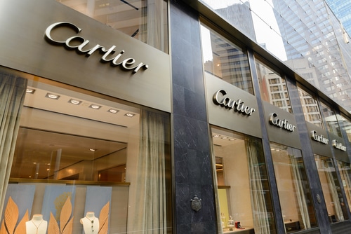
Two letters C interlaced elegantly are known as logo of Cartier. The brand is fashion lawmaker for more than a century. Cartier is dealing with jewelry, watches and perfume rather than clothing, unlike any other fashion house. Even royalty adores Cartier! In this article, we’ll tell you about the ascension of Cartier.
Create your own logo with Turbologo logo maker. It takes less than 5 minutes and no design skills needed.
Go to Logo MakerTable of Contents
Paris, a good place for a startup
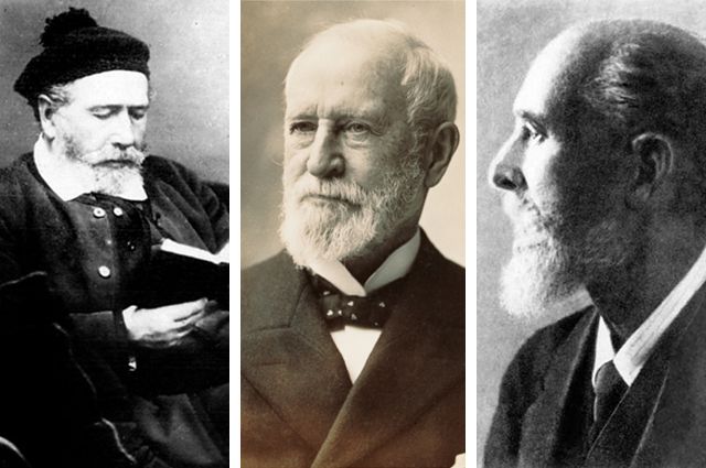
Louis Francois Cartier was a son of a powder flask owner. It clearly isn’t the most suitable surrounding for a talented child. However, Louis was dreaming of abandoning powder business and becoming a jeweler since his childhood. His parents were against it though as only royalty can afford jewelry. Everybody needs powder!
However, fortune favored Louis-Francois. He founded a jewelry shop in Paris, and was lucky to find customers among Blue Bloods!
Cartier logo history
The word of a talented jeweler got spread among the nobility soon, and was a beginning of Cartier logo history. Who designed the vignette with interlaced C letters is still unknown. But some people say that the very first Cartier emblem was created by Pierre Cartier, the grandson of the founder of the Cartier company. The emblem was designed in 1900, however, it was patented and registered later in 1910.
Cartier logo evolution
So, the first logo was first introduced in the beginning of XX century. Cartier logo adopted only a couple of minor changes since then, but it still stands tall against its modern rivals.
Logo meaning
The meaning is simple of course. It’s company founder and owner surname initials. Channel and Gucci once did the same, as it’s apt and elegant move. Letters “C” are abundant in notches, which atypical, yet alluring and unusual.
Cartier logo font
Cartier logo lettering use a calligraphic handwritten oblique font – Cartier CG.
The inscription is a sophisticated handwriting. The font used in Cartier logo is actually a unique inscription, designed in XIX century. It was used in labels initially. And you can’t type something else with the font, but you can download Cartier logo vector image. It is worth mentioning that monochrome design makes the brand identics even more elegant.
- Star Wars Logo Design – History, Meaning and Evolution
- Solar Energy Logo Design — Inspiration Logo Ideas
- Delivery logo: 15 ideas for inspiration
- Top 10 Search Engines Globally in 2023
- Guinness Logo: History and Meaning
Blog editor and content marketing specialist at Turbologo. Writing about Marketing and design. Victoria’s articles contain useful tips on how to build a brand and promote it online.