It is a common knowledge that computer games have far surpassed a level of “childish games”. Vast amounts of money are put in by both customers and developers. Consequently, a console developed by Microsoft is a formidable foe for any other console. And an Xbox logo is well known outside of gamers’ circle. Today we will tell you how one of the most popular consoles was created, and about its image as well.
Create your own logo with Turbologo logo maker. It takes less than 5 minutes and no design skills needed.
Go to Logo MakerTable of Contents
XBox logo history
Xbox logo history begins in 2000s, when a Microsoft professionals team decided to enter gaming business. They want to oppose gaming mega giants and lead the industry. It is worth mentioning that without Bill Gates’ support it would be impossible. And even having it they were having tough time developing something worthy.
The console was meant to possess many other functions along with video games. The console must be quicker and easier to service than an ordinary PC. And they were also planning to surpass all the rivals. The prototype console was assembled of Dell computer spare parts. And they called it “DirectX Box”. However, like many other long names it was shortened to “XBox”. There were other names, like “Xenon” or “NextBox”, but Microsoft marketers didn’t like them. Having asked common folks on the streets the name “XBox” was finally authorized.
XBox Logo meaning
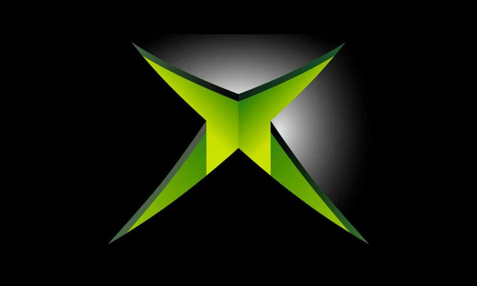
So, how was the original “XBox” logo look like? Well, it was based upon “XBox” inscription, which was typed in acid-green futuristic font. The logo was supposed to symbolize new technologies that will change the world soon.
XBox logo evolution
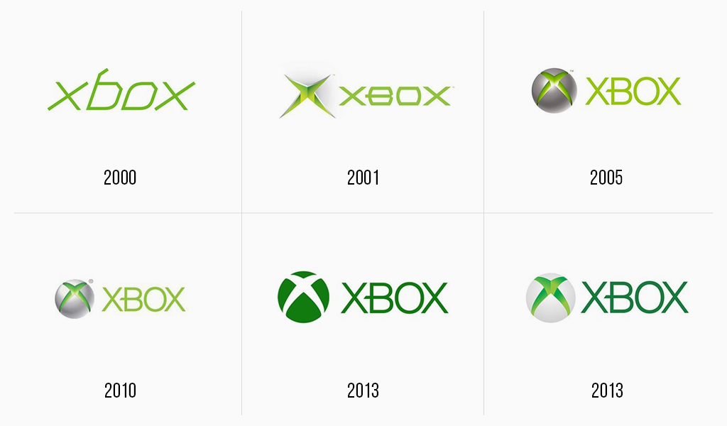
The initial label was soon altered. They decided to add a graphic element, a stylized “X”, designed to resemble a chasm. And so it was represented to audience. When the console was ready to sale, Bill Gates himself got to advertising it. He ran the presentation accompanied by Dwayne “The Rock” Johnson.
Microsoft spent tons of money to run a marketing campaign smoothly. The presentation took place in Las Vegas in 2001. Regardless the fact that the console didn’t quite meet gamers’ expectations, and Microsoft marketers were boasting nothing, a commercial success was still achieved. The console was selling like hotcakes, in spite of its higher price than that of rivals’.
Xbox 360 logo
The second Microsoft console was invented in 2005. “XBox” 360 wasn’t just placed on market, it was solemnly launched. Elijah Wood was running presentation on MTV accompanied by the Killers. And the brand itself was altered as well.
Xbox 360 logo was much like its predecessor, but it was endowed with enhanced graphic constituent. The chasm was placed into sphere. Logos could be volumetric back then. The logo remained unchanged until 2010, when the sphere was colored with brighter shade of grey.
Xbox one logo
The previous console had to step aside as its new modification was assembled in 2013. Everything becomes obsolete fast in gaming hardware industry. However, the designing industry develops as well and 3D logos were removed. That is why new Xbox one logo was designed flat, though no other considerable changes followed. Some specialists imply that Xbox logo design was affected by Windows design as “X” shape is quite similar to Windows logo. Whatever the case is, the console took its rightful place on the market. Nobody knows what the future holds, but many fans has already remembered the logo for years to come.
Current XBox Logo font
The Xbox One logo is featured a “X360” font, which was created by Redge.
It’s pretty funny, but the answer is very simple. The artist who created the Xbox sign simply had no other markers left. It’s actually true, one of the creators, namely Seamus Blackley told this: “When the artist needed to quickly create a logo for a meeting with company bosses, he had one of the amazing sets of markers with sharp, colorful tips. And so they were all stolen from his office. The only color he had left was like green, and so we made all the art that way.”
The Xbox logo was invented by Microsoft, at a time when the market was actively developing with the gaming industry. Initially the firm did not assume the option that the console would be developed by them, so in 1999 Microsoft came up with the idea that SEGA would add a special version of Windows CE. Unfortunately the experiment came out unsuccessful, but Microsoft engineers learned some useful lessons for themselves. This is how the first DirectX Box, now known as the Xbox, came about.
This button is used a variety of purposes. First of all, it turns on the gamepad or console if they are not on. It is also responsible opening the explorer in the control. During a game, it opens a special function called Game Bar. If you press and hold it for 6 seconds, it will turn off the controller.
First, make sure that the connection was successful. The problem may be a bad Bluetooth connection. Try reconnecting the device and if the logo continues to blink, contact Xbox Technical Support.
This is not the largest icon, the maximum resolution that the Xbox logo has is 2048 × 2048 pixels. The minimum is 240 × 240. There are other sizes as well, the average being 480 × 480; 768 × 768; 1024 × 1024.
Blog editor and content marketing specialist at Turbologo. Writing about Marketing and design. Victoria’s articles contain useful tips on how to build a brand and promote it online.

