
There are many famous brands on fast food market. And Wendy’s is one of those which often occupies leading positions. The company’s first fast food restaurant was opened in Columbus in 1969. It is well known for its tender beef burgers. Many customers enjoy Wendy’s due to individual cuisine. Such an individual approach resembles that of mother’s. And that might just be the thing which the company wants to stress by its design and image. But let consider things chronologically.
Wendy’s logo History
You are sure to see that wonderful and vivid label on the streets of your city. The company designed its brand rationally indeed. If you run a restaurant business there is much you can learn from them. You could even use online services to make a similar logo. You’ll be able to make a vector image for free and then download it. And we are getting back to Wendy’s history.
Food quality brought popularity to the company in 1969, in the same year the history of the logo started. Their burgers were always made of fresh meat. And you didn’t have to wait long as service was really quick. A menu also listed worldwide known desserts. And a nice branding reflected all the things mentioned. A pretty, red head girl was smiling in a logo, and her name was Wendy of course. Her prototype was a founder’s daughter with the same name. Her mom deliberately sewed the white and blue dress for her and pigtailed her hair. Such a cozy, warm atmosphere characterized every achievement of the company.
Wendy’s logo evolution
As the original logo was quite suitable, Wendy’s didn’t have to alter it completely. And the initial variation was reminding of those good old days. A notched font as it seems was taken from one those movies about the first Wild West settlers. And ringlets along its general view resembling a wagon were adding up to the style as well. There was an inscription about old fashioned burgers highlighted by a bright yellow plate. And all of those were carefully combined. At the top there was a company’s slogan which was stating that the only quality secret is fresh ingredients and proper cooking.
That was the first variation of a slogan. It was changed a few times, as opposed to Wendy’s logo. They began to think about rebranding just a few years ago. The old variation, whatever nice at could be required a contemporary designing means. However, the company decided to keep its style identity.
Wendy’s logo meaning and its secret
The company has put not only effort into logo change, but also love, as they always do. The pretty little girl is a grown up woman in reality. But not in the logo, where she remains the same old little Wendy. By the way, the company founder regretted his decision regarding naming the brand after his daughter, as it was weighing heavily upon her. However, she still remains a renewed symbol of the restaurant. All the lines in the logo have now become smooth and modern.
And those are the lines that keep a secret! It is in a blue and white, waffle collar to be precise. You can make out a word “mom” in there. This a very nice move, especially for single colored logos. Such logos are often drawn on food packages. You taste the food and subconsciously think that this is mom’s cooking. And that means it’s the best. Critics have issued a series of accusations towards Wendy’s as they directly affect subconsciousness, which can be harmful. The company’s direction implied knowing nothing about it. It is hard to believe though as it’s not likely for a giant company to know that little about their own creation.
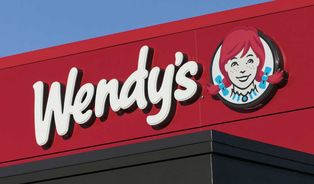
The Wendy’s iconic logo consists of a brand name and a red haired cheerful girl with a freckle face in a circle. The inspiration came from an eight-year-old daughter of the company’s founder – Dave Thomas. The girl wears ponytails and smiles at you with a friendly attitude. There is a noticeable predominance of red color in the logo, besides which there is also white and blue colors with a black outline. Unlike the previous logo, the current version of it portrays Wendy in a more relaxed and hospitable manner, where she burst out of the frame and is no longer “imprisoned”.
Not everyone would notice literally but a short inscription is to be found in Wendy’s shirt collar. The word “Mom” is not so clearly visible but the general idea of it works in the subconscious. Since the cuisine of a fast food restaurant specializes in homemade burgers, the mention of Mom’s usual cooking would come in handy. It’s supposed to make you feel comfortable and try the familiar taste if it was the meal cooked by your mother. Such a mention influences a consumer to make a choice in favor of the company, because nobody cooks better than your mother.
The main mistake in the Wendy’s logo can be considered the unwillingness to change in step with the times. For 30 years the logo has remained the same and very outdated. The western design trend is not modern or even up-to-date, and to some extent the chosen design strategy stops the flow of new customers. Young people can consider such a logo as a cringe, despite the company’s rebranding efforts. The disregard of modern trends and adherence to the old style negatively affected the company’s image. There is no way to squeeze something new out of the old version, hoping for innovative breakthroughs.
After the company was sold off and passed to new owners, the renovations were not long in coming. In 2013, the company planned to spend about $ 10 million on changing the appearance of franchised restaurants, which included updates to the logo on signs, staff uniforms and packaging. The change of the logo was the beginning of a marketing move in general and the capital cost of this project was not cheap.

SEO specialist, link builder, and blog editor at Turbologo. Writing insightful content about marketing, design, and branding. Sharing practical tips on building and promoting brands online.


