
Guinness, the Irish beer brand, was first brewed in Dublin, Ireland in 1759. It is one the most famous beers in the entire world. Guinness, which has been in the family for the greater part of the 20th century, is now part of Diageo Group. It is brewed in 49 countries around the world and sold in more than 150.
Guinness has evolved over the more than 260 years since its founding. However, its logo has stood the test.
Table of Contents
Guinness logo history

Guinness was established in 1759 by Arthur Guinness, a brewer. His brewery was established in a shut down building in a low-profile part of Dublin. The city made an incredible deal for the founder. The founder rented the property for 45 pounds per year over 9,000 years. Guinness specialized in stout beer, which is a beer known for its dark, almost-black color. Decades after decades, Guinness began exporting its beers across the British Empire and eventually around the globe, becoming the most well-known stout. It is due to high quality products, strong branding and advertising (often using the iconic toucan bird) since the 1940s. Guinness’ logo has stood the test of time because the Guinness harp symbol was used as a logo as early as 1862.
Evolution Logo Guinness
Since the beginning of the history of the beer’s iconic brand, the visual identity has been built around one simple symbol. The Golden Harp is more than a simple symbol or picture. It is synonymous with the brand, representing its philosophy, history, and values.
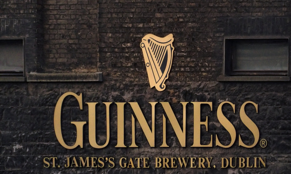
1862-1955
Guinness’s first logo was created in 1862. It featured a monochrome badge and a double oval outline, where the ornate wordmark was in two styles. The emblem’s upper portion featured a harp, which was surrounded by cursive letters. Although it was an ordinary logo for its time, it had a lot text and details. However, it looked professional and strong.
1955-1968
The 1955 Guinness logo was reduced to a single harp. It was drawn in monochrome and placed on a white background with no lettering or framing.
1968-1997
1968 sees the Harp get modern contours and a new color palette. Now its thick and smooth lines in dark l are placed on a gradient background of blue, resembling the sky, and instills a feeling of lightness and freedom.
1997-2005
In 1997, the wordmark was added as an additional element to the logo. The brand’s custom serif stencil font was as natural as the golden harp. It has only been slightly improved over the years. This logo features all letters in the same size. It looks massively masculine and is located beneath a feminine emblem.
2005-Today
In 2005, the color palette was expanded. The golden harp was placed above the white inscription on a black background. Although the wordmark was set in capitals, only the first letter was increased in comparison to the others. This adds sophistication and timelessness to the text. The date mark “est 1759”, in thin white symbols, was located to the left and right of the emblem.
2016-Today
Guinness’ visual identity was redesigned in 2016. The new emblem is three-dimensional and metallic. The harp was enlarged, and the white inscription received a new typeface that has elongated serifs and sharpened serifs. This font looked very elegant and old-fashioned.
The Guinness logo’s meaning

Benjamin Lee Guinness adopted the harp as Ireland’s national symbol in 1862 to promote his beer. The logo was based on a particular harp, the Brian.
Boru’s Harp is the oldest Gaelic harp.
The official national emblem of Ireland is the harp, which can also be found on Republic’s coins.
There is however a distinction between the Guinness and Irish government harps. The Guinness Harp is always displayed with the straight edge (the soundboard), while the government harp appears always with the straight edge (the soundboard), to the right.
Over the years, there have been many changes in the design of the Harp Device. These include a decrease in the number strings. Design Bridge introduced the current harp in 2005.
In custody
When designing your logo, or redesigning one, don’t be afraid to draw inspiration from Guinness. You could use the Guinness logo as a reference symbol for your region. You might find inspiration in the mythology and legends of your country. For example, did you know that the Nike logo was inspired by the Greek goddess of victory?
I’m a product and graphic designer with 10-years background. Writing about branding, logo creation and business.


