“Over the years, I’ve seen countless logos try to say too much — and fail. But when I see a strong monogram, it speaks in silence. That’s the power of compression in branding.”
— Mikhail Khomutetsky, Founder of Turbologo
Table of Contents
What Is a Monogram Logo?
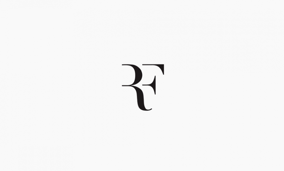
A monogram logo is a design built from one to three stylized letters — typically the initials of a brand or individual — combined in a way that creates a compact and recognizable symbol. Think of LV for Louis Vuitton, CC for Chanel, or HP for Hewlett-Packard. These aren’t just letters; they are distilled identities.
Monogram logos can be decorative, minimalistic, geometric, or even abstract — but they always retain a core function: they represent the essence of a name through typography.
Monograms originated as signature marks for artisans, nobles, and royalty. Later, they were adopted by fashion houses and industrial brands that needed a timeless mark. In modern branding, they’re the go-to solution for businesses with long names or for creators who want something elegant and concise.
How Is a Monogram Logo Different From Other Types?
| Logo Type | Description | Example |
|---|---|---|
| Wordmark | Full brand name in stylized typography | Google, Coca-Cola |
| Lettermark | Initials only, usually simple and legible | IBM, CNN |
| Monogram | Interwoven or stylized initials, often artistic | LV, YSL, HP |
| Pictorial | A symbol or icon (no letters) | Apple, Twitter |
| Emblem | Text inside a badge or seal | Starbucks, Harley-Davidson |
The distinction between a lettermark and a monogram is subtle but important. Lettermarks emphasize clarity and minimalism, while monograms often embrace stylization, symmetry, and visual balance — turning text into symbol.
Why Use a Monogram Logo?
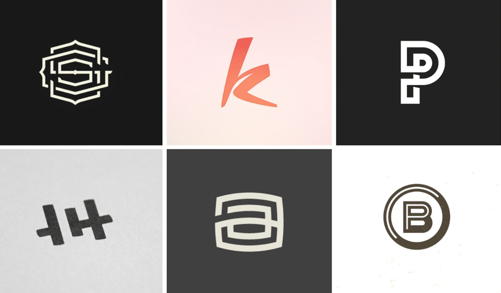
Monogram logos solve a very practical branding issue: they make long or complex names short, stylish, and memorable. This is crucial for new businesses that need to stand out visually without overwhelming the viewer.
Let’s say you’re launching a boutique called “The Olive & Juniper Apothecary.” A full wordmark may be too long for a business card or packaging. But a custom “OJ” monogram could be memorable, flexible, and chic.
Famous Examples That Work
- Louis Vuitton (LV): Probably the most recognized monogram in the fashion world. Classic serif letters interlocked for timeless appeal.
- Chanel (CC): Two mirrored Cs that became a symbol of elegance and femininity.
- HP: Hewlett-Packard’s monogram balances simplicity with technological edge.
- LG: Combines “L” and “G” into a stylized face — friendly, futuristic, and corporate.
- New York Yankees (NY): Sports teams use monograms for immediate recognition.
Why Monograms Resonate
- Minimal effort, maximum recall: Easier to remember than a full name.
- Fits any medium: From app icons to signage, monograms scale well.
- Perceived sophistication: Especially in fashion, luxury, and lifestyle.
- Symbolic layering: A well-designed monogram tells a story through form.
How to Create a Monogram Logo: 5 Easy Steps
Creating a monogram isn’t just typing two letters in a fancy font. A true monogram is designed — carefully and consciously. Here’s my recommended step-by-step process.
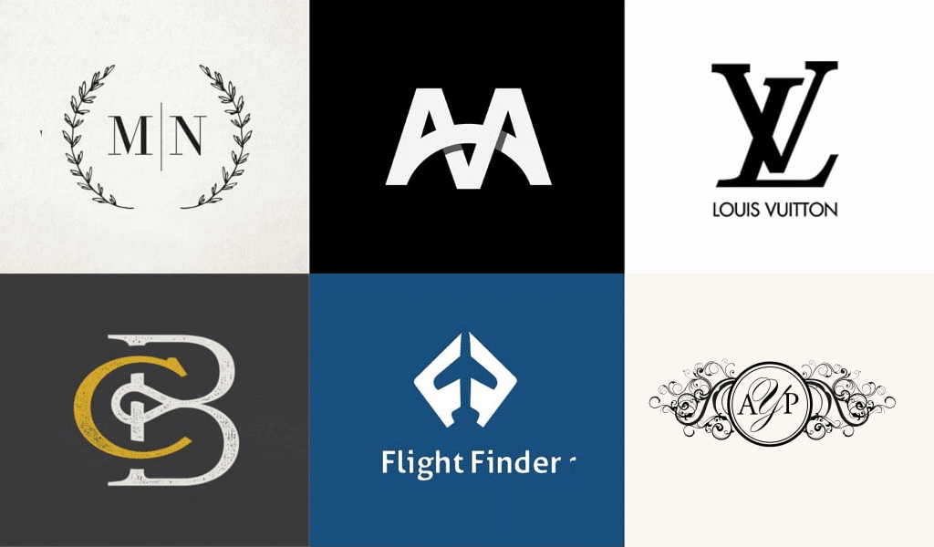
1. Define the Brand Essence
Before drawing anything, ask:
- What values should this logo communicate?
- Is the brand playful, elegant, bold, minimalist?
- Who is the target audience?
You can’t choose the right font or layout if you don’t understand the brand voice.
2. Choose the Right Initials
Most monograms use 2–3 letters, and they matter more than you think.
- Use the first letter of each word in the brand name (e.g. “Turbologo” = T).
- For personal brands, consider middle initials only if they help flow (e.g. “MJH”).
Avoid ambiguous combinations like “OO” or “LL” unless symmetry is your goal.
3. Pick Your Typography Style
Fonts shape emotion. Choose wisely:
- Serif = tradition, luxury (Chanel, LV)
- Sans serif = modernity, clarity (HP, LG)
- Script = elegance, femininity (good for salons, fashion)
- Display fonts = uniqueness, flair
Make sure the font allows customization — you may need to stretch, merge, or rotate characters.
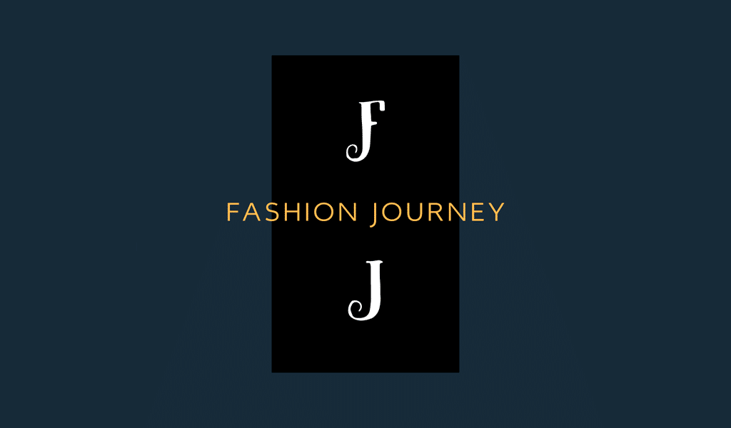
4. Compose the Letters
There are four main layout types:
| Layout Style | Description | Use Case |
|---|---|---|
| Stacked | Letters placed on top of each other | For vertical emphasis |
| Interlocked | Letters overlapping or intertwined | Fashion, high-end brands |
| Side-by-side | Clean horizontal layout | Tech, startups |
| Framed/Contained | Letters inside a circle/square | Badges, emblems, luxury |
Test all variations — sometimes a diagonal overlap gives a surprising balance.
5. Adjust, Simplify, Polish
Don’t overdesign. Keep:
- Equal spacing
- Visual harmony
- Scalability
Then, test your monogram on black, white, and colored backgrounds. It should work at 16px and 1600px.
Expert Tip
“If it looks like something from a royal seal or fashion label — and still fits on a favicon — you’re on the right track.”
— Mikhail Khomutetsky
Design Guidelines: Fonts, Layouts & Colors
Good monogram design is more than initials — it’s about balance. A powerful monogram doesn’t just “look nice,” it holds its shape and communicates consistently across formats.
Font Selection
| Font Type | When to Use | Famous Examples |
|---|---|---|
| Serif | Elegant, classic, upscale | Chanel, LV |
| Sans Serif | Clean, modern, versatile | HP, LG |
| Script | Feminine, boutique, ornate | Salons, florists |
| Display | Trendy, attention-grabbing | Indie brands |
Avoid overused or cliché fonts. Custom lettering or slight modifications go a long way. You can explore curated typefaces in our list of modern fonts for logos.
Layout Principles
- Symmetry matters — especially with 2-letter monograms.
- Negative space can create hidden meaning or visual clarity.
- Grids help maintain proportions across versions.
Color Strategy
Monograms often lean minimalist in palette:
- Black/white: Timeless, adaptable.
- Gold or silver: Luxury signal.
- Pastels: Feminine, soft industries.
- Monochrome: For tech or startups.
Use no more than two colors unless the brand demands vibrancy. For better choices, see how the psychology of color affects brand perception.
Gallery of Iconic Monogram Logos
| Brand | Letters | Style | Description |
|---|---|---|---|
| Chanel | CC | Interlocked | Mirrored elegance, symmetrical perfection |
| Louis Vuitton | LV | Overlapping | Classic serif elegance, timeless prestige |
| HP | HP | Side-by-side | Clean lines, tech identity |
| LG | LG | Circular | L + G in a face-shaped circle |
| NY Yankees | NY | Stacked | Legacy sports branding |
| YSL | YSL | Diagonal | Slim, layered, high-fashion edge |
These designs prove that initials alone — when crafted well — can build billion-dollar recognition.
Quick Monogram Generator Tools
You don’t need to be a designer to create your own monogram. Several AI-powered tools exist that let you experiment with fonts, layouts, and symbols instantly.
| Tool | Strength | Good for… |
|---|---|---|
| Turbologo | Fast monogram creation + full branding | Startups, solo creators |
| Looka | AI brand suite | Full identity packages |
| Hatchful | Easy interface | Shopify stores, beginners |
| Canva | Templates and drag-and-drop | DIY creators |
| Logo.com | Fast generation | Quick experimentation |
Start with your initials and let the tool generate dozens of compositions. Then tweak spacing, fonts, or add a frame.
Frequently Asked Questions
What is the difference between a lettermark and a monogram?
A lettermark focuses on clarity and readability using initials — like IBM. A monogram may stylize or interlock letters, making it more artistic — like LV or YSL.
Can a monogram work for non-luxury brands?
Absolutely. While monograms are popular in fashion, they work for coffee shops, tech startups, freelancers, and more. The key is smart design, not the industry.
What font should I use for a monogram?
It depends on the brand personality. Serif for classic elegance, sans serif for modern minimalism, script for softness. Custom tweaks help ensure uniqueness.
Are monogram logos good for small businesses?
Yes. They’re compact, scalable, and perfect for long brand names. Monograms help small brands appear established and trustworthy.
Conclusion
A monogram isn’t just about shrinking your name into letters. It’s about distilling your identity into a mark that stands up across sizes, platforms, and contexts.
If you’re a startup founder, freelancer, or even a student launching a side project — don’t underestimate the power of a well-made monogram. It might be the simplest, smartest move you make for your visual branding.
Create your own monogram logo now using intuitive tools like Turbologo — and watch two letters become a legacy.
Ready to Design Your Monogram?
It’s hard to design a plausible monogram logo, possessing no designing skills and experience. That’s why it is more convenient to create a monogram using our logo creator. That surely would result in something worthy.
SEO specialist, link builder, and blog editor at Turbologo. Writing insightful content about marketing, design, and branding. Sharing practical tips on building and promoting brands online.

