
A world of expensive cars is a world of pleasure, beauty and achievements demonstration. It is oversaturated with attractive brand names, which could match exquisite cars. Which of these words come to mind when you think of speed, racing and routes? Most would say it is a “Ferrari”. The company took its leading position in racing for centuries to come. Can you imagine Formula 1 without a Ferrari team? This is a 90-year story of success, which is to be told today.
Table of Contents
Ferrari logo history
The Ferrari logo is one of ten most recognizable emblems in the world. And a black steed on the logo is sure to be associated with a car, bearing the logo. Especially if the steed is proud, handsome and again black, resembling that of a knight’s blazon rather than the company logo.
However, Ferrari’s logo history is related to a much darker period of mankind’s history than it just seemed. The history isn’t related to steeds directly, it started in 1929. The initial picture was placed on Francesco Baracca’s fighter hull, who was no-less ace during WW I. He was credited with 34 aerial victories. At the end of the war, he was shot down near Montello, and a memorial was built on his crash site.
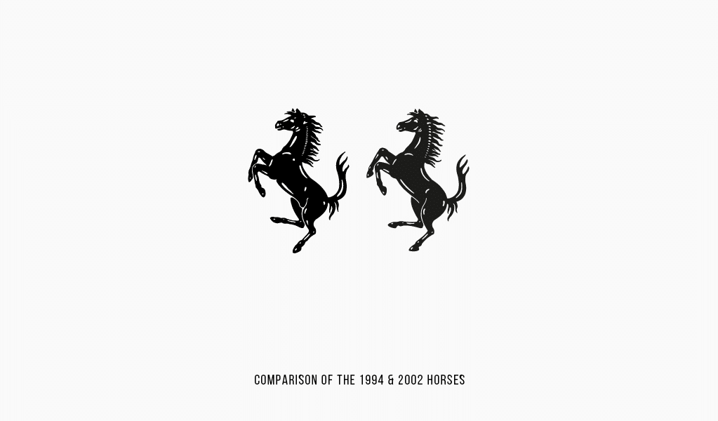
Ferrari logo evolution
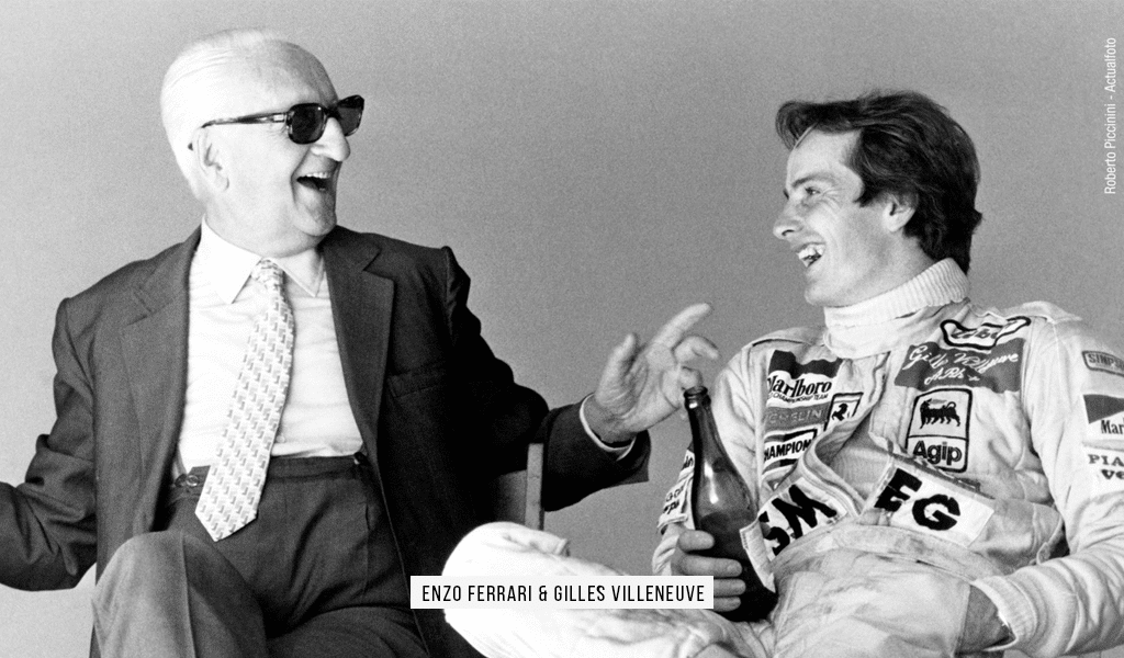
Enzo Ferrari greatly admired the brave pilot. But he had a tough time asking Barraca’s family if he could use the picture of Francesco’s plane in the logo. There was but a simple inscription on his cars back then, and that was to be changed. The steed would fit perfectly, but something was holding Enzo back. Having known that, Francesco’s mother visited Enzo and allowed him to use the picture. She also said that it would bring him luck. And right she was!
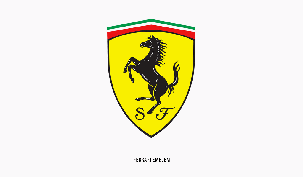
That’s why Enzo used a black steed creating the Ferrari logo image. A steed is a symbol of power and authority, yet a steed posture tells of aggression and velocity. Such properties are a must for a top class racing car. Enzo also added a bright canary red color of Modena as a background and placed an Italian flag on top of the logo, as a token of remembrance of his fatherland.
How to draw a Ferrari logo
In order to make a similar logo, you’ll need a depiction of a galloping horse. Finding or buying such a picture you may draw its silhouette in black. Add a background to it and use a vector program to scale it properly.
Ferrari logo meaning
Sometimes a racing Ferrari logo is complimented with “S” and “F” letters, which stand for “Scuderia Ferrari” or “Stables of Ferrari”. Initially, the complete signature was on the logo, but the company decided to leave only a picture. We can witness the old logo in many social networks starting from 2018. Sometimes it’s better to get back to origins than getting behind the latest trends!
Saying about the logo meaning, it’s worth to mention that founders were inspired by an image of a red horse depicted on the fuselage of Count Francesco Baracca, who was an a World War I hero pilot. The pilot has fallen, that’s why Ferrari’s horse is black, not red.
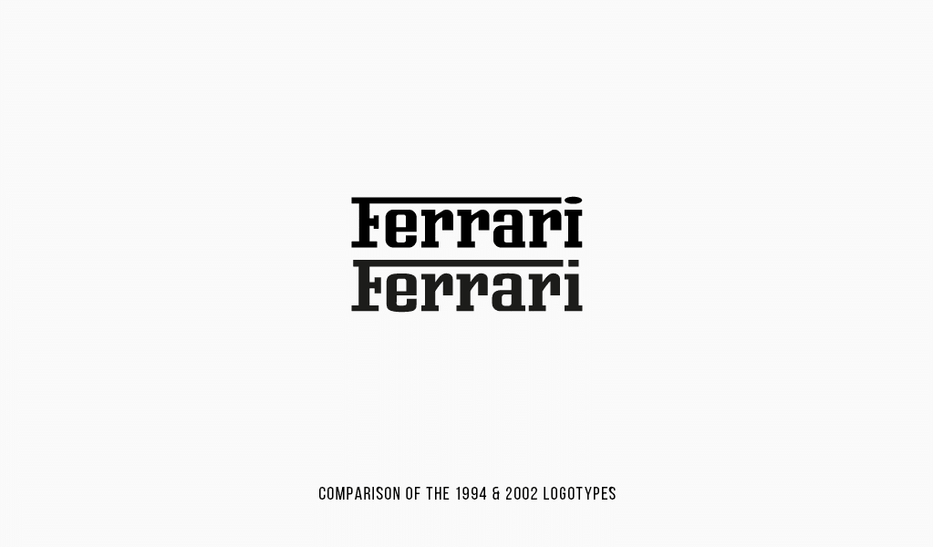
Ferrari logo font
Ferrari logo is featured a Ferro Rosso font.

SEO specialist, link builder, and blog editor at Turbologo. Writing insightful content about marketing, design, and branding. Sharing practical tips on building and promoting brands online.


