
Dream Team is the first association when you hear “Chicago Bulls”. It is an impeccable team, which also includes the king of air or simply Michael Jordan. There but a few teams which could boast such popularity! The team managed to complete a spree of 72 victories of season. The achievement made Chicago Bulls unique and no other team has managed to beat the record. It is thanks to players resolve and virtue that the Chicago Bulls logo is well known even by those keeping off sports. The team attracted millions of fans and made youths do sports instead of lingering on a sofa. That is the best reason to learn more about the team and its logo!
Chicago Bulls logo and uniform colors
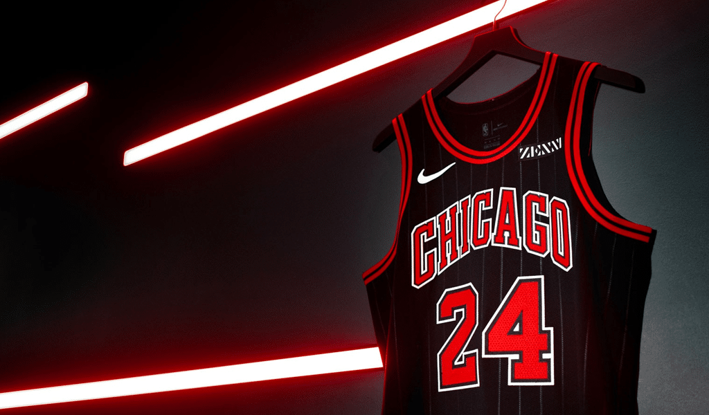
Colors of the team are black and red and we’ll tell you all about it only a few lines away. The Bulls aren’t the first team from Chicago. Another one was called Stags. They weren’t as good as Bulls though. And sometimes they play wearing an old blue and white Stags uniform as a tribute to honor the veterans.
Another interesting fact is that the team can enter matches wearing green uniform and it is written right in its contract. The Bulls seem to promote their belonging to St. Patrick day. However, an overall evolution of Chicago Bulls logo and uniform can list but a few insignificant changes.
Chicago bulls logo history and meaning
Actually, the bull fighting theme is rather common in Illinois. The team name could be “Matadors” or “Bullfighters”. Having pondered it a bit they decided to call it as simple as “Bulls”. And this was an excellent solution for promotion purposes. What creature can best others in terms of strength, power and force? A Bull can, especially if the bull comes from Chicago. Moreover, harsh and aggressive colors of black and red stress the message to savage extremes! Meaning of Chicago Bulls is as clear as the blue sky. The team will heave whoever might oppose it. And the branding perfectly matches all the team’s achievements.
The logo for Chicago Bulls was created by a professional designer in 1996. Head of enraged bull definitely catches the eye and there is team’s name between its horns. A font used in Chicago Bulls basketball logo is based on a certain font which is hard to guess though. Most experts imply that the initial font was Stymie Black. It is clear, symmetric and deliberately notched. Some say however that it is Rockwell Extra Bold that is altered.
The logo upside down
The legend has it that the bull’s stare lost its steadiness when Michael Jordan left the team. Many fans say that Jordan time were the golden age for the team. Yet another funny fact is related to the logo. Should you turn it upside down you’ll see mounted on a crab robot reading a book. And we are leaving all the implications up to you as there could be many. There was no such thing as Easter egg in 1966. However, we might just have found the very first one. Maybe the robot is just a coincidence, but one thing we are sure of. Chicago Bull logo is well-designed and artful.

SEO specialist, link builder, and blog editor at Turbologo. Writing insightful content about marketing, design, and branding. Sharing practical tips on building and promoting brands online.


