Design (especially logo design) trends are believed to be fleeting, but it’s not exactly true. This field is fast-changing and dynamic; however, your design logo will be an identification of your company for years and years. So be sure to create a logo that will be up to date and reflecting the latest changes in the industry.
The competition is harsh and your logo has to be created new and modern and relevant at the same time in order to win the chase. You can create an original logo yourself or go to a designer to use some help in the process. But whichever you choose, be sure to use a couple of the latest logo trends in your company logo design. This article will give you an overlook of some trends that shaped the field in 2019. Also, feel free to use the examples as a source of inspiration. The next year will use the same or similar patterns, hopefully. And remember that it’s alright to use some references to boost creativity and imagination and find the idea for your company brand logo.
Create your own logo with Turbologo logo maker. It takes less than 5 minutes and no design skills needed.
Go to Logo MakerTable of Contents
A modern logo is… What?
It’s not that difficult to find the patterns that are used in “modern” logos with a bit of research. We analyzed loads of modern logos to give you the common characteristics that all successful emblems share.
Symbols that are easy to distinguish
The fast tempo of living makes designers create things that are simple and easy to understand. Abstract and ambiguous forms are in the past. Your emblem has to be straightforward and relatable to the audience. If your logo “speaks” the same language as your potential customers, it’s way easier to convey your ideas to them without any obstacles.
The market is open for any type of business, so the competition grows. The only way to become closer and to appeal to your audience is to create symbols that will appear recognizable around the world.
Modern logos used unique patterns
The benefits of being original in logo creation are numerous. Regardless of the background or font choice, unique patterns and elements will play a trick on your audience’s brains. Looking at the logo people will follow the lines and take a closer look at the original details which will make them memorize the patterns without even realizing it.
Logos using simplicity
This point has to have been used as the first in the list since simplicity is recognized as a key characteristic of a perfect modern logo design. If you want to be able to use your logo in different media then simplicity is a must. A lot of companies have gone back to basics in order to be able to place their logo on any carrier: billboards, signs, ads, online shops… The wide range of opportunities is given the minimalism of a logo design. The new quality logo fashion is to strip logos of excess colors and details.
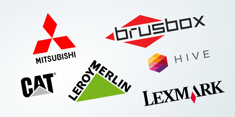
Playing around with fonts and words
Modern emblems are used mostly as logos nowadays, so they tend to be simplified and their style also gives an opportunity to experiment with fonts and letters. This became a favorite activity of today’s designers. You can place letters the way you like, you can play with sizes and colors. Different layouts, fonts, adding some graphic elements, and lots of other things… This is what makes a logo striking and catchy. Cropped out or cut in half letters are a product of hours of thinking and energized creativity. This is not easy to come up with something stylish, original, and simple at the same time, crafting such a logo takes time and effort and that’s what we can see in a modern logo driven by experiments.
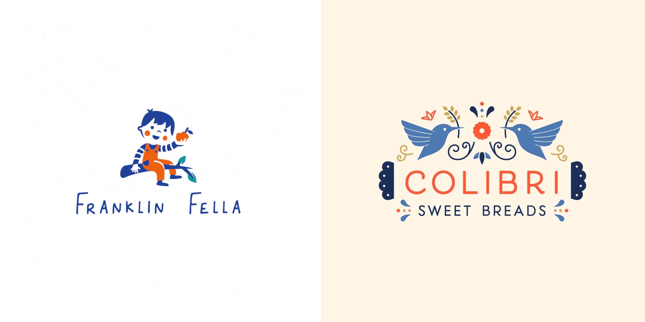
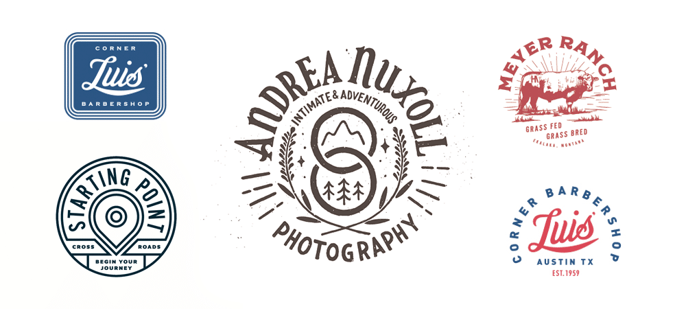
Modern logos using lettering
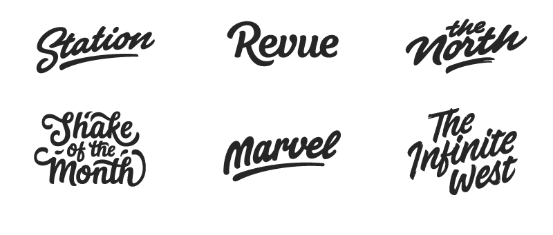
One of the things that had survived a lot of changes in the logo design world is lettering. The respectable old-timer was at its highest popularity level several years ago, and in spite of this, lettering is still alive and as widely used as before. The style of writing and designing emblems has its own charisma and uniqueness, so creative entrepreneurs such as photographers, designers, etc. use the handwritten elements. But such logos that are unusual and easy to understand require a lot of skill, time, and effort, so this style is one of the hardest to create.
Modern logos using vintage style
Vintage logos can create a feeling of “old-school”, which is really good as people tend to trust companies that seem older. If you’re actually an old company with a long story and unique and respected traditions, this style is totally for you. It will help you to draw attention to this detail of your company identity. Use the trend if you want to bring your conservative values out. But be careful if you work with innovations or anything advanced (like technologies), the vintage look might seem out of place.
Geometry and minimalism
This combination is totally time-tested. Geometric shapes are able to make a combination that will become an exciting logo that won’t give competitors a chance. A boring text can be easily accompanied by some geometry and this will give your logo a minimalistic but vivid look. When there are not so many self-sufficient details like in this style, you can freely use vibrant colors to create the logo that will stand out and be remembered and easily read by your audience. You sure can remember some minimalistic logos that are connected with great success.
Color overlapping
It’s been a trend for a long while to make logo designs more minimalistic. But minimalism doesn’t mean boring. This style has lots of variations. One of them is the color overlapping technique. This technique usually looks colorful and vivid enough to be a logo on its own, Logos created in this technique do not require a lot. You just have to come up with a graphic shape that would look perfect with the colors that you’re going to use there. The colors are going to be placed one over another so be sure to choose the colors that are a perfect match for each other. Try not to use more than one or two colors and avoid shading. One of the most successful examples of a logo created this way is, probably, Mastercard.
Modern logos using Realistic textures
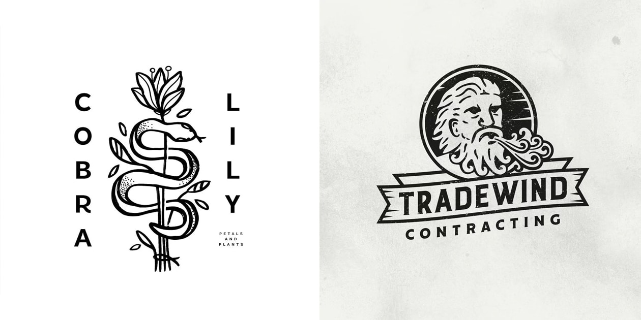
One of the rare but yet very expressive techniques are texture realism. One of the top examples here is a coffee house with a carved wooden logo. This style can give your logo a crisp and natural look. Realistic figures and forms can stand out amongst a lot of other logos. But this style might not be that popular because of its reverse side: it is not possible to use such logos on any carrier because the logo in this technique loses its quality when scaled down. So think about where you’re going to use your logo so that you won’t have to change it after a while. The choice between practical use and authentic beauty is on you.
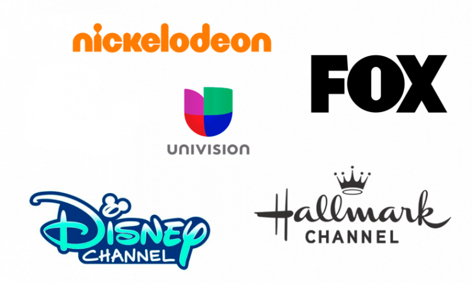
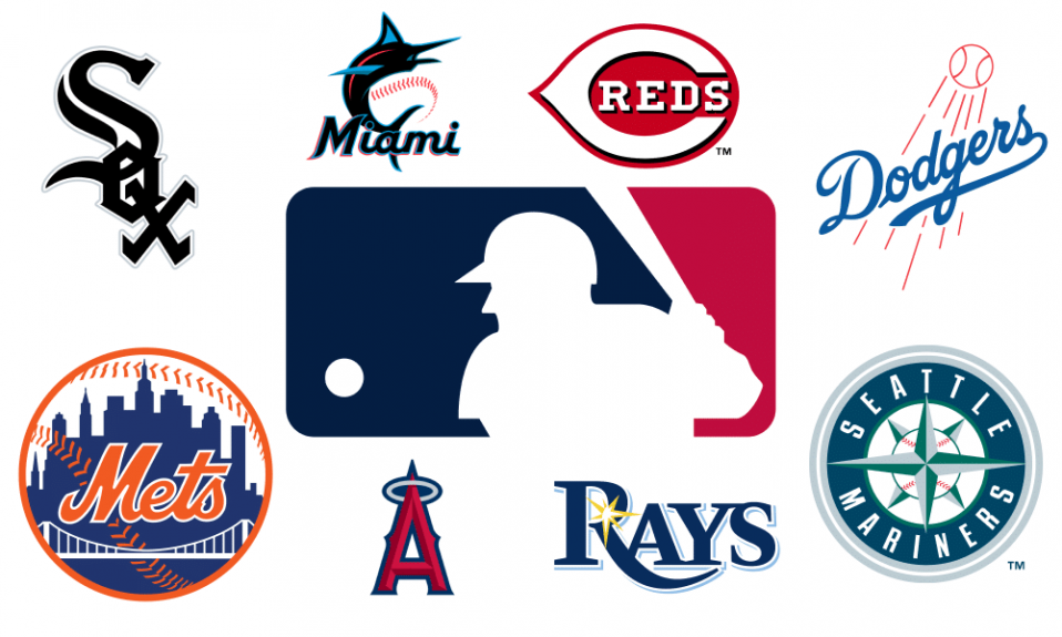
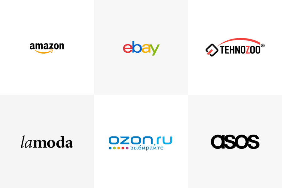
Trendy logos of big-name companies
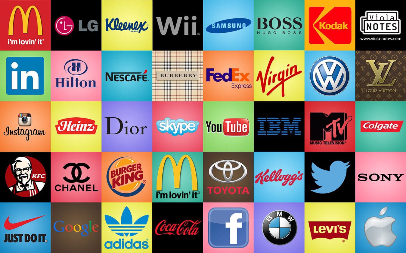
It’s important to keep track of the latest trends and follow them at times to show your customers that you are concerned about the identity of your brand. Promising startups and companies with a long story are both into trendy things. It’s alright to change your logo designs through time. Look at some examples of modern logos used by the big companies that have been on the field for quite a while.
What is the easiest and fastest way to create a modern logo
Have a look at some logos that are used by real businesses and that were created with Turbologo online logo maker. These logos were created for companies with different needs and goals and were successfully used in the real life.
Any company’s needs can be satisfied with Turbologo. Follow the steps that our service offers you and get a perfectly outstanding logo using the technique of your choice. Use the inspiration that you got from this article to create a crisp and stylish logo to bring more success to your brand in just several minutes.
I’m a product and graphic designer with 10-years background. Writing about branding, logo creation and business.