
It has become increasingly difficult to introduce something new in the real estate industry, especially if you need a professional logo that truly stands out from the others. The real estate sector vividly demonstrates this state. The vast number of agencies and solid workers need to be categorized differently. For this purpose, there are real estate logos. They are necessary for establishing your real estate brand. What comes to your mind when thinking about logo design for real estate? If you manage to find the relevant answer, it will lead your company to the top of the world.
Create your own logo with Turbologo logo maker. It takes less than 5 minutes and no design skills needed.
Go to Logo MakerTable of Contents
What makes a great real estate logo?
Designers see logos for real estate agents as their visual representation. They can serve as a basis for further development. For that, a great real estate logo should have:
- A universal design for different purposes;
- A good-looking icon or image that looks well on different surfaces;
- Customization options that make it possible to create a unique logo;
- High-quality graphic files for signage, for social media, flyers, and the like.
Being inspired by all these factors, you will be able to easily build your distinctive brand identity.
What Elements Should a Real Estate Logo Include?

When forming an outstanding logo, you should, on the one hand, distinguish your brand from your competitors, and on the other hand, you need to make your clients and partners understand the message it will convey. To achieve both of these goals, you need to consider crucial elements.
- Industry relevance: As it is a big and wide industry, you should define your business to a certain niche. Whether you sell commercial buildings or set a price for residential property, understanding your role clarifies which icons or images you need to customize to distinguish yourself from competitors.
- Font choice: Opt for bold fonts to impart a modern and essential look to brand kit materials. It adds a certain elegance to your monogram elements. However, do not forget that your tagline should be readable above all. And a definite level of your account security is also necessary.
- Simplicity: Sometimes it is better to avoid overcomplicating. Often, simple logos are more likely to stick in memory.
Understanding your business objectives is key to designing the perfect logo for your firm.
How to Choose a Color for Your Real Estate Logo

Making a choice is always challenging, regardless of the context. Choosing a color for a font may become a real problem for you if you do not know what you want to show to your target audience. We recommend you think about what colors stand for certain meanings or ideas that your business shares. For example, the color red means fun, inspiration, and moving forward, whereas green stands for nature and gardens.
The same way if you want to show emotions through your color, this is the question of extra meaning you add to your best real estate logos. Like professional designers, you can find inspiration in your choice of colors. Search for the colors most suitable for your logo design. Of course, it can be hard. But, if you find an opportunity to form a combination of all these three ideas, you will definitely gain a new audience and followers for your business.
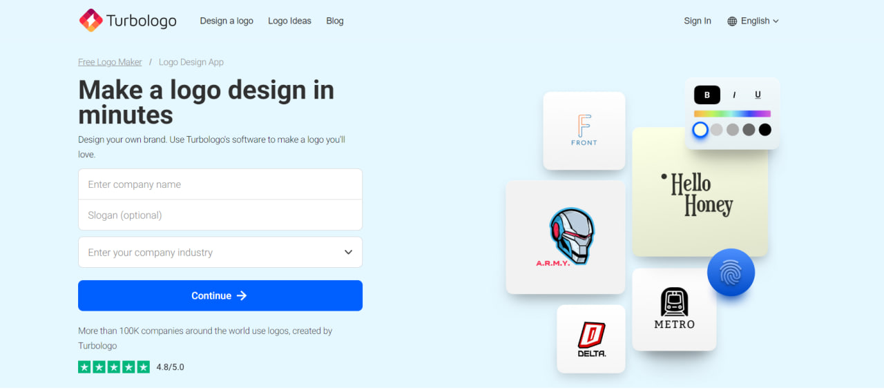
What is Turbologo Real Estate Logo Design Software?
There is a logo design website that is ready to fulfill any task you set on the path to forming your own real estate logo. Turbologo site is a platform that helps fulfill the major aim of a real estate agency: to be promoted visually. All you need to do is to follow a few simple tips to unlock the key to your business identity and produce a visual representation of your business brand.
- Indicate your business name and enter the tagline, if you have one;
- Choose a suitable layout for your further work;
- Explore an extensive library of accessible logo customization options. There are many useful settings and design elements like icons, fonts, typography, logo colors, and templates;
- Click the download button and experience the satisfaction of obtaining a great logo.
The Turbologo software is a platform that helps to achieve the major aim of a real estate agency: to stand out and be prominent.
What layout works best for real estate logos?

As we have already stated, a logo is designed to make your company noticeable and distinguishable from others. In this case, a clearly structured layout is very important. You can work in two directions:
- A symbol-only layout. It shows the niche that you belong to. Also, such a layout looks nice on marketing items like t-shirts or notebooks;
- For real estate logos, a text-only layout is a classic variation as it looks graceful and stylish. Whether it’s bold or serif letters, it is often associated with luxury real estate. These logos look great on business cards, table sheets, and other paper branding materials.
Mistakes to Avoid When Designing Logos Yourself on Turbologo
Surely, you are not protected against mistakes. But you can secure yourself and get to know about the pitfalls that may await you in the logo design field.
- Ensure you choose appropriate formats for your logo. The most common ones for a project are PNG and SVG picture formats. You receive them after purchasing as they are included in Lite, Standard, and Business packages. It is clear that the more diverse the pack is, the more useful print tools it provides. That is why a business pack is the most comprehensive;
- Avoid the mistake of forgetting about a well-developed brand kit for your project. Your business name on marketing materials is what gives you a free opportunity for additional advertising. You will present yourself in this way. Your brand awareness depends on it;
- Be mindful that you must purchase the ownership rights for your logo at the end of the design process to use it commercially. Avoid the mistake of losing a great logo you have just designed. The amount of money is nothing compared to the opportunities the best real estate logos give you.
Mistakes are something that allow you to learn and gain experience. But it is always more pleasant to learn from others’ mistakes rather than your own mistakes. Follow our tips and your head will be free from bumps.
Conclusion
When it comes to designing a logo, the question of brand recognition takes first place. Being one of the logo’s aims, it demonstrates the idea that potential customers of your real estate agency should understand the message, values, and preferences of your business at first glance. The logo eliminates the necessity to explain anything as it works at the subconscious level. It will speak louder than words, so be attentive and design one that is really worth creating.
I’m a product and graphic designer with 10-years background. Writing about branding, logo creation and business.