It is hard to imagine our world without superheroes today. Despite the fact that all the characters are purely imagined by painters, marketers and screenwriters, we all know and love them. Regardless the fact that both of the designs are related to American flag, most people can surely tell Captain America logo from that of Wonder Woman. And what element is the most recognizable in her costume? It is a big gold eagle on her chest of course! Today, we’ll tell you how Wonder Woman has acquired its logo!
Create your own logo with Turbologo logo maker. It takes less than 5 minutes and no design skills needed.
Go to Logo MakerTable of Contents
Wonder Woman logo History
Any comic books lover will tell you that the eagle always accompanied Diana (that’s Wonder Woman’s true name) And history lovers are sure to remember ancient Rome goddess and tell that the eagle here is not just by chance. It is an allusion to history made by comic book authors. Initially, Wonder Woman was known as a princess of amazons. Earning people’s trust in 1941, the character remained in books even in post-war years. In the same year the very first logo was created by psychologist William Marston. And those times were a true crisis for comic industry. However, a kind, strong and righteous character struck deep into people’s hearts. That is why she wasn’t forgotten.
Diana’s costume was too much of a trouser-suit just like many other super heroines. The eagle was placed on the top of her chest. Its design altered a bit every new book, but in general it remained the same. And so it kept going that way up until 1980.
Wonder Woman logo evolution
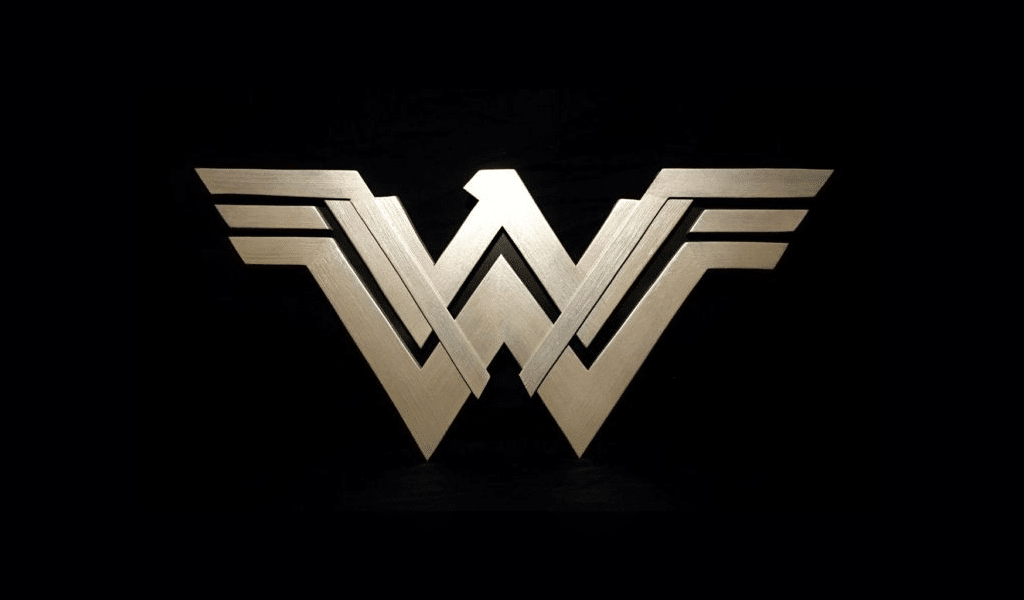
The most significant and striking changes were applied in the end of 70s. It was then that the decision regarding Wonder Woman image and logo change was made. This arduous task was given to a professional designer. Not just a new symbol was required. The new logo must also include an implication of the character’s name. And the designer provided a brilliant idea. The eagle was shaped to resemble letter “W”. Now the bird seemed to unfurl its wings proudly. And all the associations with previous logo still remained as character’s always depends on being recognized by fans.
Wonder Woman logo meaning
The emblem symbolizes the strength and power of kind and brave women who can rule the world. At first it was an image of Diana – an Amazon with an eagle symbol. With time this emblem has changed a little bit – the open wings of the eagle were combined with the abbreviation “WW”.
Despite the fact that this logo variation evolved into different forms and shapes, its gist remained the same. Just like “S” on superman’s chest, “W” stands now for Wonder Woman.
A good example of Wonder Woman logo usage
In one of remasters they decided to move the symbol from waist to an edge of her bustier, making it more elegant. Gold color was also changed to silver. The decision was good due to many factors.
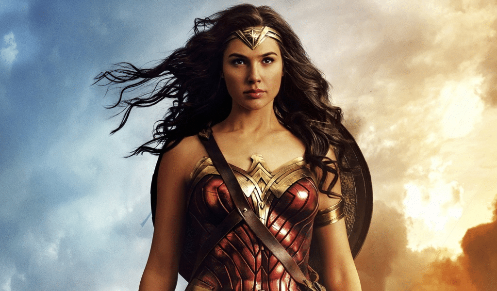
However, right before launching a movie they still returned the logo to Wonder Woman’s waist. The costume itself was made more colorful as there was no margin for errors. A movie is far more for a character than a book as the movie is far more expensive. However, the stylistic solution was the right one. The movie was a success as both critics and audience liked it. That is why we deem this tiny rebranding a successful one!
We see the stylized letter “W” – remember the Wonder Woman. Over the decades, the image of Wonder Woman has been radically changed many times, inspired by the opposite ideas.
In 2016, logo received a new trademarked look. Designers tried to make the heroine look not only sporty, but also feminine. Although the idea of the emblem remains the same, the Wonder Woman attribute now looks not so aggressive and looks like it was made of wood.
For its 40th anniversary, Wonder Woman has received a new iconic emblem. The solution was simple and elegant: the spread eagle’s wings were combined with the abbreviation “WW”. The color of the logo was chosen yellow, and the font for it was created from scratch.
Although over the years, the image began to return to the attributes of an eagle, the designers added a beak and made more expressive wings, also gave a more curved shape and changed the color to sand.
Legendary designer Milton Glazer had a hand in creating the Wonder Woman superhero logo. While working on the redesigned Superman logo, he was brought in by DC to help address both of these issues. Milton Glazer combined the two letters “W” with a stylized wing motif that marks the heroine’s ability to fly, with a subtle hint of the eagle sign.
When Wonder Woman debuted in comics in 1941, her emblem was an eagle, and her name was only roughly depicted in an open letter on the cover. In the late 80’s, when DC invested heavily in its trio of superheroes, that the Amazon superhero variant acquired its own logo.
On the cover of the first magazine, Woman emerged in the colors of the American flag. The lettering Wonder Woman was made in a handwritten style: bright red letters with shadows looked contrasting against a prominent yellow background. Following the image change came a new Art Deco logo – the font was changed from handwritten to italic.
Blog editor and content marketing specialist at Turbologo. Writing about Marketing and design. Victoria’s articles contain useful tips on how to build a brand and promote it online.