Every brand strives to create its own, unique style for its logo, advertising, website, social media, and other platforms. To solve this complex and responsible task, it is necessary not only to develop the composition and choose color combinations, but also to find the right fonts, because they are the second after the text that broadcasts the message to the target audience. How do you know which font suits your brand? First, choose one of two variants: Serif or Sans Serif.
Create your own logo with Turbologo logo maker. It takes less than 5 minutes and no design skills needed.
Go to Logo MakerTable of Contents
Differences between Serif and Sans Serif

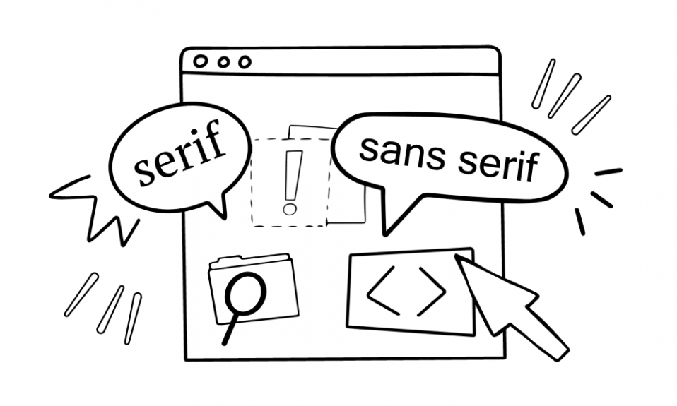
One important feature of fonts is the differentiation between serif and sans serif. Serifs are small, decorative strokes that extend beyond the borders of the elements of letters. These days serifs are considered “decorations”, but originally they had an important function. They helped to read the printed text quicker (the letters seemed to connect to each other and form a single line, so the eye wasn’t “lost” on the page and it was easier to hold attention).
10-20 years ago it was thought that serif typefaces were only good for printed text. The point was that there was a widespread opinion that the eyesight got tired faster when reading a sans serif text from the screen. This “theory” was formed due to the fact that in the early 2000s the quality of computer monitors was generally poor: any text was harder to read than on paper.
Since the 2010s the situation has drastically changed: there are screens that are easy on the eyesight – now all fonts are perfectly readable.
Pay attention: nowadays the majority of official electronic documents are designed with serif fonts - there are no difficulties and problems in studying them.
The Serif group includes serif fonts. A well-known example of serif typeface is Times New Roman. Decorative lines come in sharp or blunt, solid or flat, translucent or bold: each family of Serif fonts has its own particular style. Serifs complement both uppercase and lowercase letters, numbers and other symbols.

Sans Serif – chopped fonts without serifs. The most common variants are Arial and Calibri. Sans Serif appeared in the early XIX century. It was used mainly for advertisements, the text was more readable and clear, and was readable from afar.

Sans Serif are more versatile than Serif. At the same time, a considerable advantage of serif fonts is giving any character unique features.
There is an opinion that serifs underline the individuality of each letter: it becomes more complicated to mix them up. A significant disadvantage of Sans Serif is the smaller number of decorative elements: the only design solutions available are boldness, height, indentation and letter spacing.
Why is it important to carefully choose fonts for a logo?
Any detail placed on a company’s logo has a direct impact on brand perception. Every business conveys its own message. An important component of corporate style is lettering, which is called to convey it in a clear and simple form.
Serif and Sans Serif have a different impact on the emotional state of the target audience.
Thus, the serif fonts are classical (they are also called formal). Sans serif fonts are more modern and creative. The wrong choice of style is dangerous because it can distort the message, and therefore prevent the goals of promotion, awareness and sales.
The undisputed advantage of Sans Serif is adaptability: sans serif lettering is easier to scale. The point is that Sans Serif is not characterized by a large number of details: the characters will remain legible even when scaled down many times. By the way, this is the reason why more than 70% of companies use Sans Serif fonts.
Serif and Sans Serif fonts
Serif fonts convey confidence, steadiness, reliability, stability, commitment to tradition. They have been used for hundreds of years, since the inception of printing.
The associations are borne out by the results of numerous studies: sans serif fonts are often called “elegant” and “scientific” by respondents.
Serif is the best option for the design of companies that position themselves as reliable and serious enterprises.
It should be noted that often in serif fonts the elements of letters are contrasting in the thickness of the lines: this detail attracts greater attention and is a symbol of creativity and willingness to make non-standard decisions.
Sans Serif fonts translate innovation, dynamism and accessibility. These fonts are often associated with minimalism and lightness: they are quite simple and laconic, look modern and neat.
The results of surveys indicate that Sans Serif is considered by many to be informal: it is the best option for technology-related business and unusual startups.
Tips for choosing the perfect font for your company logo

Over the past few years, there has been a noticeable trend to get rid of serifs: more and more business owners are abandoning these elements in favor of chopped fonts. Should we follow this trend, or are there options for transforming serif fonts to make them more relevant and modern?
You should not change the design concept of the emblem because of fashion: because of such a trend there may be hundreds of identical “faceless” characters which have lost all individuality and originality. Answer two important questions before you really “abolish” text made with Serif on your logo, website and promotional materials:
- What message do you want to convey to your target audience? If business has now reached a level where there is an urgent need to shorten the distance with product consumers, to try on a more modern, casual image, serifs can really be abandoned. If the brand value is solidity, marketability, reliability and seriousness, don’t give up on serif lettering.
- What platforms do you use more often to interact with your audience? On printed materials is still better to leave Serif, for online pages Sans Serif is suitable, it is also a universal option, because it is more adaptive.
How to determine the font for the logo?

- Take an interest in trends in emblem design and study competitors’ logo designs: pay attention to the brands’ characters, their self-presentation and positioning, the marketing and communication strategies they use, study the values they convey to their target audiences.
- Apply different fonts to the layout of the logo design: create several variants, differing only in lettering. See how different fonts would look in print and online space. This will help you understand whether the lettering copes with the tasks assigned to it, as well as to feel, to appreciate the emotions that the integral composition evokes.
- If you can’t decide on one variant, use 2 or 3 fonts at once, but choose them thoughtfully and carefully! Consider a few combinations: for sure you will find one that you like.
The font is an important element of every brand’s logo design. The lettering not only conveys the main idea of the text, but sets the mood, has an additional meaning – evokes certain feelings and emotions. Study the experience of other companies, experiment, but don’t overload the design with details and accents. Remember that the font is a marker of individuality: it shows the audience how the company positions itself.
I’m a product and graphic designer with 10-years background. Writing about branding, logo creation and business.