Today’s logos favor simplicity. You can see this in the flat designs and sans-serif wordmarks of Google, Airbnb and Spotify.
Two decades ago, it was quite different. The 1990s were a time of bright colors, bold geometric patterns, and snazzy typography. We’ve collected 21 of our favourite 90s logos, from beloved candy brands to hit TV shows.
Table of Contents
Cartoon Network
Cartoon Network’s seven-by-22-square grid with its name was one of the most recognizable logos in television in the 90s. The squares were later reduced to “CN”.
The black and white blocks were alternatingly shaped with a fun, yet powerful custom typeface that reflected the fun nature of this network.
Nickelodeon
Nickelodeon’s 90s logo had an orange splat containing the company’s name. It was designed for children six-17 years old. This bright color represents youth, energy, joy, and youthfulness.
A custom sans-serif, rounded typeface with character features (see “O”) was the obvious choice as a serif font would have been too traditional.
Friends
The logo Friends of the 90s sitcom is an all-caps wordmark separated by six colored dots. These dots represent the six friends.
It looks like it was handwritten with permanent markers, which reflects the playful nature of the show and the friendship that has lasted.
Bubble Tape
The candy logo for Wrigley’s consisted of a bubble-filled typeface with a purple gradient bubble and a funky typeface below. To mimic the tape-like bubble gum, the extended “e” at the end of “Tape” wraps around the logo.
To elicit excitement and youth, multiple bright colors were used. The phrase “It’s six foot of bubble gum-for-you-not them” (as in adults) was also used (“them”) to appeal to their target audience.
Barbie
Since its inception in 1959, Barbie’s playful logo has remained constant. The brand’s sweet, innocent, and feminine characteristics are represented by hot pink. The wordmark logo was a bold custom font that featured close-set letters and an assortment of angular edges and curves. It had an upwards slant throughout the 1990s.
The Barbie logo of today is the same shade as Barbie’s original, but written in cursive script.
Microsoft Windows
There have been many changes to the Windows Microsoft logo over the years, but the most memorable was in the 1990s. This logo was ahead its time, with its four distinctive colors and pixelated elements.
Super Nintendo
Over the years, Nintendo’s gaming system has seen many changes. In the 1990s, Nintendo chose a bright color scheme that mainly used primary colors. The company name was boldly displayed in italicized font and printed in red. This immediately attracted attention from consumers and made the products stand out.
ICQ
ICQ’s logo is derived from the phrase “I Seek You”, and was simple like the service it offered. The chat site used a round sans-serif font with lowercase letters and a flower to go along with the wordmark.
Interestingly, all the petals were green except one that was colored red. This symbolised an ICQ chat message.
Apple
Apple’s logo today is markedly different than it was in 1990. Apple’s logo was bright and colorful 20 years ago. It stood out from many other brands in this industry.
Apple went minimalist with its all-black Apple shape.
MTV
This logo embodied the spirit of the time, and was the beginning of a new era in music television.
A graffiti-styled logo was used (are you seeing a trend? MTV’s logo featured an M-shaped M shouting their affiliation to music. They were unabashed in their rebellious approach to antiquated music and connected deeply with their target audience.
Dire Straits were the first to upload a music video to MTV. They even wrote a song that was based on the brand-new and groundbreaking music TV station.
Hot Wheels
Mattel’s logo was a step ahead of its time.
Two colors and a flat design helped keep the logo simple, while the intense red and yellow catch the eye and convey a message of fire, speed, and excitement. The font is playful and graffiti-orientated, which matches the style.
Mattel managed to include their name without being intrusive.
Nerf
Nerf designed an energetic logo to suit its audience of 8-17 year olds. It featured contrasting colors, a typeface with all-caps that leans to the right (indicating the sense of moving forward), as well as a pink dot pattern that resembles having arrived at great speeds.
It is bold, playful and authentically ’90s in its logo design.
Walkman
A Sony Walkman was the coolest thing ever!
It was a huge leap forward to be able to listen to music from anywhere at any time.
This was reflected in the logo’s use of an abstract “W” and a modern, custom font. To represent the freedom you have to hear music how you want, and possibly how individualistic you are by doing so, the “L” was left unattached.
Seinfeld
It was a show about nothing that had everything!
A classic show with a classic logo. The yellow highlighted Jerry’s importance, while the italicized font reflected the show’s quirky yet mature nature.
It was an extremely creative use of color, shape, and font. It was just like the show!
The Bell Saves the Bell
The Saved by the Bell circular logo is a unique mix of design elements, and it uses 3 different typesfaces and colors that are not related to each other. This helps communicate the show’s joyous nature.
The larger font and yellow color of the word “bell” have been used to emphasize the meaning.
Tamagotchi
The 1990 Tamagotchi logo featured a unique, scrawled typeface that looked like it was written with chalk by a child. As Tamagotchi is the pioneer of digital pet trends, the brand’s mix of lowercase and highercase letters reflects its innovation and uniqueness. Hot pink letters were a big hit on store shelves and created excitement.
Toys R Us
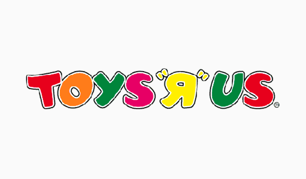
Toys R Us’ logo in the 1990s was just as playful and colorful as it is today. It suited the brand’s youthful demographic and reflected its nature. The brand’s authenticity and youthfulness is communicated by the backward “R”, which mimics young children’s writing.
The logo of today is similar, but with alternate colors and an addition of a star to the bowl of “R”
Baby Bottle Pop
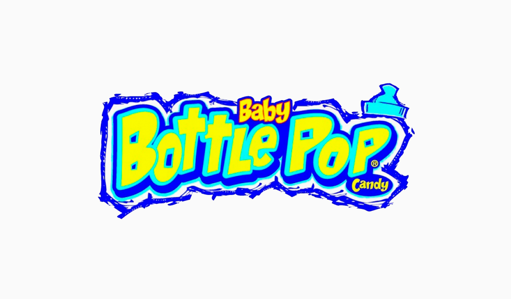
The Baby Bottle Pop logo featured a bright neon typeface, accompanied by a cap for a baby bottle and the word “Baby”, appropriately sized at a smaller scale. The wordmark is surrounded with a messy, chalk-like line that matches the interests of the target audience.
Baby Bottle Pop’s marketing emphasised the fun, playful spirit of the candy’s “explosive” experience.
Another second of your attention
The 90s saw logo design as fun, outrageous, and yet authentic to the brands represented. Bold typography and bright colors ruled the decade. This was a departure from today’s minimalist logo design trends.
Although they were more funky than many logos today, the logos of the 1990s remained true to their brands (and the times). They will always be in our hearts.
I’m a product and graphic designer with 10-years background. Writing about branding, logo creation and business.

