In ten years of working on logos and brand identities I have probably looked at tens of thousands of typographic solutions. And do you know what I noticed? Business owners almost never get colour wrong: they intuitively feel that red is aggressive and green is calming. Fonts are a different story. People pick a typeface on a “like it / don’t like it” basis and are then surprised that the brand looks cheap, even though a professional drew the logo.
A font is not decoration. It is the voice of your brand. And once you learn to hear it, you can pick your typography in half an hour without any design training. That is exactly what this article is about.
Table of Contents
Why a font is not just “letters” but the character of your brand
When I first started working with logos, one thing struck me. Two words that mean the same thing, set in different fonts, read like messages from two completely different companies. Try to picture the word “Bank” written in a gothic script full of flourishes. Now picture it in a strict geometric sans. Feel the difference? In the first case you would hardly trust that bank with your savings.
A font conveys emotion before a person has even finished reading the word. It is like a handshake: firm and confident, or limp and hesitant. Your customer reads that signal in a fraction of a second, before they consciously register the company name. By the way, if you want to dig deeper into the terminology, I have a separate piece on the basics of typography — there I explain in detail how a typeface differs from a font and why that matters.
How a font affects trust and sales
I often run a thought experiment: take the logo of a well-known brand and swap in a font that does not fit. The result is always predictable — the brand loses its essence. Imagine Apple set in a comic-book font. Or Coca-Cola in a monospaced technical typeface. Absurd, right?
In real practice it is subtler. Look at the patterns: banking gravitates towards serifs. They are associated with tradition, reliability, solidity. IT companies, on the other hand, choose sans-serifs — clean, without serifs. They signal: “We are modern, fast, technological.”
Cafés and restaurants often use script fonts or rounded sans-serifs. That creates a feeling of comfort, of a homely atmosphere. Law firms go for strict serifs that underline seriousness and competence. If you want to see how this works in real projects, take a look at font psychology — it collects examples of how different typefaces are perceived.
Getting the font wrong is expensive. I have seen start-ups lose investment because their logo looked flimsy. And I have seen local coffee shops outrun their competitors purely on good typography — people came “for the atmosphere”, and that atmosphere started at the sign above the door.
Expert tip: Do not try to choose a font that “you personally like”. Ask yourself: “What signal do I want to send to my customer?” If your brand is about reliability and tradition, a script font will be a mistake, however beautiful it is.
3 types of fonts every business owner should know
The whole variety of fonts comes down to three basic categories. Learn them and you will already be able to navigate 80% of situations.
Serif — fonts with serifs, those little “feet” at the ends of the letters. A classic tested over centuries. Associated with tradition, authority, premium quality. Suits: banks, jewellery brands, law firms, publishing houses, fine-dining restaurants.
Sans-serif — fonts without serifs. Clean, modern, neutral. They signal technology, simplicity, openness. Suits: IT companies, start-ups, medical clinics, educational projects, contemporary shops.
Script — an imitation of handwriting. Emotional, individual, warm. Suits: coffee shops, patisseries, beauty salons, handmade brands, children’s products.
There are also display fonts — decorative ones, for headlines. And monospaced fonts, with letters of equal width, technical in feel. But for a basic choice, three categories are enough. I go through the difference between serif and sans-serif in detail in the guide to font types — worth reading if you want to understand which type to pick for a logo.
A step-by-step method: how to choose a brand font in 30 minutes
Now let’s get practical. I have worked out a simple method that helps you choose a font even with no experience. Follow the steps in order and the result will surprise you.
Step 1. Define your brand’s character
Before you open a font catalogue, answer this question: what is your brand’s character? I work with five basic archetypes:
| Archetype | Characteristics | Example brands |
|---|---|---|
| Reliable | Stability, tradition, trust | HSBC, Ford |
| Friendly | Warmth, care, approachability | Airbnb, a local bakery |
| Premium | Elegance, exclusivity | Chanel, Mercedes |
| Innovative | Technology, speed, the future | Google, Tesla |
| Bold | Energy, challenge, youth | Nike, TikTok |
Work out which archetype is closest to your business. That becomes the foundation for choosing a font.
Step 2. Pick a base font type to match the character
Now match the archetype to a font type:
- Reliable — serif. Classic shapes, serifs, stable proportions.
- Friendly — a rounded sans-serif or a script. Soft lines, open shapes.
- Premium — a refined serif or a minimalist sans-serif. Thin strokes, elegant proportions.
- Innovative — a geometric sans-serif. Crisp shapes, minimum detail.
- Bold — a heavy sans-serif or a display font. Dynamic shapes, contrast.
Step 3. Build a font pair

You will need at least two fonts: one for headlines, another for body text. The rule is simple — no more than two typefaces. And they should contrast without clashing.
Classic combinations: a serif for headlines plus a sans-serif for text. Or the other way round. The main thing is that the fonts look visibly different yet still “get along”. If you want to see what works, have a look at the best modern fonts for a logo — a selection of working options with explanations.
Step 4. Check legibility
A font has to read easily at any size — from a social-media icon to a sign on a building. Test it on a small phone screen and in print. If the letters merge or “swim”, drop that option.
Expert tip: Shrink the layout down to one square centimetre. If the company name is still readable, the font works. If not, keep looking. This simple test saves you from a lot of mistakes.
Step 5. Check the licence
This is the critical point many people forget. A font downloaded from a torrent site can cost you a lawsuit. What you can legally use:
- Open-licence fonts (Google Fonts, Font Squirrel) — free, including for commercial projects.
- Subscription fonts (Adobe Fonts) — legal, but they require an active subscription.
- Paid fonts (MyFonts) — you buy a licence once or for a set period.
Always check the licence terms. Some free fonts are banned from commercial use and are for personal projects only. By the way, I have put together a collection of free fonts for a logo — options with a commercial licence.
5 brands and their typographic decisions
Theory without examples is dead. Let’s take apart real brands and see how they use typography.
Example 1: a premium brand — Chanel
The Chanel logo is a classic serif with thin, refined strokes. The font signals: “We are timeless, we are the benchmark of elegance.” No experiments, only proven classics. That approach works for jewellery brands, luxury hotels, expensive restaurants.
Example 2: a technology company — Google
Google uses a geometric sans-serif. Clean lines, minimum detail, modern proportions. The font says: “We are fast, innovative, digital.” This is the standard for IT companies, fintech start-ups, online services.
Example 3: a friendly local business — a coffee shop
Picture a coffee shop with a handwritten logo. Warm, rounded letters create a sense of comfort and invite you in. That kind of font works for bakeries, patisseries, family restaurants, beauty salons. It says: “You are welcome here, this place feels like home.”
Example 4: a B2B company — a strict sans plus a neutral serif
Law firms and consultancies often combine a sans-serif for headlines with a serif for body text. That creates a balance between modernity and solidity. The client sees: “We are progressive, but dependable.”
Example 5: a creative studio — display plus monospace
Design studios, agencies and production companies love to experiment. A display font for the logo, a monospaced one for the tagline. The signal: “We are creative, we are not like everyone else.” But be careful — this approach only works if your audience values originality.
Where to get fonts: 7 proven resources

I have gathered the resources I use in my own work and recommend to clients.
Free with a commercial licence:
- Google Fonts — over 1,000 fonts, all open-licence. You can use them in commercial projects without restrictions. My favourite for quick decisions.
- Font Squirrel — a curated selection of free fonts. Each one is checked for commercial suitability.
- Fontpair — a font-pairing service. It shows you how fonts work together.
Conditionally free:
- Adobe Fonts — a huge library, available with a Creative Cloud subscription. Legal and convenient, but it means a monthly payment.
- Fonts from independent designers — many authors offer free versions for non-commercial use and paid licences for business.
Paid, but worth it:
- MyFonts — the largest font shop. Here you can find unique typefaces from leading type designers.
- Fontshop — another respected shop. Fonts often appear here that you will not find anywhere else.
How to create a logo with the right font in Turbologo
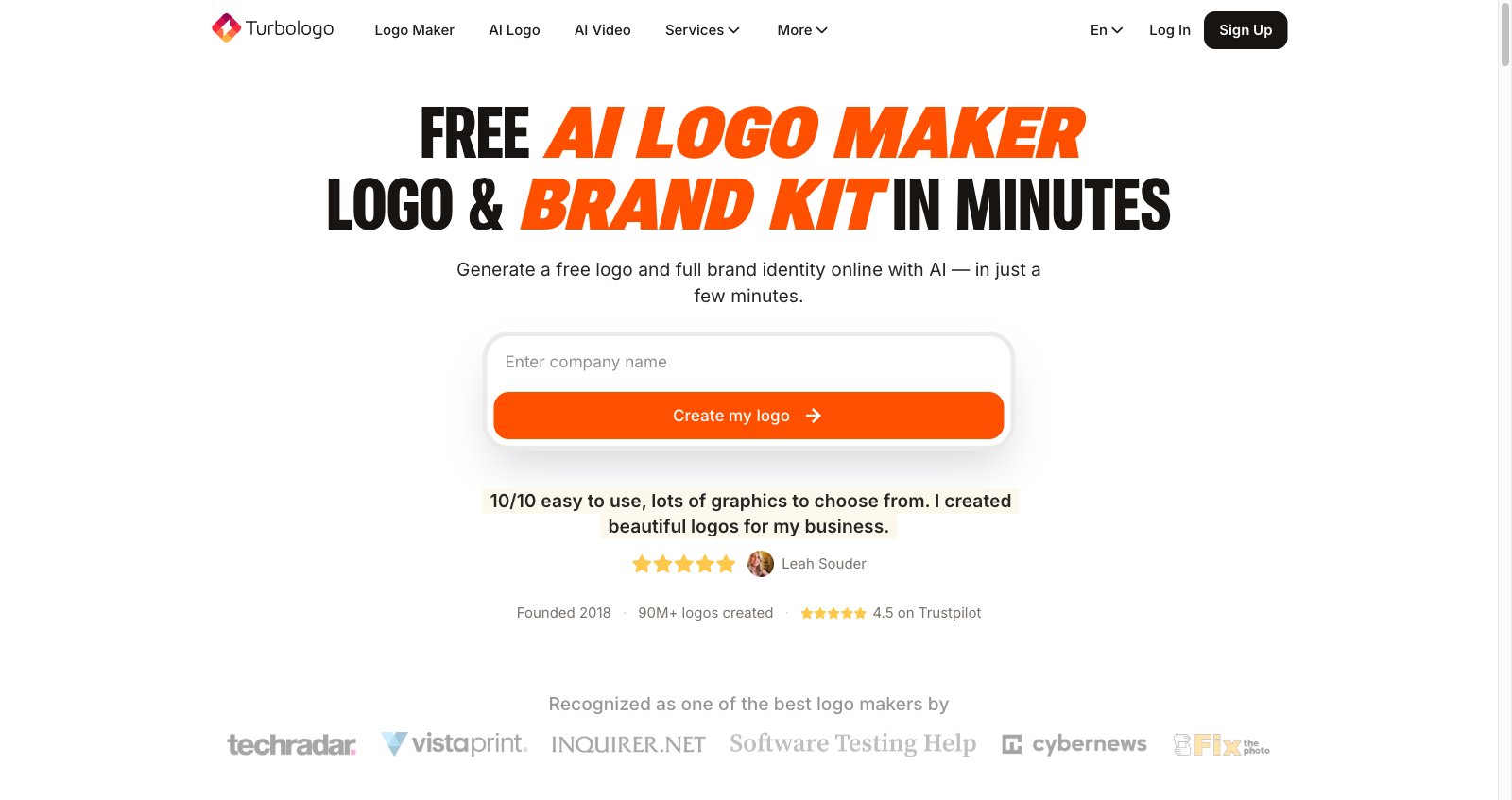
Now that you know the theory, let’s put it into practice. In Turbologo creating a logo takes a few minutes — and you do not need to be a designer.
Here is how it works:
- Enter your company name and your line of business.
- The AI offers several logo options with fonts already selected.
- Pick the one you like and fine-tune the details — colour, composition, font.
- Download the finished logo in the formats you need.
The main advantage is that the system automatically picks fonts that work together and match the character of the brand. You do not have to get your head around kerning and leading — the algorithm does it for you.
Checklist: 7 questions before you settle on a font
Before you sign off on a font, run it through this list. If even one point raises doubts, go back to the selection stage.
- Does the font match the brand’s character? Re-read the archetype and compare.
- Is it readable at small sizes? Check it on a phone.
- Does the font work as part of a pair? Do the headline and the text clash?
- Do you have a licence for commercial use? Check the terms.
- Does the font look appropriate in your industry? Do not stand out for the sake of standing out.
- Is the brand recognisable through the font? Cover the logo mark — is the font still associated with you?
- Is the font dated? Trends change, but classics endure.
Frequently asked questions
Can I use free fonts for a commercial logo?
Yes, if the licence allows it. Google Fonts and Font Squirrel offer open-licence fonts that can be used in commercial projects. Always check the terms — some free fonts are off-limits for business.
How many fonts can I use in a brand identity?
Two is optimal. One for headlines, a second for body text. More than two creates visual noise and blurs the brand’s identity.
What do I do if the designer suggests a font I do not like?
Ask what signal that font sends to the customer. If it matches the brand archetype, it may be worth trusting the professional. If it does not, argue your case on the basis of the brand’s character rather than personal preference.
How do I know whether a font is dated?
If a font is associated with a particular decade (the typical fonts of the 1990s, for instance), it can date. But classic typefaces — serifs and sans-serifs — stay relevant for decades. Follow the trends and adapt your font to current requirements.
Conclusion
A font is an investment in how your brand is perceived. Typography chosen well works for years, building trust and recognition. Getting it wrong is expensive — in lost customers, missed opportunities, a blurred identity.
Start by defining the character of the brand. Choose a base font type. Build a pair. Check legibility and the licence. And do not be afraid to experiment — but stay within the archetype.
If you want to save time and get a professional result, try creating a logo in Turbologo — the AI will pick the fonts for you, and you can concentrate on growing your business.