The first time someone asked me to “make a logo by tonight” was about ten years ago. Back then there was no generation to speak of, and the task came down to a cup of coffee and a sleepless night. Today an entrepreneur opens a laptop, types in a couple of phrases and gets dozens of options in minutes. It looks as if creativity is no longer needed. In practice it is the other way around: generation speeds up the start, while creativity brings things up to the level of a brand people actually trust. In this article I will break down where AI genuinely helps, where it gets in the way, and how to build a working system rather than just pretty pictures.
Table of Contents
What generation is in branding and why an entrepreneur needs it

Generation is the automatic creation of visual and text elements based on a short description and a set of rules. The algorithm picks compositions, colors, fonts and icons, and suggests slogans. The entrepreneur wins on time and on the cost of entry. One important detail: generation builds its solutions on patterns it has already seen. That means the speed is high, while originality depends on how clear your prompt is and on the post-processing.
In day-to-day work, generation covers the quick prototype. It is ideal for testing a hypothesis, pre-MVP packaging, and trying out positioning on a small audience. If a product is only just starting out, that is enough to enter the market and gather the first reactions.
Generation is especially useful where an entrepreneur needs to move quickly from an idea to the first visible result. For example, putting together several name options, testing a visual direction, preparing a basic logo, a draft landing page and the first copy for the page. This does not replace strategy, but it helps you understand faster how the idea looks “from the outside”: whether the offer is clear, whether the niche reads, whether the brand looks accidental. A similar logic underlies MVP branding: first a working version of the packaging is created, then it is tested on a real audience and gradually refined.
What creativity is in branding and why it is not going away
Creativity is the development of meanings and forms that serve the strategy. It is not about “drawing an unusual letter”, but about choosing the semantics, the tone, the visual logic that will live in advertising, on packaging, in interfaces. Here context, culture, risks and goals matter. Generation provides the raw material; creativity provides the intent and takes responsibility for the result. Creativity is what makes a brand recognizable by design rather than by luck.
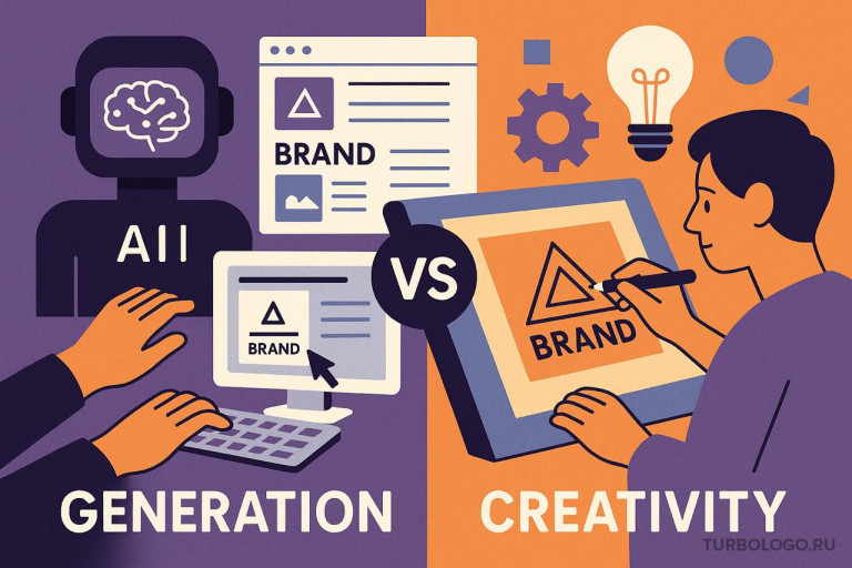
Generation vs creativity: a short comparison by task
| Question | AI generation | Human creativity |
| Time to start | Minutes | Weeks |
| Cost of a prototype | Low | Medium to high |
| Originality of the idea | Depends on the prompt | Depends on expertise |
| Risk management | Limited | Full |
| Scaling the style | High when rules are set | High if the rules are formulated |
| Depth of meaning | Medium | High |
| Legal questions | Require manual checking | Worked through in the process |
Reality does not pick a single column. The working scheme is a hybrid, where generation covers speed while creativity brings the focus and the accountability.
Expert tip

For the first two weeks, take the most out of generation: prototypes, palettes, compositions. After twenty iterations, switch on critical review and remove the excess. The excess is everything that does not serve your positioning and use cases.
Where the boundary of automation lies
Generation confidently handles tasks that have a clear formula for success. Iconography, the grid, matching compatible colors and fonts, adapting things into templates. The algorithm loves rules. As soon as it comes to meanings, the boundaries of the brand, ethics, cultural codes or the differences from your closest competitors, you can lose your identity without creativity. To simplify: AI answers the “how”, while creativity answers the “why” and the “why this way and not another”.
There are process boundaries too. The algorithm does not see the negotiations with a supplier, the reactions of buyers, the internal habits of the team. Hence the mistakes in a tone that looks flawless on a mockup and feels odd in real communication. This is not a reason to give up on generation. It is a reason to build in checks.
That is why, when working with AI, it is important to assess not only how beautiful the result is but also how fit it is for the business. A logo may look neat, a website modern, the copy smooth, yet together they do not always add up to a coherent image. At this stage a simple brand audit helps: checking whether the visual style, the promise, the tone of communication and the audience’s expectations line up. If these elements diverge, generation will only scale the mistake faster.
A framework for choosing: when to use generation and when to use creativity
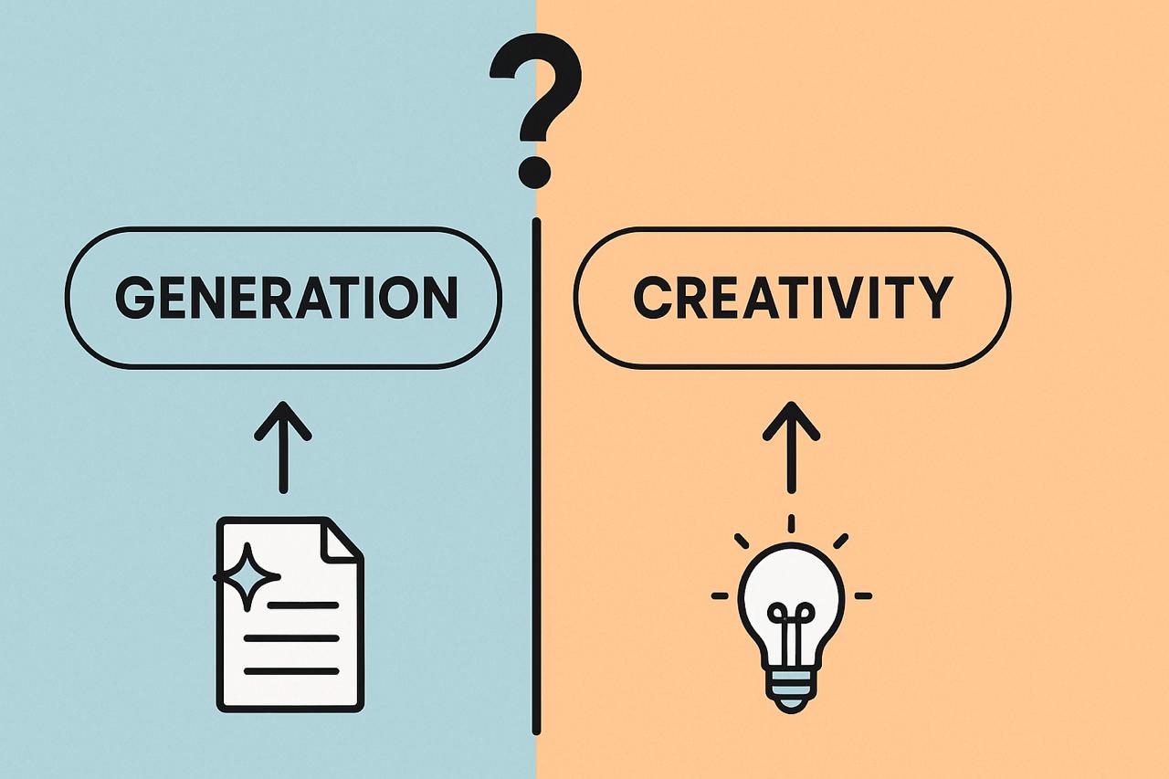
The decision rests on three parameters: risk, speed and distinctiveness.
- If the risk is low and speed is critical, generation comes first.
- If the risk is high and the stakes are large, creativity plans the system while generation speeds up the routine.
- If the market is oversaturated with similar images, creativity takes priority, otherwise the brand dissolves.
This logic is simple, yet it saves budget and nerves. Especially when the product is at an early stage and every week counts.
The hybrid process: how to combine generation and creativity without pain
I work with a five-step model. It suits small businesses and startups that have no heavy regulations.
-
A single-window brief
A short brief is formulated: the business goals, the audience, the context of use, keywords, prohibitions. The brief is validated against reality: the product, the channels, the format of the media. -
Generating options and gathering the design field
Series of logos, palettes, font-icon compositions, and adaptations for cards and avatars are created. The goal is breadth, not perfection. -
Critical filtering and the first rules
Three to five development directions are kept. Each option gets short rules: the clear space, the minimum size, color combinations and contrasting pairs, allowed backgrounds. At this step the technical errors of the generation are fixed. -
Field tests
The options are tested on real media: an app icon, a social media avatar, a button in a store, the header of a landing page. You look at how clickable, readable and recognizable they are at small sizes.
Creative polishing and brand rules
The chosen direction is refined: proportions, contrast and the rhythm of the font are adjusted, micro-patterns and icon sets are developed. A light guide is put together, 5 to 7 pages. That is enough to keep the team from breaking the style a month later.
Expert tip

If generation produced a dozen similar solutions, that is no reason to be disappointed. Change the inputs: state the idea more specifically, add prohibitions, swap the reference examples and the vocabulary. In most cases the problem is not the model but a "raw" brief.
Risks and how to close them
The first risk is being generic. It is solved by strict filtering and refining the form.
The second is legal questions. You need to check for similarity with existing marks and to comply with the rules for using fonts and stock assets.
The third is the gap between the mockup and the medium. It is cured by field tests at small sizes and on dark backgrounds.
The fourth is the illusion of saving money. The saving is real at the start, but without rules, maintaining the style turns into chaos and eats up resources.
How to choose tools and set up a stack for your business tasks
There is no universal set. We look at the scenarios. If the product has a strong visual channel, such as social media, promo landing pages and cards, then logo generators, palette generators and template sets are useful. If the channel is text-based, such as newsletters, articles and digests, then tools for generating and editing text with fact-checking and style-checking matter. Whatever the stack, you will need asset storage and simple rules, otherwise everything drifts apart over time.
A minimum of discipline helps here: name the files, put them in clear folders, fix the sizes and the spacing. Five pages of a simple guide save budgets better than expensive presentations.
From idea to a finished brand: how Turbologo helps
A fast start is built around three things: the mark, the landing page and the copy. First the logo and the basic style are put together, then the landing page and the communication build on that.
-
Logo and style
To generate a logo and a set of visual assets, use the Turbologo logo generator. The service picks compositions, font-icon pairs and palettes, and shows previews on real media. The output is a graphics package and stylistic guidelines. This is the basis for any medium: cards, favicons, banners, headers. -
Landing page
Next you build a one-pager on any website builder. The rules are simple: the first screen is one idea and one call to action, the logo from the package, the palette and fonts from the style, a 1:4 contrast for buttons, a readability check on mobile. Do not overload the blocks. Keep the visual accents on the product and the benefit, not on graphic tricks. It is worth checking the page structure separately. Even strong visuals will not save a landing page if the first screen does not make clear what the company offers and what the user is supposed to do. For a fast launch, a basic set is enough: a clear headline, a short description of the benefit, a noticeable button, product examples, a trust block and answers to frequent questions. You can double-check these elements against a checklist for an effective small-business website: it helps you avoid overloading the page and forgetting the important blocks. -
Copy
The copy is written in the language of the customer’s benefits. The algorithm helps with the first versions: key points, headlines, meta descriptions. Then comes manual editing: abstractions are removed, facts and use cases are added. Key phrases and their match to intent are checked. Finally, a short Q&A right on the page closes objections and brings the focus back to the target action.
This combination lets you take a project to production faster than the traditional cycle, while keeping room to grow.
Where generation delivers the greatest return
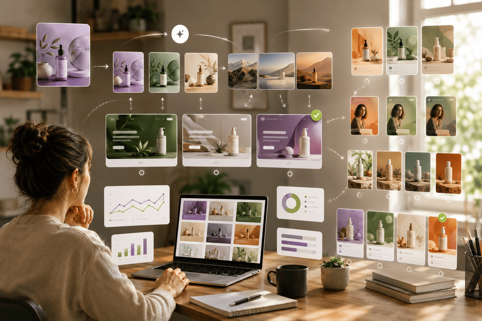
Generation performs best when you need a huge number of variations. For example, preparing monthly creatives for promotions, covers for articles, previews for cards and posts. Where creativity would have to spend hours on routine, AI does it in minutes. Creativity takes on the setting and quality control, along with non-standard tasks: campaigns, identity for offline, packaging.
A good scenario is to use AI not for a single “perfect” option, but for a series of tests. For example, make several covers, first-screen variants, ad creatives or product cards and see what works better in terms of clicks, leads and holding attention. This approach is close to A/B testing creatives: generation speeds up producing the variants, while a human chooses not by taste but by the audience’s reaction and the brand’s goals.
What has changed for designers and entrepreneurs
For designers, generation has become an amplifier, not a replacement. Strong specialists spend more time on strategy and edits by meaning, and less on the mechanical part. For entrepreneurs, the barrier to entry has dropped: you can test an idea without negotiations and weeks of waiting. This has created a new responsibility: being able to tell a prototype from a brand and to bring in creativity where the stakes are high.
Frequently asked questions
Is a logo generator suitable for a highly competitive market?
It works as a starting point. In a competitive niche, refinement is a must: rules, tests, polishing the forms. Otherwise you risk dissolving among similar solutions.
How do you avoid looking like a competitor?
State clear prohibitions in the brief, check the finished versions for similarity, refine the form and the rhythm. A table of distinctive features helps: composition, density, the character of the font, dynamics.
When is it time to move from a prototype to a full brand?
Right after the first sales and feedback. As soon as stable scenarios and channels appear, you need a system. Without a system, the cost of maintenance grows and recognizability breaks down.
How much time should you budget for polishing?
One to two weeks is enough for basic polishing. That includes testing on real media, adjusting proportions, putting together a mini-guide and handing the package out to the team.
Conclusion
The final takeaway is not that generation beat creativity or the other way around. What wins is the combination, where AI quickly assembles the options and a human sets the direction, filters out the excess and takes responsibility for the meaning. For a small business this matters especially: you do not have to spend months on the starting packaging, but you also do not turn the brand into a set of random pictures, texts and templates.
Generation helps you see the idea in action faster: how the logo looks, how the first screen of the site sounds, how the offer reads, which creatives you can test. Creativity is needed after that, to tie it all into a system, remove the generic, check the differences from competitors and preserve the audience’s trust. In the age of AI, it is precisely brand authenticity that becomes an important filter: people notice templated work faster, but they still respond to clear meaning, honest communication and a recognizable style.
So the working model looks like this: a short brief, several quick generations, critical filtering, testing on real media and careful refinement. This approach gives a business speed without chaos. The brand launches faster but stays manageable: you can develop it, scale it and adapt it to new channels without feeling that every next piece starts from scratch.