Over the past 10 years of working with entrepreneurs, I’ve noticed one frustrating pattern. Businesses often lose leads not because their product is weak, but because their website fails to explain who they help, why they can be trusted, and what visitors should do next.
This article breaks down 10 elements that every effective small business website needs in 2026. If even a few of them are missing, your site is probably generating fewer inquiries than it could.
The main topic of this guide is an effective small business website. Along the way, we’ll also cover website conversion, trust signals, sales-focused design, business websites, and AI-powered website creation.
Table of Contents
Why Small Business Websites Often Fail to Generate Leads

A website rarely fails because of one major problem. More often, it’s a collection of small issues.
The homepage doesn’t clearly explain what the company does. Contact information is hidden in the footer. The main button says “Submit.” Reviews look generic and lack details. The site loads slowly. On mobile devices, the layout breaks.
Business owners look at their website and think, “Everything seems to be there.”
Potential customers see something different:
“Who should I call?”
“Why is this service priced this way?”
“Are there real examples of their work?”
“Can I trust this company?”
This is the moment when a website either starts selling or simply exists online. A similar idea is explored in the article on Web Design Trends 2026, where website design is viewed from a practical business perspective rather than as decoration.
Expert Tip: Don't evaluate your website as the owner. Open it as someone who has never heard of your company and is about to spend money with strangers. Within 15 seconds, three things should be obvious: what you sell, who you help, and where to click next.
1. Clear Positioning Above the Fold
The first screen is not the place for vague phrases like “Creating solutions for your success.”
Statements like that don’t sell because they don’t communicate anything meaningful.
A strong hero section answers three questions:
- What does the company do?
- Who is it for?
- What result does the customer get?
A dental clinic might say:
“Dental implants and restorative dentistry in Chicago. Consultation and treatment plan in one visit.”
A construction company might say:
“Custom-built timber homes throughout Colorado. Fixed project estimates before construction begins.”
Simple language wins.
Visitors should immediately understand where they are and whether your business is relevant to their needs.
When positioning is weak, website conversion drops before users even explore your services. People are forced to piece together information from menus, images, and generic marketing language.
Most won’t bother. They’ll leave.
A simple test:
Can someone understand your value proposition within five seconds?
If not, rewrite the headline.
2. Contact Information and Business Details
Contact information is not a technical section. It’s a trust signal.
Your website should clearly display:
- Phone number
- Email address
- Messaging options
- Physical address
- Business hours
- Company registration details where appropriate
For local businesses, maps matter.
For B2B companies, legal company names matter.
For healthcare, finance, and education providers, licenses and certifications often play a critical role.
The more expensive the service, the more people investigate before making contact.
An auto repair shop may only need a phone number, address, opening hours, and photos of the workshop.
A construction company should go further by showing office information, legal details, contracts, and completed projects.
Customers are not just buying a service.
They’re buying confidence that the business will still be there after payment is made. This connects directly with Brand Authenticity in 2026: trust is no longer built only through claims, but through visible proof, transparency, and consistency.
If you’re building a new website, it’s worth understanding which legal pages should be included. The guide on Privacy Policy: How to Create provides a useful overview of privacy pages and personal data requirements.
3. A Clear Call to Action
Many good pages are damaged by weak calls to action.
The website explains the service.
It shows benefits.
It demonstrates expertise.
Then the button says:
“Learn More”
or
“Submit”
Submit what?
What happens next?
Who responds?
How long will it take?
A good CTA reduces uncertainty.
It doesn’t pressure visitors. It simply explains the next step.
Examples:
- Get a Quote
- Schedule a Consultation
- Request Pricing
- Speak With an Engineer
- Get a Website Plan
The CTA should match the customer’s stage in the buying process.
Someone reading about your company for the first time isn’t ready to purchase immediately.
For higher-ticket services, softer actions usually perform better:
consultations, audits, estimates, assessments, and planning sessions.
A similar principle applies to advertising creatives: one clear action usually works better than several competing messages. This logic is explained well in A/B Testing Creatives, especially for small businesses that need more leads, not just prettier visuals.
4. Customer Reviews and Case Studies

Reviews without context rarely persuade anyone.
A comment like:
“Everything was great, highly recommended.”
doesn’t answer the most important question:
“Can this company solve a problem like mine?”
Detailed testimonials work much better.
They explain:
- Who the customer was
- What challenge they faced
- What solution was provided
- What outcome they achieved
Photos, project links, screenshots, and video testimonials add another layer of credibility.
For a construction company, a case study might look like this:
“120-square-meter family home completed in 86 days. Original project budget optimized after a foundation review, reducing costs without sacrificing quality.”
For beauty salons, before-and-after photos matter.
For dental practices, treatment explanations and outcomes build confidence.
Reviews should appear near relevant services.
Don’t hide them on a separate page that nobody visits.
When the purchase decision involves significant money, proof should appear exactly where customers are deciding whether to contact you.
5. The About Us Page
Many About Us pages become collections of empty phrases:
“Professional team.”
“Individual approach.”
“Quality and reliability.”
Visitors skim right past them.
A good About Us page answers a different question:
Why should someone trust this team with their money?
The page should include:
- Real people
- Experience
- Expertise
- Company history
- Certifications
- Partners
- Offices or production facilities
- Photos of the team and processes
Not every business needs all of these elements.
But some combination is essential.
This becomes especially important for small businesses.
Large brands benefit from recognition.
Smaller companies often start from zero.
Trust must be earned through transparency, evidence, and authenticity.
A strong About Us page feels like an introduction rather than a sales pitch.
It explains who does the work, how the process operates, and what customers can expect after reaching out. If a founder or owner is personally involved in sales, content, or service delivery, the page can also support their reputation. The article on Entrepreneur Personal Brand is useful for this angle.
6. Mobile Responsiveness

A mobile version is no longer an optional addition to a website. For many industries, it has become the primary version.
People search for restaurants, clinics, repair services, delivery companies, and local providers on their phones. They do it while commuting, waiting in line, or comparing multiple businesses at once.
If buttons are too small, forms don’t work properly, or navigation covers the screen, potential customers move on to a competitor.
Responsiveness isn’t just about fitting content onto a smaller screen. It means:
- Easy reading
- Clear navigation
- Clickable buttons
- Fast access to phone numbers
- Simple forms
- Proper spacing
- Readable typography
A quick test is simple.
Open your website on a smartphone and try to complete a key action:
find a service, request a quote, make a call, or submit a form.
If you have to zoom in with your fingers, there is already a problem.
7. Fast Website Loading Speed

Website speed directly affects user behavior.
This is particularly true for small businesses, where buying decisions are often made quickly.
A slow website creates frustration before visitors even learn about your company.
Someone clicks an advertisement, waits for the page to load, sees a blank screen, and leaves.
The advertising cost has already been paid.
The lead is gone.
Common causes of slow websites include:
- Oversized images
- Excessive scripts
- Heavy animations
- Poorly optimized templates
- Weak hosting infrastructure
Business owners don’t need to understand every technical metric.
Instead, focus on three practical indicators:
- Pages load quickly
- Images are optimized
- Mobile browsing feels smooth
When launching a new website, performance testing should happen before launch, not after customers start complaining.
8. Simple Navigation
Navigation should help visitors find information, not overwhelm them.
Most small business websites only need a handful of primary menu items:
- Services
- Pricing
- Portfolio or Projects
- About Us
- Reviews
- Contact
- Blog or Resources
If your company offers many services, group them logically.
Poor navigation forces customers to think.
But visitors didn’t arrive to solve a puzzle. They came to solve a problem.
For ecommerce businesses, categories, filters, and search functionality are essential.
For service businesses, clear service pages matter more.
For local businesses, customers should quickly find contact information, directions, and booking options.
Good navigation works like signage in a shopping center.
Nobody notices it when it works well.
Everyone notices it when it doesn’t.
9. Security and Legal Information

In 2026, a website without HTTPS looks outdated and unreliable.
Even for a small business.
Secure connections, privacy policies, personal data consent forms, and transparent business terms help reduce customer concerns.
This becomes especially important when visitors submit contact information or make online payments.
For business owners, legal and security pages also create operational discipline.
A website stops being a collection of pages and becomes a structured sales channel.
One important warning:
Don’t copy legal documents from another website.
Policies should accurately reflect:
- What information is collected
- Why it is collected
- How it is stored
- Who processes it
Expert Tip: One of the most common mistakes I see is a lead form without proper consent language. It looks like a small detail, but customers often notice how carefully a company handles personal information.
10. Lead Capture Forms
Lead forms should be short.
Every additional field reduces completion rates.
For an initial inquiry, most businesses only need:
- Name
- Phone number
- Message
Sometimes even a phone number alone is enough.
Additional details can be gathered later during the conversation.
However, forms should clearly explain what happens next.
“Leave your phone number and we’ll call you back during business hours” feels much clearer than a generic “Submit” button.
For higher-value services, forms with intent options often work well:
- I need a quote
- I’d like a consultation
- I already have a project
- I need help choosing a solution
This provides context for the sales team and reassures the customer.
Lead forms should not appear only at the bottom of a page.
Repeat calls to action throughout the customer journey:
after service descriptions, case studies, pricing sections, and FAQ blocks.
How to Build a Website With These Elements Using Turbologo
There are two ways to build a business website.
The first involves hiring an agency, reviewing multiple design concepts, waiting for revisions, and coordinating every detail manually.
The second is significantly faster.
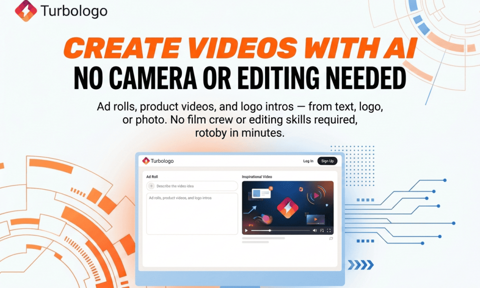
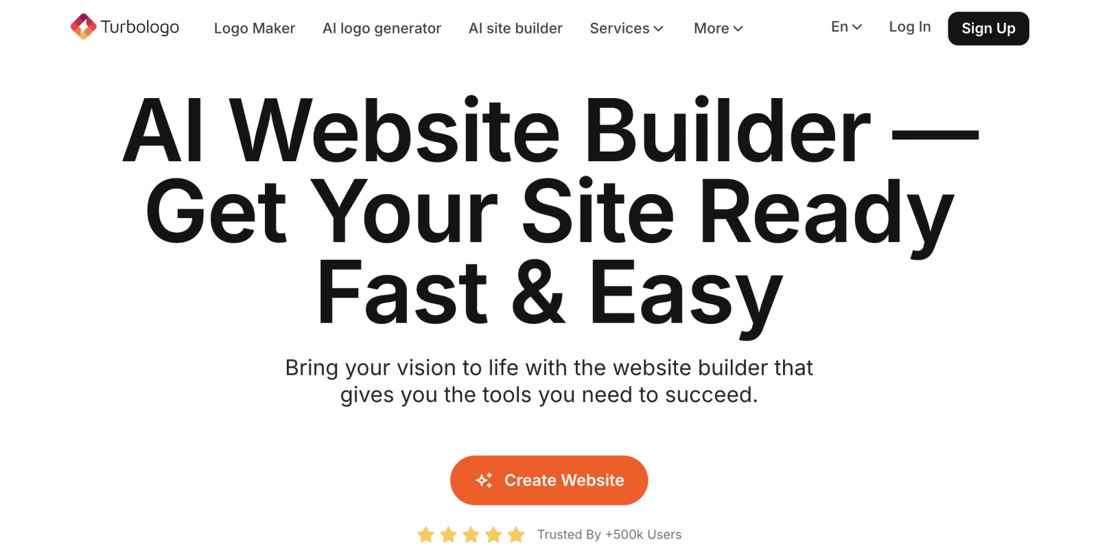
Using the Turbologo AI Website Builder, businesses can generate a website structure, visual design, and essential content blocks without technical experience.
You can create a website with AI and start with a working foundation rather than a blank screen.
That said, AI should not replace business judgment.
An AI website builder provides the framework.
The business owner still needs to evaluate the ten elements discussed in this article:
- Positioning
- Contact information
- Calls to action
- Reviews
- Mobile responsiveness
- Speed
- Forms
- Trust signals
- Security
- Navigation
That’s how a website evolves from a visual template into a lead-generation system.
If you’re deciding between traditional builders and AI-powered solutions, the article Turbologo AI Website Builder: Create a Website in Minutes With AI offers a detailed overview of how the technology works.
Website Launch Checklist
Before launching your website, don’t debate design preferences.
Run through a simple checklist instead.
| Element | What to Check | Why It Matters |
|---|---|---|
| Hero Section | Visitors understand your offer immediately | Reduces confusion |
| Contact Information | Phone, address, and messaging options are visible | Builds trust |
| CTA Buttons | Actions are clear and specific | Increases conversions |
| Reviews | Include details and outcomes | Demonstrates credibility |
| Mobile Version | Easy to use on smartphones | Protects traffic quality |
| Speed | Pages load quickly | Reduces bounce rates |
| Legal Pages | Privacy and consent pages are available | Improves reliability |
| Forms | Simple and easy to complete | Generates more leads |
For a broader perspective, it’s worth reading How to Pick the Right Website Builder: Key Criteria to Know before making decisions about your website platform.
A Website With These Elements vs. A Website Without Them
| Situation | Website With Key Elements | Website Without Key Elements |
| First Visit | Visitors immediately understand the offer | Visitors feel confused |
| Contacting the Business | Contact information is easy to find | Users search for details |
| Evaluating Trust | Reviews and case studies provide proof | Visitors remain skeptical |
| Mobile Experience | Actions take seconds | Frustration increases |
| Verifying Credibility | Legal information and company details are visible | Trust decreases |
This comparison highlights an important reality.
Sales-focused website elements do not operate independently.
They function as a chain.
Visitors arrive.
They understand the offer.
They see proof.
They verify credibility.
They find the next step.
They submit an inquiry.
If one link breaks, potential customers disappear.
What Business Owners Should Do Next
There’s no need to redesign an entire website immediately.
Start with a diagnosis.
Open your homepage and ask:
- Is the offer clear?
- Is the main CTA visible?
- Can visitors easily find contact information?
- Are there trust signals?
- Is the mobile experience smooth?
Then review three competitor websites.
Not to copy them.
To compare them.
Which website explains its service faster?
Which one makes it easier to get in touch?
Which one feels more trustworthy?
If your website falls behind in five or six areas, the problem probably isn’t advertising.
Advertising brings visitors.
The website converts them.
For additional insights, Top 10 Website Builders for Business in 2026 and Web Design Trends 2026 provide useful perspectives on where business websites are heading.
Trust is becoming increasingly important as well. That’s why Brand Authenticity in 2026 is worth reading alongside this guide.
Frequently Asked Questions
Which website elements are most important for a small business?
The most important elements are a clear value proposition, visible contact information, strong calls to action, customer reviews, mobile responsiveness, fast loading speed, and lead capture forms.
Does a small business still need a website if it already uses social media?
Yes.
Social platforms are useful communication channels, but a website provides a dedicated space for services, pricing, reviews, legal information, and lead generation.
Is a website builder better than custom development?
It depends on the project.
Complex platforms with advanced integrations often require custom development.
Service businesses, freelancers, and small companies can often launch faster and more affordably using a website builder or AI-powered solution.
How do you know whether a website is effective?
An effective website generates inquiries.
Look beyond visual design and monitor metrics such as:
- Leads
- Phone calls
- Conversion rate
- Bounce rate
- Page engagement
- Website speed
- Mobile behavior
Conclusion
A good small business website is not a collection of attractive sections.
It is a system designed to help customers make decisions.
Every element should serve a purpose:
- Explain the offer
- Reduce uncertainty
- Build credibility
- Simplify the next step
If a section doesn’t help visitors move closer to contacting your business, it should be rewritten, repositioned, or removed.
In 2026, the websites that win are not the ones with the most effects or animations.
They are the websites that make people feel informed, confident, and comfortable taking the next step.
I’m a product and graphic designer with 10-years background. Writing about branding, logo creation and business.