
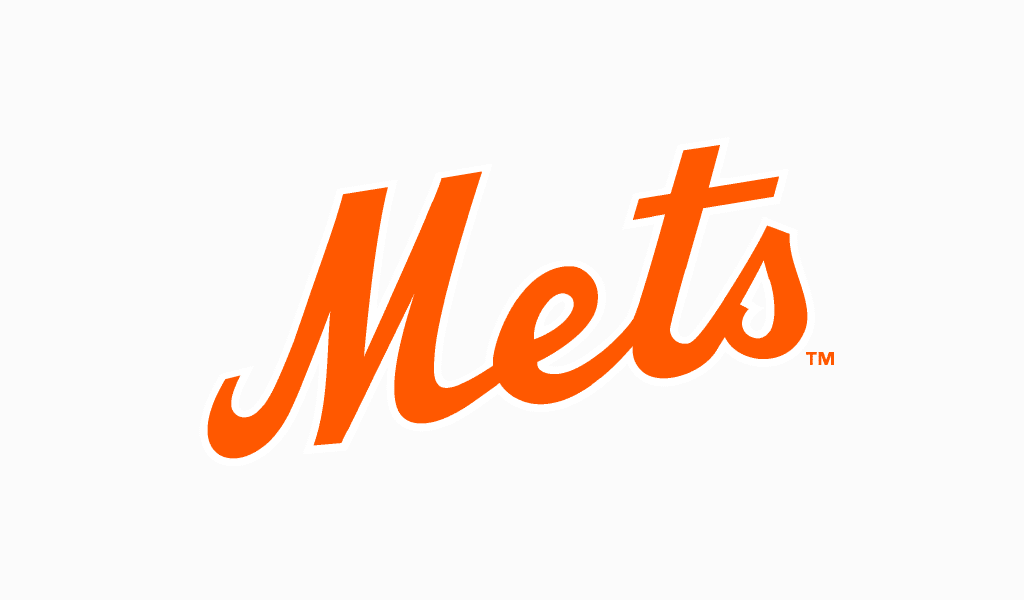
Not just any emblem in sports world can be considered a masterpiece. However, New York Mets Logo is one of good examples here. Since the day of its foundation in 1962 the team became an extremely important for New York. Moreover, the blue and orange logo has lot of fans all around the world. So, if you want to know how to create equally awesome vector logo, this article is for you!
Table of Contents
History and Evolution of New York Mets
It all began when two professional baseball teams left New York one after the other. Brooklyn Dodgers and New York Giants decided to move southwards. New York was left with no team, so they organized a new one. Meaning of a name was a simple one. Mets is just a shortening for The New York Metropolitan Baseball Club Inc. Yet their fans tend to explain it as Most Exciting Team in Sports. Meet the Mets is a widespread pun stemming from the team’s anthem. The anthem and the logo are equally striking and both items were hard to select from a huge amount of variations. And they were introduced along with the new team.
New York Mets Logo history started in 1962.
New York Mets Logo Meaning
So, what was the initial logo variation looking like? The primary logo looked like a complete design project. A bright-orange “Mets” inscription and New York silhouette were shaped into a circle symbolizing a baseball ball. Orange stiches add up to associations with the ball. Blue silhouette of the city is divided by exquisite white bridge as if stitching together all of its boroughs. And the silhouette isn’t of random shape at all. Each part of it symbolizes a borough. The colors aren’t random too. Blue and orange are official colors of New York. Mets’ logo stresses precisely that baseball unites the nation. And it makes it great!
Other elements of Mets image
Team mascot is a creature with head designed as a huge baseball ball. Its name is Mr. Met and it was given a title of best baseball mascot several times. It is wearing a white with thin blue lines official Mets uniform. There also is an inscription on a chest written in the same style and font as in the logo.
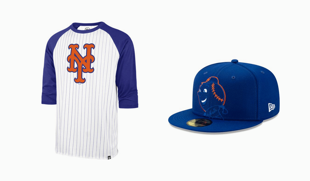
Team’s hats are deep blue. A bright orange cross comprised of “N” and “Y” letters written in gothic type is a hat logo as it symbolizes New York city. The cross remains from good old Giants times. And the color stems from Brooklyn Dodgers’ style. Both of those are an allusion to the former veterans. It seems to be the gesture of welcoming the return of baseball to the city. Team branding has been designed by professionals indeed!
All the team image elements are well-designed, which is why they weren’t altered substantially throughout the years. Only a few stylistic changes were applied in order to keep up with modern trends.
New York Mets logo Font
A unique font is used for all the inscriptions in Mets’ logo. It resembles Spills Base and Buffalo Nickel types though. However, the font and its defining traits are well protected by copyrighting regulations.

SEO specialist, link builder, and blog editor at Turbologo. Writing insightful content about marketing, design, and branding. Sharing practical tips on building and promoting brands online.


