Contemporary internet is easy to be lost in, as there is no number to measure its content. On the other hand, today the internet is far simple than before, for we know all the major sites worthy of visiting. In order to watch some videos, we go to YouTube. So, what this YouTube actually is? First of all YouTube is a platform, which affected greatly the whole net in the last ten years. It is one of the most popular sites in the world, visited by half of the internet users every day. The original YouTube logo is well known around the world, and we’ll you the history and evolution of it.
Create your own logo with Turbologo logo maker. It takes less than 5 minutes and no design skills needed.
Go to Logo MakerTable of Contents
Getting Started
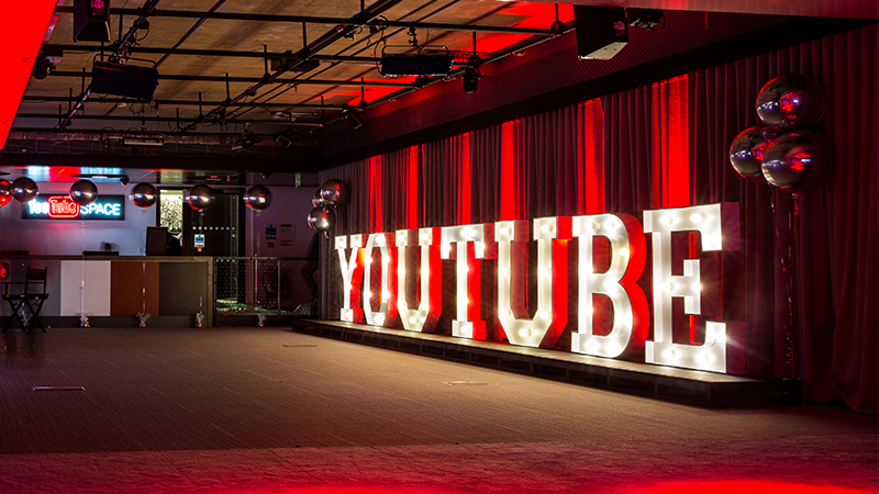
YouTube has been around since 2005. Initially, the site positioned itself as a unique dating site. However, it had a distinctive feature – users had to upload videos instead of photos, like in the usual social network. That way, people could tell more about themselves and gain an audience faster. The company quickly gained popularity, because it was the only platform of its kind. That’s how the famous YouTube came to be.
Users began to upload all kinds of content to the site: entertainment, informational, educational, news, etc. Thanks to this, the site became a major video resource.
Youtube Logo History
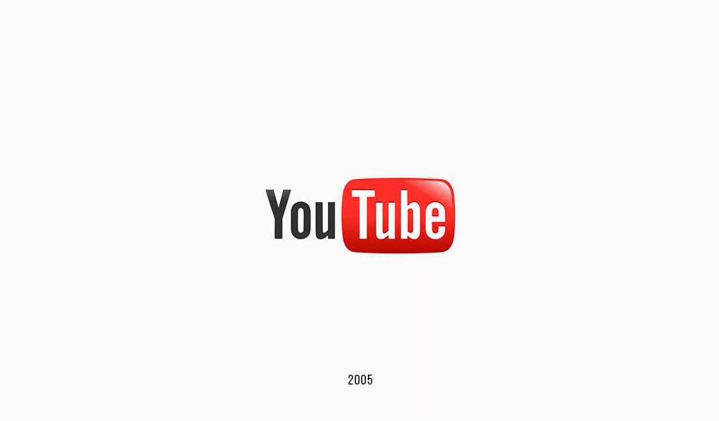
The history of YouTube logo and YouTube itself begins in 2005, as three friends came up with the idea of a unique dating site in the web. The major defining trait was that people had to upload videos rather than photos, as it resulted in receiving more data about users. The idea was great, for there was no such service on the internet at those times. So, YouTube appeared and changed the situation dramatically. As it turned out, people needed not just a video dating site, but one which could support tons of video sharing. The world never became the same since then.
YouTube original logo was designed by YouTube co-founder Chad Hurley.
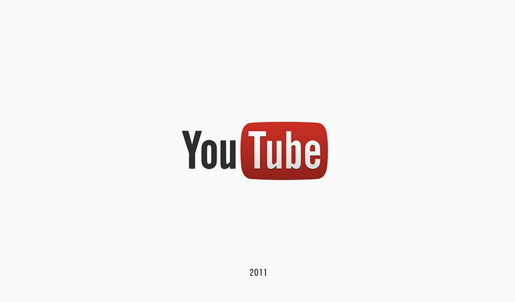
And what are the foundations of naming and emblem design? An old YouTube logo was comprised of “You” and “Tube” words. The first word was written in clear, black type, and the other one was designed in white, shaped into a red, softened rectangle. Only a few current YouTube users would understand the meaning of “Tube”. The notion is related to CRT tubes, which were used in old TVs and monitors. This is of no importance today of course.
The company suddenly realized that and decided to change the emblem a bit. The New YouTube logo looks far more up-to-date, as the button became stressed.
The “Play” button it is. VHSs are out-of-date as well, but the button design has outlived the epoch change and scientific-technical revolution. It symbolizes now the most popular site with at least half the internet users visiting it every month.
YouTube logo font
Original YouTube Logo was featuring a modified Alternate Gothic, a font created by Morris Fuller Benton in 1903.
YouTube logo evolution
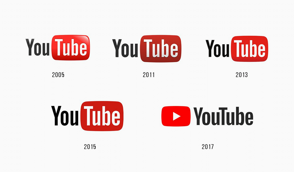
The company says the logo change isn’t a revolution but an evolution, as it’s necessary to evolve in order to stay on top. There is no YouTube from 2005. It is worth mentioning, YouTube has developed not only its own logo well, but also a design of its derived services, such as YouTube Kids, Gaming, TV, Red and Music.
Rebranding has also touched upon the old logotype. A unique YouTube type was developed. The development took a long time though, as the company sought something that would look good on any YouTube channel. Different applications, including mobile ones, are renewed according to Material Design aesthetics. It is also used by Google and applied to all its services. It is this approach, and no other, that makes the site convenient to use, legible and clear, stressing users’ content.
How to make a YouTube logo
Today YouTube is far more complicated than a simple video sharing site. It is the most effective way to advance your business, a huge amount of worksites for bloggers and a new philosophy of this world. If you have your own business, you surely have been thinking about your logo rebranding to follow the tendencies issued by YouTube. The questions of proper design and logo shape aren’t too complicated ones, not as the history of YouTube anyway.
Want to make your own YouTube logo? Explore YouTube logo design ideas in our gallery.
YouTube design is of monochrome minimalistic colors, with some red elements. It allows users to make their own designs or no design at all. That’s why you can do whatever you like designing your channel, it will be compatible with YouTube background. So, you may use any colors and types in your logo, just don’t forget to relate to your brand book.
Frequently Asked Questions
In 2005, YouTube’s first logo was created. It featured a logotype that consisted of two parts: the black “You” and the first letter capitalized. The “Tube” was written in white on a gradient rectangle with rounded angles.
Bettig, joined Google six years back and has been with YouTube for the past three years. He led the charge for the redesign of the logo. Bettig and his team tried to create a dynamic brand as YouTube was growing into a variety of services.
YouTube added the letters BHM to its logo on February 1, 2021. Companies don’t change their logos every day, especially when they are as large as YouTube. People are often confused about the meaning of the change and whether or not it is permanent.
Over time, the icon that is part of the iconic Youtube logo has seen a few modifications. The original version included the name. Since 2011, the icon features a play button. In 2013, the proportions for the triangle and the rectangle were changed.
Blog editor and content marketing specialist at Turbologo. Writing about Marketing and design. Victoria’s articles contain useful tips on how to build a brand and promote it online.

