
We have studied the logos designed in the last two years that we found on several major design-related platforms, and tried to detect the tendencies which, in our opinion, will influence the development of the field this year.
Create your own logo with Turbologo logo maker. It takes less than 5 minutes and no design skills needed.
Go to Logo MakerTable of Contents
1. Simplicity
If you watch how young brands grow and old ones transform, you’ll see that companies pursue laconism. Simplifying has become a major trend that will stay popular throughout the year. The main idea is to cut everything unnecessary off of an existing logo – reduce its parts or withdraw from bright decorative elements. Individualization of color palettes is also noticeable – one color comes to the foreground, revealing all its shades.

2. Support of multiple platforms
Particularly, the trend is getting more popular because of the development of multiple platforms and information technology. It’s important to have a brand logo looking the same on:
- websites of any design;
- banners;
- screens of gadgets, in mobile apps;
- posters and booklets;
- business cards.
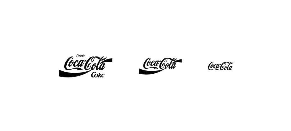
Clarity, certainty and memorability allow a client to immediately recognize symbols. It should be noted that today many famous companies pursue simplicity when rebranding.
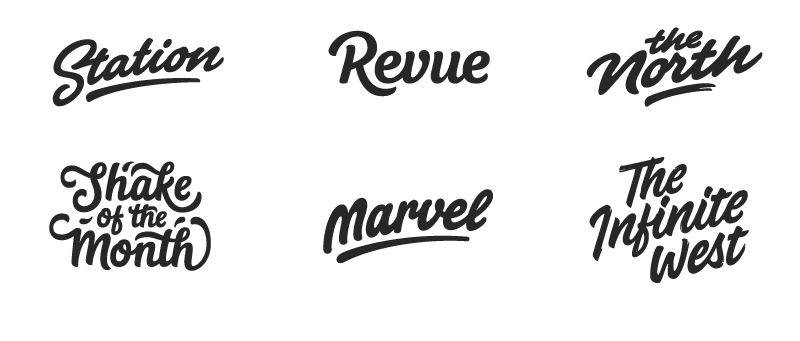
3. More experiments with texts
Playing with composition
This style implies building a vertical structure of words which are placed randomly/in any desired way. In addition, such a built column is often decorated by graphic elements, and the words are painted different colors. It’s important to not make such effects prevent clear perception of your text
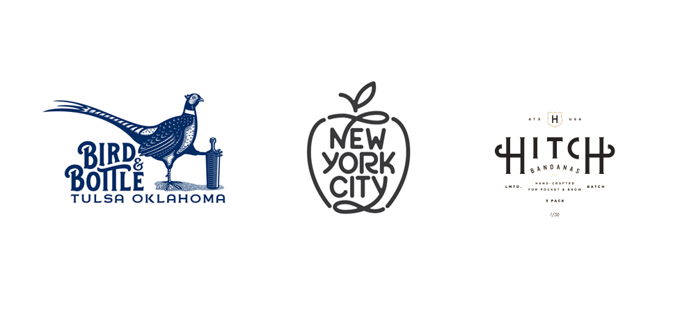
Lettering
Besides the widespread “simplicity” trend, the lettering technique in the logo world remains up-to-date and attractive. The logos made with use of it will always stay on the signs of cafes and restaurants, creative and theme venues, as well as unique emblems.
4. Classics and geometry
Stamp imitation
The retro style and its slightly nostalgic atmosphere are popular both with companies and consumers. This style of emblems implies giving a logo and any accompanying text a shape of a circle or a semicircle. It is optimal for simple, contour symbols of companies, short slogans and dates.

Simple figures
Simple and available fonts designed very proportionally started to get popular in 2017. Texts, in this case, are accompanied by geometric elements: circles, triangles, squares and other figures, along with lines and points.
The inner harmony of such a logo immediately attracts viewers’ attention, making the emblem stand out. Now that design technologies and fantasies are all around, simplicity looks unusual and arouses interest. It is a company’s way to excel. As the history of brands shows, laconic wordmarks are best remembered by the audience. Nike and Samsung are great examples.
The stamp format is associated with reliability and stability in the subconscious, and forms the good impression a brand makes on people.
5. Use of empty space
The method allowing to hide the “additional” image within the visible one is known to everyone interested in original logos and images. The tendency will certainly remain in 2018, and the only difference is, now texts are put first instead of graphics.
6. Gradient transitions and overlapping
Designers started liking mild color transitions back in 2016. Such an effect does not look brash or extravagant, at the same time being in great contrast with monotonous texts. Gradients may be used to design texts, images or icons. This trick is most useful in case of logos with massive, dense fonts.

MasterCard with its new symbol consisting of two overlapping circles started this trend. Probably, other companies will follow in 2018. Besides, the method that’s simple at first sight (who didn’t mix paints in their childhood?) leads to very original discoveries of designers.
Obviously, this list of logo design trends of 2018 is not full, and only the most clear are included. Probably, the world of design will spring more surprises – but yet, we hope this information will help you put the trending directions to use.
I’m a product and graphic designer with 10-years background. Writing about branding, logo creation and business.

We’re welcome for your comments!