Fashion is always on the move, changing rapidly and existing as something unsteady. There always is a temptation of being out of it, and, at the same time, a fear of being left out of the crowd, something that has always been one of most terrifying horrors for a socialized person. One way or another, fashion design code is being written in the modern world, so, whether you’ve wanted to be diverse or not, general ideas remain in your subconsciousness. The logo development industry, however, is an exception; there always is some space for fresh ideas. You should know these ideas to be in the know of logo design trends 2019. Here they are, in order of appearance, so to speak.
Create your own logo with Turbologo logo maker. It takes less than 5 minutes and no design skills needed.
Go to Logo MakerTable of Contents
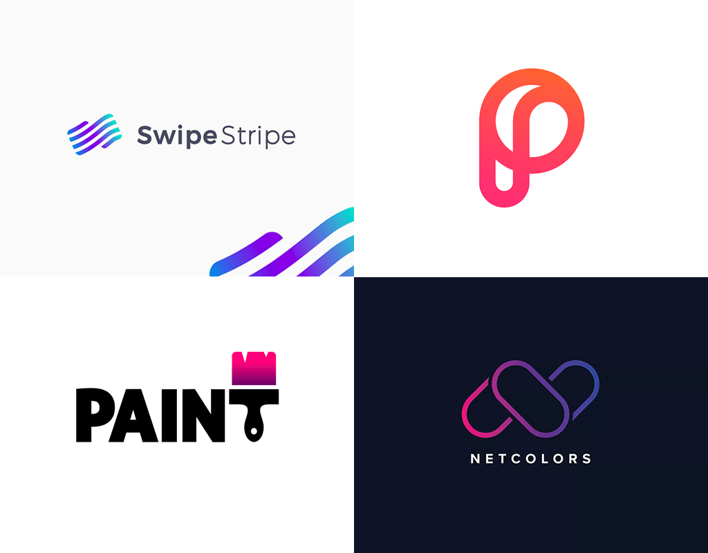
The return of the gradients
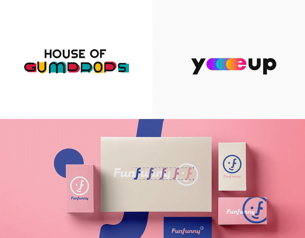
Just years ago, gradient coloring was literally tarred and feathered, thus expelling it from fashion currents. Soft color alteration and color-changing were replaced everywhere with clear and restrained stripes of color. Color diversity was often down to one and only flat sign, but in 2019 the time has come to remember the gradients. This solution is rather convenient for today’s branding. The Instagram logo is one of the famous agents of current trends in logo design. The most important thing to remember when creating such logos is that one must pay special attention to color mixing, as it may result in dirty-brown stain instead of the beautiful composition of red and turquoise, so the best idea here is to add an artificially altered color transition.
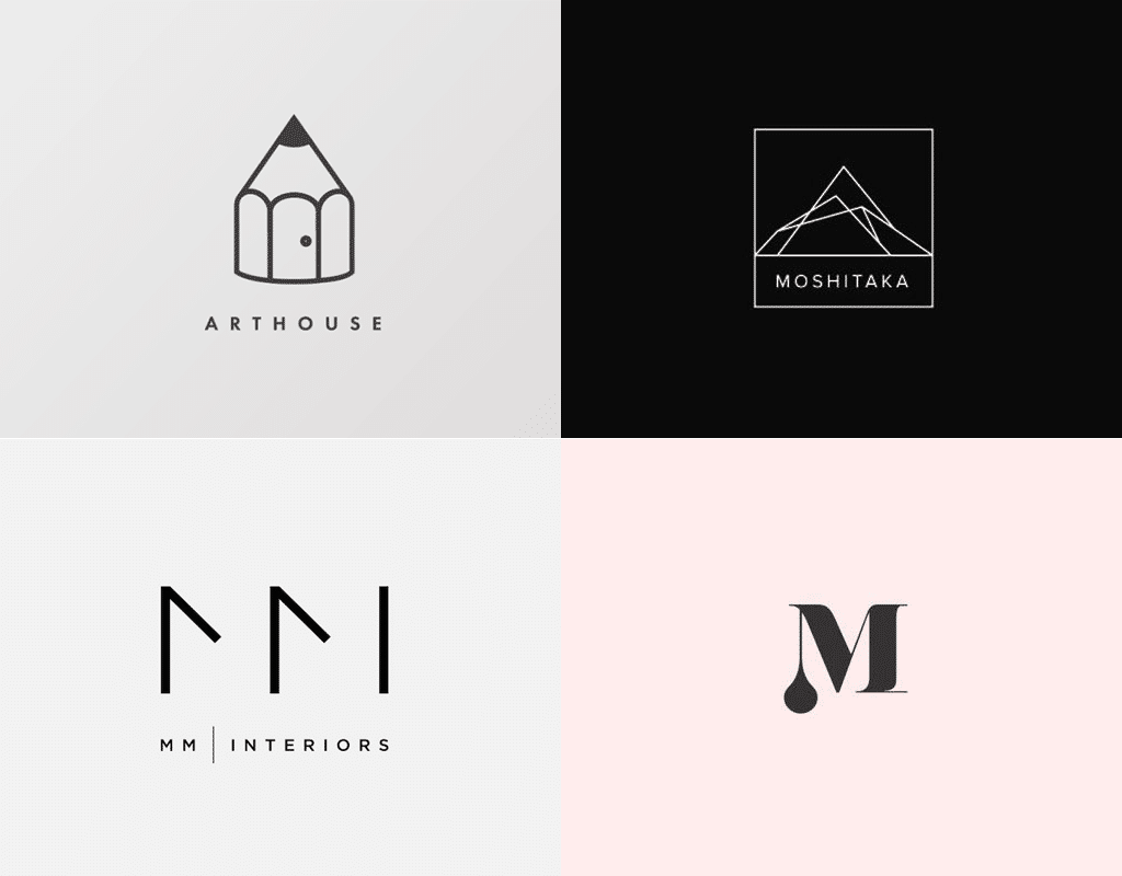
Minimalistic logo design
If your heart is against all those ruches, ringlets, color transitions and abundance – here is a sigh of relief, for it is time to let them go. Minimalism is coming and no one dares calling your simple, monochrome design “dull”, “shallow” or “have you seriously run out of ideas?” from now on. A worldwide known company Converse proves that a simple sign and an inscription is quite enough to become a market leader. Don’t forget, however, that such an approach to the design of a logo takes lots of focused attention, precision and accuracy. All the logo lines are to be measured and calculated, as the simpler the logo is, the more noticeable are its flaws. If you aren’t confident of your capabilities, it’s better to call professionals for help.
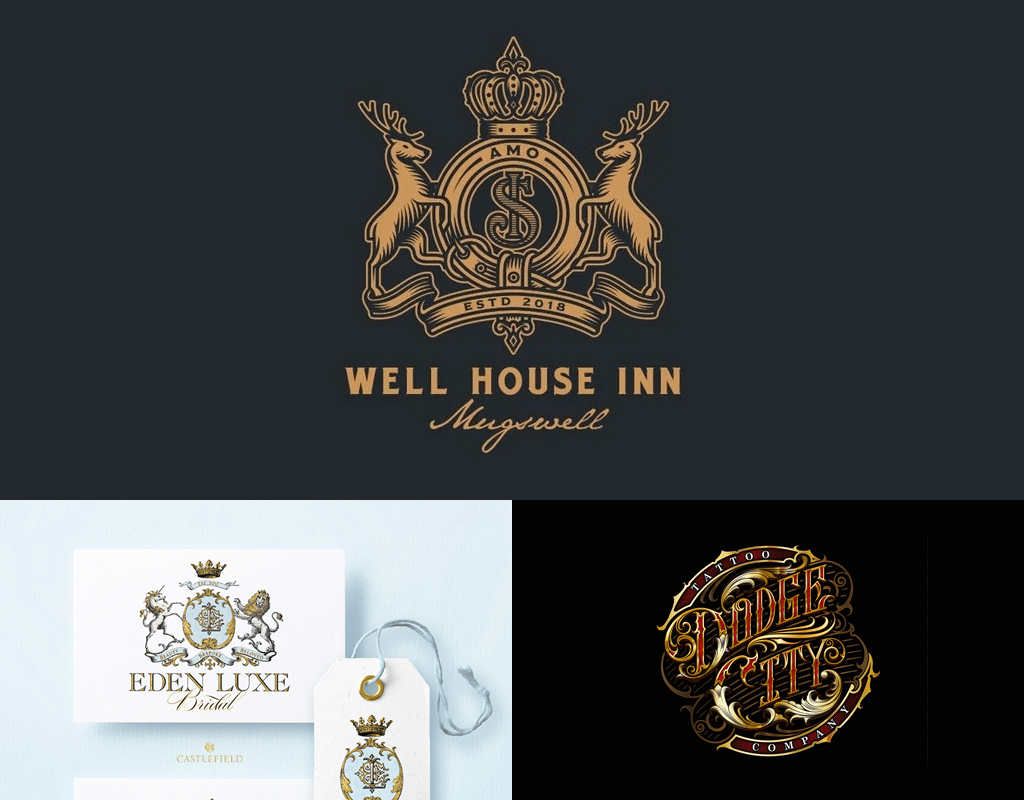
Maximalist logo design
Yes, yes, you haven’t misread! We have just had a talk about minimalism being the latest logo design trend, and there is no contradiction here. The contemporary world gives limits and restrictions no credit! There are no strict rules, provided you are truly capable of playing lots of details and colors right in a logo. It is even better if you believe that an abundance of details characterizes your brand best. If that is the case – welcome aboard! Look at Dodge City Tattoo Company logo, which makes tattoos and body piercing. Their logo has a lot of details and possesses many colors. However, it has integrity and harmony about itself. And what’s more, it makes you think that it would look just fine as a tattoo! That means the logo does its job well, as the company has almost sold you the tattoo and you are simply reading an article about fashion tendencies. So, never forget an idea and representation of your business are an absolute must for your logo, as without sales your company will simply disappear, no matter how fashionable your logo would be. Remember the basics!
Bright colors
Usage of bright and vivid colors is logo design trend 2019. Of course, the matter is to be approached with wit and artistic taste, so that a result didn’t literally pluck out your eyes, and the result would be well worth it. While making a recent rebranding, IKEA company has only narrowed its logo, applying no other transformations like recoloring or inscription altering. This palette is sure to attract customers’ attention and they memorize the color combination, thus remaining your customer for a long time and purchasing even more as time passes.
Asymmetry
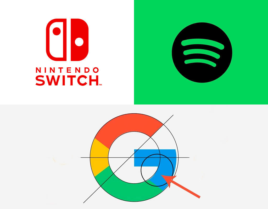
Sometimes, beginning owners dream of having a perfectly measured square with carefully inscribed their company initials in it. Symmetry and accuracy have nothing bad in them unless your company is supposed to provide some kind of creative solutions or invent something new. This boring stability implied by your logo isn’t the best choice, given the situation. Asymmetry always is eye-catching and attracts attention, being a modern logo design trend, so feel free to apply it. Please notice, you don’t have to make your logo absolutely asymmetrical. Look at Google’s logo. It is slightly asymmetrical, and that makes you spend some time finding out what’s wrong with it. The devil is in the detail, they say.
Negative space
A well-used negative space is one of the slyest tricks ever. Not all of us know what it is, and even actually notice it, then again, subconsciously we always perceive negative space. Let’s analyze the following example. Look at the zoo logo, which is located in the Bronx, and you will immediately notice unusual animals for America. These giraffes are nowhere but in the Bronx. And that can be perceived by singling out skyscrapers, towering between giraffes’ legs. The logo can be understood correctly even without a signature at all, so even a child, who can’t read yet, would understand its meaning. These intuitively perceived labels are the latest trends in logo design.
Illustrative icons
It seemed that flat-design, simplified far beyond its limits and which was so perfect and stylish will never abandon its ranks, but that is just what is happening. Nobody likes schematic mustache and scissors on barbershop signboards anymore. And nobody needs the same icons, which have don’t differ one from another. Simplicity is still attractive, but it’s got to be individual simplicity. If you draw a wrench, symbolizing your car service shop, it has to be your unique, the one and only wrench. An excellent example of trends logo design 2019 among illustrative icons is the True Honey Co logo, a company that deals with honey. The logo is comprised of uniqueness, warmth and love, and you want to believe their honey is genuine and of high quality. Though we don’t know if it is true, the logo does its job!
Typography
A quality, interesting lettering instead of a picture is a nice example of design trends in modern logos. This solution has been used for a long time. It never gets old, so by choosing this option, you might just be choosing your lifetime option. Such logo will hardly require any significant changes. Provided you have thought the lettering through, it will serve you well for a truly long time. The most appropriate example of lettering logo rebranding is a well-known Subway. The company’s designers have once created an excellent, well-balanced logo, adding guiding arrows, as if showing that you could have something to eat while leaving a subway. As of now, when the time for changes has come, the company managed to renew the logo, leaving it as recognizable and pretty as before. So, fix it in your mind, typography is one of the most effective design tools, and it also is one of the best options for creating a logo. And don’t forget to use custom types. They are hundreds of times better than Times New Roman and Calibri from Microsoft word. Be sure to spend some money on a professional lettering painter, it is the only way to create your own, unique design.
What other trends are seen in design of the logo?
Talking about stylish trends, we must mention animation as well. Even the slightest logo flickering is eye-catching, and if the whole logo falls apart into an array of stars, demonstrates your stuff, and then assembles back to normal – customers are sure to remember your store. However, this change is related to not the logo itself, but to its application. Don’t forget that nowadays, your logo will be situated not only on idle hoarding by road or on your brand-shaped bottle, it is more likely to be seen on the internet. That’s why your logo is to be adapted to the World Wide Web laws. However, it is of utmost importance to follow the spirit of fashion, not its letter, and walk side by side.
I’m a product and graphic designer with 10-years background. Writing about branding, logo creation and business.