The logo of a company is used to identify the products or services that the company offers. It is part of the company’s branding. The public won’t be able to distinguish between companies without such branding. They will also not expect the same standard of quality from the company with which they interact.
If a logo is designed well, it can help people remember the unique selling proposition of an organisation, which in turn promotes the company at a sub-conscious level.
How logos have changed in age-old and successful companies is a better way to assess their effectiveness. We searched for the most famous companies around the globe and studied how their logos changed over time, decades, and even centuries. These will hopefully give you an idea of how these companies have designed their logos so that people can easily identify their brands.
Table of Contents
1. Shell
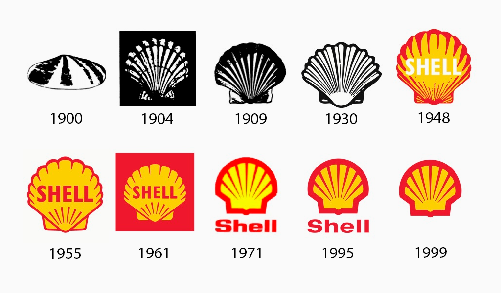
The days of literal logos are long gone. Shell used to be able to use an ambiguous illustration that depicted a seashell as a logo and it was sufficient to satisfy customers. The original shell was created in 1900. It wasn’t until 1904 when we first saw something that is comparable to the current version.
In 1948, Shell introduced their iconic yellow-red color scheme, which makes sense considering the psychology of color and technology in that era allowing easier color printing.
2. Microsoft
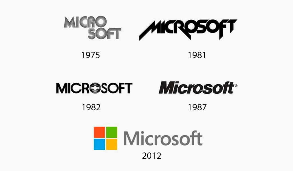
Since its founding in 1975, the Microsoft logo has taken on several personas – most of which being text-based. The look of the software company changed over time to become more edgy and tight. Finally, they settled on a logo that featured a splash color and an icon for their most well-known product, Windows.
3. Toyota
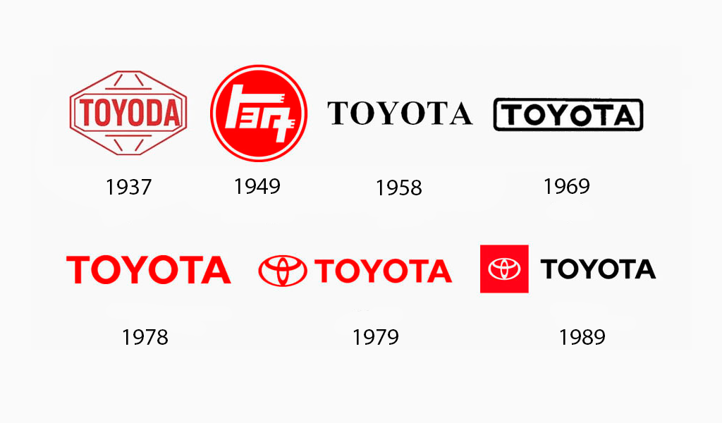
Over its 84-year history, “Toyoda”, as it was called originally, has seen three different logos. Three years after its foundation, the company requested a logo design contest. The result was a red logo with Japanese characters that form the word “Toyota”.
The Toyota emblem, which we all love and know, was first introduced to the public in the late 1980’s. It has remained their iconic logo since then.
4. Baskin-Robbins
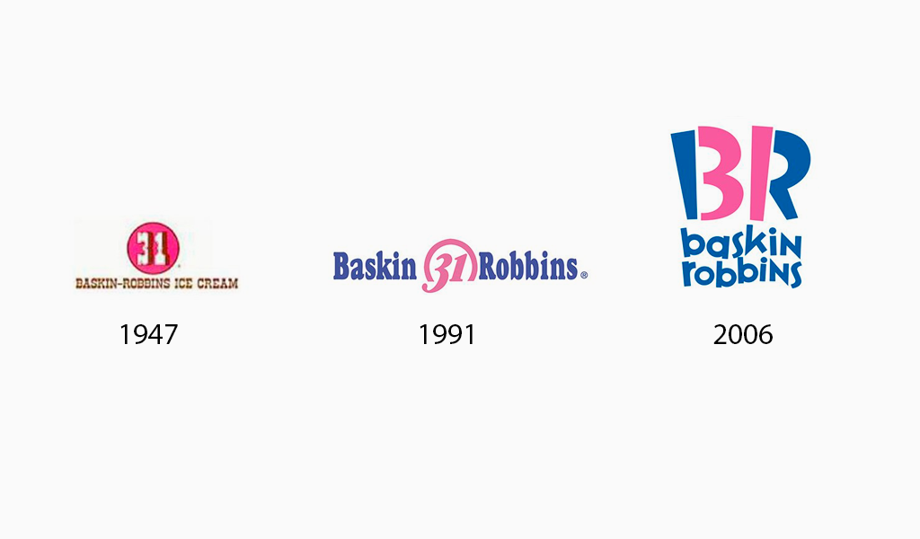
Although the original logo Baskin-Robbins used was not bad, it is outdated. The Baskin-Robbins logo evolution focuses on improving upon the original, rather than “fixing it”.
They redesigned their logo in 2006 to create the current version. It combines the initials “BR” and the number 31. This builds on the strategy they’ve used since the beginning–associating their brand name with their top selling point of flavor variety–and takes it to the next level with an image that tends to stick in viewers’ minds.
5. AT&T
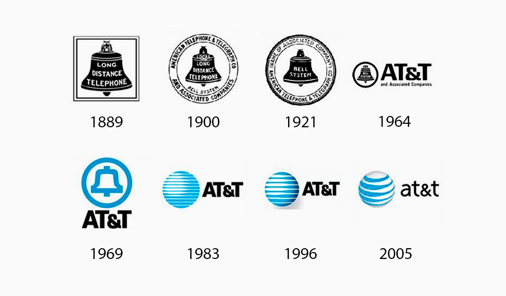
AT&T’s logo has undergone many changes from 1889 to 2005. This is in keeping with the technological evolution over the past century.
The company underwent a second rebranding process in recent years. They added smoother curves and brighter blues to their logo and expanded their stripes. This new design captures the feeling of growth and movement.
6. Apple
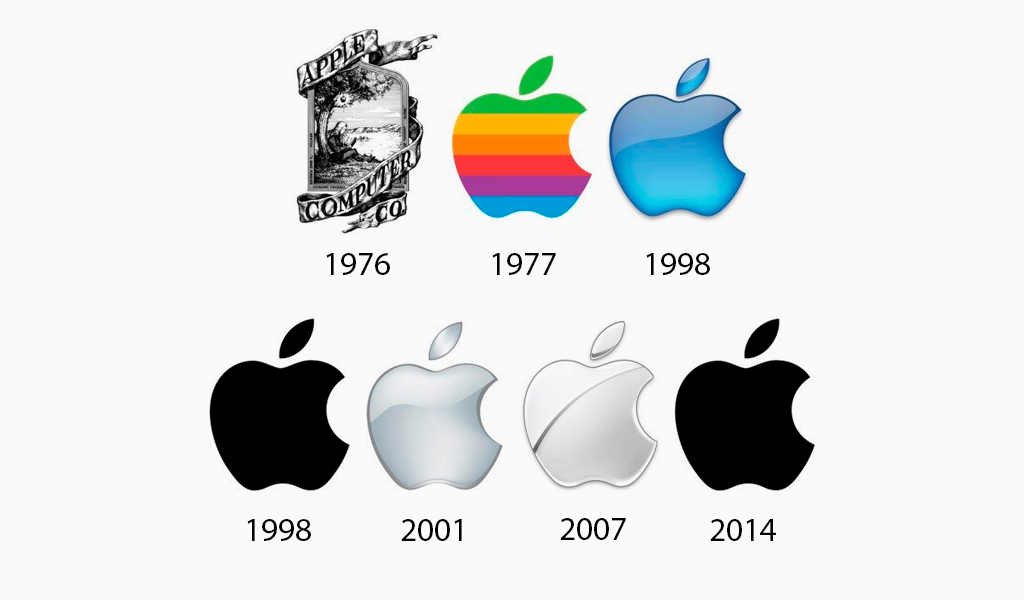
Apple has proven that simplicity is better than complexity. The tech conglomerate moved from an elaborate, detailed emblem to a simple, single-colored icon of an apple with a bite taken out of it. The logo they have now is simple, clear, and easy-to-remember – everything a logo should be.
7. Levi’s
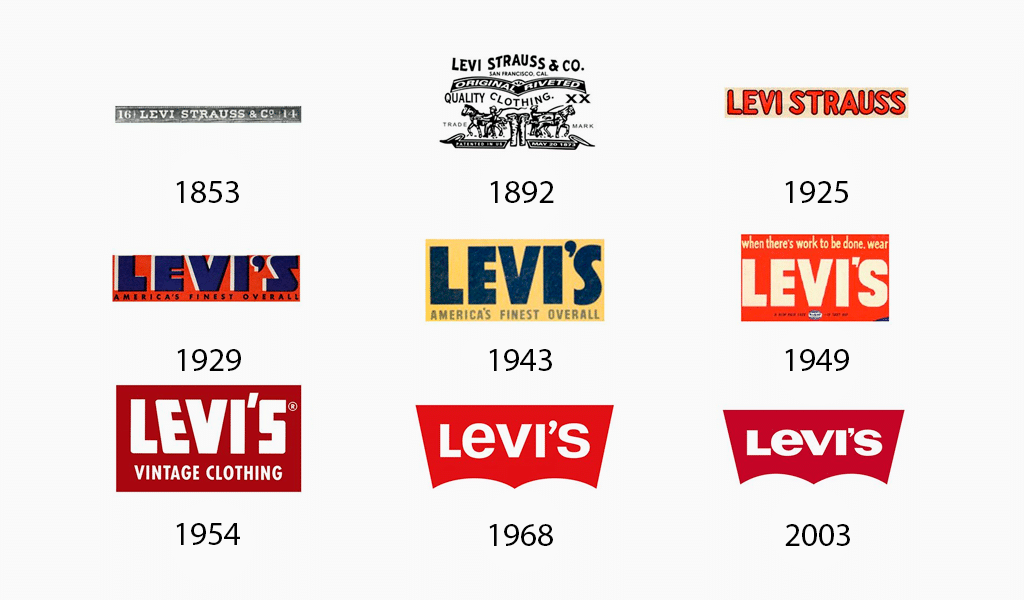
Levi’s jeans are timeless and strong, and the logo reflects this. Their logo has been around for over 50 years and we feel it will not change anytime soon.
8. Visa
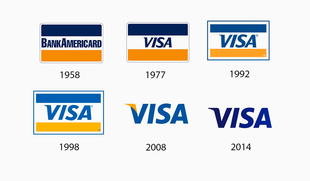
Visa has maintained its roots by using the same fonts and keeping the basic colors. They were able to remove the credit card stripes from the logo as the brand gained more recognition and allow their name to stand out in a strong, blue font.
9. Burger King
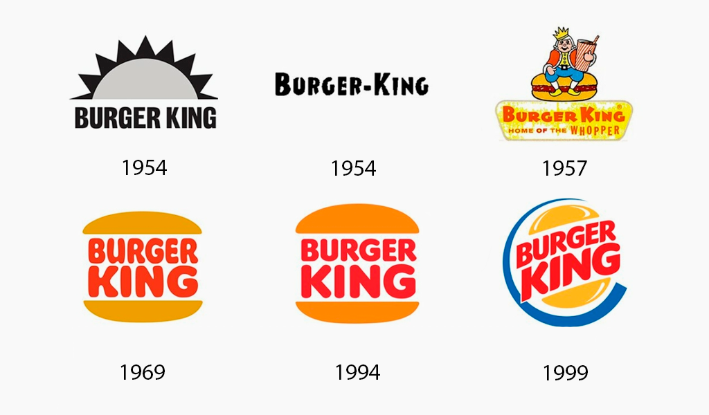
The hamburger franchise went from being mascot-oriented to an explicit image showing a bun. They’ve also tweaked fonts and colors over the years to give the logo a more “globalized” feel.
10. Nike
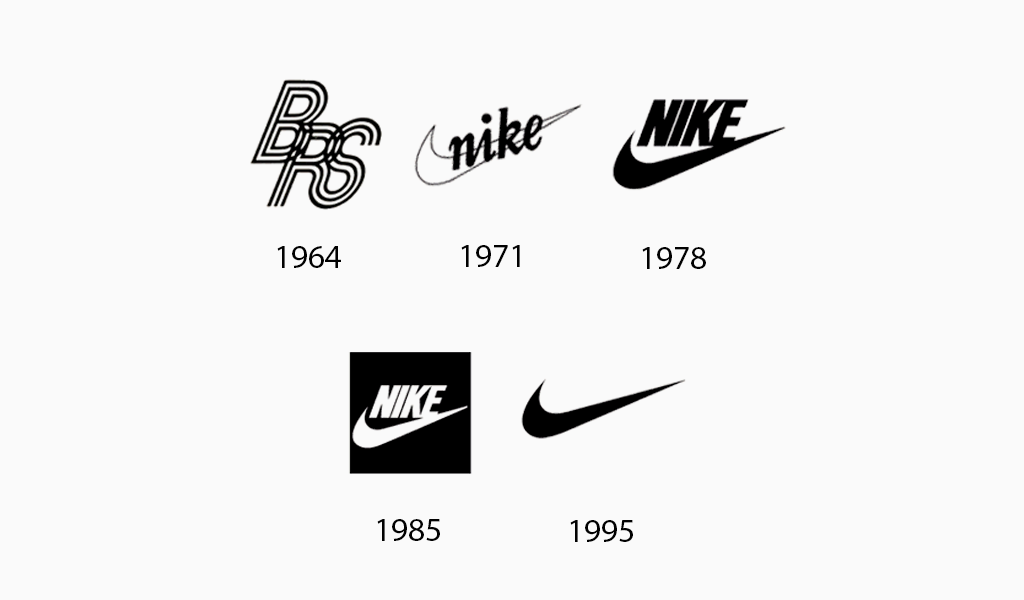
Another logo that remained relatively consistent over time, Nike‘s infamous “swoosh” was always here to stay. The logo became so well-known that the company’s name was dropped.
11. Adidas
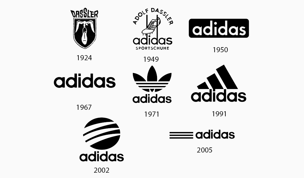
This brand’s logo, although it has changed from its original design, has maintained the same font, three stripes, and (lack) colors. Its icon has only been modified over the years. Adidas’s logo design is striking and easily recognized because of its use of a black-and-white palette.
12. Walmart
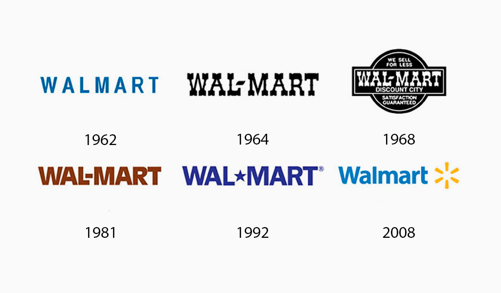
Walmart’s 1962 logo consisted of the brand name and a font that could be printed. The logo has remained nearly the same over the years with the exception of changing fonts and colors. The last time the logo was altered was in 2008. Walmart used both small and large caps to spell its brand name. It also included its company tagline and placed a yellow star-like symbol at the end of its name.
13. Kodak
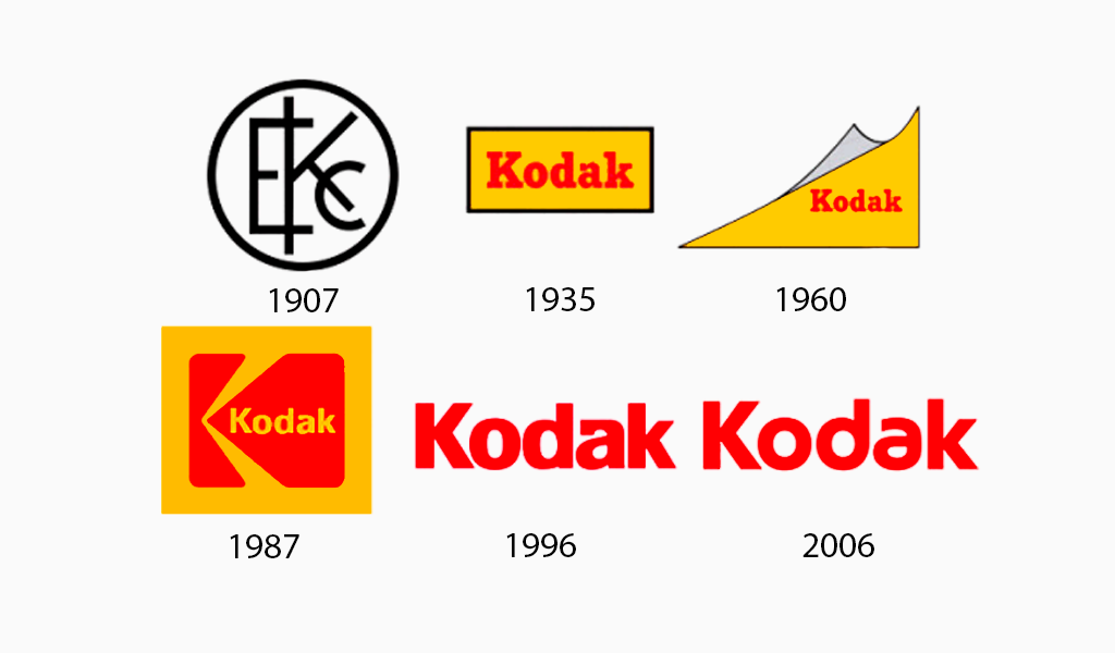
Although Kodak’s original logo is not easily recognisable, the other iterations used the red and yellow color scheme to create a variety of shapes and orientations.
14. Volkswagen
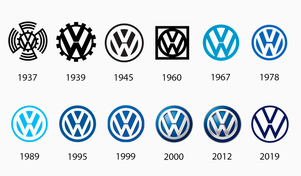
In 1939, the original VW logo featured bumped teeth all around the circle. This made it appear like a gear. Long arms rotated around the circle. After WWII, the arms and gear bumps were removed and the logo was recolored by VW in blue and silver.
15. Canon
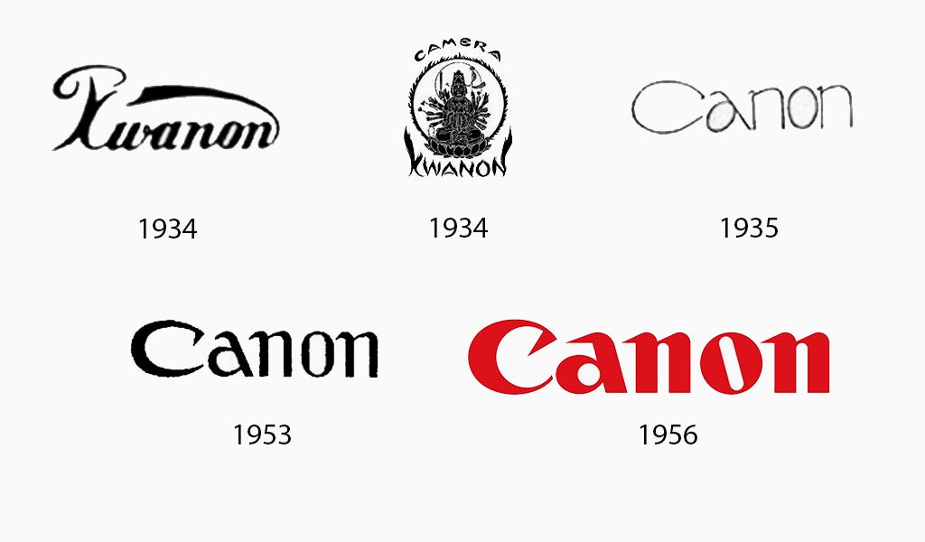
The first logo of Canon was quite different than the ones that followed over time. It depicted the Buddhist’s Goddess Of Mercy, surrounded by flames and sitting on a lotus blossom. Only the next logo retained the ‘Kwanon brand name and used unique typefaces. Canon’s logo changed to the ‘Canon” in 1935. This logo was refined until 1956 when it became the one we know today.
16. Mozilla Firefox
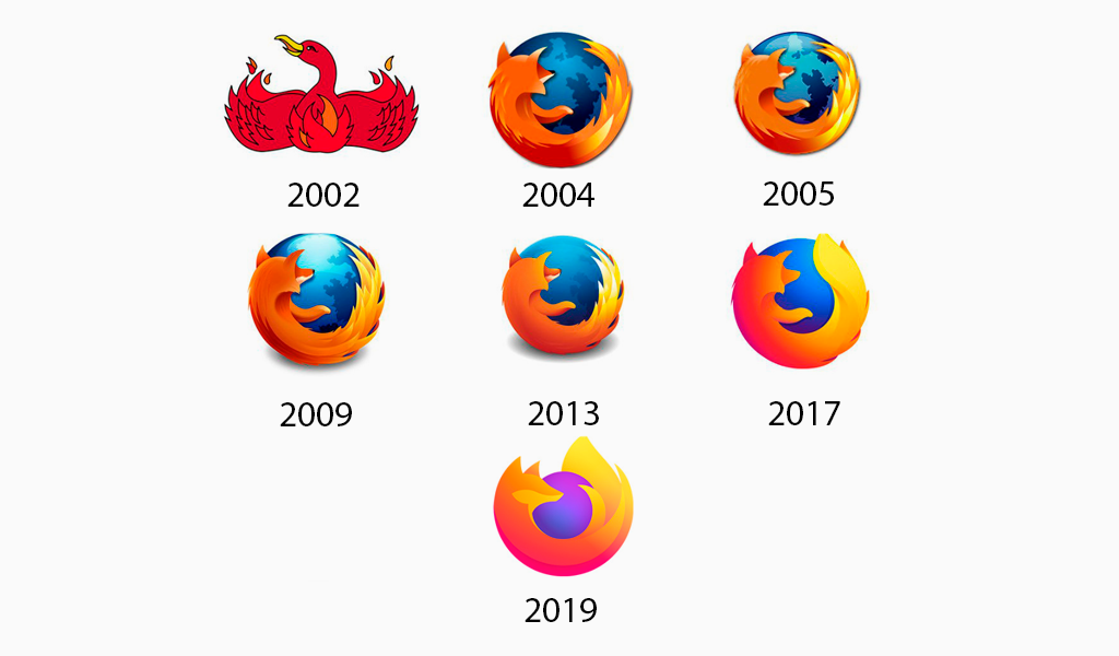
To match the original program name, Phoenix, a phoenix was originally drawn with wings spread to represent its original form: Phoenix. Legal reasons forced the name to Firefox. The logo was redrawn with a fiery globe and fox.
You can read about the evolution of the Mozilla Firefox logo here.
17. Pepsi
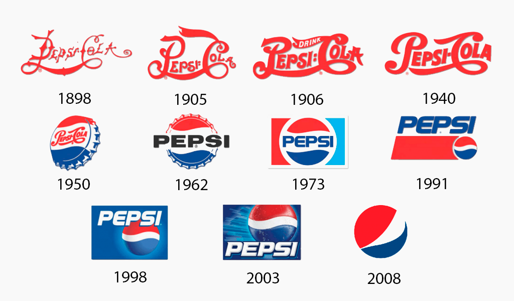
Pepsi’s first logo was red script on a white background. In 1950, Pepsi introduced a round red, white, and blue bottle cap to their logo. In 1962, they switched from fancy script to clean black lettering. In 1972, the bottlecap was transformed into a circular with colored stripes. As of 2011, the circle is still Pepsi’s logo.
18. Starbucks
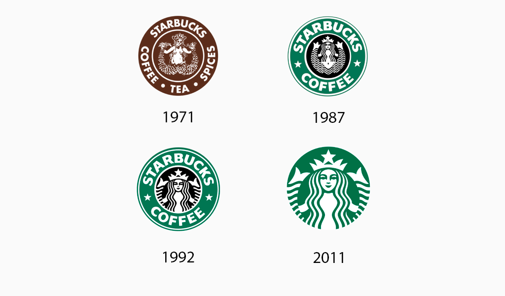
When discussing the evolution of logos for famous brands, it is important to mention Starbucks: The ugly duckling that became a beautiful swan. You’re probably wrong if you believed mermaids to be the epitome beauty.
Starbucks had become a household name by 2011, and customers could easily recognize their distinctive green logo. The company was so popular that they could reduce the size of their logo. Their modern logo is a result of this: they removed their brand name, and changed their entire color scheme to monochrome green.
19. Chevrolet
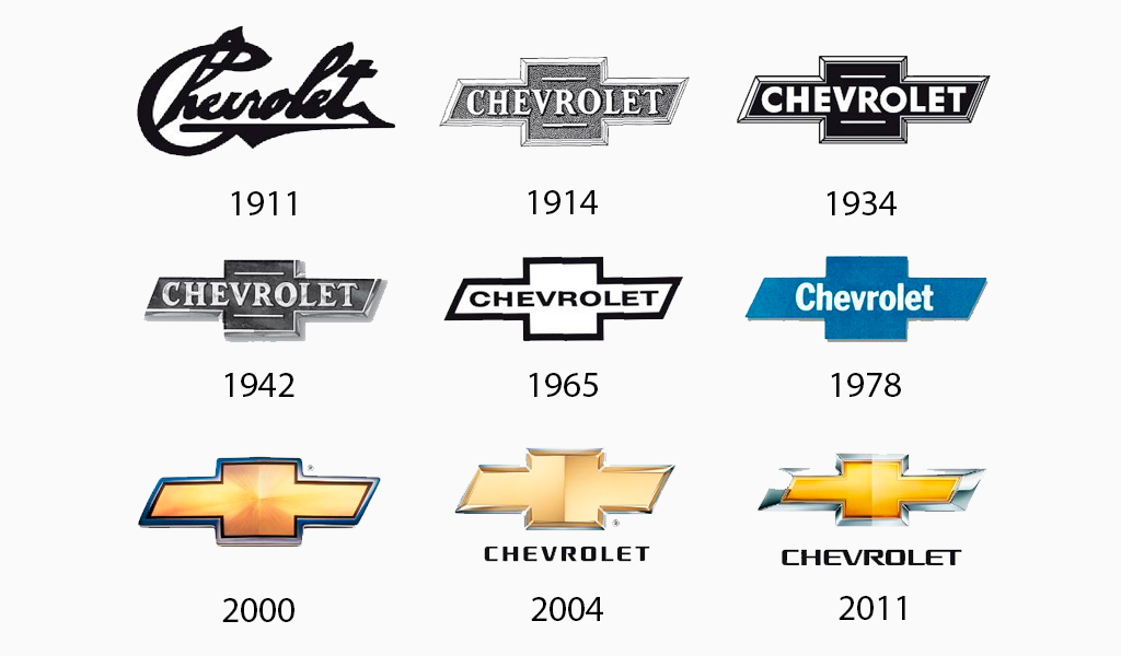
For the majority of the 20th century, the Chevrolet logo was unchanged with minor modifications to the typography and in the 70s, the switch from black-and white to blue. Chevrolet introduced its silver-and-gold color schemes in 2003. The texture makes it shine and gives it a shiny look.
20. Renault
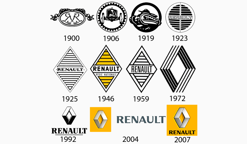
Renault’s logo was originally a medallion that had the initials of its founders, in 1900. The logos that followed indicated their products, namely cars (1906) or tanks (1919), were the next two designs. The logo was replaced by a grill, which is commonly found at the vehicle’s front four years later. Renault’s diamond-shaped logo, which we still recognize today, was first adopted in 1925. The logo was updated with their yellow color in 1946. The latest Renault logo was finally created in 2007, after further modifications throughout the second half of the century.
I’m a product and graphic designer with 10-years background. Writing about branding, logo creation and business.

