The evolution of Firefox’s logo is a sign of an evolving brand. Mozilla Firefox was one the most popular browsers of the 2000s. It was fast, efficient, new, and could open multiple tabs, something that not many browsers were able to do at the time. It was a great break from Internet Explorer, a browser that we don’t understand why we hate so much. Mozilla Firefox was more than a browser. It was a brand.
Create your own logo with Turbologo logo maker. It takes less than 5 minutes and no design skills needed.
Go to Logo MakerA good logo is a great way to represent your brand. As designers, this is something we must always remember. To create a logo that represents who and what they are, we must first understand the visions of the company. It is a difficult task to create a logo as a designer.
Table of Contents
Logo History
The iconic browser’s visual identity has been built around flame and its power. It started with an image of a Phoenix bird in 2002. This mythological creature was resurrected from the ashes and transformed into the iconic orange Fox. Mozilla Firebird was the original name for the browser, but it was changed to Phoenix in 2003. The current Firefox name was adopted in 2004.
Logo Evolution
2002 – 2004
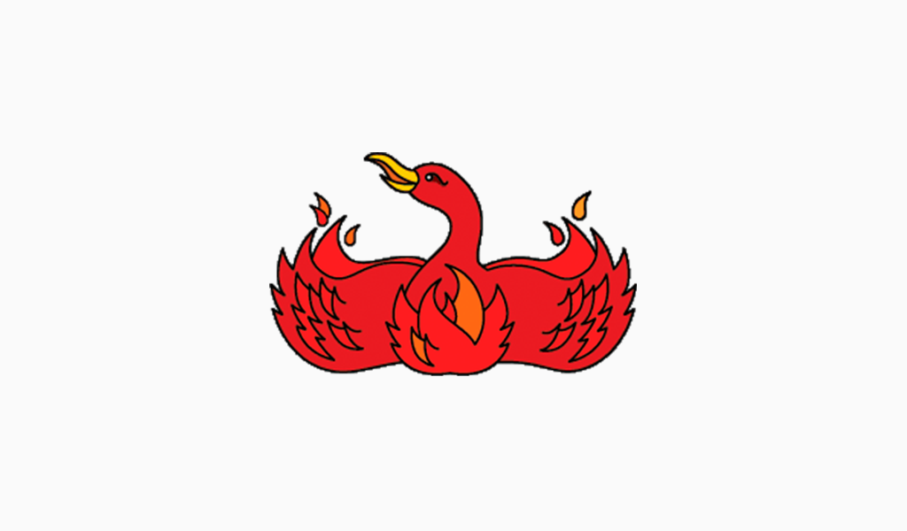
The original logo was created by Phoenix. It depicted a stylized, red bird with its wings spread out to the sides. It was curved up with delicate red petals over it, resembling an flame. The bird’s head was turned to the left, and it looked bright and friendly.
2004 – 2005
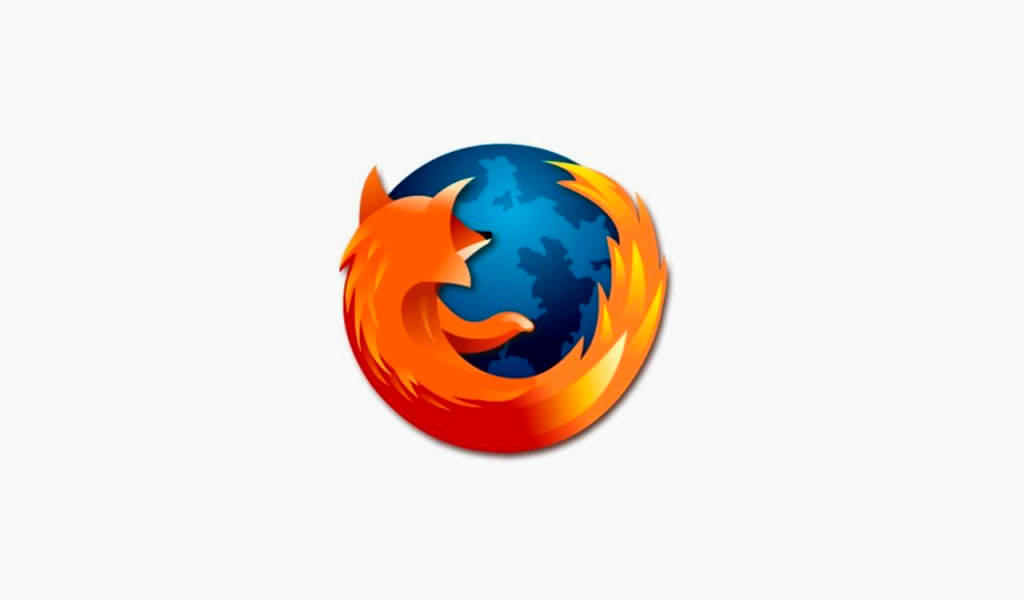
The new logo was created after the browser was renamed to Firefox in 2004. The blue globe was made in gradient shades and featured a stylized orange Fox, curving along its bottom, snuggling the globe. The long, fluffy tail of the fox was drawn in sharp shapes to resemble a flame.
2005 – 2009
In 2005, the colors and contours of the globe as well as the fox were improved. The use of contrast tones of orange and blue made the bridge brighter and clearer.
2009 – 2013
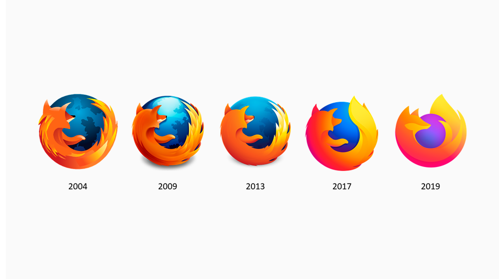
In 2009, the globe received lighter gradients. This made the emblem more three-dimensional and glossy. It also looked modern and trendy. Although the overall style and composition of the globe have not changed, the tail of a fox was redrawn so it looked more like a flame.
2013 – 2017
The Firefox emblem will be redrawn in 2013 and simplified. The badge is now simpler and flatter without the gloss. The elements of the globe were reduced in color and the same happened with the fox. All accents were moved to the tail.
2017 – 2019
The 2017 redesign brought a smoother style to the iconic Fox. It was executed in wide, smooth lines with no triangular parts and all of the sharp triangular elements were removed. The globe’s color was brightened, but the contours of the continents were not visible anymore. The background is now plain and gradient.
2019 – Today
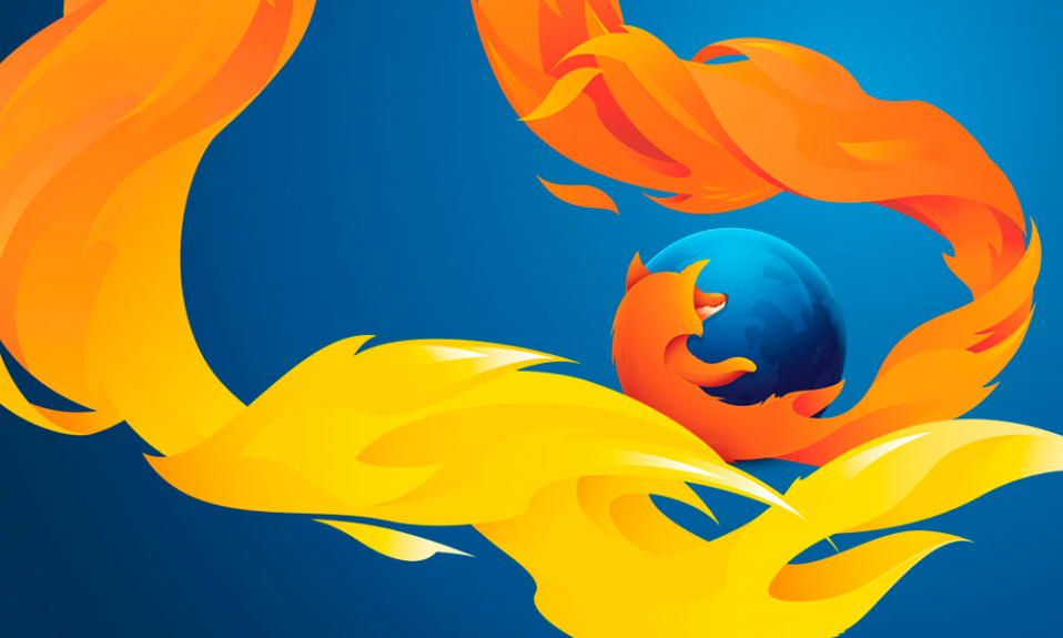
The globe will shrink in size and be replaced by light purple in 2019. The profile of the enlarged fox shows it in profile. It is cuddling the globe with its arms. The creature’s tail is elegantly and smoothly shaped, with its lines being long and smooth.
Old logo
Steven Garrity, interface designer, was the person who rose to the top of the company’s visual identity team. He published his critique of the Firefox symbol shortly before, in which he explained every aspect he disliked.
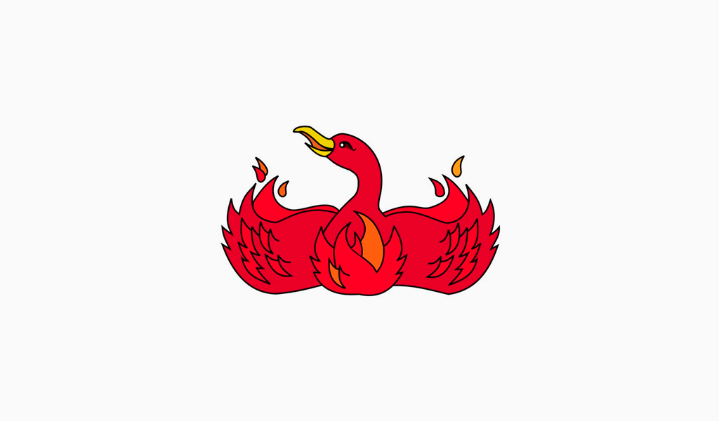
A new version of the software and a new visual identity were released in early 2004. Silverorange, a group made the icon. Jon Hicks, an English designer and author of the Camino website, created the final version. He drew his icon from sketches of his predecessors.
The history of the Mozilla Firefox logo was updated with many new versions over the years. There have been multiple updates to the logo. Many times, the reason for modification was due to flaws that were discovered when the logo had been enlarged.
Mozilla firefox logo meaning
Although the icon depicts a fox, it is actually a firefox. The word “firefox”, however, refers to the red panda. Why then is a red panda not featured on the logo Hicks explained that very few people understand that “firefox” is a panda.
Other people say that the logo based on flame, its power and the depict of a reviving Phoenix bird.
The 2017 emblem
Mozilla’s new logo appears to be simpler than the previous versions. The blue part of the logo is now almost flat unlike previous versions. However, there’s still a subtle gradient.
Font
The font used in the logo’s previous versions for the words “Mozilla”, and “Firefox”, is called FF Meta Bold Roman. Erik Spiekermann designed the font.
Color
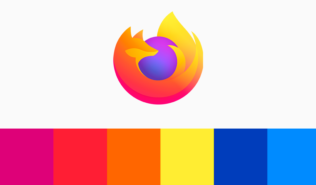
The combination of orange and blue is both optimistic and striking. Orange is the color for the Fox’s Fir, and blue adds a pleasing contrast.
Animal in the Mozilla Firefox Logo everyone knows as red fox. But that’s just the part of the truth, because in this name of the animal contains an error. The fact is that “red fox” means “panda”: at first the creators of the logo wanted to embody in the logo a rare endangered species, guarded in Asia. But mistake during translation this phrase from Chinese to English (red panda = fire fox) led to cardinally other animal in this logo. The main creator of this logo was inspired by fragment of his children bible with story about jackal – its tail was in the red fire. Since then red tail we can see on all the rebranded logo of this super browser. And this is the talented finding for all us, who used to this invention and see the picture of browser every day.
In 2002 year Dave Hyatt and Blake Ross created free web browser Phoenix, which was renamed in Firebird, and then – in Firefox. In 2003 partners were attacked by John Hicks, interface designer from Hicksdesign, because he was suffering from their terrible branding. After a while Mozilla invited him to create new identity and got now famous bright logo, which is visible even from Earth in space. John Hicks gave to the world stylish, bright, beautiful and conceptual logo with many meanings to each. Then the logo has undergone changes during a long time, and today we can see not the first version of this sign. But it becomes more and more stylish and modern.
Today Mozilla design system consist of all we needed to create the products and web servises in our day and in the far future. There are new color palette with many gradients for a variety of artistic purposes. Also design developers created the system of forms this product (logo), based on geometry, which can to create the nice background patterns, spot illustrations, motion graphics and pictograms. There’s more here is the modern font to the trademarks with the rounded pattern, which is similar on our icons. Type and color standards are available in order the brand will be open to everyone.
I’m a product and graphic designer with 10-years background. Writing about branding, logo creation and business.

