Companies didn’t seem to care about label adaptability when there was no internet. They were simply making TV ads and placing the label on packages and boxes. Times change, and now we have internet, smartphones and tablet PCs. Your logo might be looking good on a huge billboard, but it’s unlikely to do the trick as a favicon or an icon on a website. Many companies don’t realize that logo must be responsive. In most cases, logos just get smaller in the web and lose all the features they were designed to demonstrate. And if brand identity isn’t recognized anymore, it’s completely useless. That’s why we are going to tell you how to create the best responsive logo in today’s article.
Create your own logo with Turbologo logo maker. It takes less than 5 minutes and no design skills needed.
Go to Logo MakerResponsive design creating basics
First of all, you’ll have to research your style and identics. Then you should design some variations of those, keeping in mind that the variations are to be used for different purposes of course. They can be varied in terms of scale and orientation. The first thing is quite obvious and the second one isn’t. Orientation can be portrait and landscape, and you are going to need both. Basically, you’ll have to alter inscription place and that’s it. And don’t forget to design a square variation too.
Now that we have created two orientations, we may proceed to how to make a responsive logo scaling. There are better be three versions yet four is the best. Be sure to define priorities for all the inscriptions, including the slogan. The amount of text is to be reduced according to picture diminution. Also, don’t forget to keep font size proportionate. And the smallest logo version requires only initials and nothing more.
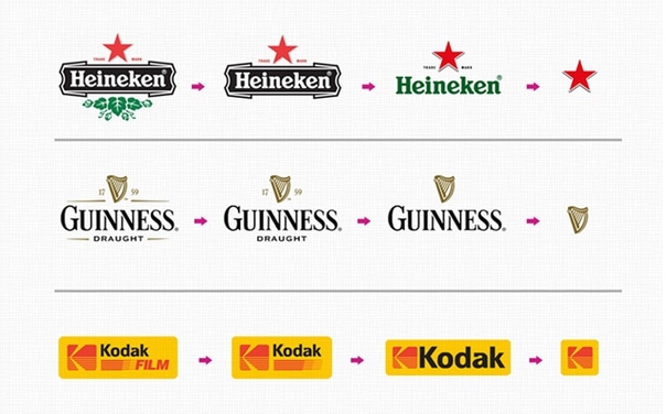
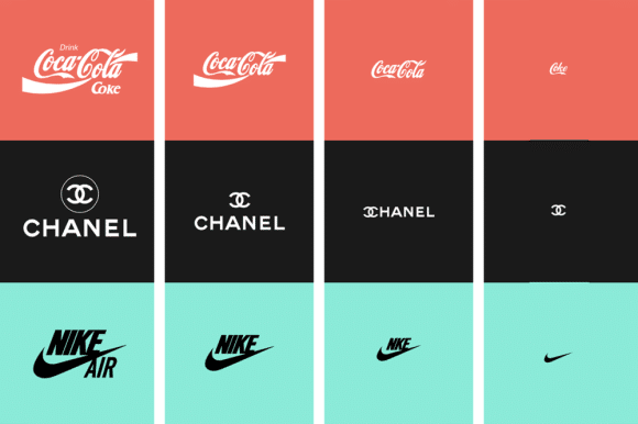
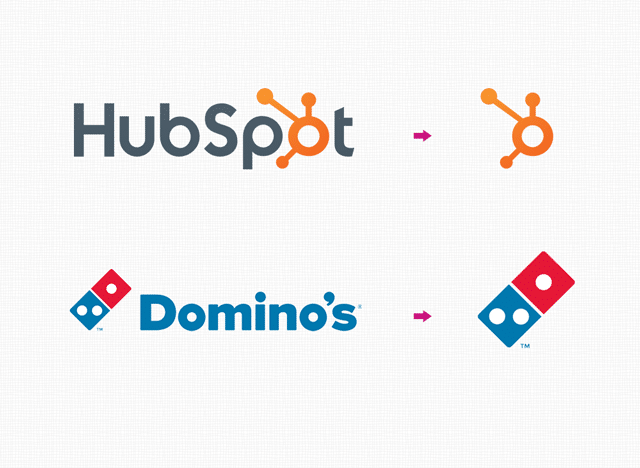
Proceed from compound to simple things while making different logo versions. Lessen the number of details if a logo gets smaller. Multicolored gradients are best to be reduced to two or three colored ones. Draw one bold line instead of two thinner ones. Also, unify small polygons avoiding overall logo shape modifications.
Examples of best responsive logos
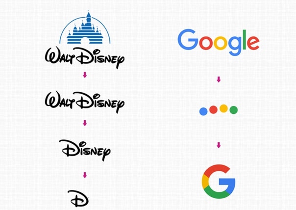
Probably the best example here is Walt Disney Company. The full version features a detailed castle. A reduced one depicts only one word. And minimal one is nothing but a single initial letter. Nevertheless, each version is well known and recognized by everyone. Channel, Warner Brothers, Levi’s and Heineken are other brilliant examples. If you have doubts regarding how to make a responsive logo, scrutinize those examples. Thus you’ll be able to understand the basics of consecutive reduction and laconism.
I’m a product and graphic designer with 10-years background. Writing about branding, logo creation and business.