
Basketball has claimed hearts of millions and it is one of the most spectacular sports nowadays. However, it wasn’t always like this. Long ago, in 60s when the World War II was finally ended things were different. Basketball wasn’t as popular as it is today. There was no ad, no stadiums and amount of money in the industry wasn’t tremendous at all. Sportsmen had to search for a training spot. And only the chosen one could afford a carrier in NBA. And ABA was created for weaker teams. It was that association that included another decent team called Buffalo Braves. Just what is the story behind the brand? Let’s find out!
Table of Contents
The first LA clippers logo history
So, Buffalo Braves team realized that a wild ox brings no luck. The team decided to change its name and origins. Having moved across the entire country they stopped in San Diego and after a while finally settled in Los Angeles. The team’s new name was Los Angeles Clippers. The previous logo featured a buffalo encircled by feathers. And they had to refuse the old logo just like the old name. While the team had been stationed at San Diego they accepted a new logo. It was a white sailing ship. However, the symbol didn’t last long.
As for LA Clippers’ sports achievements, they were lucky to take a vacant place in NBA. And NBA was really happy to accept one of the best teams of the minor league, but LA Clippers still were quite lucky becoming part of NBA. Despite having many experienced players, moving to a new place and complete image alteration resulted in a succession of injuries and staff replacements. Oddly enough, the team was lacking competent players. The logo history started in 1971.
LA Clippers logo evolution
How did the team’s symbolism change after moving to California? According to NBA brand book having a basketball ball in logo is a must. And the rule was followed to the letter. Colors were altered to patriotic blue, red and white ones. The ball itself was depicted with thin crimson lines. And a huge “C” written in italics was occupying the second part of the logo. The font was blue on a white background. The team was using the logo until 2010. And then LA clippers had to do a rebranding. There were no significant changes. Only a few stylistic ones were applied. The lines have become more clear and certain to be precise.
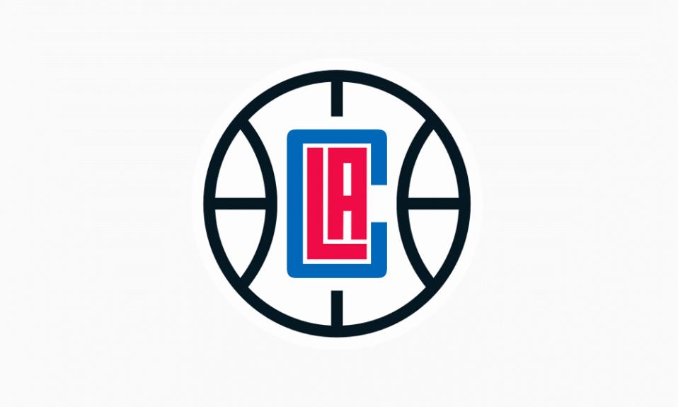
New LA Clippers logo meaning
It wasn’t until 2015 when they decided to apply some major changes. And it was the first time in 33 years. Colors haven’t changed, but overall composition has. Previous variation implied contrast between a blue ball and a red letter and there was harmony in it. All the logo elements were aligned in a straight line in the center. The curved lines symbolize the horizon of the ocean, this horizon horizon seen from the bridge of a Clipper ship – it is a symbol of marine theme roots of the team. A visual stress switched to a small-scale and neat ball at the top. Two red “L” and “A” letters are placed in the midst as if symbolizing a field. And “C” is sort of hugging them, symbolizing players’ love for their city.
Unveiled in February 2024, the LA Clippers’ logo places a stylized clipper ship inside a navy “C” shaped like a compass. The ship’s hull carries basketball seams, tying together the team’s maritime and hoops heritage. A compass element is built in as well, with the “N” in “Los Angeles” oriented north. The palette features navy blue, ember red, and Pacific blue.
Logo Font
The major inscription is written in The Baskerville Old Serial Heavy font at the bottom. You truly can’t miss such neat and symmetrical logo!

SEO specialist, link builder, and blog editor at Turbologo. Writing insightful content about marketing, design, and branding. Sharing practical tips on building and promoting brands online.


