Customer attraction is the major task of any business. A unique style and alluring logo
are of great help here. They are vital pastry-cooking and many other businesses too. Keep
reading the current article and you’ll learn how to get that and what’s worth paying attention to.
Create your own logo with Turbologo logo maker. It takes less than 5 minutes and no design skills needed.
Go to Logo MakerTable of Contents
Why would a bakery need a logo?
A personal brand logo has some vital functions like:
- Stressing company uniqueness;
- Telling area of work;
- Pointing at the advantages of your goods and services;
- Catering for better memorizing of a brand and its style;
- Causing certain associations and emotions.
Pastry-cook logo creation basics
You can get an idea of the latest pastry-shop emblem designing trends by just looking at
your rivals’ logos. We have pointed out major need-to-knows to make your logo analysis more effective.
Choose eloquent icons
It’s essential for a pastry-cook to use thematic images in a logo. All those bakings, lush
and appetizing sponge-cakes, or pies must make passersby at least sample your cooking.
Use appetizing colors
It is common knowledge that colors can affect appetite. For instance, red, orange, and
yellow are the most delicious shades. They boost spirits and heighten blood pressure, thus, inspiring a coffee break.
You should avoid cold shades in pastry-shop logos. When it comes to appetite, they are at a huge disadvantage.
Don’t be afraid of handwriting
Handwriting isn’t always appropriate here. However, pastry-shop is a delicious exception.
Such fonts would look cool in a candy-maker logo. The only thing to pay some special attention to is an icon and overall style compatibility.
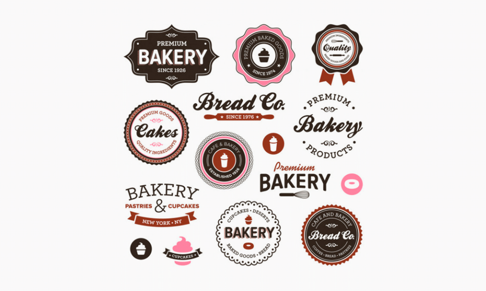
Pastry-shop logo examples

How to create a pastry-shop logo
You can also design a pastry-shop logo using modern constructors. This option stands out
for its simplicity and effectiveness. Moreover, it enables you to save a fair amount of company funding.
Logo generators create logos in accordance with your demands and requirements. You
can choose proper colors, icons, and fonts. Just leave the rest to the logo maker.
You will also be granted access to readily available pastry-shop logo templates in the
Turbologo directory.
I’m a product and graphic designer with 10-years background. Writing about branding, logo creation and business.

