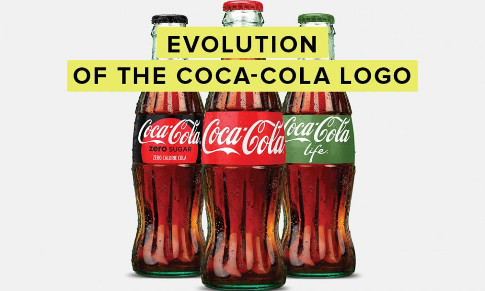
Color is one of the most important elements of product branding. It has a strong influence on the audience perceptions of the brand personality, creating certain associations among the consumers, acting as a kind of trigger for various moods and emotions. With the help of a well-chosen color or color scheme, a brand can stand out in the market among a great many competitors and draw attention to its products and services with lasting impression.
Table of Contents
Why is it important to choose the right company colors?

A company’s visual identity is a powerful force. In a crowded marketplace, it can help a company stand out and encourage people to form an emotional connection with the brand recognition. The right branding colors can convey a specific message, mood and attract a specific target audience.
A great number of fast-food chains prefer red in their brand color. They do this because red stimulates the appetite. By branding themselves with this primary color, they signal to the buyer that they can satisfy their preferences.
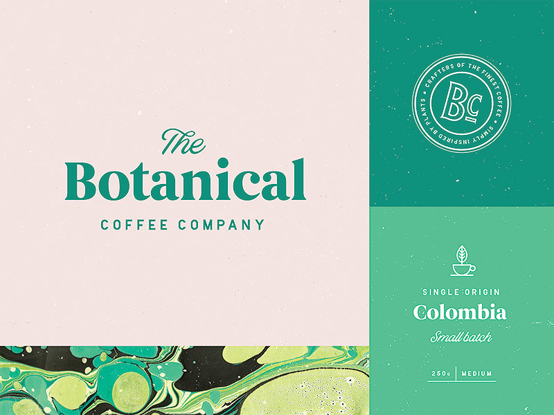
When a customer sees a company logo on a product, walks past a branded store on the street, or sees a web design, they are sure to notice the color scheme and react emotionally to it. This does not mean that a red logo will make the customer immediately feel hungry. But colors are more likely to evoke a more subtle subconscious response to brand guidelines.
Selecting the wrong primary color for commercial purposes can confuse the consumer or simply fail to attract their attention. If the color wheel suits the product or the company as a whole, then it has a better chance of creating the type of reaction you want. The color scheme will in any case evoke an emotional response in the target audience, so it is important to know which colors are most likely to provide the desired effect.
Color theory perception

Color perception is a very subtle process, the study of which is at the intersection of color psychology, ophthalmology and physics. The characteristics of vision and brain function cause each person to see color differently, and these differences can concern barely noticeable nuances of shades, or they can be very significant.
For professional designers, a common situation is when the customer demands to use the optimal color, in his opinion. But is it really like that?
The color design of a brand should not be determined only by arguments like “beautiful” or “ugly.” Choosing the optimal color palette is a serious task, the solution of which follows from well-defined categories of logic and advertising.
Necessary color in branding – what is it?

How to choose from millions of shades the right one that will ideally suit your brand. First, you should pay attention to the competitor’s visual design in your field and track what branding colors, signs and symbols they use in their work. How do you personally react to certain combinations? Remember that color in branding choices is directly responsible for feelings.
The chosen shades or combination of colors must accurately convey the brand message. In addition, they must correspond to the chosen promotion area and not offend the target audience. It is difficult to imagine a bride in a black dress. And white in Chinese culture is a symbol of grief, so take into account cultural connotations.
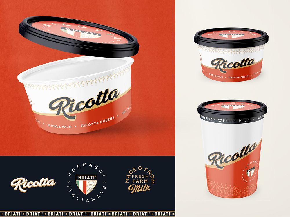
The final decision is not always so easy to make. Often your choice falls on a color that has already been taken by a smart competing company. What to do? You need to look for an alternative solution or make a combination of several colors. Refusal of the desired color is not so bad. The brand message in social media can always be strengthened with the right combination or the addition of auxiliary symbols.
How to choose the primary brand color?
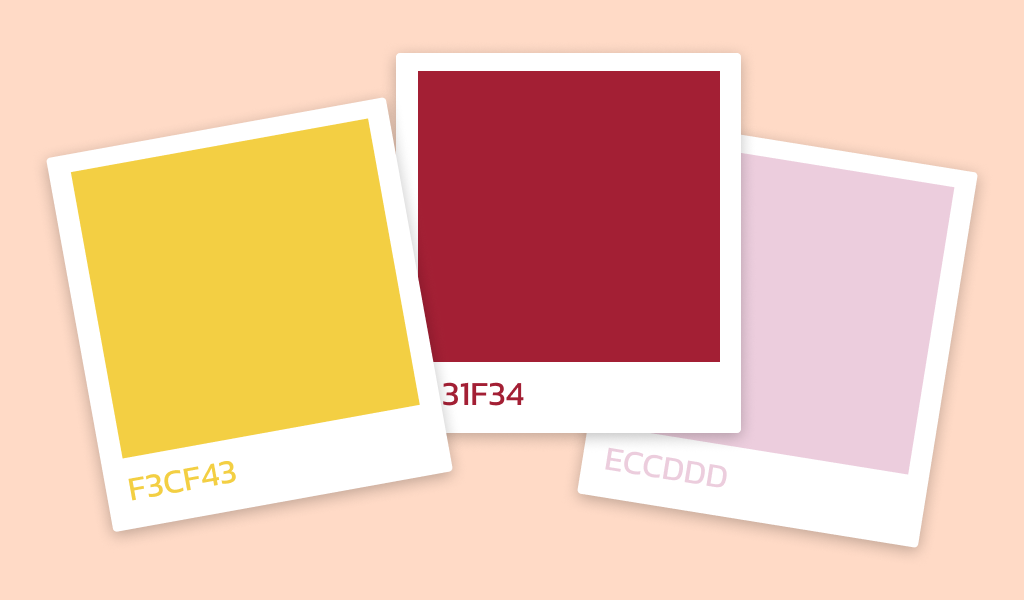
The choice of the main color for the primary brand is the starting point for the color choosing process, on which the further perception of the product by consumers will depend. Before choosing a specific color, it is necessary to carefully formulate the brand’s personality, its goals and determine the overall philosophy of the company. The color should be consistent with your brand and its values. Remember that different colors are associated with different emotions and feelings.
The next step when choosing colors for your brand is to analyze by brand managers the existing market conditions. Study the colors your competitors use to choose a color palette that will stand out from the competition and help your company stand out.
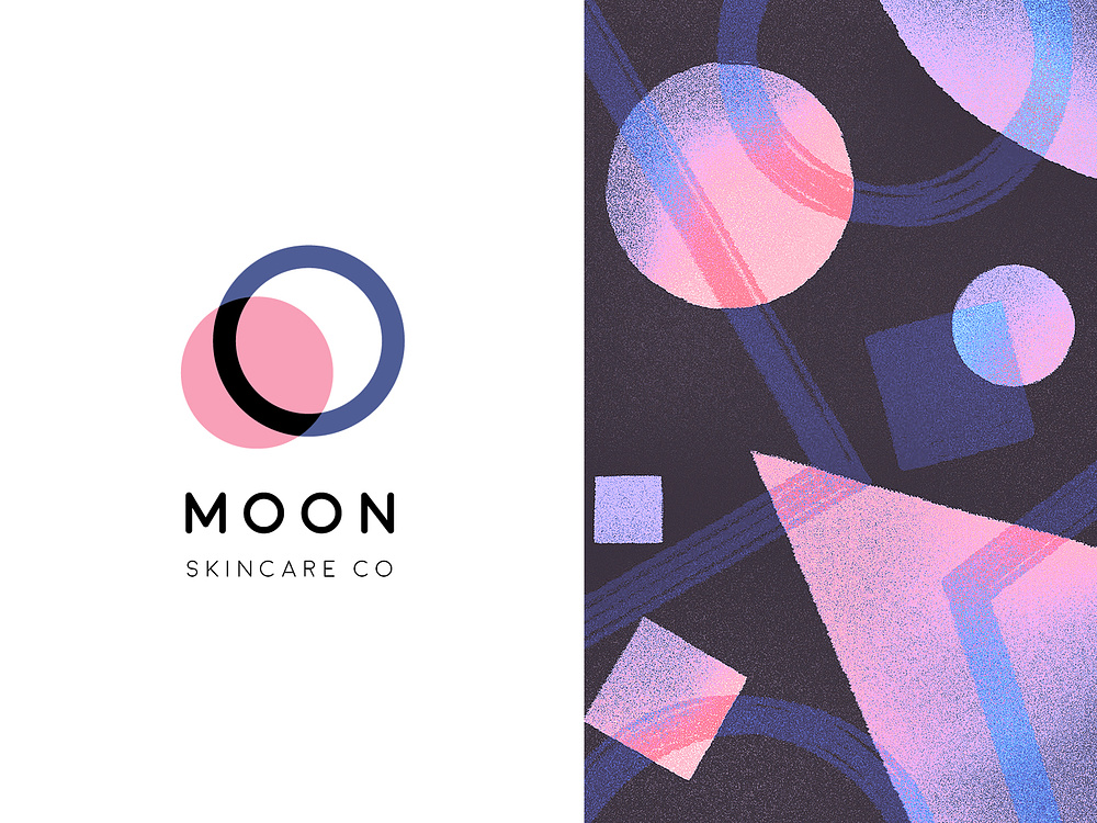
You also need to take into account where and how you will use the chosen color, and how it will combine with other secondary colors. For example, if you plan to use color in your logo, make sure it is legible and looks vibrant against a variety of backgrounds.
To choose your brand color choices to be most effective, it is necessary to try several different color options for valuable insight and rate how they look on different materials and in different contexts. Select colors that best convey the tone of your brand and suit your target audience.

Colors evoke different emotions in people of different ages. For example, bright colors can be effective in attracting children, while calmer, more neutral colors may resonate more closely with an adult audience.
However, remember that when working with creatives for the company and design, you must adhere to the brand book. So that it doesn’t happen that, for example, Dr Pepper advertising suddenly takes on blue shades in the style of Coca-Cola.
Do’s and Don’ts when choosing branding colors

If your brand has a lot of physical media, don’t use RGB encoding of image source. It contains shades that are not in the CMYK system, but it is used in digital printing. To match colors with RGB, you will need to use the more expensive Pantone coding.
If you’re on a budget and the product is inexpensive, avoid complex primary colors that are difficult to print digitally, like acid shades or gradients.
Undertake brand awareness as early as possible. Brand colors will help you with this and will mold rigid associations with your company. Eventually, the consumer will be able to precisely identify you amidst other brands.
Color meanings in brand identity
To understand which colors to use in a brand personality style, you first need to figure out how they typically evoke feelings in your audience. Here is a short list of colors and the feelings they evoke:
Black

Refined, strict, powerful color. It perfectly emphasizes the high status of the brand. Black will appeal to fans of the classics.
White
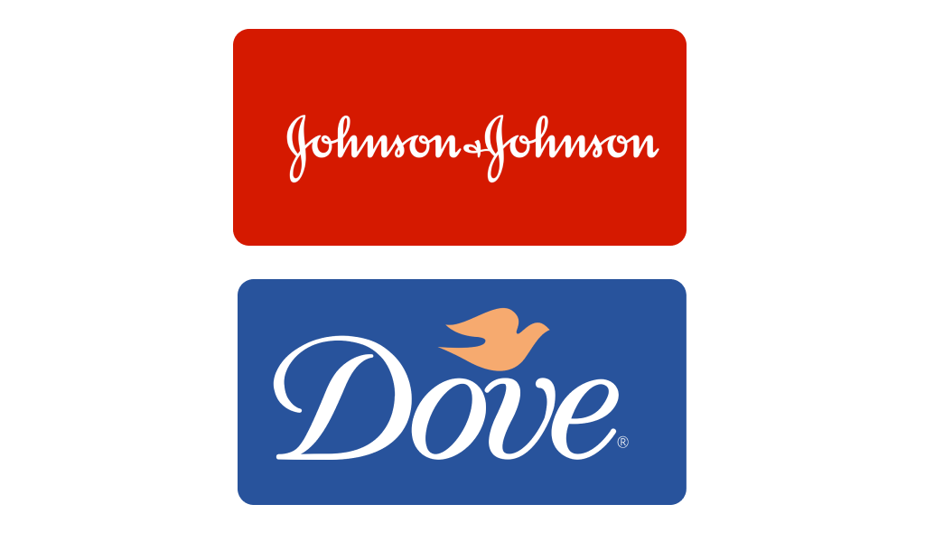
Here brand color meanings associated with innocence, purity and simplicity. White needs a companion, since the color itself does not carry a call to action. Combines with any shade thanks to the versatility that is inherent in all achromatic colors. Often used in brands of products for women and children.
Brown

The color of wood generally evokes pleasant emotions. It is associated with stability and wisdom. Unfortunately, for some, an excess of color brown may cause unpleasant associations with wet earth (mud), although the earth itself is a symbol of fertility and life.
Yellow

One of the main warm colors, the sunny color of optimism, joy and good mood. It is often used as a marker to attract attention and call to action with its yellow arches. At retail outlets, signs for promotional items are often displayed in orange and yellow.
Violet

Light shades of color create a romantic, spring mood. Dark shades are associated with sophistication, elegance and nobility.
Red

The color of passion, aggression, audacity and strength, courage. In rare cases it can cause anger, but more often it motivates action, stimulates interest, or even signals danger.
Blue

The color of the sky and water is associated with reliability, inner strength, calmness and inspires trust. Meeting rooms are often decorated in navy blue tones, as the color helps to find a compromise and stimulates brain activity.
Green

The color of grass and tree crowns, it is associated with nature, freshness and health. Because of the latter comparison, it is, for example, often used in pharmacy logos. Causes calm, confidence, optimism.
Shades may differ from the main color in the undertones of the emotions evoked. What matters is their intensity. Dark shades are perceived as more gloomy, while light shades (pastel colors) are associated with tenderness.
Basic functions of color in marketing

The color and even shade of the packaging of your product or service is extremely important: it makes your brand personality stand out from the rest, helping to build trust and positive attitudes among the consumer.
Main functions of the selected color:
- Make the product more visible against competitors.
- Strengthen brand recognition and communication with the target audience.
What combination of colors should you prefer when creating a logo for social media and developing a brand identity? Extensive research has identified the following favorites among those already used by thriving brands today:
- Blue – 33%;
- Red – 29%;
- Black and all shades of gray – 28%;
- Gold or yellow – 13%.
More than 95% of brands prefer to work with 1-2 colors, mostly with blue and red orange and yellow. Others resort to multi-color logos. 40% of brands use only text in their logo, without any additional visual identity effects.

By the way, some brands use several palettes at once. For example, for different advertising campaigns or different target audiences. Often a new product line may be released in different shades.
Color psychology also helps analyze the emotional associations that a general audience experiences when they see a particular combination of shades. Effectively combining a group of colors will help improve the accuracy of the interaction and increase conversions.
Deciding which colors to use in a company’s brand can be difficult due to the number of shades and their different effects on the consumer behavior. To make things easier, you should ask a few questions to fall back on your search.
How to combine colors to create eye-catching combinations?
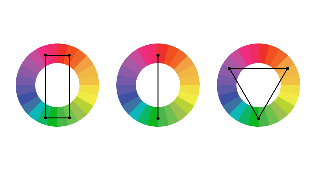
A competent combination of brand colors is what the entire design is based on. In practice, you can use various methods for selecting an effective primary color. Use a color wheel, a tool to help you determine the best color combinations. For example, you can use opposite colors to create contrast, or colors next to each other to create a harmonious brand’s personality traits.
Using different shades of the accent color can create a deeper and more interesting combination. You can use light blue and dark blue shades to create visual contrast, or opposite shades of the same color to create harmony.

Also use neutral colors such as white, gray and black – this can help tone down bright colors and create a more balanced composition.
Try different color proportions. Different color ratios can create different effects. For example, you can use one main color and two secondary colors in a 60/30/10 ratio to create more balanced brand colors.
You need to decide on how to define your brand: stand out from the crowd or choose a more traditional or conservative color schemes.
When choosing a brand color scheme, you can adhere to standard divisions
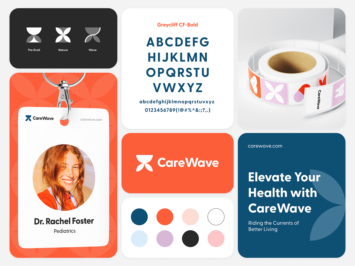
In recent years, minimalism in design has become popular, so elements of only one color are used in the logos of many famous brands. It is necessary to take into account that the branded color palette is used in advertising materials, room decoration, and everywhere it must remain recognizable. It is advisable to choose one of the following color scheme options.
- Monochromatic. Several shades of the same primary color are used. Will allow you to emphasize seriousness and brand unique status.
- Additional. On the color wheel, every two complementary colors opposite each other are contrasting. Using them together allows you to increase brand recognition.
- Analog. Use pairs of colors placed next to each other on the color wheel. This allows you to create a harmonious design for sports teams for example.
- Triadic colors. The same color wheel cis used, from which three colors are selected that are at the vertices of a triangle, which is mentally superimposed on the circle. Make sure that none of the colors are in dissonance with the brand idea.
It is not advisable to use more than three colors in brand identities, otherwise the style will become heavy with poorly memorable brand. The exception is black and white, which can be combined with any shade.
Brand colors play a vital role in the formation of brand identity. Avoid copying, otherwise, when contacting the brand, the client will subconsciously think that he has already seen something similar somewhere. Borrowing interferes with individualization.
Women’s and men’s color preferences

Why do women (with rare exceptions) like to surround themselves with bright and rich shades, while men prefer subdued colors? Maybe such habits were laid down in childhood, when boys are traditionally dressed in all color blue, and girls in hot pink? Why are women so often offended by their companions who do not see the difference between pink and coral? The reason for this color psychology lies in male laziness and reluctance to understand uninteresting things, or is it something completely different?
Scientists have proven that women and men have different color perception:
There are two types of receptors in the human retina: cones and rods. The former are responsible for the perception of colors during the day, and the latter – at night. Numerous studies have shown that men have more rods in their retinas, while women have more cones.
- Men see better in the dark, but women perceive shades more subtly during the day.
- Men prefer achromatic colors (black, gray, white).
- Their attention is more attracted to combinations of shades selected according to the principle of analogy (colors are located in adjacent sectors of the color palettes).
What does changing the brand color give?

The right color in branding is luck. This issue must be approached very carefully so as not to cause irritation and disappointment in the brand experience among people, or, worse, disappear from their radar. Just imagine that Papa John’s suddenly decides to change its corporate red color to some acid-yellow or green brand color palette.
Consumers, having received their order, will wonder for a long time: “What did they bring me now?” And it’s good if it comes to delivery at all – perhaps doubts that crept in when ordering will force you to turn to competitors.
Conclusion
So, now you know that choosing a color for your brand identity is a responsible task. Through the eyes, a person receives most of the information about the world around him, and the logo and its color palette will be all the tools of contact between the company and the client. Brand colors, be it brown, green or any other color, always carry an emotional context and determine the associations evoked in the client.

SEO specialist, link builder, and blog editor at Turbologo. Writing insightful content about marketing, design, and branding. Sharing practical tips on building and promoting brands online.


