A logo is more than a mere image. It is a visual anchor for a brand, its DNA, condensed into a single symbol. In a world where everything flows and changes, the evolution of a logo often reflects not only design trends, but also the path of the company itself. The UPS logo history is a prime example. Join us on this journey from the intricate emblem of the early 20th century to the discreet sign of the global delivery corporation.
Table of Contents
From Messenger to Giant: Laying the Foundation for UPS
Before diving into the abyss of logo redesigns, a few words about the company itself. The name: United Parcel Service, or simply UPS, came into being in Seattle back in 1919, first as a modest message delivery service. Originally founded by two enterprising teenagers with $100 capital borrowed from a friend, the business venture known as the American Messenger Company grew quickly. The company began to grow and change its direction. One of the owners, Jim Casey, realized that the future was in delivering goods to retail stores, not just fulfilling one-time errands, and switched the name to Merchants Parcel Delivery.
Today, the brown UPS trucks have become an integral part of the urban landscape around the world. The brand itself is synonymous with reliable package delivery company, operating one of the largest and first air delivery networks on the planet. And like any self-respecting brand with ambitions, UPS needed a visual symbol that would speak volumes and increase brand recognition.
1916: Eagle, a parcel and a claim to reliability

The first UPS logo, which appeared in 1916, was, so to speak, a child of its time. It was not just a sign, but an entire emblem enclosed in a heraldic shield. In the center of the composition is a mighty eagle, tenaciously holding a parcel with the inscription “Safe, Swift, Sure” in its claws. Although the slogan is not readable in the presented image, it is often associated with this early design and reflects the key company’s values.
The eagle symbolized strength and speed (and perhaps American roots), the shield — the safety and protection of the cargo, and the parcel directly indicated the scope of activity. The color palette — a combination of intense yellow with brown — added solidity. This first package delivery company logo was a statement: “We are a serious company, you can trust us.” Detailed, a little cumbersome by today’s standards, it nevertheless clearly conveyed the brand message at the dawn of the automobile era.
1937: Goodbye, Eagle! Hello, conciseness
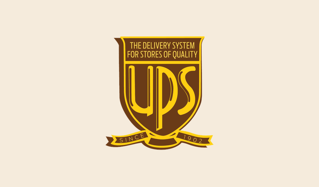
Two decades passed, the world changed, and the branding strategy along with it. In 1937, the company introduced a significant redesign. The eagle flew away, giving way to a more restrained and focused logo design. The shield remained, but became stricter and more geometric. The main character was now the abbreviation “UPS”, executed in a confident, slightly elongated sans-serif font, which for that time was a step towards modernism. This redesign marked the transition to a more straightforward and recognizable company’s brand identity.
Key features of the 1937 logo:
- Central element: Large abbreviation “UPS” occupying the main space of the shield.
- Shield shape: Retained as a symbol of reliability, but the contours became clearer.
- Slogan: The inscription “The Delivery System for Stores of Quality” appeared — an emphasis on company’s focus on B2B segment.
- Additional details: Ribbon at the base of the shield with the inscription “Since 1907” (Since 1907), emphasizing the history of the company.
- Font: A more modern (for that era) grotesque, symbolizing efficiency and a businesslike approach.
- Color: Preservation of the brown-gold range, strengthening the association with the brand.
This logo served the company for almost a quarter of a century, becoming a visual symbol of the company’s growth and strengthening of its position in the market. It was simpler, easier to scale, and looked better on uniforms and transport. Less is more, as they say.
1961: The Parcel Takes Center Stage
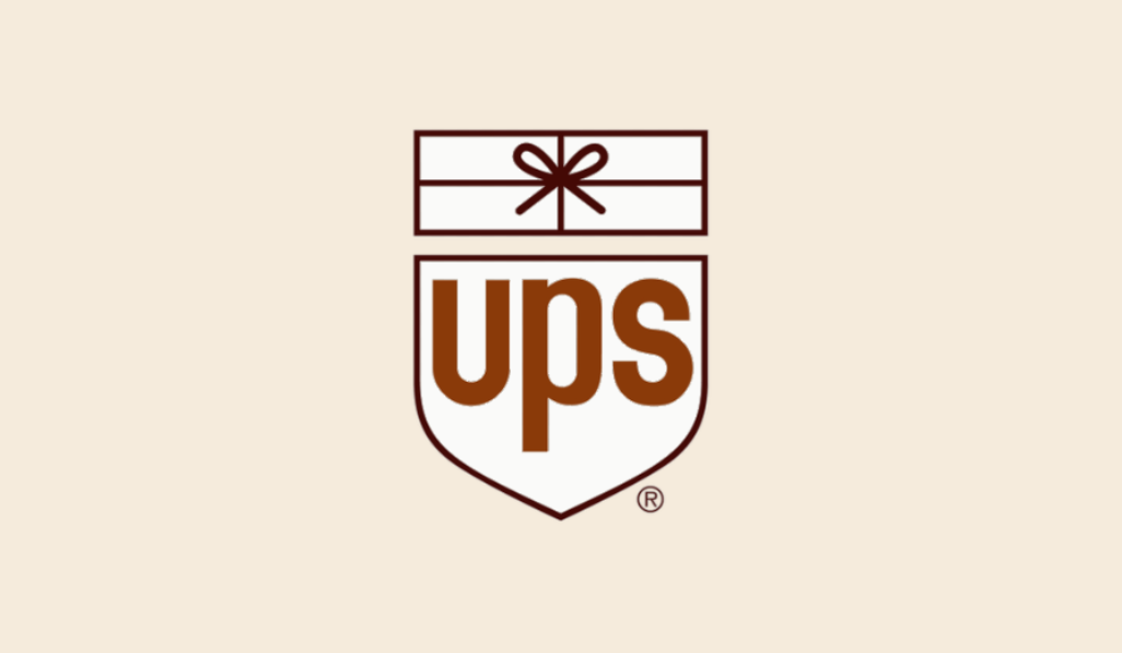
The sixties arrived, an era of bold design decisions and a desire for minimalism. UPS felt the winds of change again and in 1961 introduced an iconic logo that for many became the classic and instantly recognizable symbol of the company for many years. Crafted by legendary designer Paul Rand, this new logo was a real breakthrough.
Rand radically simplified the composition, leaving the essence but giving it a completely new form. The shield remained, but its contours became even cleaner and more elegant. But the inscription “UPS” underwent a radical change: now it was strict but friendly lowercase letters, executed in a specially designed font. It was a bold decision to use lowercase letters for such a large corporation, which gave the brand a more accessible and modern look.
But the main novelty that the logo featured was the witty detail above the abbreviation — a stylized image of a parcel tied with twine and a bow. This simple but brilliant element directly communicated the company’s commitment and scope of activities, adding playfulness and humanity to the design. This is the very case when a picture is worth a thousand words.
What made the 1961 logo stand out:
- Iconic symbol: The stylized package with a bow is a direct and memorable reference to UPS services.
- Typography: The use of lowercase “ups” in a unique, clean sans-serif font made the brand more approachable.
- Composition: The perfect balance between the shield (reliability), the abbreviation (brand name) and the package (the essence of the business).
- Minimalism: The rejection of unnecessary details and slogans directly on the logo in favor of clean graphics.
- Color: True to the signature brown color, which by this point had become firmly associated with UPS (sometimes even called “Pullman brown”).
This Paul Rand creation served the company for over 40 years and became a true benchmark for corporate design, along with Coca-Cola and Apple logos. It was simple, smart, memorable, and perfectly captured the essence of the UPS strong brand identity — reliable and friendly package delivery. A true classic.
2003: The Glitter of the New Millennium and Farewell to the Bow
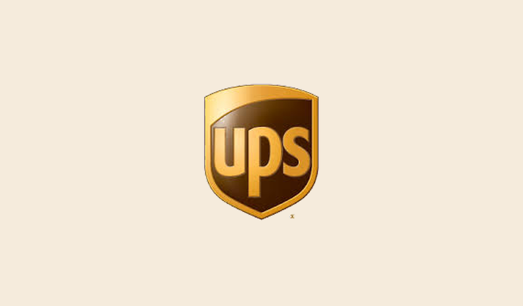
At the beginning of the 21st century UPS decided to adapt to new realities — globalization, digitalization, and the expansion of its range of services far beyond simple parcel delivery. In 2003, after more than 40 years of faithful service, the iconic UPS logo design gave way to an updated version made by the agency FutureBrand.
The most notable, and perhaps controversial, change was the disappearance of the bow above the acronym. The company explained that the bow was too closely associated with small-package delivery, while UPS expanded to become a giant in global logistics, supply chain management, and financial services.
The shield was still there, but acquired volume and a glossy shine, following the design trends of the early 2000s. The lowercase letters “ups” retained their outline, but became voluminous and golden, in harmony with the new shield. This redesign signaled the transformation of UPS into a more technological and multi-profile company. Although the bow was gone, nature abhors a vacuum — it was replaced by a modern world gloss.
2014 – Present: Flat Design and the Digital Age
A little over a decade has passed, and design trends have taken another turn. Volumetric and glossy elements have been replaced by flat design, which is ideal for display on the screens of any devices – from huge billboards to tiny application icons. In 2014, UPS presented its current logo, remained pretty the same, which is essentially an evolution of the 2003 version, adapted to modern needs.
Key characteristics of a current UPS logo:
- Back to the flat: The main difference from 2003 is the rejection of gradients, highlights and noble gold shade. The shield and letters have become flat, which makes the logo cleaner, more universal and easier to reproduce on any media. Back to the basics, but with a modern interpretation.
- Form and composition: The main elements have been preserved — the familiar shield and lowercase letters “ups”. Continuity is obvious, and the visual identity remains consistent.
- Typography: The font has not changed — friendly and modern UPS Sans (specially developed for the company), executed in lowercase letters.
- Color palette: The signature brown and gold colors have not gone anywhere, but have become more saturated and cleaner without volumetric effects. The contrast between them works flawlessly.
- Adaptability: Flat design is ideal for digital platforms. The logo looks great on websites, mobile applications, social networks, without losing clarity and recognition even in small sizes.
The last UPS emblem is an example of a strong visual heritage successfully adapted to the demands of the digital age. It is concise, confident, catchy, and effectively conveys the image of a global, reliable, and modern logistics company. It does not shout, but asserts itself with confidence, as befits a market leader.
Strategy in the Shield: Lessons from UPS’s Visual Evolution and Brand Consistency
A look at the UPS logo evolution is not just a design tour, but a dive into strategic branding. Each redesign was not a whim, but a response to market shifts and the growth of the company itself.
Lesson 1: Start with clarity. Even the early eagle clearly conveyed a message of reliability to the target audience.
Lesson 2: Strive for iconicity through simplicity. Paul Rand’s brilliant simplification with a bow (1961) made the logo unforgettable and human — a great example of how a complementary “thing” can become a symbol of an entire industry.
Lesson 3: Evolve strategically. The departure of the eagle (1937) reflected a focus on B2B, and the disappearance of the bow (2003) — the transformation into a global logistics operator. Your logo should keep up with the business.
Lesson 4: Think Universal. The move to flat design (2014) is a prime example of adapting to the digital age, where a logo needs to be equally legible on a smartphone screen and on board an airplane.
Lesson 5: Value Continuity. But through all these changes, two constants ran like a red thread, which became the brand’s values: the unchanging shield (a symbol of reliability, albeit changing style) and the signature brown-gold colors (solidity and quality). It was these anchors that allowed UPS to change without losing its face and the customer satisfaction.
Conclusion: From shield to shield, through the ages
The journey of the UPS famous logo — from the eagle of the early 20th century to the modern flat shield — clearly shows how a visual symbol can evolve with a company, reflecting its growth and adaptation. And while UPS has been honing its style for decades, today you can lay the visual foundation for your business much faster. Modern solutions, such as the Turbologo, allow even startups to get their own well-designed logo effortlessly and start writing their own brand history, and who knows, maybe in years to come, its evolution will be studied.

SEO specialist, link builder, and blog editor at Turbologo. Writing insightful content about marketing, design, and branding. Sharing practical tips on building and promoting brands online.

