A logo is an inalienable part of any modern company. Its main goal is to transmit
information about a brand, including its peculiarities and advantages.
Create your own logo with Turbologo logo maker. It takes less than 5 minutes and no design skills needed.
Go to Logo MakerIt is sometimes hard to pick a proper logo due to a huge abundance of styles. In the
current article, you will learn what logo styles there are and what their uniqueness is.
Table of Contents
Classics
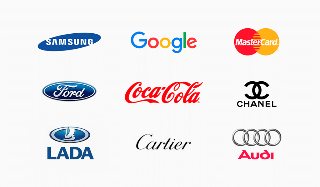
Classic style implies restraint, pithiness, and ease of design. Such an emblem is defined
by completeness and lack of pretentiousness.
As a rule, they don’t use shading, half shading, volume, and other effects that focus
attention on details. The priority here is a generalized image.
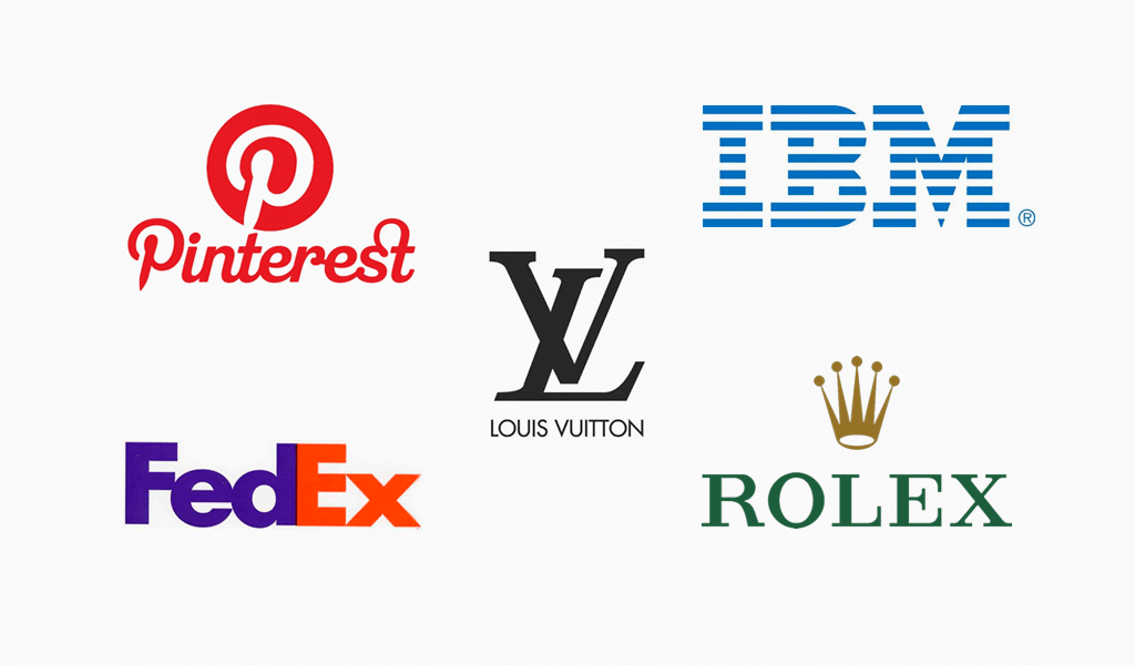
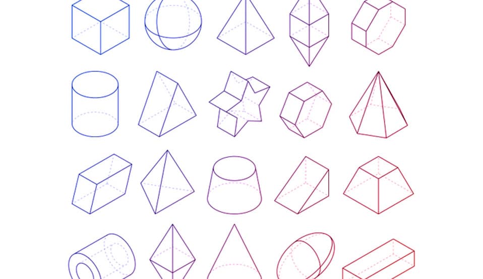
In most cases, classical corporate signatures are presented by an elegant combination of
the most basic, flat geometric figures. Proportions, perfect matching, and traditions are always effective and they are often based on many other styles.
Why choosing classics?
Classic logo suits almost any company thanks to its universalism. Companies dealing with
technology, construction, medicine (etc.) often choose such emblems.
Restraint and aptness of a classical logo enable you to spread your message across a target group, pointing to the advantages of your brand.
Why shouldn’t I choose classics?
If you choose to keep it expressive, bright, and emotional, classics might be harmful. You
would need something different for that particular purpose.
Modernism
Modernism is a contemporary synonym of universalism and originality, relievo, and
ornateness. It has its own peculiarities. There are countless forms, letterings, and coloring
solutions. No limits are bestowed upon it. Asymmetry, irregularity, and sophisticated clumsiness are most welcome too.
Another important criterion to follow is balance. The composition must be harmonic and
all its constituents are to be pertinent and informative. A popular modern trend is a lack of detailed texture, restraint, and classicism.
Why choosing a modern logo?
Modernism logo stands out for its harmony and meaningfulness. A logo like that is sure to stress company authority. Companies that aim at the financial elite would do well using such a well-thought-out logo.
Why shouldn’t I choose a modern logo?
Modernism logos are to be avoided by companies dealing with children’s goods,
entertainment, food, etc. The depiction simply doesn’t match a target group in those cases.
Vintage

Vintage isn’t just a reference to the “past”. It’s a whole big strategy of affecting the world
around. Vintage style is quite a risky move these days. Properly implemented, such a good old emblem is capable of attracting tons of attention.
Antiquing and imitation of hand-made properties are arduous and time-consuming
processes, but it’s still worth trying as the idea is truly creative, interesting, fresh, and original.
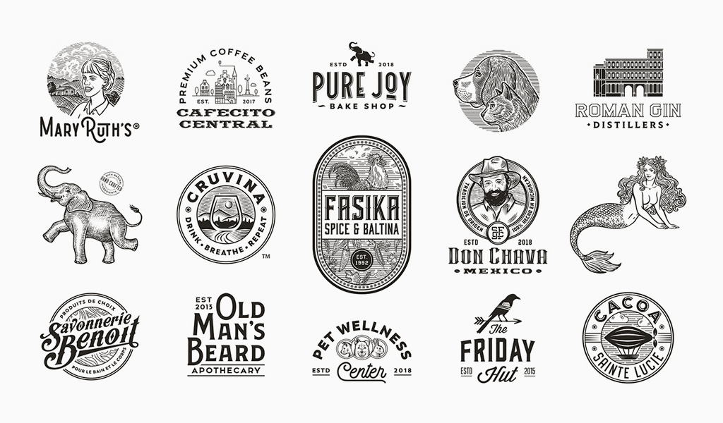
Vintage style implies a lack of straight lines and dashing angles. Each bend should slowly
turn into another. Use smooth strokes if possible too.
When it comes to coloring, such emblems often require stern, muted shades, and their
combinations. You must avoid acid and neon shades, or gradient of any kind.
Why choosing a vintage logo?
There is nothing better to stress your brand uniqueness and its peculiar features (if any).
If company alignment matches current images, such logos can boost brand recognition.
Why shouldn’t I choose a vintage logo?
Not just any company can afford to use the style. Also, it’s really hard to design an
alluring emblem that would match the overall design.
Abstraction
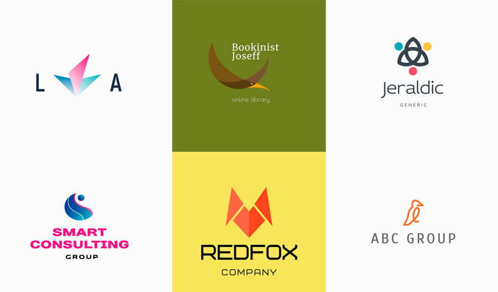
Abstract logo kind is boundless indeed. It includes separate symbols and complicated,
multilayered images. Such emblems bear a huge semantic load. However, abstraction also enables your customers to use their own imagination and build up their own understanding of your logo through their own associations.
A complete absence of any templates is a defining trait of abstraction. It is some sort of a
subconscious game where every bit of knowledge matters, namely, personal and cultural ones.
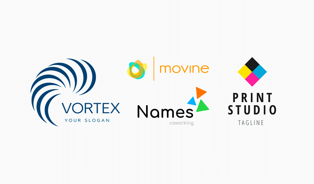
It is essential to learn in advance what sort of psychological leverage you expect to get by both separate elements and their unity.
Why choose an abstract logo?
Abstract logos look interesting and weird. They can attract tons of attention by causing
desired associations. Abstraction is absolutely universal in terms of branding and logo design, so it matches just about any company.
Why shouldn’t I choose an abstract logo?
Probably the only limitation here is when you need a logo abundant in details. An
abstraction like that would simply overload our customers’ imagination, leading to illegibility.
Minimalism
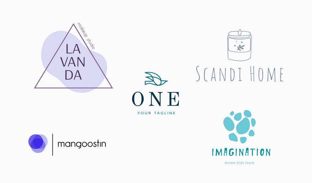
Minimalism features are simplicity, picturesqueness, accuracy, and legibility. And the
approach is modern too. It is essential to delete useless data in order to deliver clear messages.That is so information-society-like.
Visualizing the style, you can clearly and legibly depict brand essentials, its mission, and,
message too. Such a solution is limited by a maximum of 3 colors, but contrasting is still rather plausible. The idea is to transfer as much data as possible, using as few colors as possible.
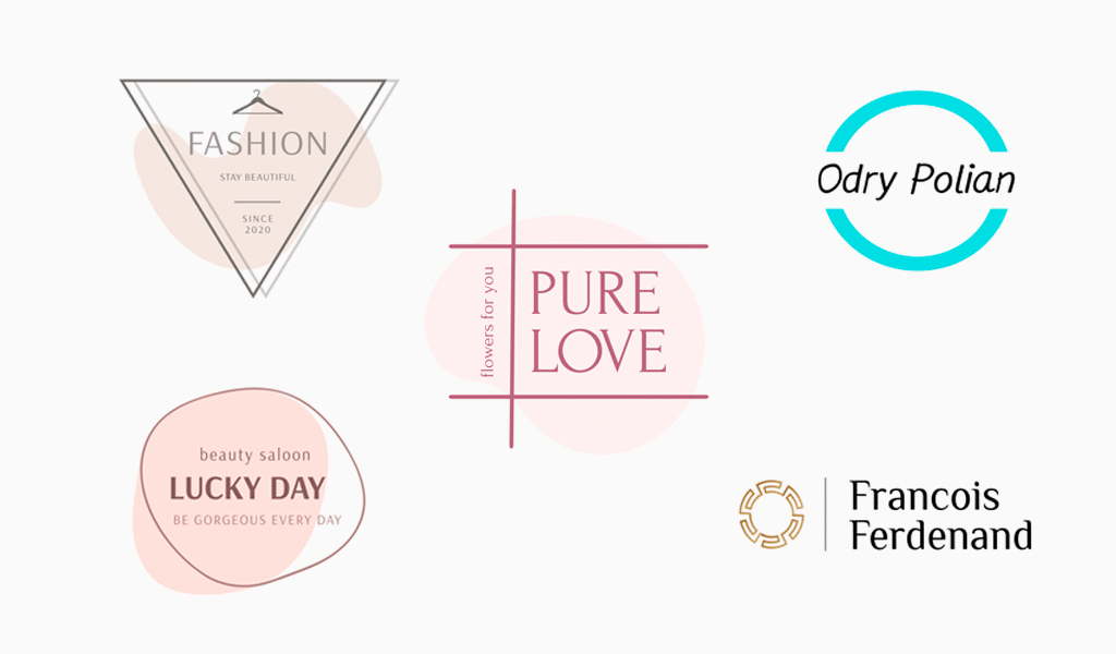
Minimalism is actually about orderliness, harmony, and functionality, propelled by scarce
detailing. Each of the elements is carefully chosen and contrasted against a free space in a logo, stressing the importance of shapes.
Minimalistic logos are well-structured, rhythmic, and balanced. They are noticeable and
recognizable. They say that the given approach in design is meant to save humanity troubles understanding visual content, removing brain overloading factor along with “graphic garbage”.
Why choosing a minimalistic logo?
Minimalistic design is getting more popular even as we speak. More and more companies prefer well-balanced logos with the minimum elements possible. Such a brand is sure to look accurate and alluring, provided all the details are matched perfectly.
Why shouldn’t I choose a minimalistic logo?
Minimalistic logos aren’t the best choice for entertainment brands. For example, a
computer game emblem must bright and colorful. And that is something that is almost
impossible to achieve through minimalistic design.
Logo creation Turbologo
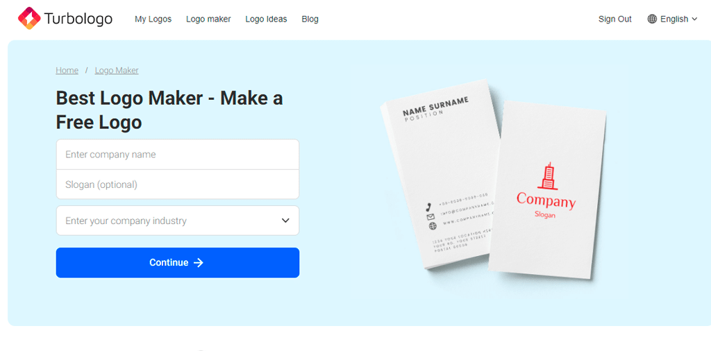
Upon defining a future brand style, there is no time to waste designing it. You can resort
to designer services or to online logo generators. The second option is far more profitable, convenient, and universal.
You may create a logo using Turbologo online service. The generator is defined by
interface simplicity and a huge library of icons and fonts. Also, you can access the “logo ideas” section, where various templates are aligned according to keywords.
Conclusion
Every logo style has both advantages and disadvantages. That’s why you should pick your
style carefully, considering the company’s peculiarities, target groups, and your personal
requirements. Each logo is sure to look cool and attract lots of customers, providing an
implementation of a unique and hooking idea.
I’m a product and graphic designer with 10-years background. Writing about branding, logo creation and business.

