The modern world of design does not stand still, and every year new trends appear that attract attention and bring inspiration. Among several graphic design trends that have become particularly popular in recent years, the use of candy colors in logos is in demand. Their bright and saturated shades not only attract attention, but also evoke a sense of nostalgia and joy in the audience on a deeper level. In this article, we will look at why this color trend has become popular in logo design and how it makes a brand memorable.
Table of Contents
What are the candy colors?
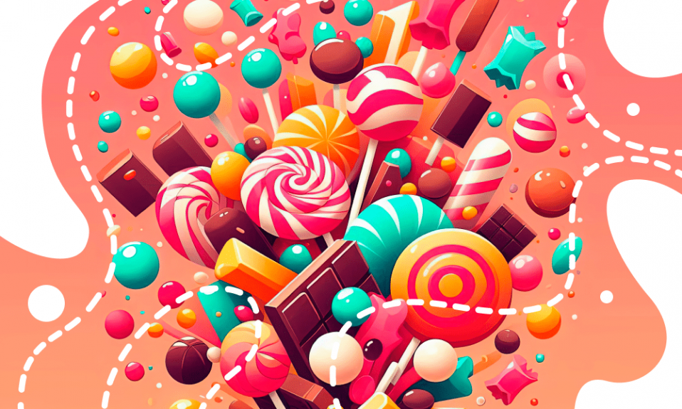
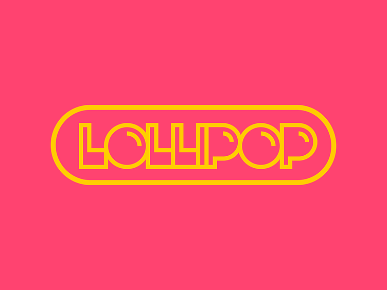
A candy palette features bright and vibrant colors, often saturated and slightly neon, reminiscent of lollipops, gummies, and other sweets found in any candy store. These colors often evoke associations with childhood, carefreeness, and fun, making them remarkable design choices for forming a vivid brand’s identity.
Candy specific colors include bubblegum pink, lemon yellow, lavenders, and sky blues.
More neutral tones such as mint green or millennial pink encompass less vibrant shades for subtle look and suitable for home decor, for instance.
Why are these color choices gaining popularity?
The popularity of candy colors in logos is due to several factors. First, they instantly attract attention due to their brightness and saturation. In today’s world, where visual noise is constantly increasing, it is important to stand out from competitors in overall design. Second, candy colors create an emotional connection with the target audience, evoking positive memories and associations.
Finally, such colors help to obtain a unique and memorable brand's personality, smoothly building consumer loyalty.
Nostalgic effect
Candy colors in logos not only attract attention and create positive emotions, but also evoke nostalgia. This effect is especially essential in the modern world, where many people seek comfort in memories of carefree childhood. Brand identity embracing candy colors often becomes a link between the past and the present, helping customers experience pleasant emotions and associations.
Candy Color Combinations: Rules and Recommendations for Designers
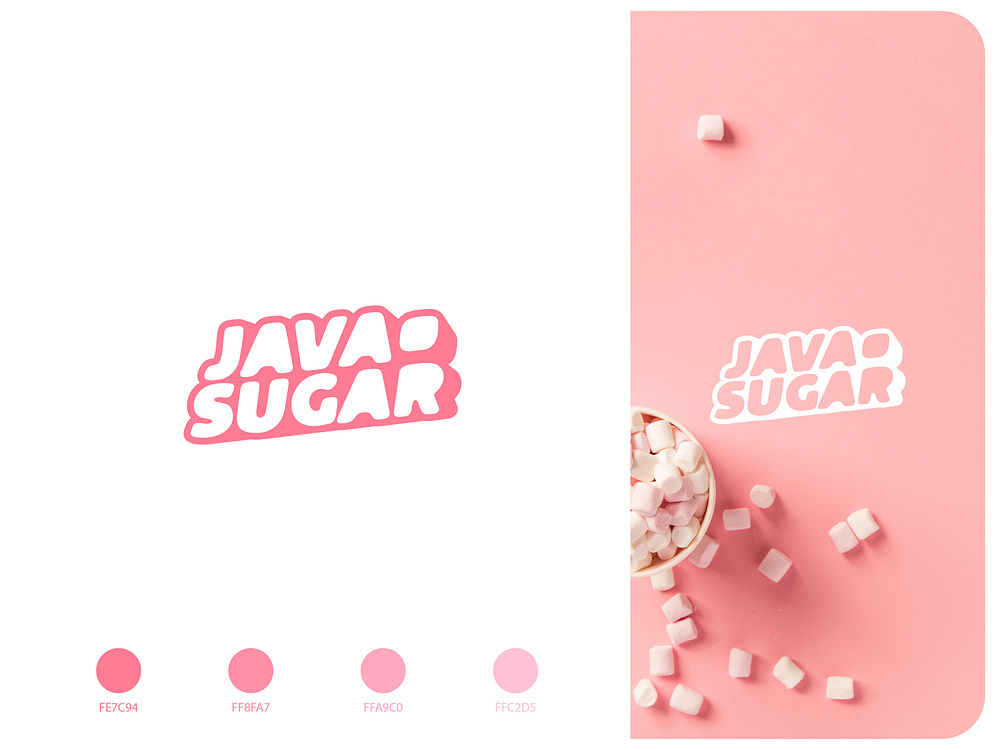
The guidelines of color harmony and compatibility should be taken into account while utilizing candy color in logo design.
Designers must carefully choose colors and their proportions to produce a logo that is both imposing and memorable.
A win-win solution would be to employ a monochromatic color scheme, which implies selecting one primary candy color and all of its shades and saturations. This gives the logo a cohesive and pleasing appearance. An alternative approach involves employing contrasting complementary colors that are situated opposite one another on the color wheel, such as pastel pink and mint or lavender and lemon yellow. These pairings draw the eye with their striking contrast.
Examples of Candy Color Logos
Many well-known brands are already using candy colors in their logos to excel and create a positive brand story. Here are some examples:
The Instagram logo serves as a perfect example of candy colors. The vibrant gradient from pink to orange to purple is eye-catching and evokes associations with joy and creativity. This logo reflects the dynamism and diversity of content that users share on the platform.
Dunkin’
The Dunkin’ brand, formerly known as Dunkin’ Donuts, utilizes a vibrant color scheme of pink and orange colors in its logo. These hues create a sense of warmth and energy, which is perfect for the image of morning coffee and fresh donuts. The logo conveys cheerfulness and fun, making it memorable and appealing.
Nickelodeon
The Nickelodeon television channel uses a vibrant orange color in its visual representation. This color is associated with fun and energy, which is perfect for a kid-friendly audience. The Nickelodeon logo conveys a sense of fun and adventure, which translates into brand recognition as simple and appealing to children and their parents.
Baskin Robbins
The Baskin Robbins logo is another great example of a successful candy-colored minimalist design. The combination of baby pink and blue creates a cheerful and inviting impression, evoking feelings of sweetness and pleasure. Together, these colors create a harmonious contrast and attract the eye.
Tips and Mistakes When Creating Logos with Candy Color Trends

Creating a logo using a candy color scheme requires careful consideration of a number of factors. In order for such a logo to be successful and memorable, it is important to follow certain recommendations and avoid common mistakes.
Common tips
- Color Palette: Use harmonious color combinations. Although such colors are bright and saturated, their combination should be pleasing to the eye and not overwhelming. Stick to the rule of three colors to ensure the logo looks balanced.
- Contrast and Readability: Ensure sufficient contrast between the text and the background. Bright colors can make it difficult to perceive information, so it is important that the text and main elements of the logo stand out from the background.
- Simplicity and Minimalism: Do not overload the logo with details. Bright colors are eye-catching on their own, so excessive complexity can make the logo too busy. Aim for simplicity and clean lines.
- Brand Consistency: Make sure the colors you choose reflect the values and essence of your brand. Candy colors are suitable for brands associated with fun, youth, and energy. If your brand is positioned as serious and conservative, this style may be inappropriate.
Mistakes to Avoid
Too much brightness and saturation: Too many bright colors can make a logo visually overloaded and difficult to read. Try to limit the palette to a few main colors.
Ignoring the emotional context: The wrong choice of colors can cause unwanted associations. For example, shades of earthy tones that are too sharp or aggressive can scare off potential customers.
In addition, the wrong combination of colors can create disharmony and cause unpleasant associations in viewers.
Contrasting and incompatible colors can look unaesthetic and reduce the perceived professionalism of the brand.
Don’t forget to consider how the logo will look in different sizes and on social media platforms to avoid losing its effectiveness and appeal.
How to make candy design styles without designers
Using online logo generators like Turbologo can make the process of creating a candy-colored logo much easier. Turbologo uses artificial intelligence algorithms to offer a wide range of relevant layouts in any style, from hand-drawn to monograms, as well as color palettes that can be customized to match your brand.
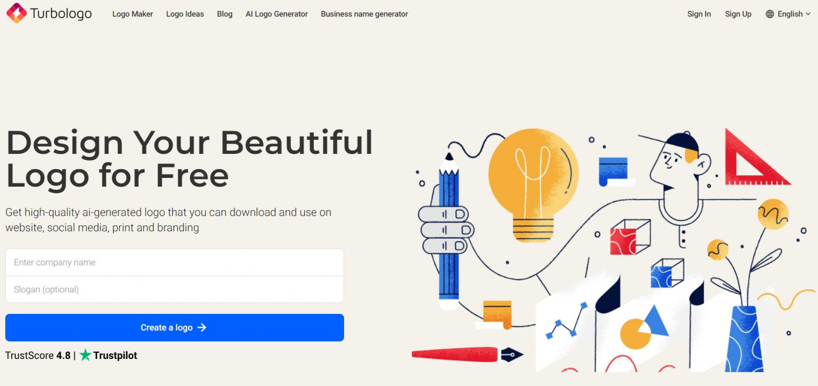
This tool makes it quick and easy to experiment with different designs by changing fonts, shapes and graphic icons. The intuitive interface allows you to make changes quickly. The generator also offers a preview of the logo in different contexts, which helps avoid common mistakes associated with adapting the design.
Give free rein to your imagination by experimenting with the color palette, choosing bright, saturated shades reminiscent of the colors of your favorite childhood candies. Built-in editor offers a wide range of ready-made color schemes, as well as the ability to fine-tune colors with a handy Color Picker tool. Don’t be afraid to combine several shades to create a truly unique and bold design.
Conclusion
Candy colors in logos are valuable for creating a bright and enduring brand personality. Their ability to arouse positive feelings, garner attention, and elicit nostalgia makes them very appealing to a diverse array of customers. In a world where visual perception plays a key role, the use of these colors can speak volumes about the success of a brand.

SEO specialist, link builder, and blog editor at Turbologo. Writing insightful content about marketing, design, and branding. Sharing practical tips on building and promoting brands online.

