Can you remember how you fell in love with photography? Long ago, in our childhood, we were shot and given a small white card that should has been shaken. And then, all of a sudden, a picture was appearing on the card in a minute! Now you remember those wonderful and sweet moments. The ones that were completely amateur but cozy polaroid photos. Just what have we exchanged it for? A wide-know service Instagram it is, owning the hearts and minds of millions. All your photos are as nice, cozy and home-backed as before. They have simply moved online.
Create your own logo with Turbologo logo maker. It takes less than 5 minutes and no design skills needed.
Go to Logo MakerInstagram logo meaning
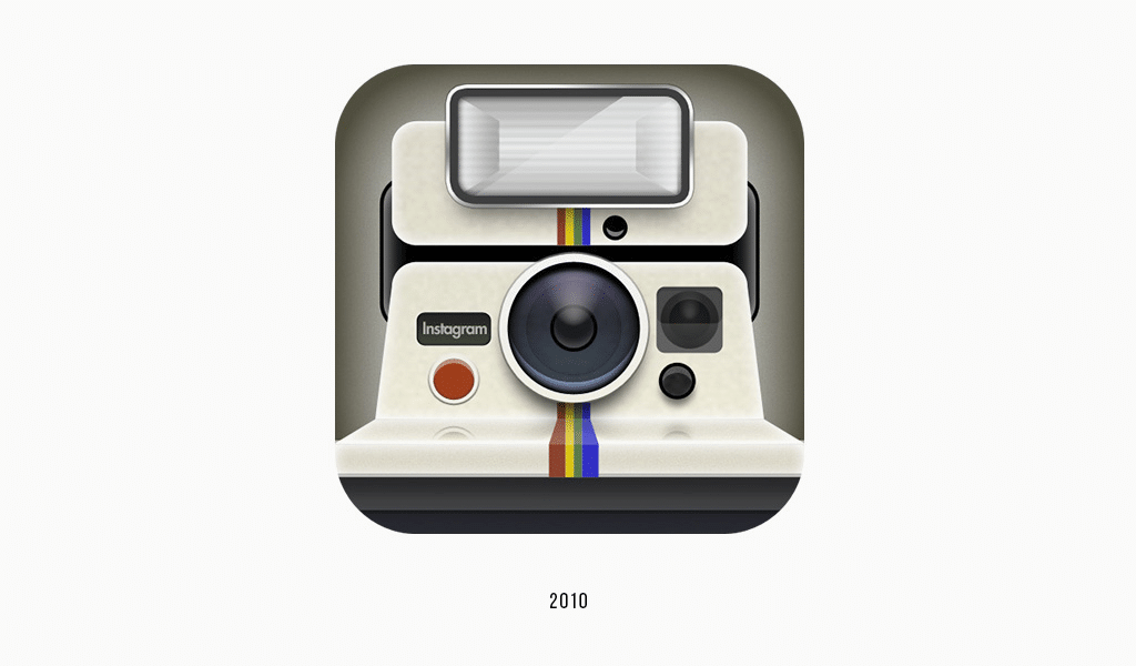
It is not only functioning principles (small amateur photos for everyone), but also a square format that returns us to those associations. Now you know that this camera icon as a logo isn’t just a coincidence. One might say that a smartphone camera looks completely different, but the point is that the polaroid retro-camera invokes sweet memories and people’s feelings. What’s more, the service allowed not just posting one’s photos but also using transparent filters, which, in turn, make photos look vintage.
Instagram logo history
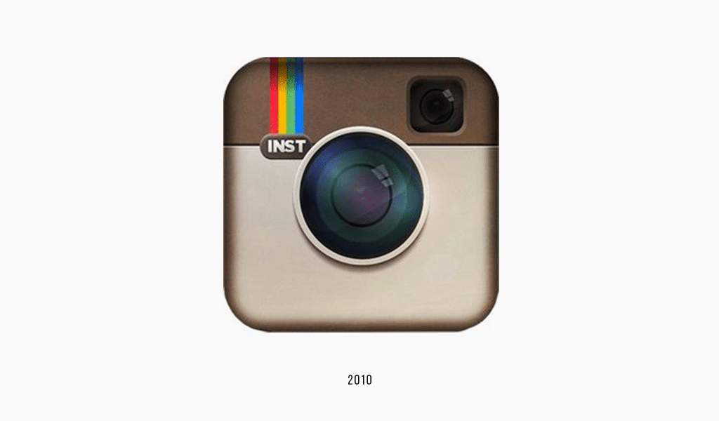
The service has appeared in 2010 and the first 5 years old Instagram logo didn’t change a bit. In the same year, in 2010 the Instagram logo history started. Instagram logo font was designed in a retro-style, just all the logo. As time passed, the service has been becoming more and more famous, developing new functions, so the company finally decided to alter the looks of its brand. They commenced a briefing and asked themselves what were the most striking old Instagram logo details. Those were a lens, a rainbow and a viewfinder. And so, all these elements became part of a new, vector brand logo.
Instagram logo evolution – Rainbow emblem
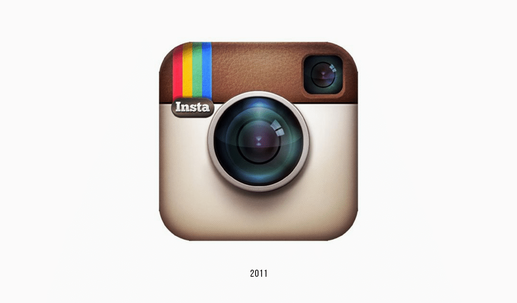
The rainbow has been given the front, becoming a basic logo color and the lens and viewfinder have turned into stylized lines. The logo kept being harmonic and balanced, thus becoming even more fashionable and up-to-date than ever. This fact indicates nothing but the high professional skills of designers. An artist, who has designed the Instagram logo, said that it takes loving your job to create a successful logo. He has created the best of his works for his friends and relatives free of charge.
In truth, another reason lies not only in professionalism and art-loving but also in its field of interest. People, who develop Instagram are on the edge of fashion tendencies. The interplay with everything that creates modern mass-culture on a daily basis, and, to some extent, they create their own tendencies. It is that very design that they offer becomes trendy and fashionable, as Instagram users spend online an average of 21 minutes and 3,5 billion likes are pressed every day.
Instagram logo history isn’t reached, as each change is to be done cautiously, given the number of users. Digital online technology companies’ advantages can become their drawbacks. Your favorite application logo will catch your eye immediately and you’ll be wanting to learn more. Also, changes towards more clear and clean design often contribute greatly to the success of such companies. The more an icon looks simple and friendly, the more users will click it. And every click brings profit nowadays. That’s why, when developing a logo for a service like Instagram it is important to remember that logo clarity means clear and opportune functionality.
The Instagram logo was handwritten especially for the brand by a typographer and designer Mackey Saturday. The modern script is quite similar to the well-known Billabong font, but the typeface was improved and began to possess a unique and inimitable style. The elegance of design was achieved due to the prevalence of cursive lines which are perfect for branding projects. The font for the Instagram logo is primarily a laconic and stylish design in a simple black color and accurately redrawn curved letters.
Since the founder of Instagram was a fond of film photography himself, it is not at all surprising that the brand’s logo features a camera. To be more precise, it is the vintage Bell & Howell camera, which looks very simplified at the moment, representing the shape of a smoothed square with a circle in the center as a lens and a small dot in the upper right corner as a flash. Historically, the logo has gone from being Polaroid-inspired to a detailed drawn of the Sierre 120 with a rainbow stripes that symbolized app filters.
With a desire to replace an outdated design Jan Spalter focused on creating new outlines of the logo, consisting of camera silhouettes. It was he and his colleagues who replaced the logo depicting the previous instant camera by Cole Rise with a more monochrome option.
Since the concept of the application is based on adding user’s photos or videos to the feed in the form of a photo album, it is not surprising that it is the camera-shaped icon placed as a major on the Instagram logo. Sharing and taking photographs are the main features of the app, so the camera is an irreplaceable attribute of photography and without its application, the very idea of capturing images and obtaining photographs would be feasible. In addition, the founder of Instagram was inspired by the hipster culture and the popular Polaroids at the time.
At the moment, the icon did the re-branding with the advent of the new interface and came to a minimalist design with a bright gradient from orange to pink. The predominant color of the gradient is pink, while this choice of colors is reminiscent of the colors of a sunset. The Instagram logo has evolved from the original black-and-white version to the colorful and smooth variation of it.
Blog editor and content marketing specialist at Turbologo. Writing about Marketing and design. Victoria’s articles contain useful tips on how to build a brand and promote it online.

