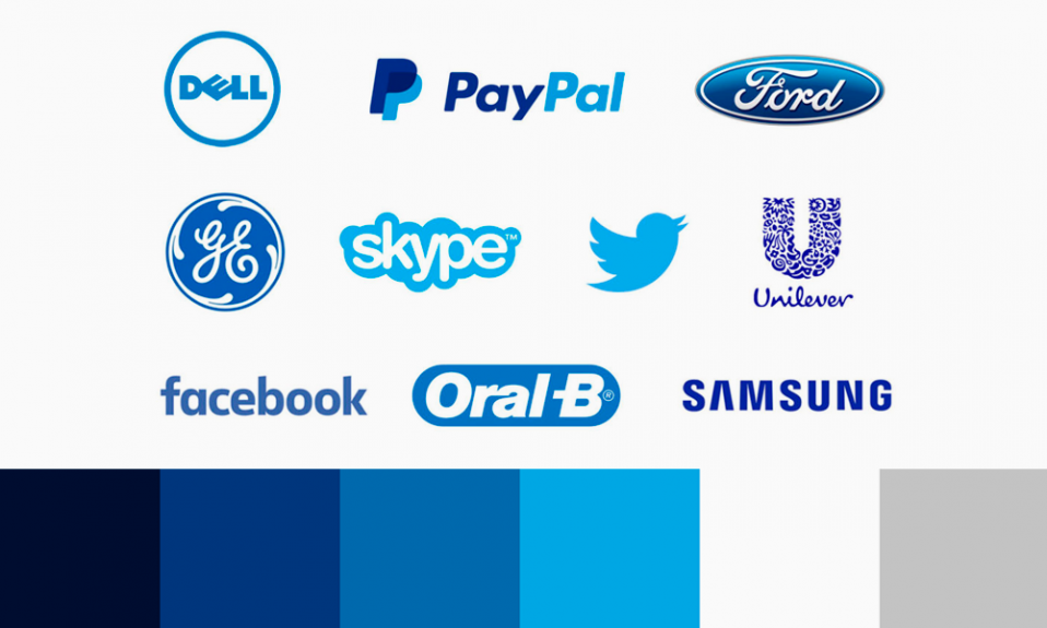
The simplicity of the Wordmark logo design concept is key. The popular and timeless type-only design is very well-liked across all industries, including tech, media, fashion, food, and fashion.
Table of Contents
What is a wordmark?
A wordmark is a type of logo that only includes the company name. It does not include symbols, mascots or badges. Wordmark logos can also be called “logotype” and include monogram variations to fit smaller spaces such as social media profiles or favicons. These logos are simple, so typography and spacing are more important.

Google, Coca-Cola and Calvin Klein are just a few examples of wordmark logos. These cases have shown that the words are the brand’s visual landmark.
It is possible to use cultural and visual associations to communicate certain messages using fonts and colors in your logo if you know your target audience.
When to use a wordmark logo
Although wordmarks are preferred by many designers and considered the best form of logotype, it can be daunting to create a wordmark if you’re not a professional designer.
A well-designed wordmark can be a great solution for many businesses. These are some strong reasons to choose this type of logo:
Your brand’s name is reinforced by wordmark logos
If you are a new company or have limited marketing budgets, it is crucial that prospects remember and recognize your name. A well-designed graphic may be able to reinforce a brand’s name, such as Domino’s or Target. However, it is more likely that you will need to create a new symbol. Additional effort is required to get people to associate the graphic and your brand.

Poorly designed logos are a common problem for many companies
It is difficult to create a memorable, well-designed graphic symbol that represents your brand’s image. Too many logos are poorly designed. They look unprofessional or have a confusing concept. It can be hard to find a professional designer who is able to design a strong logo, especially if you are limited on budget.
A well-designed logo should be simple. It should capture your brand essence in a clear and simple graphic. It is easier to focus on your typography and colors, and not try to synthesize your brand into one symbol.
Wordmark logos get a better value
You can see the difficulty of creating an icon logo or graphic. Inexperienced and low-cost designers are unlikely to produce outstanding results. But it is possible to hire a full-service branding company.
Here are some tips and tricks to make your wordmark stand out:
Choosing the right typeface
Wordmarks can only be created using letters so it is important to choose a typeface that conveys your brand’s personality.
If you run a life insurance business, a script font won’t work because it doesn’t convey the trust or seriousness of the service.
A children’s music school or summer camp that focuses on fun, community and learning would not use an all-caps serif font.
Before you start choosing a typeface for your business, consider a few adjectives that describe it. For example, “helpful” or “environment-focused.” Next, start looking at font families to determine if they match your adjectives.
When choosing a font family, the first question is often: sans-serif vs. serif? Sans-serif has no strokes and is more modern; serif has strokes for each character.

There are many font groups that go beyond these two categories. Here’s an example of how Turbologo categorizes fonts:
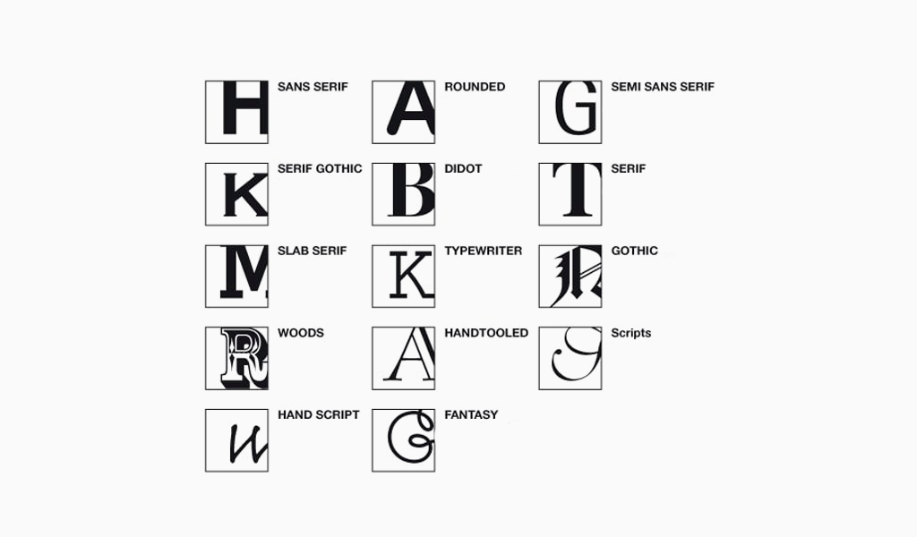
You should choose a typeface that is easily legible across all sizes and channels, just like any other logo style. Consider:
- Weight. Does your typeface weigh a lot? Are you looking for something solid or textured?
- Case. How does your font look in lowercase and uppercase letters?
- Features. Do your typefaces have distinctive features such as notches or curves
These are just a few examples:

Being aware and familiar with the logos of your competitors allows you to select a typeface that isn’t currently in use on the market. Make sure the font you choose has the right associations with your brand and business. You can modify a typeface or have one created from scratch to create a unique wordmark that stands out among the crowd.
Tip
How to use a character
A single character that stands out from the rest is sometimes all that separates a regular typeface from an eye-catching, eye-catching font. This element of surprise is what makes a logo memorable. Think about the Casper logo’s swoosh or the Braun logo’s exaggerated “A”.

Character features may not work in all cases, but they are fun design elements to explore and can help you overcome the fear of boring text.
Custom and existing typefaces may have character features that are specific to certain letters, such as extended ligatures or diagonal notches, or other embellishments (as shown below on the “v”)
You should consider if you choose to use a character feature. Will you use the letter as your monogram? Is it going to help you put the emphasis on your company name?
Choosing the right color
Color is a great way for your brand to stand out and draw attention when text is the main attraction of a logo.
Think of Etsy’s cheerful, but subdued orange, the dark turquoise of the revamped Kickstarter logo and Cadbury’s royal purple.
Sometimes, a simple typeface combined with a bold color can make everything fall into place (see Delight Labs).

It’s possible to experiment with color by changing one of the characters (or words) within a company’s name. Flickr uses a hot pink “r”, while Mobil does the same with a red” “o”.

Like character features, you should make sure that your emphasis is on letters that are relevant to your company name. This tactic, especially if your logo is a common color, can help you to establish your logo identity.
A white wordmark with a colored background is possible. For many branding purposes, your logo will be placed on white backgrounds. Reverse color versions of your logo are required to ensure that your wordmark appears well everywhere.

Color is the most easily identifiable component of a visual identity. If there are no other businesses using the same color as yours, that color is yours to own. This would allow you to immediately stand out among the crowd.
Tip
Choosing thr letter spacing and letter case
You should be more careful about spacing when designing a wordmark logo. For example, you can use our logo maker to make it easier.
Your logo’s typeface will determine the kerning that you choose. Are you looking for some or all letters to touch? How does increasing or decreasing the spacing between letters affect the readability of your logo’s text? What effect do weight and angle have on the spacing?

To find the best way to describe your brand, you can play with letter case. To find the right fit, go back to the adjectives that you used to describe your business.
Although the most popular title case is used, many brands use cases (pardon the pun!) You can use all lowercase and uppercase letters.
Keep in mind, however, that wordmark logos don’t technically have slogans. One word is sufficient if you need one.

A great wordmark is a combination of a carefully chosen font (or set of letters) and a careful kerned.
TIP
How to choose the right shape
Designers can also add visual interest to wordmarks by putting the text in a form.
Showtime places the three first letters of its name, “SHO”, in a red circle. Then it reverses the color of the rest of their logo. This gives the logo a completely different look.
LinkedIn is a single-word company name. However, the logo places a blue box around “in” to make the logo visually distinct. This reflects the “in” feeling you get from having connections within your industry.
Also, stacked text is a popular choice. Uniqlo uses stacked text to break up its six-letter company names with three letters per line of its logo, creating a square. This is where legibility is crucial! Your company name should be short enough to stack, and the meaning shouldn’t be lost between two lines.
Circular logo forms aren’t forgotten either. For examples of wordmarks in a form, look at long-standing logos such as Samsung and Pfizer.

You shouldn’t place a wordmark on a square or circle just because it looks interesting. It should have a purpose.
Tip
Final words
Wordmark logos are widely used across industries because they are simple and straightforward, increase name recognition, and can be applied across multiple media. They are timeless, and that’s the most important thing.
They are not easy to design, even if you’re not a professional. This type of logo design requires a lot of patience and laser-sharp attention. You have to ensure that every character is perfectly placed with the limited surrounding elements.
For shorter company names, wordmarks work well. For social media, website favicons and apps, as well as for business names that are shorter than yours, a monogram or lettermark logo may be appropriate.
It’s possible to do a lot of things to make your wordmark logo stand out and look great across all channels. You can be restrained with embellishment, but simplicity is better than complexity in logo designs. This will make a lasting impression on your target audience.
I’m a product and graphic designer with 10-years background. Writing about branding, logo creation and business.